YOU HEARTLESS BASTARDS: Hidden in Plain Sight (Review)

YOU HEARTLESS BASTARDS!

How come Hidden in Plain Sight isn’t universally recognized today as one of THE great video game party experiences? That’s a party foul, right there!

Granted, this is now the third game that I’ve had to give YOU HEARTLESS BASTARDS recognition to that got its start on Xbox Live Indie Games. It’s where I got my start doing game reviews, and I know the uphill battle developers had to deal with. Like Escape Goat before it, Hidden in Plain Sight found modest success on Xbox 360 and on Steam. On Nintendo Switch? Nobody talks about about it. I don’t think people quite realize what a truly marvelous party game has been out on their console this whole time. One that, despite what developer Adam Spragg told me, is actually fun for all ages. Well, not all ages. Presumably 2-year-olds wouldn’t be great at this. They’d probably go kill crazy. That’s why they call it the terrible twos: because they make terrible +1s for multiplayer.
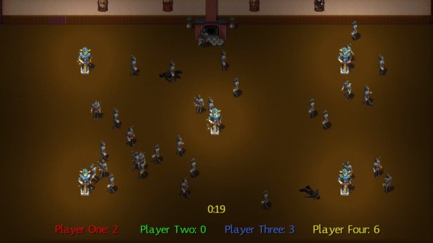
Go ninja! Go ninja! Go!

I should note that designer Adam Spragg is someone who I’d consider to be a good friend. No, actually, we go back far enough and have talked enough that I’d go so far as to call him a great friend. We have been ever since after my first review of Hidden in Plain Sight back in 2012. Hell, I consider myself a mediocre-at-best interviewer, but my 2012 interview with Adam is one of my strongest. But, that friendship stuff gets placed in suspended animation when I start playing a friend’s game. My friends would have it no other way. That’s sort of what makes them friends, you know? So, this is the part where I rip my friend’s heart out and say that, in the case of Hidden in Plain Sight, I’m more than a little disappointed that nothing has been done to jazz-up the presentation.

This play session incorporated a rotation of eight players between the ages of 75 to 6. EVERYBODY legitimately won at least one game, including Sasha, my 6-year-old niece (“hey, I’m almost 7!” she said when I shook my head and said “we just pwned by a 6-year-old!”). She touched all five statues in the classic Ninja Mode, being smart enough to not go for kills and thus avoiding detection. Later, she was on the winning team of a Knights Versus Ninjas game AND successfully scored the game-winning kill. Was she one of the better players? No. But, nobody let her win, either. We don’t go for that in our household. You play? You play to win. Little Sasha played to win. This ain’t no Candy Land. I was dang impressed. It also shows that Adam vastly underrated who can play these games. NOT EVERY MODE. Death Race and To Catch a Thief was a little out of her league, but she legit held up her end of the bargain as a teammate in others and was always a threat to steal the free-for-all matches.

Hidden in Plain Sight barely looked fine for a 2012 Xbox Live Indie Game. Now, it’s nearly 2023 and it looks exactly the same as it ever did. Kinda blurry. Kinda low-res. It doesn’t make for an interesting-looking game. If I hired a marching band and had fucking Beyoncé write a jingle about the awesomeness of Hidden in Plain Sight, it’s still going to be a tough sell at the point of sale, which is where most indies are made or broken. Even that goddamned ugly font. The font is something that will turn people off. It makes Hidden in Plain Sight look like an old freeware game. I could see someone who, via word-of-mouth, looks up the game, is totally interested, and then passes when they see the look, and that font. It doesn’t look retro-old. It looks like expired-milk old.

Catch a Thief mode became our least favorite mode. You pass over coins while a number of other players are snipers with limited bullets that must snipe them. There’s a wisdom to the design. The coins don’t just immediately disappear when you touch them. It’d be too obvious then. As for the NPCs, in this mode, you can mark which ones you’re sure aren’t people. My family being made up of slobbering fucking idiots, we all kept marking the real players. We sucked at this. All of us. BUT, I like that you can basically make up your own rules. We all took turns being the lone sniper, and we took turns where one of us was a player. It was fun.

Of course, gameplay is king, and I’m pleased to report that Hidden in Plain Sight absolutely holds up to the test of time. While, yes, games like Assassin’s Creed has multiplayer modes, there’s still never been a local multiplayer game quite like this. The main mode alone gave us over an hour of quality party gameplay over two days. In it, you’re presented with a room filled with dozens of identical ninjas (yes, you can adjust how many, including filling the whole screen if you wish), all of which are non-player characters (NPCs) except you and your fellow players. You don’t know which ninja you are, or which ones are your opponents. Your first task is to figure out where you are in the sea of ninja humanity, and you have to do so without giving away your position. Because, once you know where you are, you must sneakily begin to touch the five statues in the room. Every time you touch one, you score a point, but a chime goes off that alerts the room someone just scored. You can attack and take out characters from the game, but in doing so, you give away your position. There’s a variation of this mode where touching all five statues wins the game for you, but we preferred to stick to the main mode. Once we all got a feel for our own strategies, not to mention mimicry of NPC walking behavior, we kept going back to this mode again and again and it never got boring! It’s seriously such a genius use of video games as a medium for delivering the perfect social experience. It’s museum-worthy.

In Death Race, you’re again a randomly-assigned character in a room full of NPCs where the first challenge if figuring out who you are without giving away your identity. You have two buttons: walk and run. Hold them down to advance towards the finish line on the other side of the room. The NPCs will NEVER run, so you have to walk. The catch is everybody also has a single shot with a sniper rifle to take out anyone who they think is a real player. At one point, I tried to fake out like I was ready to pull the trigger on someone else, when in reality I had the crosshairs over my own character. It nearly worked, until my sister said “SHE’S GIVING HERSELF AN ESCORT!” and I was JFKed soon after. This was everybody’s second-favorite mode. This is the Squid Games a decade before that came out, and it’s AWESOME!

Unlike my previous experience reviewing Hidden in Plain Sight, this time, I was playing with family who actually wanted to play. At least after a few minutes. Hidden in Plain Sight’s worst aspect is that it’s a relatively difficult sell to get a game going. It sounds so much more complicated than it is. In the coming days, I’ll be posting a review of another for XBLIG that released more recently on Switch, Chompy Chomp Chomp (the review linked there is about to become outdated). That one is easy to explain: eat players and don’t get eaten. We played it first, and nobody wanted to move off of it and onto HIPS. Tellingly, when everybody wanted to play a party game again the next day, they wanted to do more rounds of Hidden in Plain Sight. Even those who preferred Chompy voted to play HIPS. I was delighted. I figured I’d have, at best, ninety minutes to check and make sure HIPS could still be fun in the 2020s. We doubled that, and even found that modes I’d previously scoffed at were actually among the highlights.

In my original 2012 game, I played with a bunch of interns at our office and games quickly devolved into letting two of the three royal NPCs die and just puppy-guarding the third. This go around, teams were planning complex “divide and conquer” strategies and rounds could go to the very last seconds before players began to make their moves.

Knights & Ninjas, where you divide into teams that must either assassinate three “royal” NPCs or protect them, became the mode we put the most time into on the second day, to the point that we had a little mini tournament with it. While yes, it does have issues with puppy-guarding, especially if a knight gives away their position killing an NPC by accident (they don’t try to attack the royals) it also proved the old adage “patience is a virtue.” The final match of the tournament was won by my parents when Mom and Dad (the ninjas) defeated Angela and myself (the knights) with two seconds left on the timer. Dad spent a lot of time lingering around the royal family without making his move, to the point my sister and me, and everybody watching, had him pegged as an NPC. I wasn’t bitter at all when I said “wow, congratulations Dad, you sure pulled off being a mindless drone convincingly!”

This is a last-assassin-standing type of mode where the playfield progressively shrinks into a circle. This was the only mode not every observer was interested in trying their luck at. That’s REALLY telling to me. It proves beyond a shadow of a doubt that it’s the deception and sneakiness that’s the attraction in Hidden in Plain Sight, whereas the killing is not that fun. In fact, the biggest fight in our house over HIPS was nobody wanted to be the snipers, to the point that we had to make a rule that everybody had to take a turn with the guns. Wow, I didn’t expect that. Even the little kids enjoyed learning to walk like NPCs and eventually were winning games with consistency. It’s a game that you WANT to get better at. Where winning feels rewarding.

So, even though it took a decade to get there, Hidden in Plain Sight now seems fated to be like an old, yellowing board game with split-corners on its box that’s tucked in our closet. Something to bust out not just when we have guests over, but also when we have free time and nothing better to do. I certainly underrated it before. It’s why I’m bumped-it-up nearly one-hundred positions higher on the IGC Leaderboard. Like many great board games, you need three other people. There’s no online play, because the charm is totally lost without everybody in the same room. You also need players who have the right mindset. If someone has overactive adrenal glands and goes stab-happy, it’ll ruin the fun for everybody else, as people going stab-happy tends to do. But, with the right group? Even observers can have fun trying to suss-out who is real and who is an NPC. Despite the archaic graphics, Hidden in Plain Sight sure feels like it’s going to be kind of timeless. Ten years later and, if anything, I think it somehow managed to get better with age. Of course, being someone who cheers for every game to find success, I still wish Adam would redo this with modern graphics. Maybe then you heartless bastards would give it a chance.

Hidden in Plain Sight is Chick-Approved
Leaderboard Ranking: #87 of 306 Indie Gamer Chick-Approved Indie Games*
Top 86.4 Percentile of All 640 IGC-Reviewed Indie Games
Top 71.5 Percentile of All 306 IGC-Approved Indie Games
*Rankings based on time of publication. Check the Leaderboard for updated standings.

Hidden in Plain Sight was developed by Adam Spragg
Point of Sale: Nintendo Switch, Steam
$5.99 gave up its position in the making of this review.


ArsonVille

Fire is fucking awesome. I think we can all agree to this. It gives us delicious food, warmth on cold nights, and hilarious fail videos involving rednecks with too much boiling oil every Thanksgiving. But mankind’s control over fire sometimes goes astray, often with disastrous results. The sacking of Alexandria burned their legendary library to the ground. A lone unguarded lantern destroyed Chicago in 1871. And now, perhaps the worst misuse of fire in human history: Arsonville.

It's really not going to make any sense. Just watch the trailer.

It’s really not going to make any sense. Just watch the trailer.

Okay, that’s a slight exaggeration. Arsonville is a bad game, but at least there’s something here that could potentially lead to something decent down the road. The idea is you have an 11 x 11 grid of squares with various trees, lakes, and houses that you must strategically place flammable objects around. After thirty seconds, time is up and you have to then choose which square to begin the fire on. The object is to burn as much to the ground as possible using that single initial square of fire.

That’s it.

No really. All stages are randomly generated and there is no progress. There are no win or fail conditions. The above describes the entirety of the game. There literally is no point to it. Just put shit on a random map and watch it burn. Perhaps “bad” wasn’t the word I was looking for. “Unfinished” is more appropriate. “Proof of Concept” if that’s not specific enough. What they are selling here works in the most minimal sense, but without any driving motivation besides “fire is pretty” what’s the point?

The lengths we'll go to for a decent s'more.

The lengths we’ll go to for a decent s’more.

There’s lots of dumpware on Steam that feels like a cynical cash grab. That’s not Arsonville. Instead, it feels like a child who got caught opening their Christmas presents too early. All the parts of a game of merit are here, except one thing: THEY FORGOT THE GAME PART! Instead, Arsonville feels like a demented Fisher-Price play set. This goes out to the team at Slavitica: hire someone to make actual puzzles and stages. Remove the 30 second timer. Do not throw away Arsonville’s potential. With what you released, you did the unthinkable: you made fire boring. I didn’t even know that was possible!

headerArsonville was developed by Slavitica
Point of Sale: Steam

$3.39 (normally $3.99) unlocked 10 of the 16 achievements in under 3 minutes. I mean come on guys, shouldn’t achievements involve actually achieving something besides surviving booting up your game without keeling over from a fucking heart attack in the making of this review?

This article may only be reprinted with my express written consent, which can only be granted if you bring me the head of Tim Schaffer. For God’s sake, do not bring me the body with it. It probably smells like onions and farts.

Mystery Castle

When I started Indie Gamer Chick in July of 2011, I figured I’d be playing a lot of new ideas and experimental concepts. Ha. Silly me. Most of indie games take their inspiration from games of yesteryear. This is fine, especially when those muses are properties that have long since been abandoned. Take the Adventures of Lolo, for example. Here’s a franchise whose last American release came when I was two-years-old. A series popular enough that it had three full releases for the NES, and even more globally, but has gotten no love since. Hell, the Smash Bros series is by HAL, the studio behind Lolo, and yet it can’t even get so much as a trophy in the series. Yea, him and Princess Lala were villains in the Kirby series, but that isn’t much comfort. That would be like Fox saying “yea, we cancelled Firefly, but hey, you can see Captain Mal flipping off Jack Bauer in the background of an episode of 24 so it’s fine!”

Working title: The Adventures of No-lo.

Working title: The Adventures of No-lo.

I hadn’t played Lolo until I found an XBLIG called Aesop’s Garden, and someone said “well it’s just a Lolo clone.” It’s not, though the inspiration is clearly there. Since then, I found another Lolo-inspired indie gem, SpyLeaks, which I liked so much that I included it in my Indie Royale bundle back in 2013. While those games expanded the Lolo concept, people who wanted just a straight re-imagining of franchise might not have liked them. For those unambitious types, Mystery Castle is probably their best bet. It holds the distinction of being the only Ouya game I ever finished. I liked it just fine, but never bothered to review it on account of it, well, being an Ouya game. My reviews of puzzle games here are already as well received as a diagnosis of Gonorrhea, and the double whammy of being on a platform only owned by people who hate money made it seem like a waste of time to write-up. But now it’s on Steam and Xbox One, so here’s what I have to say about it: it’s fine.

I mean, you’re not going to be enthusiastically singing the praises of it to anyone. Mystery Castle’s gameplay is as forgettable as its name (one fan of mine mistook it for a remake of an NES game called Milon’s Secret Castle, which I guess is known for being horrible), but it’s solid. The idea is you’re a gnome. You have to puzzle your way through rooms, collecting diamonds to open up an exit. The formula is somewhat adjusted by having things like warps to push boxes through, lanterns to light invisible paths, or keys that only work on certain doors. The controls are a little too floaty, which is common for the genre because you sort of have to be able to move one-half-space at a time, or else it would be too hard to maneuver blocks into the correct positions. Veterans of Lolo will get used to it quickly.

I do appreciate that the boss fights are still puzzles, as opposed to Lolo 3 where you just basically Care Bear Stare the bosses like a shooter.

I do appreciate that the boss fights are still puzzles, as opposed to Lolo 3 where you just basically Care Bear Stare the bosses like a shooter.

So is it fun? Yea. I probably would have enjoyed it more if I had played it only a couple of stages at a time instead of trying to plow through it as fast as possible. Puzzlers can be exhausting to attempt in one sit-through, something that I’ll fully admit is unfair for game developers since their genre doesn’t lend itself to the review process. Especially when the game has a lot of needless dialog and explanation. Really, the only part I truly hated were the ice stages, which feel closer to a game called Starzzle that I reviewed a week after launching IGC. I’ve given up on developers ever figuring out that most gamers would rather lick rust than play ice stages. But, whatever. There’s enough new ideas to keep things relatively fresh from start-to-finish, enough so I think anyone wanting a game like this will be satisfied. While I still prefer Aesop’s Garden and Spyleaks, Mystery Castle is really good for what it wants to be. Really, this is closest in feel to a direct sequel to Lolo you’ll probably get anytime soon. If you like that series, you’ll enjoy this. If you don’t, you won’t. Easiest. Review. Ever.

Mystery Castle logoMystery Castle was developed by Runestone Games
Point of Sale: Steam, Xbox-One, Ouya

igc_approved1$9.99 (I think, not sure what I paid for the Ouya version) said “Thank you to all my readers for five incredible years of support. Here’s to the next fifty!” in the making of this review.

Mystery Castle is Chick-Approved and ranked on the Indie Gamer Chick Leaderboard

Adventure in the Tower of Flight (Steam Review)

Update: Adventure in the Tower of Flight is now $4.99

Ugh, what an unwieldy name. It flows about as well as a small creek overrun by giant-sized mutant beavers. Which, actually that sounds like a bad ass idea for a game. Perhaps a tower defense title? It’s all yours, indies. I hate harping on names, but Adventure in the Tower of Flight has “in the” and “of” in it. “Adventure” and “Tower” are also gaming staples, making the title that more forgettable. It’s not just a title that rolls off the tongue about as well as a sugar cube (which is both sticky and cube shaped and thus rolls poorly), but it’s generic and bland. And that’s a shame because Tower of Flight is a decent game that doesn’t seem to be finding its audience. I posted screencaps with smart-assed captions on my Twitter feed while I was playing it and was besieged with questions about this nifty looking NES tribute that I was playing. Nobody had heard of it. Everyone wondered how they could have missed it. Maybe it’s because it just sounds like it’ll be a bad game, or boring. I don’t think you can legally speak the title out-loud while operating heavy machinery. Names are important, and indies often seem to give less than top consideration for this. It would be like opening a restaurant and naming the place Spitty’s. Who gives a shit how good the ribs are at a place called Spitty’s?

Classic gaming call-backs are abundant in Tower of Flight. The bats here behave almost exactly like those annoying Medusa heads from Castlevania. Which you'll note is something nobody has ever wanted to see in any game, ever. Why do people paying tribute to these classics insist on using the worst parts of games? Granted, everyone remembers those parts, but still..

Classic gaming call-backs are abundant in Tower of Flight. The bats here behave almost exactly like those annoying Medusa heads from Castlevania. Which you’ll note is something nobody has ever wanted to see in any game, ever. Why do people paying tribute to these classics insist on using the worst parts of games? Granted, everyone remembers those parts, but still..

AitToF (It doesn’t even abbreviate good!) isn’t a bad game at all. I found it to be a decent neo-retro platformer that you’ll get a few hours out of (and more levels are coming soon!) and forget about soon after finishing. They’re enjoyable hours though. Think of Tower of Flight (Christ, even a shorter version of the name sucks) as a linear Zeldavania, with a heavy emphasis on Zelda looks and a Castlevania feel, with a small helping of Kirby mixed in. There’s a thin plot about trying to reach the top of a tower, but it feels tacked on and needless. The hook is instead of a standard 2D jumping mechanic, you have the ability to fly for a short distance. That’s the Kirby part. Think of it as Kirby if the flying mechanic had a limitation to it. You gain a couple special moves along the way, upgrade your sword, gain extra hearts, fight a few bosses, and that’s pretty much it. You certainly don’t want to mistake this for a Metroidvania. Tower of Flight is mostly linear, with few opportunities to deviate from the set path.

This is a tough one for me to review. There’s not a whole lot to talk about, because every aspect of the game is average. Graphics? Very convincing in an 80s sort of way, but average. The level design? Mostly without fault, but average. Enemies? Too limited in variety, and whats here is average. Controls? Maybe slightly above average, though I hated having to manually map everything to my Xbox One pad. Maybe that’s what Tower of Flight aimed for. A decent, convincing 80s NES tribute that plays it safe. Hey, kudos for pulling it off. And I’m sure NES fans will like it a lot more than I did. I just wish it had messed with the formula a little more. I guess that Tower of Flight could seamlessly pass for an undiscovered NES game is remarkable enough, but after games like Shovel Knight, Super Win, and Axiom Verge, I’m too spoiled to get too excited by a game that simply feels like a game from a different era.

The only art in the game that made me cringe. This boss looks like the unholy off spring of Kang and or Kodos and a Hungry-Hungry Hippo.

The only art in the game that made me cringe. This boss looks like the unholy offspring of Kang and/or Kodos and a Hungry-Hungry Hippo.

Actually, there’s one thing that bugged me enough to mention. There’s a town section with a fetch quest stuck in the middle of this game that feels insanely out-of-place. Not only does it channel the giant mutant beavers and break the flow of the game, but it’s mechanically a little broken. The game’s engine makes it so that when you go through a door, it locks behind you. Thus, navigating is a tack-like pain in the ass (measured by amount of pain, not by the size of the source of pain). I think the developer’s goal was to make the town a puzzle or maze of sorts, where you had to figure out which doors led to which parts of the town. Both myself and the only other person I talked to who has actually played the game simply kept making loops until we stumbled on the douchebag who completed the fetch quest. It was boring, it was clunky, and it was pointless. I honestly have no idea what the developer was thinking. At least it was short, I guess. But  even admitting that section is short feels like telling a condemned prisoner “It’ll be over with quickly.” Not all that comforting.

Of course, for fans of that era, you really didn’t need this review at all. The only information of relevance I can provide such fans is that the game works fine and is an authentic NES style game. It was made for children of the 80s, not a smart assed millennial. I have no doubt that Adventure of the Tower of Flight hit all the marks it needed to for its target audience to walk away very satisfied. This is a quality game with true craftsmanship displayed. I just hope the developer mixes it up a little next time. Take some risks. I usually try to end reviews with a joke, but for this review, I’ll instead end with a thought: There are a lot of games that can do the “Like an NES game” thing. But only truly inspired can make people say “like an NES game, but..”

tower logoAdventure in the Tower of Flight was developed by Pixel Barrage Entertainment, Inc.
Point of Sale: Steam

igc_approved1$14.99 (probably too much) admits that the indie scene is likely to be picturing a different kind of giant mutant beavers than me in the making of this review.

Adventure in the Tower of Flight is Chick-Approved and ranked on the Indie Gamer Chick Leaderboard.

White Night

Update 5/9/19: White Night has been delisted from both the Xbox One and PlayStation 4 stores. It’s available still on Switch and Steam.

This is the latest challenge from the gang at the Indie Game Riot, who matched my White Night purchase price ($14.99) as a charitable donation to the Epilepsy Foundation. I buy the game, they match the price, everyone benefits. Except my brain, because given their selection of games for me, I’m starting to think they hate me.

In the interest of fairness, I should concede that I almost certainly never had any chance of liking White Night right from the get-go. This is for a couple of reasons. I never got into horror games. As a child, my parents didn’t let me play M rated games. I guess they didn’t want me to grow up cussing a blue-streak or making obscene jokes. The results speak for themselves. By time I was an adult, I had epilepsy. Horror games are meant to be played in the dark, with all external lighting turned off. That’s the biggest epilepsy no-no there is. But, White Night was mostly done-in for me by relying on fixed camera angles. I hate those. My first Resident Evil was #4. Also known as the one that ditched the fixed camera angles in favor of, you know, anything but fixed camera angles. You’ll notice almost nobody talks about the first three Resident Evils as the pinnacle of the series. Resident Evil 4 was so good it made the first three retroactively bad. More outdated than natural aging should have made them, and that’s almost entirely on the fixed camera angles. I get the point of them, especially in horror games. Like a theme park dark ride, they direct your attention in a specific direction to optimize the terror when something scary comes into view. The problem with that is, it compromises optimized gameplay for stylized storytelling. Games aren’t movies. Gameplay should always be paramount.

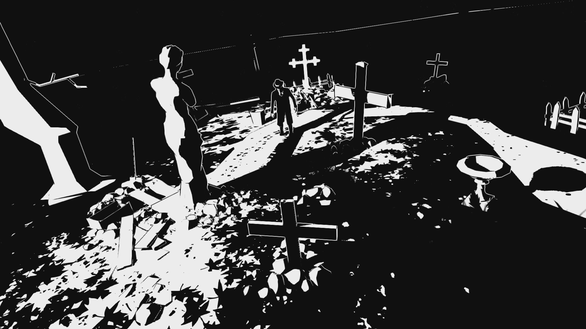
And, in the case of White Night, the graphics style does not mesh well at all with the fixed camera malarkey. This gets proven nearly every time something is introduced that’s intend to drive the plot in some way. There’s a scene in the second chapter where you’re in a dining room (I think it’s a dining room) and the game’s plot takes over: a ghost girl who needs your help. She appears suddenly and then walks through a door. When she does, the cinematics take over so you can see her walk through the door. You then return to the fixed camera you were at, and it’s almost impossible to figure out which door she just went through. The game is drawn in black and white graphics and the gimmick is most of the game is shrouded in darkness.

White Night 2

Here’s an example of how the puzzles in the game don’t work in a logical sense. See the statue casting a shadow on the grave marker? There’s a key hanging where the shadow is. It’s not an Indiana Jones type of thing where moving the shadow of the statue activates a mechanism that reveals the key. No, the key is apparently just hanging there (you can even feel it before you move the statue) but you can’t actually claim it until you move the statue and can see it. Oh COME ON! It’s right fucking there. It’s just so damn silly that it breaks immersion right off the bat. This is literally the prologue to the game and the concept is already ruined. Sigh.

It doesn’t work as a play mechanic or a storytelling device. Hypothetically, the player character saw the ghost and knows which door she went through. That’s why it’s scary. Because holy fuck that was a ghost! But the player can’t tell which door she went through, so the plot grinds to a halt once again while you stumble around slowly, lighting matches to illuminate dark areas and clicking every object hoping to make the god damn slow-as-radioactive-decay story unfold just a sliver more. This breaks immersion, because in a cinematic experience (like White Night strives to be), the guy who, again, just saw a fucking ghost crying for help and walking through a door, would know which door she went through and follow her. In the game, the players are left to stumble searching for the door that the character himself saw. Are we scared yet? No, really, we’re just bored.

Oh, and by the way, the door she went through? It was locked.

Other technical issues get in the way. Even the simple act of clicking on shit to examine wasn’t handled well. The game kicks off with a car crash that injures the main character. I’m not sure if he spends the whole game limping around, but at the point I quit (which, granted, was very early in), he staggers with all the urgency of a murderer being dragged to the gallows. The limping animation leads to making lining up with stuff that you need to click a needless exercise in frustration. I’ve slammed the examine when the magnifying glass appears on-screen, only the dipshit you control was still dragging his leg in the animation and thus by time the game acknowledges that you hit a button, the character is no longer in position to examine the thing in question. Normally I would label this “lag” but it’s not really lag. It’s just bad design.

I don’t want to call it “Style over Substance” because that implies the game’s creators made a conscious decision that the gameplay could be mediocre as long as the art work was striking (and it is). I think White Night is a victim of the development team knowing how to play their own game and forgetting that you develop games for everyone else. Like an expectation that players will play the game the way the game’s creator does. For example, save points are notoriously spread far apart. In theory, this is done to heighten tension, making players practically pray that they come across one so that all the progress they’ve made isn’t lost. In practice, players just make a tiny bit of progress, return to the last save point they found, then venture back to make a little more progress, rinse, repeat until they stumble upon a new one. Thus 10 minutes worth of gameplay takes an hour to complete. I’ve never seen a game where that’s an option and most players opt to just risk making it to checkpoints. That’s especially true with White Night, because the game unfolds so fucking slowly, with miserable play control, that fear of having to repeat the tedious activities is more terrifying than any jump-scares or creepy atmosphere the game can throw at you.

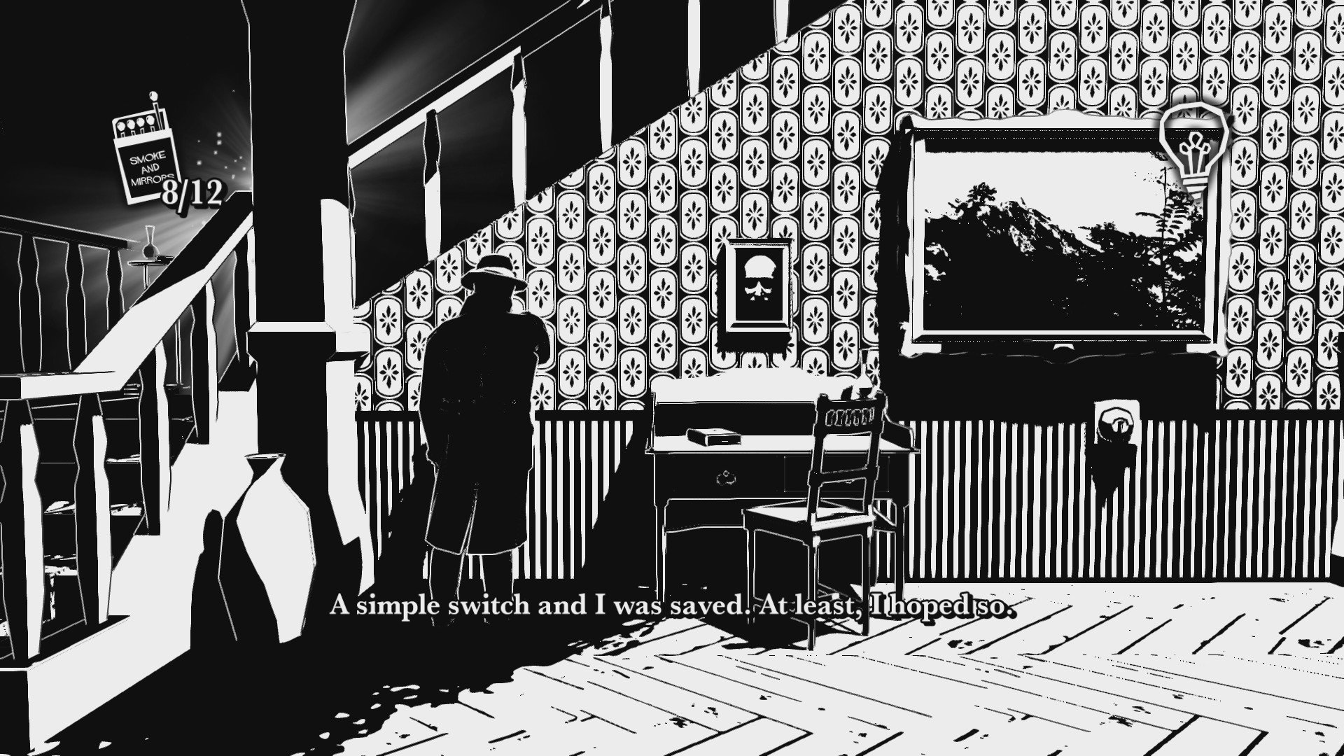
Lighting matches doesn't protect you from the more aggresive ghosts, but they'll be removed as threats by electic lights. This leads to two things. First, some of the light switches "look dangerous" and thus your character won't push them, because of course he won't. I mean seriously, you fucking pussy, you're being stalked by killer ghosts who are only scared of electricity. You're locked in the house. It's just a fucking light switch! Again, all the stuff designed to keep tension up or be a "puzzle" is handled so poorly that it breaks the immersion. In a horror game, immersion is all you have. You break that, you're left with nothing. And second, it leads to players hugging the fucking walls searching in vain for a light switch that simply does not stick out enough. Who wants to play hug the walls? White Night is a wall-hugging simulator.

Lighting matches doesn’t protect you from the more aggressive ghosts, but they’ll be removed as threats by electric lights. This leads to two things. First, some of the light switches “look dangerous” and thus your character won’t push them, because of course he won’t. I mean seriously, what a pussy. He’s being stalked by killer ghosts who are only scared of electricity. He’s locked in the house. And it’s just a fucking light switch! Again, all the stuff designed to keep tension up or be a “puzzle” is handled so poorly that it breaks the immersion. In a horror game, immersion is all you have. You break that, you’re left with nothing. And second, it leads to players hugging the fucking walls searching in vain for a light switch that simply does not stick out enough, and then when you find it, it doesn’t work. Who wants to play hug the walls? White Night is a wall-hugging simulator.

There’s not a single concept that White Night has that I feel works the way it was probably envisioned. The game gives you matches that you must use to stay in the light. You can carry 12 at a time. If you run out of matches, you die. If you can’t get a match lit in a dark area fast enough, you die. That can be problematic when you’re trying to light a match but the character is either caught in an examination animation or even a movement animation that you can’t even see. I’m guessing it’s done to be realistic, because real people would struggle to light a match in a haunted house where ghosts will fucking kill you if you aren’t able to spark the thing up. THIS ISN’T REAL LIFE! It’s a game! And besides, when the ghosts actually kill you, the death animation looks more like a mildly annoyed person trying to shoo a housefly away, not a scared-shitless person having the life force sucked out of them by a god damned mother fucking GHOST! And why the hell are the ghosts in the game instakills? And why are we even doing the ridiculous save stuff? And why in the blue fuck are matches in limited supplies? White Night has a very old, first-gen 3D horror mentality. It ignores all the major advancements in-game design that have come about over the last twenty years. A lot of people say Resident Evil 1 was scarier than Resident Evil 4. Fine, maybe it was. But horror games control better today than they did in the PS1/Saturn era. Can’t we find a healthy middle ground between good gameplay and real scares?

That’s the real shame here. White Night might actually be a really scary video game. I played it in a room with four grown men and my mother. We all had a couple “fucking game got me!” BOO moments. But typically those resulted in me dying, followed by dying several more times in a row. Then more dying. You die a lot. This is mostly because, for some reason, when a ghost spots you the movement gets even weirder and more limpy than normal. If a ghost catches you, you die. You can run away, but while doing so, you have to compete with horrible play control and the possibility that the fixed camera angles will change. Again, because of the all white and black style and the darkness versus light gimmick, the layouts of rooms are confusing at best. Often, it’s not even worth attempting to runaway.

Going off the percentages of players getting achievements for completing the second chapter, a shocking amount of people quit playing White Night at some point on the second stage, and I’m amongst them. This game is awful. Look, even scary games are supposed to be entertaining. While the game is interesting to look at, a game shouldn’t make it so easy for players to give up and quit. White Night frustrates with archaic fixed angles, clunky movement, bad play control, confusing layouts, a slow, somewhat uninteresting and far too vague story, and annoying instakills that make you replay all the annoying things. No, as someone who completely missed the fixed-camera era of horror gaming and HATES that style, I probably never stood a chance to like White Night. Was this review fair? I feel it was, because if you’re in the same boat as me, with no nostalgic affection for that style, White Night is clearly not for you. Playing White Night is practically a war of attrition, and it is in that sense only that it succeeds. I wave the white flag.

White NightWhite Night was developed by O’Some Studio
Point of Sale: Nintendo Switch, Steam

$14.99 said “who’ya gonna call?” like a schmuck in the making of this review.

Default Dan

Default Dan is a novelty platformer, the hook being the game does the opposite of traditional gaming tropes. Coins kill you. Power-Ups kill you. Pitfalls don’t kill you. Springboards can’t be jumped off of. Spikes act like springboards. Sounds wacky and weird. And it is, until you realize that really it’s just any other platformer with the enemy and traps being reskinned. The only such gag that kept getting me were the coins. My brain, like the brains of all gamers, is wired to be like “OH, COINS! YOINK!” Even an hour into the game, my mind would wander just long enough for me to get snatchy with the coins and die. Otherwise, the gimmick gets old really quickly. Even the story, which flips the roles of a Bowser lookalike and a princess didn’t really work for me because the princess looks too, well, psychotic. Actually, she looks like a grown-up version of Elmyra from Tiny Toons. Which, yea granted, she’s one step below Annie Wilkes in the “chick you wouldn’t want to be stuck in a room alone with” scale, but still.

Anti-capitalist hippies!

Anti-capitalist hippies!

Default Dan is a decent platformer. It takes only a couple of stages for the gimmick’s novelty factor to wear off. That’s an occupational hazard with comedy games. For Default Dan, really, the concept should have been done as a little three or four stage free flash-game, while the developers put their efforts towards something with a little more meat behind it. Strangely, it doesn’t quite feel like they got the most out of the idea. The boss fights, for example, feel just like any old boss fight in any platformer. You would think they would make the gimmick “you have to get the boss to kill you” or something to beat it. Really, the only difference is the boss throws power-ups at you instead of projectiles, but they’re the same power-ups you’ve spent the last few levels avoiding. Again, it’s all just a glorified reskinning and it feels like it doesn’t go far enough. They should have just gone balls-to-the-wall nuts here. Mushrooms that make you small instead of big (as it is, they just kill you. Really, Mario Lost Levels already fucking did that). Bosses that you have to let kill you. Ice levels with spectacular play control. What’s actually here is downright tame.

Thankfully, Default Dan does have some decent level design. Nothing exceptional, but the stages scale well, add new mechanics through-out, provide a relatively fair challenge, and the game ends before it wears out its welcome. If you want more after the credits roll, there’s a second quest with tougher stages, or you can challenge the leaderboards for previous levels (the second quest’s stages did not have working leaderboards when I played this). The controls are solid, if slightly unresponsive. The collision detection is the biggest strike against Default Dan. Most of the enemies are beaten by jumping up into them. You have to be square under them for it to kill them. Otherwise, you die. Against the final boss, there were a couple of instances where I would hit her and it would register as hitting her, but then I would immediately die because of either how I was positioned when I hit her or because it switched from her “can be hit” sequence to her “invincible, can’t be hit” sequence while I was still midair and touching her. Yea, that was a bit of a run-on sentence. Sorry.

I had an idea for how Default Dan could have been a little more substantial: some kind of mechanic where you switch between the conventional gaming and the opposites stuff. So like, sometimes the coins help you, but then other times the coins kill you. Maybe have like an evil witch cause the game to switch back and forth between the two.

I had an idea for how Default Dan could have been a little more substantial: some kind of mechanic where you switch between the conventional gaming and the opposites stuff. So like, sometimes the coins help you, but then other times the coins kill you. Maybe have like an evil witch cause the game to switch back and forth between the two.

So, kind of mixed bag for Default Dan. The concept did catch my attention on the Steam marketplace. But, the novelty isn’t really strong enough to carry a $5.99 game whose main quest ends in well under an hour. The bosses are boring and don’t really defy convention, which is a big disappointment in a game whose sole hook is defying convention. But, there’s some inspired level design here, enough extra challenge to keep players happy after the credits roll, and a couple laughs to be had. It doesn’t reach its potential, but I had fun with Default Dan, so it wins my seal of approval. And not just by default.

Default Dan logoDefault Dan was developed by Kikiwik Games 
Point of Sale: Steam

igc_approved1$5.99 conceded that for an ice stage to have markedly better controls, the rest of the game would have had shit controls, so it’s probably a good idea they didn’t use that one in the making of this review.

Default Dan is Chick Approved and ranked on the Indie Gamer Chick Leaderboard

8BitBoy

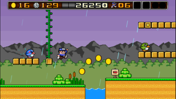
I’m reviewing far too many neo-retro games. 8BitBoy lured me with a siren song of colorful, convincing retro graphics and a modest $0.99 price tag (when it was on sale. Price is now $3.99). An opening narration eases you into the charming, Neverending Storylike setting of a man who discovers that one of his beloved Sega Master System cartridges from his long-lost childhood has a label with a missing title. He plugs it in, and suddenly he’s in the game. I loved the idea. So it’s a real shame that the storyline never pops up again, at least until you beat the final boss. Only it does the Bubble Bobble thing where you have to get all the correct items to unlock the true ending. I didn’t bother trying, but for those who purchase 8BitBoy, you’ll be happy to know that it put a lot of stock in replay value. That is, assuming you can look past some of the worst play control seen in a good indie platformer that I’ve experienced.

Sigh. No, I can't ship the dev off to the Turkish prison. They have no room left for people who make ice stages. Because that would be like 99% of all platform games. Nobody likes ice stages. Stop making them.

Sigh. No, I can’t ship the dev off to the Turkish prison. They have no room left for people who make ice stages. Because that would be like 99% of all platform games. Nobody likes ice stages. Stop making them.

8BitBoy handles awfully, at least with an Xbox One controller. Part of that is on me and my clearly-demonically possessed left thumb. No matter how many times I rest it on the d-pad and tell it “you will use THIS! The stick is no good!” the damn thing has a life of its own. Serves me right for smoking nutmeg that one time. But, actually, stick or d-pad, movement is ultra slippery. The best example of how movement needed a lot of tuning up are the Super Mario like vines. Sometimes you’ll hit a block and a vine will come out. The act of climbing this vine should not be a chore, but simply going up it in a straight line is agony. I kept wiggling to the left and right. I’m told this is much easier with a keyboard. Um, yea? So what? Who wants to play a 2D hop-‘n’-bop platformer with a keyboard? I don’t. I haven’t spoken with the developer so I can only speculate what happened, but I’m guessing he designed the game to be played with a keyboard and the controller support was only added afterwards. When you turn on the controller, the cursor for selecting stuff from the menu is also mapped to the controller, even though it still handles like it’s mapped to the mouse.

There’s a lot of other weird control issues. The game does the Super Mario “hit the block to reveal the item or get coins” thing. Only in 8BitBoy, you have to be perfectly lined up with the block or just bonk off it to no effect. There’s really no benefit to making a player be perfectly lined up. It’s just busy work. Like Three Dead Zed, 8BitBoy feels like the all the movement physics are transplanted from a different game. There is no one-sized-fits-all style of movement physics. Two of my favorite-controlling platformers are Super Meat Boy and Shovel Knight. Both couldn’t be more different. Take Super Meat Boy’s controls and put them in Shovel Knight and the game would be a disaster. Put Shovel Knight’s into Super Meat Boy and the game would be unbeatable. As a developer of a 2D platformer, you need to make sure the play control is perfect for your game, based on nothing else but how your game should handle. Don’t say “I like how (Game) controls. I’m going to make mine handle that way!” Because what you’ve designed might not lend itself well to that. And for God’s sake, don’t stop testing with complete strangers until the moment you go gold. Once you’ve released, you’re sort of locked in. Ask the Three Dead Zed guys.

I’m really frustrated with 8BitBoy’s loose controls because everything else about it is sublime. I almost never talk about the graphics of a game, but what’s here is practically an 8-bit siren call. 8BitBoy is colorful, inviting, and beautiful. Well, opening level rainstorm not withstanding. Seriously, why would you start your game with a rainstorm? Rainstorms are depressing. Christ, is there some kind of unwritten rule that indies must be at least THIS bleak? I shudder to think of what an indie reboot of Mappy would be like. “Act One: Mappy’s mother just died of cancer. Mappy laid down in bed and began to cut himself. Going too deep, Mappy nicked an artery. Our adventure begins with Mappy slipping into unconsciousness..”

Gene Kelly is the only person who made rain seem less than bleak. For everyone else, rain is like liquid sadness. What was the tummy symbol on the unhappy Care Bear? RAIN!

Gene Kelly is the only person who made rain seem less than bleak. For everyone else, rain is like liquid sadness. What was the tummy symbol on the unhappy Care Bear? RAIN!

And that level design? Sorry to quote Inspector Gadget, but I’m feeling it here: wowzers. Perfect use of old school tropes here. Excellent moving platforms. Well placed spikes. TONS of hidden pathways and rooms. No matter how bad the controls were, I wanted to experience these stages. When I found a warp zone early on and skipped to the midway point of the second world, I was kind of bummed out. But, the fact that the level design is so inspired only serves to frustrate me with the controls more. How could a developer get one aspect of the game so fucking right and completely and utter airball an equally important component? You know, a common theme in indie gaming is final stages that go out with a whimper instead of a bang. Where you can tell the developer rushed the finale out just so they could see the game released and hear what people have to say about it. 8BitBoy doesn’t have that. The last levels are some of the best in the entire game. Normally that would have me looking to give the closest person a tearful hug of relief. Here, that made me just shake my head and wonder, what if they had got it right?

8BitBoy by all rights should be a top 25 game on the Indie Gamer Chick Leaderboard. Does it do anything new? No. Instead, it feels like an all-star version of an old school tribute. Every conventional 2D mechanic is here and damn near perfect. Even though I spent my entire run cussing the controls, I would be lying if I said I didn’t have any fun. 8BitBoy is a lot of fun. It’s yet another one of those “dream game come to life” titles. But this dream game is a bit of a nightmare. The controls are completely unacceptable. I do absolutely recommend 8BitBoy, both to love-sick nostalgic types and cynical nostalgia-hating cynics such as myself. But I also recommend it as an example of a game that does everything right except the thing it needed to do most. Giving a game like this to a fan of platformers (such as myself) is like handing someone a Porsche without a gas pedal that has to be started like Fred Flintstone’s car. Hey, it’s still a Porsche, right! Just be ready to pick glass and rusty nails out of your feet.

8bitboy logo8BitBoy was developed by Awesome Blade
Points of Sale: Steam, Desura

igc_approved1$0.99 (normally priced $3.99) didn’t note above that there’s a nasty glitch where sometimes you have a reserve item, go to activate it, and the item is lost with nothing happening. They really ought to fix this in the making of this review.

8BitBoy is Chick Approved and ranked on the Indie Gamer Chick Leaderboard.

Pressured

You know, there are a lot of really good games waiting to be Greenlit on Steam. So it’s a bit shocking to me that Pressured got through, because (1) PC is completely the wrong platform for it. It would be right at home on iPad. And (2) this is one seriously boring game. There’s a grid of twelve monitors that cycle through different numbers. You have a target number which you must get to by clicking the numbers on the screen until they add up to it. The last number used to hit the target becomes a bomb. When you hit the target five times, you move onto the next stage. And that’s pretty much it.

This won’t be my longest review, because I don’t have a lot to say about Pressured. It’s a competently made game. Not ambitious in its art style. The whole “indie minimalism” thing is getting out of hand. So many games these days are devoid of personality, and it makes gaming almost exhausting. It’s not novel or cute anymore. Minimalism now reminds me of Kristen Stewart. An actress so utterly devoid of talent, personality, or charisma that it leads me to assume she must be giving the best head the casting couch has ever seen for her career to still exist. You indies are Kristen Stewarting your games. STOP IT!!

This game bored me so bad I think I might have PTSD from it. Just looking at this screen shot made me reach for the power button on my PC.

This game bored me so bad I think I might have PTSD from it. Just looking at this screen shot made me reach for the power button on my PC.

I have nothing against math-based puzzles. I was hooked on Sudoku for a while. But as a game, Pressured just plain doesn’t work for me. It feels more like a bonus round for a larger game that’s been given a full release. I really have no other complaints about it. I don’t even think I could offer any tips to improve the concept, since the foundation alone has all the earmarks of a digital sleeping pill. There’s a lot of fans for Pressured out there, and I’m sure the usual gang of idiots will demand I bestow my Seal of Approval on it because it’s a competent game that didn’t cause birds to fall dead out of the sky. But really, I’ve done nearly 500 reviews and the hour I spent with pressured is the most agonizing one I’ve had ever at Indie Gamer Chick. I’ve played incompetently made games and at least they gave me something to talk about. Pressured bored me AND gave me nothing to work with. I can nit-pick that there’s no leaderboards local or online, but I wouldn’t want to challenge for them anyway. The bland visuals and the dull gameplay just absolutely walloped me into a coma. I’m not picking on Flump Studios. They made Pester, which is one of the only shmups I’ve reviewed that scored my Seal of Approval and a Leaderboard ranking. I think the difference between this and Pester is Pester feels like a lot of time and effort went into it. Pressured looks and feels like one of those games people make in 48 hours at a Game Jam. And no, my dislike of this has nothing to do with the whole “girls suck at math thing.” I’m awesome at math. Well, at least my accountant is, but I pay him so that totally counts for me.

Pressured logoPressured was developed by Flump Studios
Point of Purchase: Steam

$2.39 (normally priced $2.99) whined “nobody said there would be math” in the making of this review.


Super Amazing Wagon Adventure (Second Chance with the Chick)

Super Amazing Wagon Adventure was a rarity for me on the XBLIG scene. It was one of a very small group of games that I continued to play after I finished reviewing it. Not a lot of time. Maybe a few extra hours, but I couldn’t focus on any other games until I had satisfied my run with Wagon. It happens to me sometimes. I have a term for this: “getting it out of my system.” It’s a term friends, family, and co-workers have come to dread from me. It means my productivity is ground to a screeching halt. Terraria is currently the standard-bearer for this. I reviewed it, hated it, but still felt the need to get it out of my system. Then I realized that I was addicted to it and I had to do a complete 180 and concede that it was something special. I put about ten hours into it before the review went up. Between the time I posted my original review and the time I had to suck it up and admit I was wrong, I put an extra thirty hours into it. And after the second review, I added another fifty or so.

Currently, I’m migrating all my XBLIGs over to PC, and many of them will get a Second Chance with the Chick. Super Amazing Wagon Adventure has the word “Turbo” added to it on the PC build, so I figured I would start with it. I had a few nits to pick in my previous review of it, and I wanted to see if they were addressed.

Nope.

Under the sea! Under the sea! You'll some how not drown, when the wagon digs down, under the sea!

Under the sea! Under the sea! You’ll some how not drown, when the wagon digs down, under the sea!

Of all the games I’ve enjoyed at Indie Gamer Chick, Super Amazing Wagon Adventure is the least fair, and it doesn’t give a shit about it. As you make your way through the game, all the events unfold randomly, and many of them revolve around you just plain losing health. Sometimes the game immediately starts with one of your three characters coming down with some hilarious illness and having three of their four hit points get drained. You get them back if you survive a couple of waves, but there’s a chance that if a single enemy makes it past your defense, that character will die. Right off the bat, with almost no chance of survival. What a dick of a game.

If you think that’s bad, try making it all the way to the end of the game with full health (a rarity) only to be forced to sacrifice one team member or starve to death. This can be avoided if you collect 40 animal hides when this scenario comes up. I talked with a lot of players of the game and all of them determined that anything short of perfect shooting with the correct weapon will fail. Many of the weapons in the game completely annihilate the animals you can hunt, leaving no carcass behind for you to chow down on. That happened to me several times. I got so pissed off that I chose to starve once. I figured I would be left with only one heart per person. No, actually, they all died.

You know, Sparsevector, there’s a fine line between making your game challenging and making players want to burn your house down.

As fun as Super Amazing Wagon Adventure is (and make no mistake, it’s really fun), you never feel any sense of accomplishment when you play it. When literally everything comes down to the whims of fate, how can you feel good about it? If you display any skill, the game will bend you over its knee and introduce you to the paddle of “shit happens.”

Wagon 2

Brian FINALLY presents me a flower, which is what initiates a life-restoring ritual known as “fucking each-other’s brains out.” Oddly enough, my original lineup was myself, Brian, and our friend Bryce. Wagon Bryce and Wagon Brian couldn’t stop fucking each-other, much to the real Brian and Bryce’s chagrin, though we all admitted that Nintendo could learn something from their Super Amazing Wagon Adventure’s Brokeback Mountain moments.

Low on life and counting on the fur trader to sell you some health? Fuck you, all he has for sale is the ability to move your wagon faster. Which you will never ever EVER want. All that does is assure you will take more damage, because you have a big moving target and moving faster means moving more recklessly. Having the best run you’ve made in several attempts? Why, here’s syphilis for your characters and also a pack of wolves chasing them. The wolves are the most appallingly overpowered enemies because they move too fast and if you dodge them, they turn around and bite you in the ass. Have the right default weapon to handle them? It might get jammed, or drunk if you’re using the falcon. Shit like this makes me question if I would be brought up on assault charges if the developer was within chair throwing distance of me. It’s the most infuriating good game I’ve played at Indie Gamer Chick.

And it is fucking awesome.

8+ hours into the PC port (with probably around the same amount of time put into the XBLIG version), and I was still discovering new scenarios I had never encountered before. Train robberies. Caves. Aliens.  I had more wagons and even modes to unlock. And the weird thing is, I actually want to press on. I feel like the love-struck school girl trying to catch the attention of the local bully. So, is it a nice game? No. It blows up bullfrogs with firecrackers and pulls the wings off flies. But I’m downright smitten. I also think the guys at Sparsevector are responsible for a 20% hike in my blood pressure. MY PARTY GOT ANOTHER VD? CAN’T YOU GUYS STOP FUCKING FOR TEN SECONDS?

Wagon logoSuper Amazing Wagon Adventure was developed by Sparsevector
Point of Sale: SteamDesuraXbox Live Indie Games
Ports played for this review: Steam and Xbox Live Indie Games.

IGC_Approved$2.99 preferred the wagon that lets you use the falcon in the making of this review. Even though the falcon had a big drinking problem.
Super Amazing Wagon Adventure is Chick Approved and ranked on the Indie Gamer Chick Leaderboard.


Escape Goat 2

From July 1, 2012 to July 26, 2013, the top ranked game on the Indie Gamer Chick Leaderboard was Escape Goat, an incredible platform-puzzler by Ian Stocker. I’ve played dozens upon dozens of puzzlers since starting Indie Gamer Chick, and it stood out. It didn’t have the most difficult puzzles, but the ingenuity of the puzzle design left a big impression on me. It was one of the first games I played that made me realize that indies in many ways have eclipsed big studios in terms of creativity and intelligence of design. But, what impressed me most of all about Escape Goat was how this was a puzzler that anyone could play. Compare it to something like Gateways, which is probably the most brainy puzzler ever created. Less than 1% of all people who purchase that game ever finish it, even on it’s “easy” mode. Which is not a knock on it. As of this writing, it ranks #9 on my Leaderboard. The game is genius. The problem is, the learning curve is so steep that you practically have to be a genius to get the most out of it. Escape Goat was challenging enough to give anyone making their way through it a sense of satisfaction, but not so smart that anyone would be likely to walk away and never return. Sort of like what I’ve been known to do with punishers. Damn you 1001 Spikes, you refried bastard of a game, you.

Escape Goat 2 isn’t a revolutionary upgrade on the original by any means. It’s still built around single-screen puzzles that are solved by activating a series of switches that alter the layout of each stage. You still have a mouse helper that you use to squeeze through narrow passageways, transfer places with, or to activate switches. And it still contains equal parts platforming and puzzling, a balance that many of its genre cousins have trouble maintaining. It’s safe to say that Escape Goat 2 is more of an evolutionary step. When this is the case, I typically find the sequel to be satisfactory, but leaving less of an impression on me. Mario Galaxy 2, Kingdom Hearts II, and Arkham City all left me feeling that. That’s what makes Escape Goat 2 such a surprise. It not only feels fresh, but that sense of awe and discovery that hooked me with the original happened to me again and again, as I watched floors and walls shift around to reveal the pathway to victory stage after stage. It reminded me the staircases at Hogwarts, or the some of the elaborate boobytraps from the Indiana Jones franchise. In this sense, Escape Goat and Escape Goat 2 hold a unique distinction for me on the indie scene: they’re the only games that made me totally revert back to my childhood. Not even Journey managed to accomplish this. For this reason, Escape Goat 2 is the first game since Journey that made me debate whether it should go on top of the Indie Gamer Chick Leaderboard.

No, my mascot making a cameo did not influence my feelings. Truth is, I'm a little insulted by the lack of stature it was given. It should have been a miniboss, at least.

No, my mascot making a cameo did not influence my feelings. Truth is, I’m a little insulted by the lack of stature it was given. It should have been a miniboss, at least.

As an evolutionary version of Escape Goat, the sequel features new styles of puzzles. Sometimes you’ll acquire the ability to manipulate four mouses at once. Other times, you’ll have to turn the mouse into a block, either to act as a shield or to smash platforms below you. Unlike the first game, levels unfold in a slightly more linear way. One of the fatal weaknesses of the original game was that the levels could be tackled in any order. For this reason, the difficulty couldn’t be scaled. The sequel not only fixed this, but it contains one of the finest difficulty curves the indie puzzle scene has ever seen. Even when you later open up new stages that link off the opening levels, those new levels feature the proper scaling of difficulty. Is it perfect scaling? Of course not. Even big budgeted games by some of the biggest names in gaming rarely nail the curve, and indies never do. Having said that, Escape Goat 2 comes the closest. Considering how bad the first one screwed the pooch in this area, I thought it was worth mentioning.

Like the first Escape Goat, I found the controls to be exceptional. I was actually shocked to learn that people are complaining about them. I’ve reviewed 472 indies as of today, with the highest percentage of them being platformers. Proper platforming controls are among the most difficult things to get right. I never once felt the controls failed me. If I died, it’s because I fucked up, not the controls. The jumping is so natural that your limitations become instinctive almost immediately. Maybe I had an easier time because I enjoyed Escape Goat 2 with an Xbox One controller, but really, even some very good indie platformers struggle with controls. I would rank my experience with Escape Goat 2 second only to Super Meat Boy in terms of how instinctive they become. I can think of no higher praise.

I don’t want this to sound like a digital blowjob. Believe me, I have some bones to pick with Escape Goat 2. My biggest gripe: the lighting effects. Many of the stages are lit in a way where you have to explore them to get a proper lay of the land. It sounds great in theory, but I felt it took away from the majesty of discovery, which is where Escape Goat really shines. It’s the same thrills that make movies like National Treasure and Tomb Raider bearable to watch. Unfortunately, those moments in Escape Goat 2 are often shrouded in darkness (even when you turn the image brightness up in the options), and that’s really a shame. I’m also still not a fan of when the stages center less around puzzling and more around simple precision platforming. Although I argue that Escape Goat 2 does platforming very well, it’s not the game’s calling card, and those stages feel almost phoned in.

Escape Goat 2 also does that annoying thing where one of the unlockable super powers can only be achieved by dying X amount of times (in this case, 400 god damned times). I *hate* it when games do that. Thomas Was Alone did it too. Granted, TWA did it in a way that confirmed my fucking awesomeness, but this shit is like rewarding players for incompetence. Picture if we did this in all walks of life. Did you watch the last Superbowl? Remember when the Broncos gave up a fucking safety right off the bat? Imagine if they followed that up by dousing their coach with Gatorade while the players that fucked up gave each other chest bumps and high fives, all while the beleaguered Seahawks watched on in dumbstruck awe. You wouldn’t give them a fucking achievement for that. And yet gaming now does this on a consistent basis.  STOP IT!! The point is to not die!

Unless you’re one of those games where the point actually is to die.

See what I mean about the lighting? Why is it every game has to be so damn dark and mopey these days? Do you know what the indie development scene needs most of all? A fucking psychiatrist.

See what I mean about the lighting? Why is it every game has to be so damn dark and mopey these days? Do you know what the indie development scene needs most of all? A fucking psychiatrist.

Escape Goat 2 isn’t revolutionary. It won’t change the way you feel about gaming, one way or another. So it surprises me that I actually had to stop and think about whether I enjoyed it more than Journey. It ultimately came down to this: Escape Goat 2 made me do that “revert back to a giggling, wide-eyed child” thing that games like Portal and Super Mario Galaxy did for me. I crave those moments. They’re so very rare. I give the nod to Journey because it’s the only indie I played that took me places emotionally that I never expected any game would do. I hope that doesn’t detract anyone from giving Escape Goat 2 a whirl. After all, I am comparing the best indie I’ve ever played to the second best indie I’ve ever played. Because, as of this writing, that’s exactly what Escape Goat 2 is. A magnificent title from a rare breed of talent. A game that makes me proud of what I do here at Indie Gamer Chick.

And now, if you’ll excuse me, I have to go back to the game and kill myself another 304 times. Because Ian Stocker is that much of an asshole.

Escape Goat 2 logoEscape Goat 2 was developed by Magical Time Bean

IGC_Approved$9.99 is so hungry it could eat a goat burger. I have no clue what that means, but my late partner Kevin used to say that every day in the making of this review. Do goats taste nasty or something?

Escape Goat 2 is Chick-Approved and ranked on the Indie Gamer Chick Leaderboard.