Cape’s Escape Games (Switch Series Review)

As previously stated in what became the least-viewed feature in the entire history of Indie Gamer Chick, the Vice Family has a new pastime: Escape Rooms. Certainly healthier than our previous pastime: smoking copious amounts of tobacco while sitting on our fat asses and binge-watching old TV shows. Escape Rooms have been our post-Covid salvation. You go into room, they “lock” you in (there’s typically no actual lock for safety reasons, though we did once do a room where we started handcuffed), and you work together to solve puzzles to hopefully exit the room (or in some cases simply unlock a primary treasure chest) before time expires. It’s normally an hour time limit, but sometimes you only have 45 minutes if it’s a shitty room made by cheapskates. In my experience, the 45 minute rooms are the ones that put in the least effort anyway. Either way, Escape Rooms can get expensive. When it’s my parents, Angela, and me, it usually runs us $100 per room. We’ve paid as much as $300 for a single room when we did one with my brothers from different mothers Reggie and Christian and their wives and kids. Spendy, yes, but it’s such a great time. Seriously: if you’re looking for a great Christmas gift, check to see if there’s escape rooms in your area and buy someone the experience. You’ll be hooked. You’ll also find out who among your friends and family are the dumb ones. Of course, you risk finding out it’s you. Not that I would know anything about that. Cough. 

On mobile, this game is called “Cape’s Extra Room.” On Switch, FOR NO REASON, it’s called “Cape’s Escape Room 2.5.” That makes it sound like the same room as #2 with different puzzles. It’s not. At all. It’s an entirely different room, in an entirely different location, with entirely different puzzles. I met developer Alignment Sharp on Twitter and confirmed that he doesn’t speak English at all, so some of these quirks seem to be a result of poor translation. The dude has talent and honestly I’d love to see him design an actual real life Escape Room.

Of course, that experience can’t possibly translate to a video game. According to my non-seizure-having family, doing the rooms in VR isn’t remotely the same as real rooms with real props. So, translating the experience in a video game is tough. I’ve done several Escape Room video games lately and all of them fall short. Usually, it’s via clunky controls and unstable engines. That’s why it’s funny that the closest I’ve seen any game come to feeling like the real thing is any of the releases in the VERY cheaply made series called Cape’s Escape Games. There’s five of these on Nintendo Switch and presumably more coming since this series runs ten-deep on the iPhone App Store, where the franchise originated. This review covers the whole shebang, including future releases, because no matter which room you buy, all games offer the same fundamental experience. One that is being shit on by other critics, and I don’t get it. Did they even play it, or did they take one look at the graphics and thumb their snotty noses up at it? Because this was far and away the best I’ve seen any Escape Room video game come to feeling authentic so far. They’re really not bad at all, as long as you ignore the writing and the mediocre visuals. Basically, if Kevin Smith did a video Escape Room, it’d be this.

As you’ll notice in this screenshot, there’s no word-wrap in the dialog. It’s SO annoying. It’s hard to believe that one of the best options the Cape series offers is turning the story off, but you can. It’s a shame, because Cape is hella cute, but the actual dialog is overly sexual and so cringey. These should ideally be good games for the whole family, and they still are.. as long as you turn the story off. Like, immediately. Before the kids are in the room.

Unlike the more higher-end Escape Room video games, the Cape series doesn’t have a physics engine or a 3D environment to deal with. Everything is handled like an old-timey adventure game with static screens and items to collect. But, instead of having to deal with LucasArts style octopus logic (“mix the stick with the trashcan to arm the racoon to overthrow the mayor who in turn gives you a key..” YEA, THAT MAKES PERFECT SENSE!), the puzzles are exactly the type you find in Escape Rooms. They’re scattered along a small handful of interconnected rooms, along with hints to how to solve them. You have to figure out the sequential order of the puzzles, since solving one always unlocks something essential towards another. This process repeats until you get the final key that unlocks the ultimate door. There’s a story framed around a ghost named Cape that keeps trapping people in these places, but it’s poorly translated from Japanese, overly horny (the implication being that the main person Cape keeps trapping is a pervert), and completely skippable. In fact, you can disable it in the menu, and I strongly suggest doing so. I know this sounds weird coming from the girl who paused the ending of Walking Dead: Season 2 to go play with herself in celebration of her most hated character finally dying, but there was NO REASON for these games to have that type of “humor” in them. What the Cape’s Escape Games do best is perfectly replicate the type of puzzle design you see in real life escape rooms. They took a “less is more” approach that makes every game in the series a genuine joy to experience.
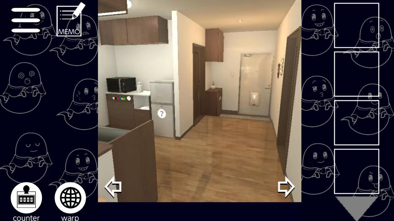
Sure, it’s not much to look at. It won’t win any awards for presentation, but actual effort is made to assure you can locate the puzzles and figure out your way around the room. If you get lost, there is a hint system which can do as little as point you at the next puzzle you’re scheduled to solve, which I confess, we did use once or twice. Hey, we had shit to do! Mostly play other Cape’s Escape Games, but that counts.

So, for example, a drawer might have a lock with a different color for each number, while somewhere else those colors are represented by X amount of colored objects. Count how many of each object, input those numbers into the lock, the drawer opens, and you get something that helps you solve the next puzzle. None of the puzzles are obtuse, with one exception (more on that in a bit). Repeat that for an hour each game and it’s done. Usually, Escape Room releases have no replay value, but Alignment Sharp also included an after-the-game mode where you find various hidden ghosts. Nice addition, but really, you’re paying $3 – $9 (depending on the release) for a one-and-done hour or so experience. That’s fine. Not every game has to be a permanent investment that will be fun for ever and ever, people. If you think $3 for an hour is too expensive, you’re a snot. Hell, we pay $30 every month FOUR TIMES OVER for Escape Room-at-home subscriptions from Cratejoy (we get Deadbolt Mystery Society, Finders Seekers, The Conundrum Box, and the bi-monthly Escape the Crate, at a combined cost of around $140 a month with shipping & handling figured in) that also take roughly an hour or two to finish and offer no replay value. Of course, too many people these days expect every game to last a lifetime. Right. And how many arcades let you take home the machine you dropped a quarter into for 90 seconds of gameplay? Christ, you people crack me up sometimes.

Which of the five games is this from? Honestly, it doesn’t matter. They’re all basically the same level of difficulty. Gun to head, my Dad and I agreed Cape’s Escape Game 3rd Room was very narrowly the hardest of the series. Or was it? We did finish it at like two in the morning, so it’s possible our brains weren’t firing on all cylinders.

Of course, the Cape’s games don’t have the charm of being a real life escape room OR an escape room box with physical maps/puzzles/trinkets. But, you’re also paying a fraction of the price. In fact, I’d say that these are excellent games to spend very little money on and sample if the Escape Room experience is something you’d be interested in. There’s only one puzzle in the entire franchise that we agreed was bullshit. In the second game (I think it was the second game), you have to call up your note pad and use the transparency filter, which suddenly reveals a clue that you couldn’t see before. That’s the only such puzzle like that in the entire game. Otherwise, you never have to use the built-in tools or counters. You can sit and play the game with a notepad and a pen, and it works better than the tools provided.
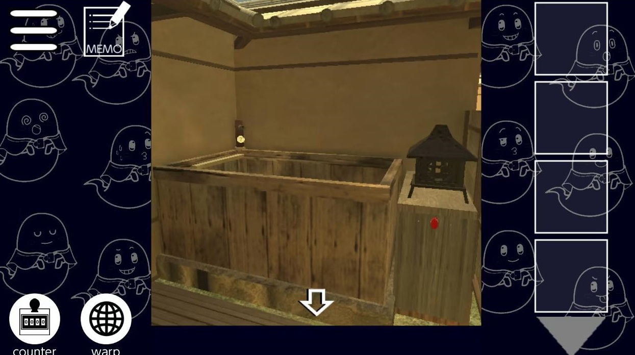
There’s a learning curve to navigation, and occasionally it’s hard to get a feel for the geometry of the room, but thankfully puzzles and points of interest call your attention with things like (?) stamps. Plus, anything that’s finished and offers no further value to the rest of the game is removed from being able to be clicked on, which is INSANELY helpful. Seriously, as cheaply done as these games are, they really feel like they’re made to be enjoyed. The fatal flaw in so many Escape Room video games is that it seems like developers want confusion to factor in, but that’s just being unimaginative. Really, a video game escape room should have massive advantages over real ones in terms of being able to wall-off players from areas that no longer matter. Even the best video game escape rooms can’t beat the charm of a real one, but they sure as hell can be more convenient and accessible.

All puzzles BUT that one are well done, feel rewarding to solve, and even leave you wanting more when the game is over. When you finish a puzzle, you don’t have to worry about ever clicking that area when you try to navigate the room. Finished puzzles are walled off, and even whole rooms get locked-off once you no longer have use for them. The navigation arrows that lead to those rooms simply vanish, never to be seen again. That’s perfect! That’s the type of video gamey thing a real escape room can’t actually do. If you can’t be better, at least do the things real escape room designers could only dream of doing. The funny thing is, when I showed off that my Dad and I were playing these games in early November, a few people got snobby based on how cheap they look and sound and assumed they were shitty. But actually, these are REALLY good examples of how to do video escape rooms, and we had fun with all five of them pretty much equally. Seriously, it’s embarrassing how excited we are for even more of these games. We’re going to buy every single one from here out. That’s an incredibly rare accomplishment for any indie franchise.
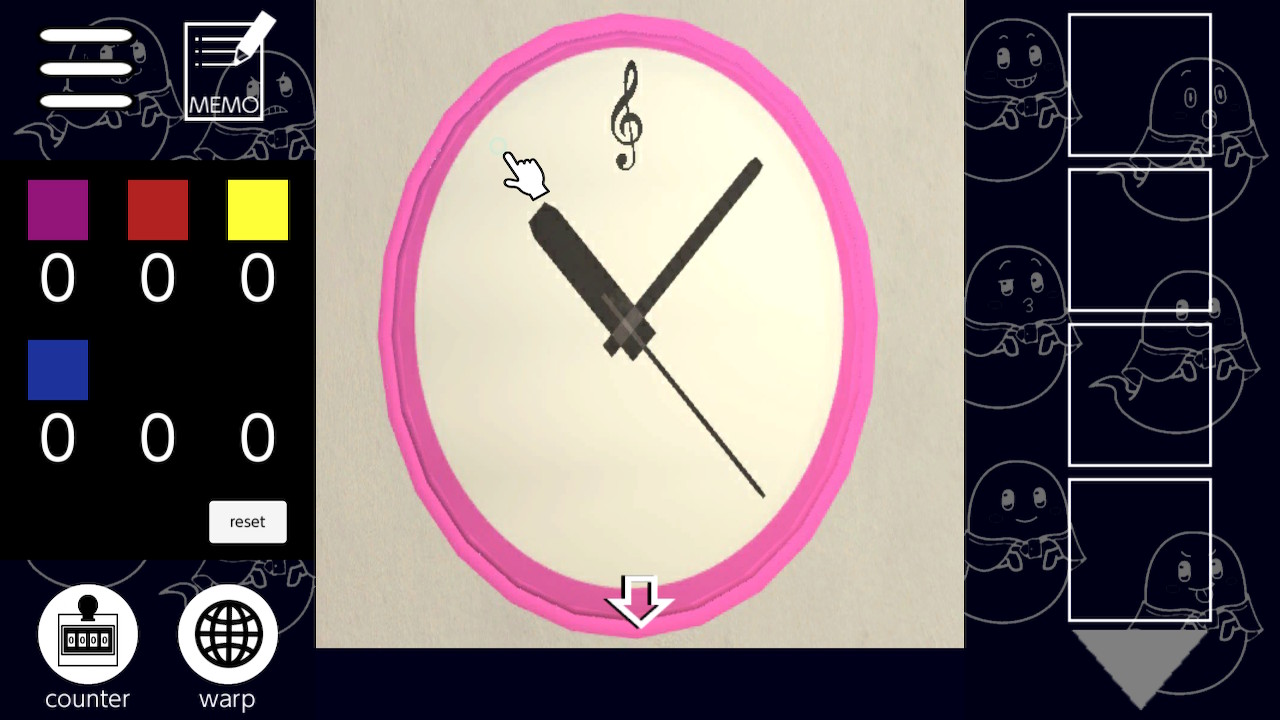
One of the most rewarding aspects of doing an Escape Room is when you enter the room and you see all this weird shit that makes no sense, until you start to solve the puzzles. Suddenly these weird, out of place things have a logic to them, and when you realize that, it’s like you just learned an entire new language, because you sort of did! You’re speaking the puzzle’s language, and it’s genuinely thrilling. Like when I was a kid and I learned how to say “fuck” in ten different tongues.

The one thing I don’t get is why they’re priced differently. The first one sells for $3. The second and third one (which is actually 2.5) sell for $4.90. The 4th and 5th one (which are numbered 3 and 4 sequentially) sell for $9. Mind you, the more expensive ones don’t offer more challenging puzzles or a longer experience. It’s such a nonsensical way of selling a game franchise and it’s bound to trigger confusion. These games seem to go on sale regularly, so if you’re only casually interested, you might be better served waiting for a sale. But seriously, don’t be one of those people who says “well it’s a mobile port and it’s ugly..” Gameplay is king! Take it from someone who has done over a dozen real life escape rooms in 2021: this accomplishes what those 3D escape room games haven’t come close to doing. The lack of physics allows you to FOCUS ON THE PUZZLES! That’s what it’s about! You can’t do that if you’re fumbling around with a camera or if the engine is unstable or you can’t examine items or can’t interact properly with the environment. All credit where it’s due to the Cape’s Escape Game series: it fucking gets it. It’s about the puzzles, stupid! And puzzles don’t require state of the art technology or graphics engines to do right. In fact, they get in the way more often than I do when we enter real escape rooms. HEY, AT LEAST I’M HONEST!


Cape’s Escape Games are developed by Alignment Sharp
NINTENDO SWITCH STORE LINKS

Cape’s Escape Game
Cape’s Escape Game 2nd Room
Cape’s Escape Game 2.5th Room
Cape’s Escape Game 3rd Room
Cape’s Escape Game 4th Room

Each game was purchased at a discounted price.

This entire series is Chick-Approved and ranked as a single entity on the Indie Gamer Chick Leaderboard.

THIS REVIEW WILL BE UPDATED if any additional Cape’s Escape Games become an exception and are not worthy of wearing the IGC Seal of Approval.
Death Coming

Have you ever picked up a Where’s Waldo book and wanted to massacre all the extras? No? Just me? Scary? Okay. Well, Death Coming is basically that. You take the role of an assistant Grim Reaper, specifically targeting three people per a level. But hey, you also have quotas to fill, and look at all the fleshy people just walking around, being all quota-like. Each stage requires you to kill a certain amount before you can move on. On the Switch, you can use a cursor or a touch screen. My brain has bad wiring and for some reason I kept alternating between the two, but in a nutshell, you click objects and if you click them at the right time, people die. And if that’s all Death Coming had going for it, it’d be fine. Not memorable, but a decent little time waster.

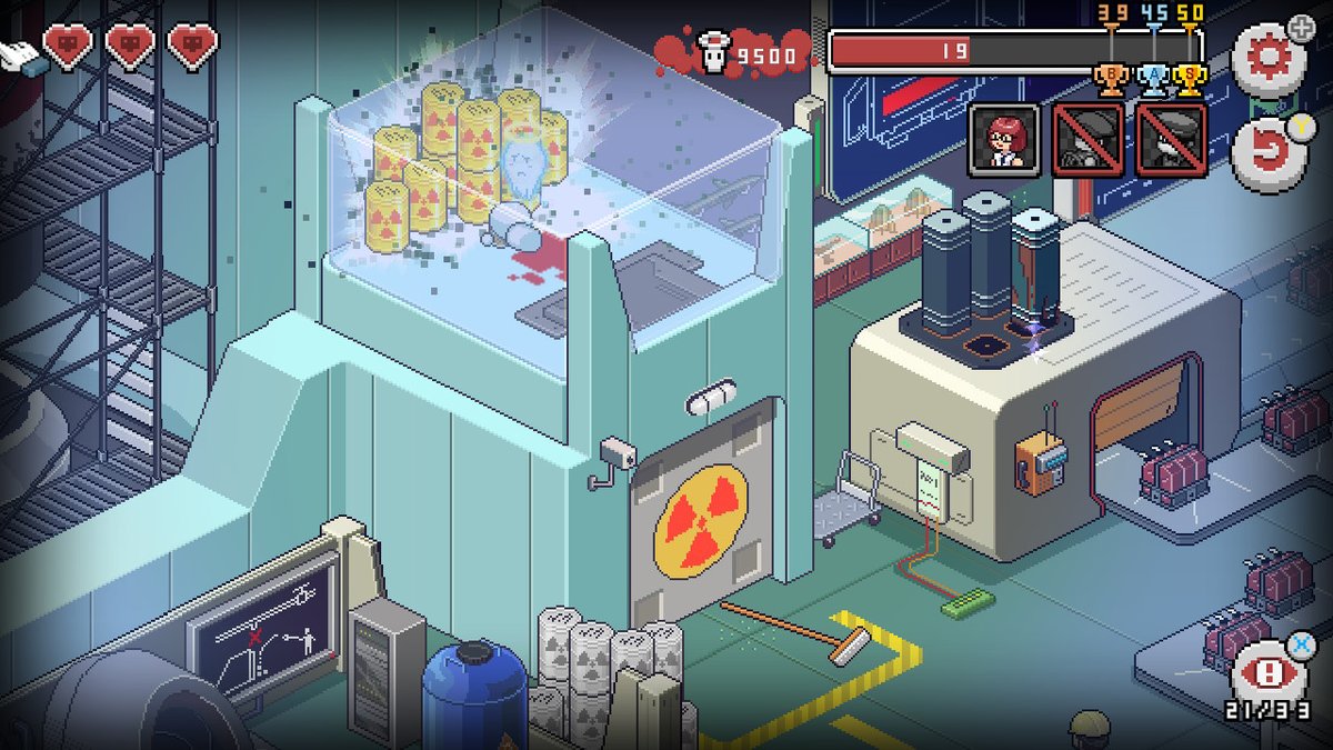
You get to pull off such kills as locking someone in a room with radioactive material and let them die of radiation poisoning. It’s the feel good game of the year!

But, Death Coming has a lot more going on for it. It’s all the proof developers need that it’s not what you do, but how you do it. Developer NEXT Studios was smart enough to give the NPCs personality and character. Don’t get me wrong: the NPCs follow strict parameters and aren’t exactly subject to free will despite what the game says. But at least it feels like they were given enough heart to be a bit more than just a body count. An ongoing story during your reaping shenanigans is a series of heists that you inadvertently foil through your death-dealing duties. Some NPCs carry on torrid love affairs, complete with scootilypooping (censored behind giant hearts, aww isn’t that sweet). Even alien invasions go down while working. None of this has anything to do with you being a Grim Reaper, though your presence certainly can work out for and against them. You just simply take souls while these cannon-fodder go about the (last moments of their) lives. It makes Death Coming fun in a fly-on-the-wall kind of way. If that fly were armed and wanted you dead.

You don’t directly kill anyone in Death Coming. Rather, you click objects and hope they do the deed for you. At its most base level, this means waiting for an NPC to walk onto a single square of the playfield that a trap will catch them on, like having something fall and squash them, or having them fall down a manhole. The more puzzlely aspects involve using various objects as complex series of rube-goldberg antics in order to free the meatbags from the mortal coil. Like there might be a target character lounging by a swimming pool. You close the umbrella above his head, wait for him to get into the pool, then click an electrical wire above the pool, frying him and all the other NPCs in the pool with him. I don’t know what is says about me that I found the gameplay so satisfying. Nothing good. Or, according to my increasingly terrified family, surprising.

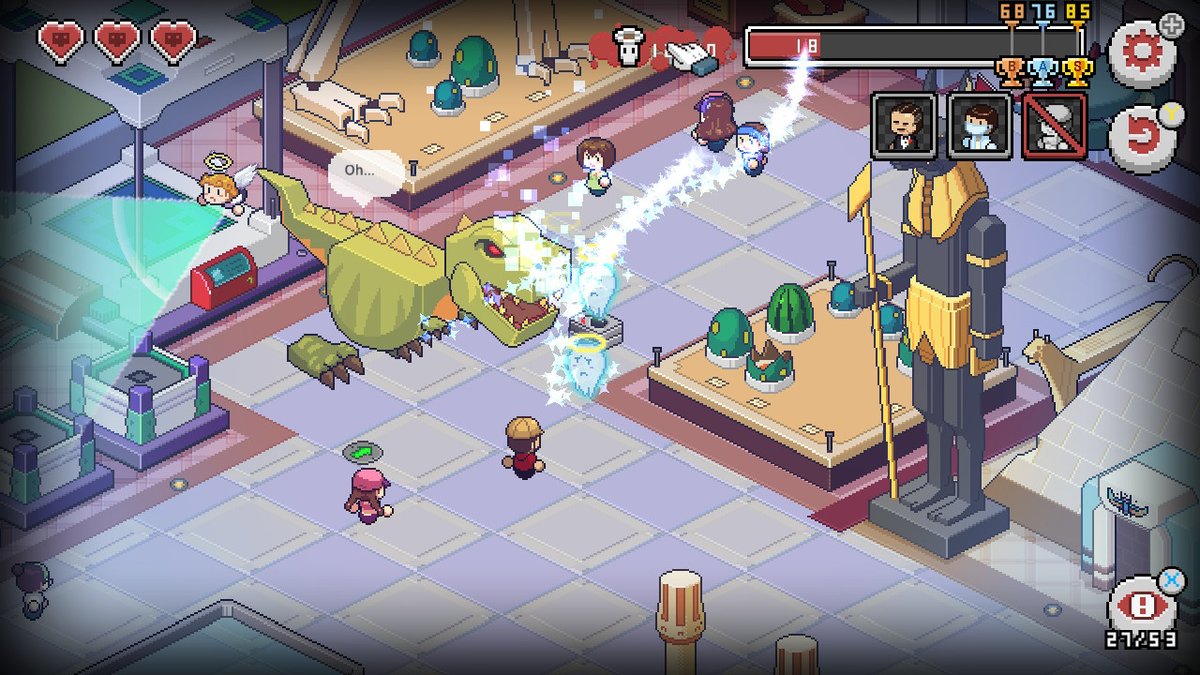
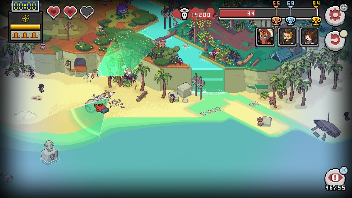
But, as cathartic as it is to resurrect a tyrannosaurus and send it on a rampage, I take issue with some of Death Coming’s design choices. In order to add “challenge”, the game employs “angel police” that feel you’re just a little too blood-lustful. In order to activate any trap, you have to click it twice. The angels only catch you if they spot you between the first and second clicks of an object. If they spot you three times.. I’m honestly not sure what happens since it never once happened to me. I mean, it’s a point and click game. There’s no avatar that has to avoid detection of the angels. The only time I got spotted was when the camera auto-zoomed in because I triggered some event and I forgot to zoom back out afterwards. Death Coming didn’t need this shit. All it does is slow the gameplay down, making me have to wait longer to kill NPCs because I had to watch an angel slowly fly by. And it’s not like Death Coming was fast paced to begin with. It’s one of those “minimum indie badness” decisions that seems so obviously unnecessary in retrospect and makes me wonder if there was anyone along the way who told the devs “no”. It gets really out of hand in the last level. You’re given a chance to activate weather-based events, but doing so spawns an angel. It’s not optional to do this, but the game also spawns even more angels as you go along. I don’t know if this was done to feel climatic or to pad the run time, but it grinds the level into something resembling a slog. The Indiana Jones theme is so fun for that level too. It doesn’t ruin it, but it comes close.

The angels spotting your finger does absolutely nothing. As long as you zoom out, you shouldn’t get spotted at all. It’s like someone spent a day with the world’s least threatening hall monitor and said “this pussy man would make a great video game antagonist!”

The bigger problem is how many replays you’ll need to get a feel for the traps. Sometimes they’re not so predictable, but once they’re used (or used X amount of times), they can’t be reused. If the word bubbles that appeared above the traps had been more descriptive, maybe you could more accurately predict what way they’ll fall or what part of the current rube-goldberg puzzle they’ll activate, and what path that will take once you do. In each of the six levels, I would find myself restarting them several times each, which I found necessary to figure out how the traps are used and how many characters you can take out in each. The only time I didn’t was in the sixth and final stage, where I put over an hour into it before realizing that it’d probably be in my best interest to start over. Once I did, I finished it in about fifteen minutes. In fact, I realized late in the game that you don’t even need to kill the three “target” NPCs featured on each stage to advance to the next level. You just need to fill your quota. I honestly don’t even know what the point of it was. Maybe it’d make sense if it were a different three characters every time you started each stage again and getting all three was necessary in addition to reaching your quota. But it’s not. Strange.

And I always hate to say this stuff, but the current Death Coming release is a bit unstable. The game skipped a bit sometimes when events would be triggered or when I scrolled around, or zoomed in or out. The skip never went away, but wasn’t a deal breaker or anything. I think one time it messed with my timing of activating a trap. A bigger worry is that I crashed the game a couple times in the final stage, once loading it, once when I went to take pics for this very review, uploaded them, then returned to the game only for me to code out to the Switch main menu. I’m sure it’ll get patched out eventually, but I hope the irony that a game about the Grim Reaper kept dying on me isn’t lost on anyone.

This is fun an all, but getting high scores would require keeping track of so many things that really you can probably chalk all the top people down to blowing lottery-levels of luck on a $7 Switch game instead of a lottery ticket. Only they know if it was worth it. Probably not.

Being a puzzler, once you finish Death Coming, in theory you should be done. Thankfully, NEXT came up a novel solution: a scoring system with online leaderboards. I figured there must be an absolute max score and the boards would be filled with multiple identical numbers. As of this writing, they’re not. None of the six levels feature the same person or same score in the top spots. That’s promising, and makes me think that the potential for higher scores might be on the table. So, Death Coming is more than your run-of-the-mill puzzler. But I wish it realized that. The angels and the arcadey scoring I think might have come at the cost of more of the more complex, multi-phase traps that made me giggle like an sadistic five year old who just discovered what you can do with ants and a magnifying glass. But hell, even a single-phase kill, like dropping an anchor on a boat, made me smile and feel warm inside. Death Coming isn’t perfect, but it’s a lot of fun. It’s the exact sort of pick-me-up you want to play when you’re suffering from the flu and have pondered whether you’d welcome the loving embrace of death. Can you tell what kind of week I’m having?

Death Coming was developed by NEXT Studios
Point of Sale: Nintendo Switch, PlayStation 4, Steam, iOS, Android

$6.99 didn’t fear the reaper in the making of this review.
Death Coming is Chick Approved and ranked on the Indie Gamer Chick Leaderboard

Homo Machina

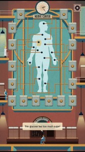
This also makes an effective diagram on the best places to shoot someone.

Big time educational video games are a thing of the past. But, their fade into oblivion wasn’t exactly based on lack of sales. In a nutshell, by 1999 a publishing company called Softkey had most of the more well-known educational games like Reader Rabbit or Carmen Sandiego or Oregon Trail. Softkey was led by my dear friend Kevin O’Leary. Yes, THAT Kevin O’Leary. Mr. Wonderful on Shark Tank. Kevin and the Softkey guys were bought by Mattel for 4.2 *billion* dollars, even though they really weren’t worth that much and Mattel could never in a million years hoped to recoup on the deal. At least in a time frame most people would consider reasonable. This was around the time of the Dot Com gold rush, and Mattel probably had big plans for these properties related to that. But $4,200,000,000? Yikes!

It startled people at the time and later went down as one of the worst deals ever. But, people didn’t really stop buying educational software. What happened is, Mattel had to try to get back what they paid for it, so they overspent on the production of the games, then over-manufactured them. The inventory outweighed the demand and what had been relatively low-cost to produce products suddenly had too much money being spent to create them. This led to Mattel posting losses on the Learning Company.. you know, the thing they massively overpaid for.. and it was thought “well shit, if Mattel can’t make money on these types of games, who can?” Absurd, but that’s how it works when short-sighted, overly-reactionary people are in charge. The industry decided that the bottom had fallen out on educational software, even though there was no other evidence of that besides Mattel’s losses. Bye-bye educational software. Oh, and Mattel fired Kevin. Kevin was so crushed he could barely muster up the enthusiasm to sit and count his millions by the fireplace, with a glass of fine wine, probably cackling. I picture cackling. And he’s naked when I picture it. I need help.

It’s a little more complex than that and more than a few heads at Mattel rolled over it, but that was the downfall of educational-entertainment in the game industry. Based on nothing but an obviously bad, reactionary, short-sighted deal going about as well as expected. When business gets dumb, it gets real dumb.

One of the minigames is really just a stripped down, no-fail version of Hang-Man. The answers were a garbled word-salad. Maybe the human’s date involved showing her the Oh…Sir games.

Those IPs are rotting on vine, and honestly the new Carmen Sandiego on Netflix wasn’t for me, but that there’s no reason for edutainment to be dead. Hell, if a group of plucky modders can save Sonic The Hedgehog (at least before Hollywood and Jim Carrey drive the final stake through his heart), why can’t indies do the same for educational games? Take this idea: Homo Machina. Which is Latin for “Man Machine.” But I’m sure some particularly dense and hateful parents won’t know that and forbid their kids from playing the game they think is about gay robots. Homo Machina is a game that aspires to educate children on the human body. This way they’ll understand the mechanics of all the things people on Xbox Live are saying they’re doing with their mothers.

The real kicker is they based the game around the art of Fritz Kahn. You might not know the name, but you for sure know his work. He’s the one who drew the human body like a giant factory or machine populated by human workers. He’s considered the Godfather of Infographics. And, if you want to talk about someone who lived a fascinating life, look no further than Kahn. Homo Machina uses the basis of his work to teach children and adolescents about bodily functions. Frankly, it’s not the worst starting point for an edutainment game I’ve ever heard. But what do I know? I’m inching towards the big 3-0 in two months. And, despite the Power Rangers / Super Sentai fandom, I’m fairly sure I know how the human body works. In the immortal words of Jaime Lannister: “the first time you cut a man. Realize we are nothing but sacks of meat, blood and some bone to keep it all standing.” Not that I’ve ever cut a man. Flame throwers don’t cut.

So, I recruited my nephew (age 13) and niece (age 8) to give the game a try. Homo Machina is broken up into a series of short vignettes. Holding the Switch vertically, like a tablet, you’re presented with puzzles based around getting the human machine to work properly. Stuff like focusing an eye to see, an immune response to a cut, tuning into a song, etc. Each of us made one complete play-through, which takes under an hour or so. The “puzzles” are rudimentary touch-screen stuff with no fail conditions. They’re all short and simply, with the only one giving me issues being the two hearing mini-games. One requires you to pluck cords in your eardrum in sync with a noise coming through, while the other asks you to tune into the frequency of the music. The final tuning bit took me forever to get everything to line up and was insanely frustrating since the touch controls throughout the game can be imprecise and fickle. The little people inside me were activating my cussing mechanism. The struggle with this game was the only of the minigames that all three of us couldn’t quite get right, and in fact I had to solve it for the 7-year-old. Hah, showed her. Psssh, newb.

They could have included extra modes and challenges after the game. Like with the heart one, you just took a speed ball. Keep your heart from exploding and live long enough to say “I’M NEVER DOING THAT AGAIN!”

The short run-time (though at a low price) of Homo Machina didn’t really take the edge off for me. I have to confess: I got really bored quickly with it, and never really stopped being bored. The minigames are too simple and the art style and presentation did nothing for me. It’s not actively bad, but the inspired setting didn’t really lead to inspired gameplay. But, Homo Machina wasn’t really made for 30-year-olds. So the question is, what did the kids think of it?

The answer: they liked it. Mostly. The base problem is the framing of a human body as a factory with business people and a board of directors running the show didn’t really connect with them. Both are fans of Pixar’s Inside Out and that made more sense to them, at their ages, than a boardroom did. But, they loved the actual gameplay mechanics. Through those, without the story or dialog, both got immersed enough that they felt they were contributing to the life of a real person. That’s important. It’s the edutainment secret-sauce that the top games like Carmen Sandiego had going for them. The sense that the tasks are important and are building to something bigger. Both were disappointed that the game ended when it did. Hell, the ending took me by surprise too. The last mini-game is about lining fingers up with a possible love-interest and doesn’t feel climatic at all. It ends with the people inside the human machine celebrating and dancing. It felt like we were just starting and the first chapter was over. But nope, credits. I think it says a lot about Homo Machina’s potential for young people that they were both crushed that the game was over. Meanwhile, I silently did a fist-pump.

One universal complaint, besides the bleh touch input, was that the games come with almost no instructions and it’s not always clear what touch motions you’re supposed to be using to achieve what effect. In a game that requires you to mix chemicals to activate your adrenal glands, there’s no instruction that you need to shake-up the beaker. I spent a few minutes poking at the screen trying to figure out what the next step was, including botching the puzzle by turning the heat on before the mixture was ready. None of this stuff is a deal breaker, nor particularly challenging, but what you’re supposed to be interacting with and how you’re supposed to are common questions during Homo Machina that you get no answers to.

This is the music game I was talking about. See the graph on top? Well, the game is quite anal about getting it just right, since I spent almost as much time trying to get that right as I would listening to an actual song. I pictured Homer Simpson stun-locked after Carl told him he was slow.

The real real question is: does Homo Machina have educational value? For thirteen-year-olds, probably not. My nephew already understood things like respiration and nerve signals. At least he still had fun playing the game. But, my niece now knows that her body makes chemicals that help her run and knows the basics of how nerves work (she got very wide-eyed when she found out her body used electricity and asked if she would ever become a super hero). So yeah, there’s something here, but no means to quantify it. Then again, did kids really learn all that much about the Manifest Destiny from Oregon Trail? Over thirty-years after it came out and really, what people older than me learned from it is that dying of projectile diarrhea is fucking hilarious.

Still, I like what Homo Machina represents. I was literally just talking to developer Red Vonix (who was such a good sport with my Santa’s Special Delivery review) about the gaping hole left by the lack of educational games. Think about it: the generations that came before me still talk warmly about Oregon Trail and it’s hilarious death-by-dysentery lessons, while even the most cynical of millennials develop a subtle phosphorescence when talking about Reader Rabbit. That’s something current generations don’t have. Indie developers should take note, because it could be your work that gets the fondly-remembered meme treatment 30 years from now. Homo Machina might end up being that game for my niece and nephew. Sadly, I found it too boring to award my seal of approval to. I spent a solid week going back and forth on whether or not I should, but ultimately I can only speak for myself. If the kids don’t like it, they can start their own blog. But seriously parents, you could do worse than spending $3 on Homo Machina. For example, you can force your kids to play your generation’s educational games. Just remember, if you do so your kids will wonder what they did to piss you off.

Homo Machina was developed by Seaven Studio
Point of Sale: Nintendo Switch, iOS, Android

$2.99’s niece thinks static electricity makes her Raiden in the making of this review.

IF I could award my seal of approval based on how RJ’s kids liked Homo Machina, I would have done it. So parents, take note.

Not Not – A Brain Buster

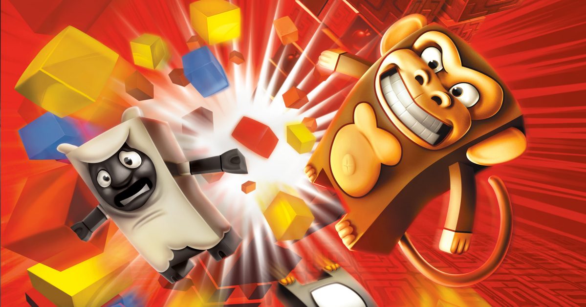
Well, this one is different. Because Not Not – A Brain Buster (which I was disappointed to learn isn’t a spinoff of BrainSmasher: A Love Story) is the first time in 594 indies played where the person who asked me to give it a try was my Mother. Now, that might not be significant to some, but my Mom isn’t exactly someone who I gamed a lot with growing up. Which is not to say we never played video games together in the Vice household. I’ve written previously about the time a brain parasite called Peggle had us under its thrall. And, like almost any family with a gaming child and non-gaming parents, when the Wii arrived there was a brief but potent Wii Sports period where we’d do the bowling (and sometimes the less fun golfing) every day. And then there was the month where we played Boom Blox for hours every night, usually until someone started complaining their shoulders were hurting. The classic “I’m getting my ass kicked and can’t hit the broad side of a barn today but I don’t want to seem like a total pussy so I’ll claim a non-existent injury” move. In the Bay, we call it “Pulling a Monta Ellis.”

Speaking of Boom Blox.. where the hell is it on Switch? I dare say the Joycons would be better for it than the Wiimotes. We need to bring this series back. It was just so god damned fun!

Beyond that, there was only one significant gaming moment I had with my Mother. A few years ago, we were playing Angry Birds Space on our phones. My Mom was, and still is, deeply into the series. I was stuck on a stage. Well, not stuck-stuck. More like I was casually exploring the nature of the level and searching for deeper meaning. But, before I achieved nirvana, she coldly snatched my phone from me, aced it on her first try, and handed my phone back to me with the most adorable/sickening look of pride on her face. No, I didn’t need her. It’s not like I’d spent twenty minutes on that stage, grinding my teeth and cussing under my breath. But I wanted her to feel like I needed her. I mean, she did give birth to me. Least I could do. I let her have it the moment. Really. No, I’m not willing to pinky swear. If that shit actually works, I’m fond of my pinkies so.. hey wait..

Okay, so gaming isn’t a Vice Family tradition. But my Mom, who spends roughly thirteen hours a day on her phone, found Not Not a while back and wanted me to review it for IGC. I told her “well, I don’t do mobile reviews” in the same tone of voice I have to use to tell her I don’t really want to watch vapid ignoramuses hock their shitty wares when she tells me the Kardashians are on. And then I made a grave mistake a few weeks ago when Not Not hit the Switch: I asked her if this was the game she was talking about. “No excuses now, Miss Indie Star.” D’oh!

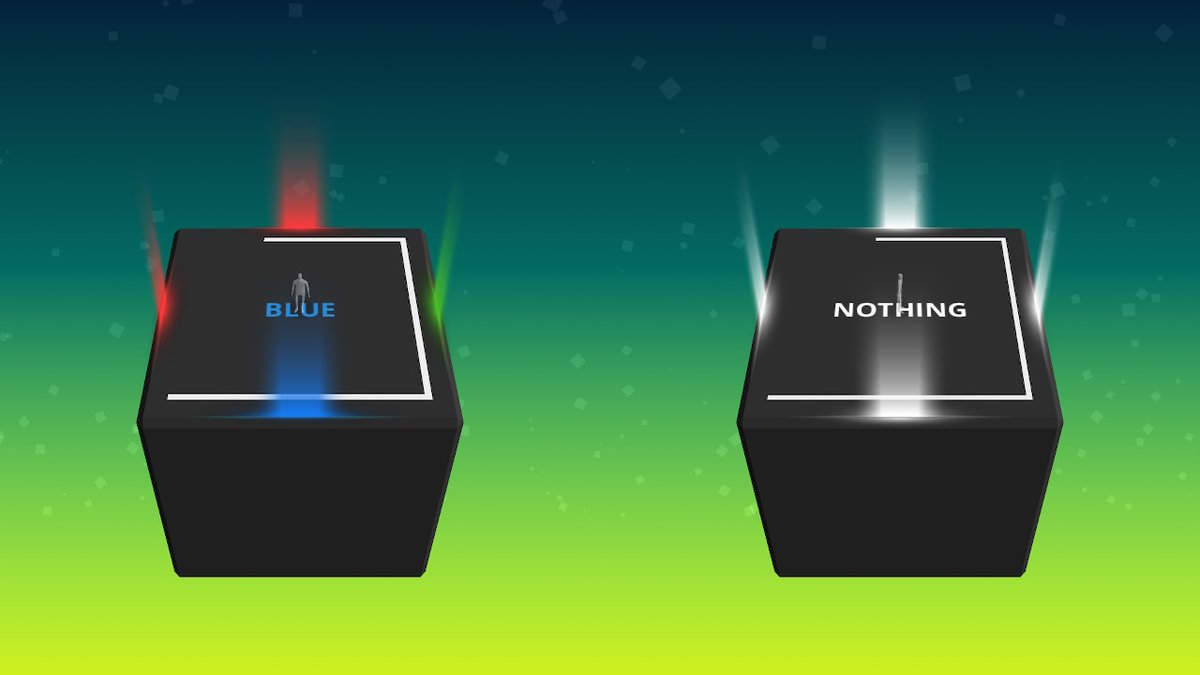
It’s best to think of Not Not like it’s a mini-game from the Brain Age series. It’s basically a multiple-choice version of the Stroop Effect Test that is used to test reaction times of individuals. It’s not to be confused with the Schtoop Effect Test, which measures how long it takes for people to begin fucking when sex is offered. During a traditional Stroop Test, a labcoat with a stopwatch times how long it takes you to state the color the word is written in, which is difficult because the word says a completely different color. In Not Not, you’re placed on a cube and must choose to move up, down, left, right, or do nothing based on the directions given in a relatively short amount of time. There’s multiple tiers of levels that add increasingly more complex or roundabout directions to follow, with three levels of difficulty for each. It sounds fairly straight forward. And it is, until Not Not is not.

In fact, the name of the game comes from the fact that Not Not outright starts to fuck with you the further you progress. At first this comes from commands like “Not Up.” In response, you should move any direction but up. But then the game tells you to Not NOT move up. Meaning you should move up. And yes, it throws in Not NOT NOT commands eventually. If it sounds confusing, it is at first. But really, a decent brain should adjust to this quickly. Two nots = go the direction it says. Three nots = one not = don’t go the direction it says. “Ha, this shit is easy. Suck it, smug ass loser devs, bragging to me that only one person in the entire world beat the mobile version on the hardest difficulty. I’ll show them!”

And then, the directions just go completely into “humble this bitch” territory. Like here, for example.

Right and not Yellow. But wait, you can’t move right, because it’s yellow! Well, the game doesn’t really explain this (or, if it does, I missed it) but if it gives you a contradictory direction, you’re supposed to do nothing at all. It becomes really really confusing when it tells you to do things like to go up and down. Because I was used to the “not (direction)” commands earlier, my brain was wired to instead go left or right when these type of commands came up, resulting in a loss of life. And self-esteem. Seriously, you guys made me feel dumb when I was starting to feel smart. Not cool.

For what it’s worth, Not Not actually is fun. But I think the developers are wasting time targeting game critics with it. They should be sending it off to places that do cognitive testing. I like to go the extra mile so I checked around and found out that a testing kit that includes an instruction guide (like a teacher’s edition of a text-book) and Stroop Test flashcards can cost as much as $500. For a book and some cheap cards! A Nintendo Switch costs $300 and a copy of Not Not will run you $2. Gamers can enjoy it, but really, this belongs to academia.

So I guess that’s the only relevant stuff I have to say. Good day!

Not Not was devel..

Wait a second, missy..

Mom? How did you get into my review? And why are you typing in italics?

You skipped the part where I whooped your ass at the game. Tell them.

Really, I don’t think they’d be interested in hearing th..

TELL THEM!!

I.. uh.. yea she beat me at a few games of Not Not’s multiplayer mode, which is the same as the main game but racing against 2 to 4 players. Just a few. I let her win.

You let me win twenty-seven times?

Well, uh.. happy birthday Mom!

I wish that was a joke for the sake of this review, but she really did beat me 27 times to 0. Not fair! She’s been playing it longer!

It wasn’t my birthday.

But really Mom, I just love you so much that I feel like every day should be your birthday.

Also, you left out that the way you unlock more levels is a little out of whack. You have to beat the medium and hard difficulties of multiple levels to unlock the easiest mode on newer levels. Logically, beating the easiest level should unlock the next stage’s easiest level, and the medium for the next level’s medium, etc, etc.

Wow! Mom, that was actually an insightful point to make. Perhaps the one flaw of the game. And, well, the whole “so unforgivingly difficulty that one person in ten million has beaten the final stage” thing. You might want to rethink what you’re trying to accomplish there, devs.

Yea, that was me.

Um.. the developers told me it was an Italian Judge that beat it.

Well, I do have a life outside you and your father, you know.

……. Moonlighting as an Italian Judge?

Yeah.

And you guys thought your family was weird.

You’re just jealous that you couldn’t beat me.

Am not.

Hey Cathy..

Yes Mom?

GiT GuD!

Brian, I know it was you that taught her that phrase. I’m never blowing you again. Hope it was worth it.

Not Not – A Brain Buster was published by QubicGames
Point of Sale: Switch, iOS, Android

$0.99’s (normally $1.99’s) husband failed the Schtoop Effect in the making of this review.

Not Not is Not Not Chick Approved and Not Not ranked on the Indie Gamer Chick Leaderboard

SpellKeeper

There’s plenty of “place tiles on grid” games out there. SpellKeeper is just the latest one, and to be frank, it’s not particularly special. Which is not to say it sucks or anything. If you’re into puzzlers, it’s perfectly fine. Then again, with puzzle games nothing I say besides whether it works or not matters. If I say it works, puzzle fans buy it. If I say it’s broken, they don’t. Non-puzzle fans will never be swayed to give the genre a try. That’s just how it is. Yet, I keep reviewing them, because I love this genre. But it’s hard to go into full Indie Gamer Chick mode and really pick apart games like this. There’s not really all that much to pick apart. I feel like a food critic who has to do an entire review of an Olive Garden based on the bread sticks.

Credit where it’s due to SpellKeeper: the graphics are clean and beautiful. For some reason I couldn’t get the board game Pretty Pretty Princess that I forced my parents to play a LOT of in my youth out of my head while playing this. And by “youth” I mean we stopped playing around the time I was 28. Hey, that’s younger than I am now. It still counts!

For SpellKeeper the concept is to place tiles called “spells” on a grid that guide a source light to crystal cocoons that open up into butterflies. The old “reflect the light” mechanic has been done a zillion times before, most memorably in Zelda: Wind Waker. Hey, the classics are classics for a reason: they work. And SpellKeeper works and is pretty fun. But having played tons grid puzzlers, I’ve come to the conclusion that they’re the simplest of all logic-based brain-benders. Once you get a feel for reverse-engineering the levels, you should be able to breeze through most stages with minimum resistance. Often you can do this just by even the simplest of monkeying-around with the various tiles you have until the final move becomes self-evident. From there, you just sort of work backwards. I used this to solve 80% of the puzzles I finished in SpellKeeper in under a minute. Your mileage may vary, but as far as puzzle games go, this one was one of the easier ones I’ve dealt with. But hey, it is genuinely well done, fun, and who doesn’t like butterflies? I mean, I don’t. They’re glorified moths we’ve decided are less gross or annoying because their wings are pretty. Ladybugs get away with this too. Spiders could really learn a lesson from them. If they’d just put on a little makeup they’d be on the receiving end of significantly less rolled-up newspapers. Something nice looking, you know? A red splotch shaped like an hourglass isn’t enough. In fact, that just sort of makes you look like a serial killer.

Where was I?

It’s worth noting that I play a *lot* of puzzle games and so you might actually find SpellKeeper harder than I did. My fans on Twitter who got copies via #IndieSelect seemed to find it challenging.

I actually do have a few things to moan about, and not that fun bedroom type of moan. The interface is moderately clunky. You use the control stick to move the cursor, but you have to use the D-pad to point some of the tiles in the direction you want to use them. The left trigger cycles through the tiles you can use. For whatever reason, it never felt natural to me and I was constantly fumbling with it. And there’s a few stages with multiple-outs, which is a personal puzzle pet peeve developers productively pass-over perpetually. Hell, at least twice I finished stages without using all the tiles in my inventory. I like my logic puzzlers tightly designed and having several solutions is the complete opposite of tight (unless the game is based around that, which SpellKeeper isn’t). It led to situations where know I was beating levels in ways the developer never envisioned. And for some reason, when that happens I always picture developers screaming at me in Boss Hogg’s voice like he’s threatening to get the Dukes. No joke. And now you will too. You’re welcome.

Later in the game, SpellKeeper adds “moths” that are already hatched but turn back into cocoons if the light touches them. God, I wish that’s how it worked in real life. I’d make them so much easier to hit with a shoe.

But, by far the worst part of SpellKeeper is how many tutorial-feeling levels there are. When new mechanics are introduced, which happens in all four “worlds” of the game, you can count on the first few rooms using new titles being completely toothless. It seems like these are here to help players get the hang of new tile-types. That would be a fine, perfectly logical design choice. Except for the fact that there are tutorials besides the stages I’m talking about! When you start a new world, it opens with a few tutorial rooms. And then those finish and the next few rooms are like the world’s most embarrassing preschool. It’s a common mistake puzzle makers do. Have a little faith in your audience, puzzle developers! This isn’t a super-intense platformer or a white-knuckle rescue mission in a shooter. It’s a fucking puzzler. We buy them with expectations of having our grey matter put through the wringer. You don’t have to build-in rest periods for us. It’s not like baseball where there’s so much non-stop action that they had to create the seventh inning stretch just to assure players don’t die from exhaustion after strenuously standing around doing nothing but grabbing their crotches and spitting for the last two hours.

And that’s especially true of puzzle games, which are at their very best when you only play one or two levels per a session. Games like SpellKeeper have their place, but I’ve never felt comfortable with the idea of marathoning through them. I like a puzzler I can open up when I know I don’t have enough time to invest in a game that requires a lot of attention. Where I can put ten minutes into it, knock out a few stages, and then turn off my device feeling perfectly content and satisfied. If I’ve got a short time frame to work with, maybe I can open up Mario Odyssey and have enough time to grab a new moon. But I don’t know it. But with a game like SpellKeeper, I know my session will end with progress being made. That is a puzzler at its most idealized. SpellKeeper good for that. But it should be great for that, and it’s not. There’s just too much downtime with relatively weak stages. To be fair, if you enjoy the genre you’ll never be bored playing SpellKeeper and a lot of its puzzles offer real challenges. That’s why SpellKeeper has won my seal of approval. But far too many of the levels outside the tutorials would embarrass my niece, who just turned six and will appreciate the shout-out here. Happy Birthday, Angela. Yes, you’re right, that game with the butterflies was fucking easy.

SpellKeeper was developed by Silesia Games
Point of Sale: Nintendo Switch, Steam, App Store, Google Play

$5.99 put snuck away innocently while their niece got her mouth washed out with soap in the making of this review.

SpellKeeper is Chick-Approved and ranked on the Indie Gamer Chick Leaderboard

A review copy of SpellKeeper was provided to Indie Gamer Chick. On April 2, a copy of SpellKeeper was purchased by Cathy. All games reviewed at Indie Gamer Chick are paid for out-of-pocket by Indie Gamer Chick. For more on this policy, read the FAQ.

Jack N’ Jill DX

Auto-runners aren’t exactly my thing. Once upon a time, it was cool when developers figured out the solution to getting platformers on buttonless mobile phones without the use of a fake controller on the screen. “Why don’t we just have the game move for you, and the player can tap the screen to do all the jumping?” And this worked well enough. But then everyone was getting in on the auto-runner fad. Even Mario did, though that should be a surprise to nobody. Mario being the most insecure of all gaming heroes, OF COURSE he would do an auto-runner if that’s what’s popular. He has no shame. He’s golfed, he’s go-karted, he’s raced Sonic The Hedgehog at the actual Olympic games, he became a drug pusher, a baseball player, a street fighter, a typing tutor, etc, etc. If games where you performed back-alley abortions became a popular genre, I promise you within twelve months you’d see Nintendo fans lining up to play Super Mario Coat Hanger and talking about how Nintendo would finally show these newbs how to do a proper unlicensed pregnancy termination game.

What point was I trying to make again?

Oh, that I’m over auto-runners. Well that sort of went off the rails a bit.

It’s my policy to know as little about a game as possible when I go to play it. That rule has bit me in the ass more times than bed bugs and it struck again here. When I bought Jack N’ Jill DX, I didn’t know it was an auto-runner. I didn’t know anything about it besides the fact that it was black-and-white and the screenshots gave off a Game Boy Kirbyish vibe. Then I fired it up and discovered it was an auto-runner with one AND ONLY ONE action button that was almost certainly going to be another lazy console port of a mobile game. Then I went through the level-select screen to see how many stages there were, counted 140, wept for the next twenty minutes, then bit my lip and sat down to play.

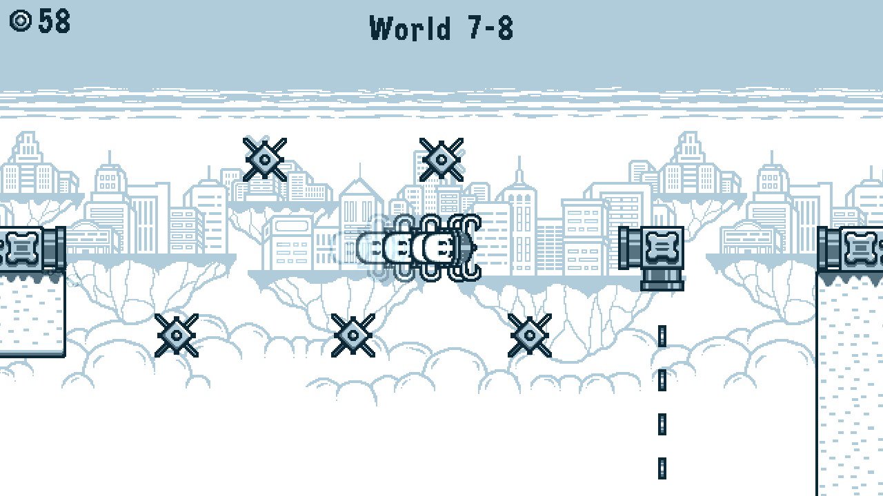
Probably the best thing I can say about the graphics is that if I had to guess who made this, without any prior knowledge, I’d guess Nintendo. Isn’t it strange how so many people hate me for assuming I hate Nintendo when the best compliment I can give a game is that it could be mistaken for a Nintendo-developed title? But hey, I occasionally notice when Nintendo does something sucky or lazy and actually say that out-loud instead of doing logic-yoga to bend my way of thinking so much that shit like naming their 3DS follow-up “NEW 3DS” seems like a good idea. Clearly I must hate Nintendo, right? Anyway, Jack N’ Jill DX is Nintendoish, and that’s a good thing.

And honestly, I don’t know what I was worried about. Jack N’ Jill DX ain’t bad at all. I’m prepared to go so far as saying it’s the best auto-runner to make its way to consoles ever. And why wouldn’t it be? It’s like a “best-of” compilation of the genre, all wrapped up in one package and then polished to a mirror-shine. Responsive controls. Forgiving collision-detection. Very forgiving. There were times I should have died when jumping onto clouds but didn’t because the game gave me a pity hug and said “that’s okay, you really should have stuck that landing like a champ, so look, there you are. You made it! You’re a winner!” when really I shorted it by a good foot or two. And Jack N’ Jill DX keeps adding new mechanics from start to finish to keep things fresh even after 100 levels have come and gone. Actual effort was put into this one. It’s a keeper.

Especially the level design, which often left me saying “well that was clever.” Jack N’ Jill is really fond of making a player hit a wall to reverse their direction, and often utilizes the entire length of a map to go back-and-forth as you make your way to the goal. Of course, when you get down to it, you’re really only pressing the A button and doing nothing else, which means you’re playing a game that’s barely more interactive than a Sega CD FMV game with command prompts of when to press the button to make the actors do something replaced with the appearance of being a platformer but HEY SHUT UP it’s better than one of those. A lot less Corey Haim among other things.

Oh, it’s not perfect. And actually, this is one of the strangest complaints I’ve had to say about any game, but Jack N’ Jill DX has too many levels, and most of them just repeat the same concepts. It gets to the point where sections of it feel cut-and-pasted to the point of skimming the line of being dull. Ideas repeat themselves so much and players get so much practice at perfecting them that Jack N’ Jill’s first 110 levels are far too easy. I never once needed more than three tries to beat any of those stages. Hell, the tension was removed entirely when, about halfway through the game, I said “you know what? I wish this game had checkpoints just because I wouldn’t have to sweat every jump that way.”

And then suddenly the game had checkpoints starting the very next level after I said that. I’m not even kidding. This is not a joke I came up with for comic effect. I wished for checkpoints and suddenly there were checkpoints. Then I realized the Golden State Warriors have become a championship dynasty and Brian’s penis miraculous grew four inches overnight and I realized that I probably had acquired three wishes at some point over the last five years without knowing it and had just used up the last one. Damn. I swear everyone, if I had known, I would have used that third wish on ending world hunger. But hey, for those of you starving out there, take comfort in knowing that halfway through Jack N’ Jill DX you won’t have to start from the beginning of levels if you mistime a jump.

The mini-games all feel like they were mechanics that were considered for inclusion in the main game but didn’t make it past the drawing board. All of them suck, but thankfully they’re optional. And I didn’t even realize you could unlock new costumes or colors playing them. The game doesn’t call attention to the presence of a shop. You access it through the mini-game menu, with a teeny-tiny little icon in the bottom right corner that looks like a shopping bag that has “X” next to it being the only thing to alert you of its existence. It’s weird.

The biggest issue with Jack N’ Jill DX is the sameness starts to wear thin and by time I was five worlds into the game, I was sort of ready for it to be over with. And then, with thirty levels left to go, something weird happened. The level design, which was already more than acceptable (if insanely repetitive), dialed up a few more notches and was suddenly an enthralling experience. Some stages even took on a puzzle-game feel, where you had to figure out a way to hit buttons to change the position of cannons (functionally the same as barrels in Donkey Kong Country) in order to reach the next area of a stage. Funny enough, Jack N’ Jill DX started life as a mobile game (hence the DX part) and these longer levels would not be suitable for the type of “knock a level or two out while in-line at the supermarket” style that the best mobile action games tend to have. But that’s fine, because Jack suddenly grew teeth, required concentration, and went from an acceptable time waster to a genuinely good game. Of course, this consequently made every level that came before it feel like a glorified tutorial. 110 levels of tutorial. Yeesh.

That’s what makes it so hard to quantify the value of Jack N’ Jill DX. Its biggest problem is poor pacing, but never in a way that’s a deal breaker. The first twenty levels are a bit of a bore, but not painfully so. The final thirty levels were my favorites in any auto-runner ever, easily. Everything in-between is decent, but never great. And when the game finally goes for the throat, it still has to take the time to point out every single button you have to press, as if it has no faith in players to be able to figure out that if there’s a button on stage, it’s probably a good idea to figure out how to press it. And then it tucks you in at night and reads you a bedtime story. It’s really condescending like that.

Jack N’ Jill DX doesn’t really do anything original. Instead, it’s like it took every notable platform game mechanic, retooled it to work in a single-button game, and then polished it to make it play near flawlessly. It’s impressive. Really and truly.

There’s seven optional minigames that you can unlock by beating each world, though they cost 100 coins to play and range from terrible (the first minigame, where you must control the baddies as they jump, has unresponsive controls and was just awful) to bleh (like one that’s a near-copy of the bonus levels from Balloon Fight). Playing minigames earns tickets which let you customize Jack & Jill’s appearance or change the black-and-white graphics to some other pallet, similar to Super Game Boy. Hell, beating the game even unlocks a mirror mode, were you can play all 140 stages in reverse. $5 gets you a LOT of game. That’s why I had to sock it to VideoKid, which costs the same but has only one level and doesn’t work half the time. You’ll speed through the first 100 or so stages of Jack with minimum effort, then spend the same amount of time finishing the final two worlds. It paces like a marathon runner with narcolepsy.

Still, I have to give developer Rohan Narang credit. Jack N’ Jill DX is the best auto-runner ever made. Which is like saying Wonder Woman was the best DCEU movie, but still. It’s never fully boring, and when it finally starts to come to life, it’s actually a very fun game. Does it belong on platforms like Xbox One? Probably not. I’d recommend the Switch or Vita versions. I played on the Switch and spent about a week knocking it out. Even then, I probably played it wrong. Jack N’ Jill is meant to be played a couple of levels at a time. Maybe the sloginess would have been muted if I had played through the 140 stages over the course of a few months instead of just under one week. But hey, Indie Gamer Chick played a game wrong. Not exactly something you stop the presses over. And yea, I’m known for complaining that people shouldn’t have to tread water waiting for a game to “get to the really good stuff”, which Jack N’ Jill unquestionably does. But, at least everything here that comes before the really good stuff is still enjoyable. Maybe someone should buy a copy of this for David Cage so he can take notes.

Jack & Jill DX was developed by Rohan Narang
Point of Sale: Nintendo Switch, Vita, Xbox One, PlayStation 4, Steam

$4.99 rhymed:

Jack and Jill
Is hardly swill
To quench a fail spotter
Some levels let down
But I can’t go to town
Great ones follow thereafter

In the making of this review.

Jack N’ Jill DX is Chick-Approved and ranked on the Indie Gamer Chick Leaderboard.

Doodle God: 8-bit Mania

There are some things I will simply never understand the appeal in. Cricket? Baffling to me. Woody Allen films? I mean, maybe if you need a nap and have no Benadryl handy. But, despite what my retro-loving readers believe, old-timey point-and-clickers aren’t among the things I don’t understand. I do get those. I think they suck. I think they have no relevance today. I think I would rather be boiled in horse bile than play most of them. But I get how they could become popular when they did. The technology of the time didn’t allow for full 3D environments or complex adventure storytelling. The point and click genre allowed for something sort of like that, using descriptive writing to smooth-out rough edges. My biggest problem with them is that the item puzzles involved utterly batshit insane logic that I’m sure made sense to the writer, at least until his medication kicked in. This turned the games into a tedious slog where players were forced to rub one item against another, or against the backdrop, until the right combination was found, thus unlocking the rest of the story. Again, I think they suck, but at least I  understand the appeal they once had. Besides blind nostalgia, I can’t imagine why anyone would want to play them now. Gaming has come so very far in the decades since. Yes, I’m aware my two favorite indies are nostalgia-bait. Hey, I never said I’m not a hypocrite.

Alcohol is made by combining Fire and Water. I'm about as far removed from being politically correct as a person can be and even I cringed in shame at that.

Alcohol is made by combining Fire and Water. I’m about as far removed from being politically correct as a person can be and even I cringed in shame at that.

And then you have Doodle God, an inexplicably popular franchise that removes the story progression and is just the batshit item puzzles of days gone by, over two-hundred times. This is actually a global mega-hit. I shit you not. Millions of people, myself included, have paid real money to select two random items from a list and hope that it opens a third item that goes onto a list. That.. that.. is one of the most popular games in mobile history.

That was one of the toughest sentences I ever typed out. My hands kept trying to amputate themselves. Joke’s on them because I would just replace them with a hook.

And saying the logic is batshit is putting it lightly. Some of the combinations defy the type of logic someone suffering plastic-fume-induced brain damage would find absurd. Life + Ash = Ghost. Holiest of all fucks, that is pure, unbridled lunacy. Or there’s the ones that could be logically but they fucked them up. Human + Money = Work. Um, wouldn’t it be Human + Work = Money? I mean, you would think, right? But then again, Logic + Lobotomy = Doodle God.

When you go to a restaurant and order more than one item from a menu, you are essentially playing Doodle God.

When you go to a restaurant and order more than one item from a menu, you are essentially playing Doodle God.

As for the whole 8-Bit-Mania stuff, it’s just Doodle God with pixel art. Same combos. It’s such a cynical cash-grab, you can practically hear the developers saying “hey, why aren’t we appealing to older gamers? Maybe it’s the graphics. Someone get on that.” It’s also $4 cheaper on Steam than the normal Doodle God is. Bizarre, but whatever. I just don’t get the appeal in this at all. In fact, the worst thing I can say about Doodle God in general is that it makes me long for being stuck with one of the 80s point and click games that I absolutely detest. At least those attempt to tell a story that you feel like you’re a participant in. Why is this even called “Doodle God” to begin with? If you were drawing the shapes, maybe. But you just select items from lists. It’s as if someone set out to make a really ambitious game, then said “Okay, select file.. you know what, fuck it, this is too hard. Select File: The Game will do.”

headerDoodle God: 8-Bit Mania was developed by JoyBits LTD
Point of Sale: Steam, Google Play, iOS App Store

$1.39 (Normally $1.99) said Money + Fire = Doodle God in the making of this review.

This review covered only the Steam version.

Spacepants

If you don’t care who this new guy is and just really need to know how good Spacepants is right the heck now, skip this paragraph. Hey guys, I’m Bernard! I’m going to be writing reviews for this fine website! Yay! I feel I should do some sort of introduction. So, hi, I’m David Bernard Houck. David means “beloved,” Bernard means “bear-hardy,” and Houck is meaningless. I think it fits: everyone loves me (yes, even you, dear reader, love me! LOVE ME!), I’m a fat gay guy, and my whole existence is meaningless. I play videogames and I write because those are the only two things I’m any good at, so I guess writing reviews makes sense! If you want to get to know me, follow me on Twitter maybe??? I retweet a lot and I am sorry. If I seem too cheerful for IGC’s hard-lovin’ style, don’t worry, I have serious vitriol for dumb games. Luckily, the first game I’m reviewing isn’t dumb, it’s a tiny, wonderful game that I think y’all should play!

SpacepantsTitle-300x42

Okay, you’re safe, no more information about a human, just the cold, hard facts of Spacepants. Spacepants became one of my favorite iOS games after playing about three rounds. But, like, Kid Games are supposed to be easy, right? So why is this game made by an actual twelve-year-old so damn hard? I play it whenever I have a couple of minutes to kill and I still can’t fucking break 60 seconds, god dammit!

Spacepants stars a ginger scientist who I guess wears spacepants, which I guess are malfunctioning such that he can’t stop moving. Ginger runs along the borders of your phone’s screen, because I guess spacepants let you walk on walls and ceilings, dodging pixel clumps that want to hurt spacepants. Tap the left half of the screen to change directions, tap the right half to jump. Collect hearts to make a bomb out of hearts and clear away the current enemies with the power of spacelove. Last as long as you can without dying because you were dumb.

SpacepantsScreen21-300x225

It’s like Super Hexagon, except not pretty or impossible. And instead of Jenn Frank’s smooth voice and Chipzel’s jammin’ tunes there’s just harsh bloops. And instead of walls there’s space caterpillars. And instead of hexagons there’s spacepants.

It really does feel a lot like Super Hexagon, I swear! But despite being very difficult, Spacepants is a much more chill, relaxing game than Super Hexagon. It’s mellow, it’s delightful, and it’s so fucking hard why can’t I get past level 2 fuck. It’s really cool to see such a fun little game come from such a young developer. I’d say it deserves a spot on the fridge, but no one would be able to get any food because I’d be standing in front of the fridge playing Spacepants all the time.

Spacepants logoSpacepants was developed by Boxface Games

IGTlogo-01$0.99 noted that Boxface Games is just a 12-year-old kid named Sam Smith who made a funner game than a lot of professional grown-ups ever have in the making of this review.

Bernard has awarded Spacepants the Indie Gamer Team Seal of Approval.

Luminux

Do you know what I hate? That we call games like Tetris “puzzle games.” It seems somehow wrong, since we also apply that term to stuff like Lolo, Spyleaks, Gateways, and Portal, even though they couldn’t be more different. Readers of mine suggested “Puzzle-Like.” But that’s just asking for a marketing disaster, like if a restaurant served you a “meat-like protein substitute.” The best I could come up with is “Cognitive Dexterity Tester” or CDT for short, though that’s a terrible name. Not to mention it would confuse the dentists that read me.

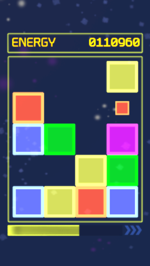
Luminux 1Yes, I’m stalling. Why? Because I really don’t have a ton to say about Luminux, a game by my good buddy Eric Hornby. The idea is, you have a 5 x 4 play field on which different colored blocks spawn on. Pushing together a straight line of three or more of the same color block clears them. And uh…….. well, that’s it really. The setup doesn’t sound hugely complex, but it lends itself to combo-heavy gameplay, which is one of my favorite aspects of any action-puzzler (I guess that’s the universally accepted term for the genre, though that still sounds wrong to me). So obviously I liked Luminux, right? Actually, no I didn’t. Because it just ramps up in speed and difficulty too damn quickly. Only three levels in, blocks spawn at such an insanely fast rate that you barely have time to think. And because stuff spawns randomly, you’re partially left at the mercy of the luck of the draw. After a certain point of speed, it would probably make more sense to only have one block spawn at a time. It doesn’t work that way. Any spawning block you slide an existing block over is destroyed, which buys you a little time, but not enough. Once you get to level four, forget about it. I usually consider myself pretty good at games like this, but the absurd speeds combined with the luck factor are just too much to overcome.

At first, I thought this was an example of a developer trying to challenge themselves instead of challenging their consumers, but as it turns out, that was wrong. Instead, the team at Pelagic Games was trying to create an experience that could be over and done with in three minutes or less. Now, I more than anyone else has said one of the reasons I like certain handheld games (especially stuff on phones) is that you can pick them up and put them down with little consequence. But action-puzzlers don’t lend themselves to that. If you have to drop your game, you have to drop your game. You can’t tell someone “give me a second, I’m about to hit level four and then I’m pretty much screwed” if you’re waiting in line at Starbucks. If a developer wants to limit a play session for a game like this, it really needs to be done via an actual timer. By having the game accelerate the way it does, it becomes more frustrating than challenging, and consequently turns people off. There is a slower-paced mode where the blocks only spawn in when you move blocks. I’m happy it’s there, and it’s certainly where Luminux is at its strongest, but having to unlock it is fucking annoying.

By total coincident, "Cosmic Meltdown" is the term Brian used to describe what was happening to me while I was playing 1001 Spikes.

By total coincident, “Cosmic Meltdown” is the term Brian used to describe what was happening to me while I was playing 1001 Spikes.

That mode alone doesn’t save Luminux. I feel the play field is also too small. As I mentioned earlier, the system they’ve created lends itself well to setting up combos. Unfortunately, there’s simply not enough room to do this well. Having the field be taller than it is wide makes Luminux feel more awkward than it needs to be. If this had been made specifically for iPad, the field could have been bigger and the game would have been better. Luminux isn’t without good ideas. But the package never comes together. Thankfully, when I broke the news to Eric, he took it well. In fact, he had a moment of revelation.

“So I think I see what you mean. Luminux would do better with a slower difficulty pacing because it would allow people to get into (it) easier. It certainly takes a little while to get adept enough to be comfortable with its pace and your criticism is probably the most heard one I’ve gotten after the release. By aiming to keep the game completed in under 3 minutes by even skilled players we instead made a game that new players have a hard time getting into. Instead, we shouldn’t have worried too much about “limiting” the time frame of play and instead just focused on a pacing that would have felt better, even if it meant that skilled players might find the game taking “too long.” (especially considering that skilled players already like the game.) Does this seem to be about the right lesson I should be taking from your commentary?”

Yes, yes it is. Sigh. I hate it when developers figure it out before the review is up. It makes me feel guilty when I want to use lines like “Luminux Lumi-Sux.”

Luminux logoLuminux was developed by Pelagic Games

$1.99 in all seriousness wants to thank Pelagic games for its consideration in including “the switch” which lessened my personal epilepsy risk in the making of this review. Much love to you guys. Issue a second chance against me sometime in the future.


Final Flight of the Perseus

Sigh. Another game by a really, really close friend. In this case, the developer is Jesse Chounard. I was originally reluctant to review his new title, Final Flight of the Perseus, because I just reviewed not one but TWO games by my good buddy Edward D. Geronimo. By the way, it must really suck to be Ed. People are constantly screaming his name when they jump off high places. Sorry. I forgot to use that joke in both the Sportsfriends and Turtle Tale review, and who knows when I’ll get another chance to. Anyway, I hated Turtle Tale and said as much, and thus I feel comfortable talking about Jesse’s game.

It’s a wave shooter set in space, and a fairly basic one. On consoles, this isn’t exactly my favorite genre. On phones? I actually enjoy them quite a bit. Especially the way shooting is handled in both this and Hypership: Out of Control (which Jesse handled the porting of to iOS). There’s no fire button. Your ship shoots automatically. It makes playing such an joy, because you can devote your attention entirely to dodging enemies and maneuvering into position. It’s an awesome system, one that I wish more games would adapt. A lot of mobile shooters would have benefited from not having to tap the screen to fire.

Gameplay is fairly minimalistic. There’s no items at all to collect. Instead,  you earn money from each enemy you kill, which you spend on upgrades between each wave. Unfortunately, there’s only three: gun power, gun speed, and shields. You can replace the shields as you go along (well, most of the time. I actually stumbled upon a glitch that prevented me from buying them during my best run, which Jesse is going to patch out), but they get progressively more expensive. There’s a handful of bosses, and then levels start to loop after you clear the 28th. And that’s basically it.

Is it fun? Yes. As safe and shallow as it is, I was really surprised by how much it sucked me in. This is especially surprising given that the last game I played was also a safe and shallow game by a friend. And it was a platformer, a genre I typically like a lot more than space shooters. Some things are inexplicable I guess. It probably helps that there’s online leaderboards, and that the game is free. If you have no money on your iAccount, you could do a lot worse than wasting your time with Final Flight of the Perseus. You could be wasting your time with the Perseus’ other final flight, Wrath of the Titans. That movie fucking sucked.

IGC_ApprovedFinal Flight of the Perseus was developed by Third Party Ninjas.

It’s Chick Approved and ranked on the Indie Gamer Chick Leaderboard.