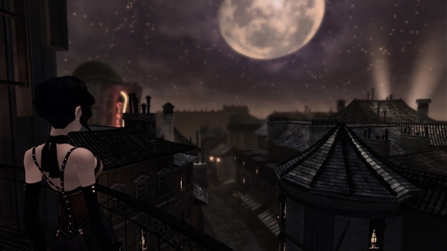
Volume

Quick disclosure: I’m buddies with both Volume creator Mike Bithell and actor/critic/celebrity mime Jim Sterling.

Disclosure over. Yea, I didn’t like Volume. But not because it doesn’t stack up against Thomas Was Alone, Mike’s previous game. Anyone who went in expecting something like that is probably being a bit unfair. I should also disclose that I’ve never played the NES Metal Gear, which is what inspired Volume. I’m not quite sure why you would want to mimic a nearly 30year-old game’s mechanics, especially in a genre like stealth. I’m sure the retro fans will hate me for saying this, but being like something old isn’t necessarily a good thing. Metal Gear isn’t inherently better because it’s older. You only think it’s better because you played it at an age where video game stimuli caused your body to generate higher levels of dopamine than playing games today as an adult does. When you look at one of your childhood favorites, those memories alone could possibly trigger something close to that desired effect but not quite there, which essentially renders the experience the gaming version of chasing the dragon.

By the way, that whole dopamine rant I pulled it out of my ass for comic effect not knowing the science probably backs me up on it. Also, put down the pitchforks, retro fans. Tongue firmly in cheek. I’m not suggesting old school gamers would turn to heroin because they can’t get their copy of River City Ransom to boot up.

Okay, fine, maybe Patrick Scott Patterson would.
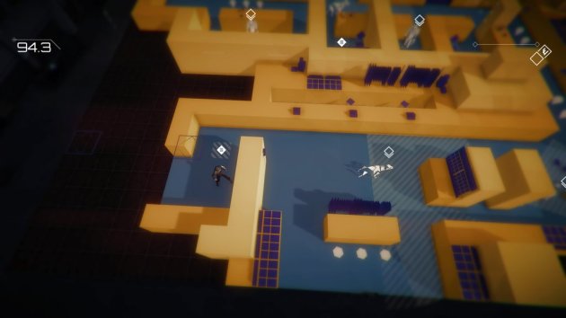
The dogs in Volume can alert the guards to your location but can't actually attack you. Oh COME ON, this totalitarian regime couldn't afford a couple angry Dobermans?

The dogs in Volume can alert the guards to your location but can’t actually attack you. Oh COME ON, this totalitarian regime couldn’t afford a couple hungry Dobermans with a taste for human flesh? Because if not I know a guy..

I actually like games inspired by the legendary titles of yore. Inspired being the key word here. Actually being like them is sort of the pits, since gaming has come a long ways. That’s why Volume fails. It’s married too much to being like old school stealth games. You know, the ones where actual stealth wasn’t required. It also wants to be a puzzle game. And an action-arcade game. These three styles really aren’t compatible, and some aspects of them also get in the way of delivering an in-depth story that tries to be a modern take on Robin Hood. The hero’s name is Locksley, while the villain is Guy Gisborne. Also known as the Robin Hood villain nobody gives a shit about. Given the totalitarian regime angle, the bad guy should have been named John Prince. Guy Gisborne sounds like he would be a back-up drummer for Winger.

So why didn’t I like Volume? You can break it down into three parts.

1. I like my stealth games to be sneaky and tension filled.

Volume is neither. The enemies are so fucking brain-dead that I was able to set global record times on dozens of stages just by ignoring the stealth stuff and making a run for it. Right in front of the enemies. Sometimes I would be walking up against a wall, in full view of one of the guard’s line of sight, literally wiggle my body to try to get caught, and nothing happened. I made a mix tape to demonstrate everything I’m talking about. Take a look.

Dimwitted guards operating like they recently had a full frontal lobotomy might have been a staple of gaming’s past, but why not smarten it up today? Wouldn’t that be the best way to pay tribute to those past games, by improving on their original intent? The lack of anything resembling intelligence really takes the oomph out of Volume. There’s no tension at all. That would require a fear of getting caught by the guards. But I often walked into tiny, dead-end rooms from which there was no possible way I could escape, have the guards follow me, peek into the room, and give up the search. If they worked there, surely they would know of the room and know I had no place else to go.

This was also the primary reason why I couldn’t get into the story. The idea is you’re simply running a simulator that’s teaching others how to break into these guarded buildings and loot treasure. I was sort of hoping the big plot twist in the end would be showing Locksley the pile of bodies the dictatorship had racked up due to his horrible advice on thieving. “Surely Locksley you didn’t expect us to hire guards that don’t know the layout of the building they work in you stupid fool!” A+ writing there, by the way. I’m for hire.

2. I like my puzzle games to be brainy.

You can certainly see the logic of Volume’s levels. Some of them might have offered some downright brain-bending moments. They would have, if you had to solve them the way Mike envisioned. But you don’t. I had pretty much figured out how to exploit the guard’s behavior only a few stages into Volume and was able to just plow through stages with total disregard for the elaborate puzzles set up for me. Two guards that I need to whistle for to distract and slowly move away from the diamond sandwiched between them? Yea, I could do that. Or I could just walk up, take the diamond, occasionally hug the wall to restart their aiming mechanic, turn a corner and sprint to the exit. I never repeated any level more than a couple of times. There’s no punishment for being caught by the guards, and because the global leaderboards reward fast times, you’re actually rewarded for ignoring that point of the game. I wasn’t just beating high scores, I was annihilating some of them by thirty seconds or more on my first attempt at those stages.

This cracked me up. Many stages in and the game just alerted me that new, dumber guards were added. As opposed to the guards from before? Ha.

This cracked me up. Many stages in and the game just alerted me that new, dumber guards were added. As opposed to the guards from before? Ha.

3. I like my arcade games to be fast-paced.

Volume’s moderately interesting story is told with a mixture of voice overs and text boxes that are placed in stages. Whereas Thomas Was Alone’s fairy tale-like narration was in perfect sync with the happenings of the game, Volume has a much more complex plot that requires your full attention to process. Then it throws you in a game where your attention will be anywhere but on the plot. When this isn’t happening, you might stumble upon a text-box that pauses the game (and thankfully the timer) so you can get more plot points that my brain processed as gibberish because it had broken my flow of not-giving-a-shit running from guards while cackling the whole time. Really, the text boxes should have more often been envelopes that you could read at your own leisure between the stages. I don’t want my not-a-stealth-or-puzzler-or-arcade game interrupted in the middle of a chase. Do you? Volume probably does a lot better as a fast-paced action/arcade title than it does anything else, but it still feels too slow and dull for that without the story interruptions.

Volume has some neat moments. I like how you’re still getting new items even after 90 stages, and the items are mostly fun to use. The voice acting is mostly fine, even though I can’t pick one British voice apart from another besides Jim’s, who I’d like to think has some sort of dolphin-like ultra-sonic thing going for them. The graphics are okayish. It controls fine. But, Volume just plain isn’t fun. Too dumb to challenge. Too long to say “at least it was quick.” And to those who say I’m not being fair because I didn’t play it the way it was intended to be played, I say this: it’s up to the developer to tighten the game to prevent me from doing that. Look, if you give an asshole a flamethrower and unleash them in the Jiffy Pop factory, I’m sorry but you’re an idiot if you don’t think there’s going to be a mess of popcorn at the end of the night. And in the case of Volume, I was given moronic guards and non-puzzles. I took the path of least resistance and said “fuck this, I could go for some popcorn right about now.”

Volume logoVolume was developed by Mike Bithell
Point of Sale: PSN, Steam
Only the PS4 version was played for this review.

$19.99 pumped up the Volume like it was a Fygar in the making of this review.

VVVVVV

VVVVVV is one of my most requested reviews. It came out a year before I started IGC, and it’s one of those games that come up every time I review a punisher, along with Super Meat Boy and Spelunky. Usually it gets name-dropped in the form of a question, like “how does this compare to VVVVVV?” or “why can’t punishers be more like VVVVVV?” I hadn’t played it, so I couldn’t comment on it. I meant to play it because people wouldn’t shut up about it, but I just never got around to it. Then it came out on PlayStation 4 this last week, and I finally got to see what all the fuss was about. And see it I did. Understanding the continued love for it? I still don’t.

Maybe VVVVVV was special back in 2010 when punishers were starting to become a thing. The problem is, standards have changed a lot since then. VVVVVV has a nifty play mechanic where, instead of jumping, you reverse gravity. It has an open map that can be explored at your leisure, since then are no upgrades you’re required to find to unlock areas. Some of the stages are clever, and there’s a genuine sense of thrill when you make progress. So trust me when I say, I wish I could like VVVVVV. Especially considering that people get really mad when others don’t like it. It would spare me a lot of angry responses that usually end with “go back to Call of Duty you pinko casualtard.” Well, I never.

The V's in the title represent spikes. Which, I assure you, there are more than six of.

The V’s in the title represent spikes. Which, I assure you, there are more than six of.

VVVVVV has horrible play control, at least on PS4. I had people insisting to me that the PC version, or the 3DS version, or the iPad version were better. I tried the demo for the PC port, and it felt pretty much the same. Very slippery and imprecise. Unfortunately, space-age technology like analog control doesn’t exist except in the realms of fiction. So even the act of moving forward is risky because it’s tough to judge just how far a press of the pad will take you, often leading to you walking into a spike. VVVVVV relies heavily on precision platforming for level design and “difficulty”, but really, can you still call it difficulty when the challenge is more about fighting shoddy movement? And it’s not like it can’t be done better. Many, many games from this genre have controls good enough that if you die, it’s your fault. Platformers have been capable of better control than VVVVVV for at least three decades now, and indies consistently get it right too. Maybe VVVVVV wouldn’t be as hard if it was more precise, but it’s not as if it would be a cakewalk. You can see thought and mastery of design with some of the stages. It’s a shame that instead of being able to admire that effort, all I could think about was “oh goody, I just barely nudged the stick and walked into a spike. Again.”

To VVVVVV’s credit, the developer got the absolute maximum potential out of the gravity gimmick in terms of level design. I wasn’t expecting a five-year old punisher that inspired many of the games I’ve reviewed at IGC to surprise me with clever design that holds up relatively well, but it still did. And it is for that reason that I can’t give the bad controls any leeway. Because VVVVVV shouldn’t have any relevance remaining after this long, but it retains it to a large degree. Smooth, responsive controls would have unquestionably cemented it as an all-time classic. More importantly, it would have served as much better inspiration for the next generation of indie developers. Now, I can’t help but wonder if some of those bad punishers I played failed because their devs said “well, VVVVVV got away with crap controls, so fuck it, my game can too.” I would love to see developer Terry Cavanagh challenge those he inspired to do better than he did. I mean, there is a pair of stages called “Do as I say, not as I do” in VVVVVV. He’s trying to send you guys a message! What does he have to do, wink at you and nudge your ribs with his elbow? Because I might be willing to pay his expenses to go wink and nudge you guys in ribs with his elbow if you don’t get it. Terry, you’re about to get a lot of frequent flyer miles.

♫Come and fall on on our floor. Suck the spikes like a whore. Save some face and quit you disgrace, three's company too! ♫

♫ Come and fall on our floor. Respawn and die a little more. Save some face and quit in disgrace, three’s company too! ♫

The map isn’t perfect by any means. Much like the EA clearance bin at Wal-Mart, there’s a lot of dead space present. VVVVVV also isn’t consistent with checkpoints. Sometimes they’re so abundant that it feels almost like the game is mocking you, and sometimes you’ll scream “WHY ISN’T THIS ROOM SATURATED WITH CHECKPOINTS LIKE ALL THE OTHERS?” while your family begins moving breakables out of controller-throwing distance. And not all the ideas work. There’s a section where you have to sort of steer an NPC through a few puzzles. The NPC is so worthless and inconsistent in its responses that it makes Yorda look like a fucking genius. During this section, I got stuck on one particular room, had three rage quits during it, wrote a full review for this game, uploaded a pic of the stage I was stuck on, realized I had not been playing the room right, had a run-on sentence like this one only much more swear-filled, and finally finished it. About an hour later, I finished the game properly. I had to think really hard whether I liked VVVVVV more than I disliked it.

I finally came to the conclusion that I didn’t. But it was close. If I had an anti-leaderboard for games I didn’t like, VVVVVV would be at the bottom of the list, or the top, or.. damnit, I’m trying to say that it was the best game I’ve played that I didn’t award my seal of approval to. I just couldn’t get over how badly it controls. I don’t deny VVVVVV’s historical significance. But like many classic games, the formula has just been replicated with better results too many times to ignore. Now granted, I’m not a huge fan of games where the point is you die a lot, but I think it’s safe to say that there are better options these days. Games where failure is unquestionably your fault. I do appreciate that VVVVVV includes an option to reduce flashing/flickering special effects, which makes it significantly safer to play with my epilepsy (if you have epilepsy, DO NOT attempt to play VVVVVV even with the effects turned off before first consulting your doctor). That was classy on the part of creator Terry Cavanagh and he has my eternal gratitude and respect for including it. Yea, he forgot to stop a giant elephant from strobbing that literally became the elephant in the room for my play session, but he’s thankfully pledged to fix that too. So yea, Terry is a class act. I just wish his game hadn’t controlled like shit. No, VVVVVV isn’t in one of my most beloved genres, but the idea that I was predisposed to not liking it is about as far-fetched as Adam Sandler or Peter Dinklage being retro-gaming champions. But hey, I did finish the game, so that makes me different from Sandler. I did progress.

VVVVVV logoVVVVVV was developed by Terry Cavanagh
Point of Sale: PlayStation 4
This review only covers the PS4 version.

$7.99 loves how Sandler went out of his way to stress how he never got good at the games featured in Pixels, so that his fans would know for sure he’s not one of those loser video game players in the making of this review.


Rocket League

Rocket League combines cars and soccer. It’s such a simple concept that seems like it would be better suited as Mario Party minigame. Or a sport played by Wuzzles. Funny enough, and this is a true story, one of the first sketches my boyfriend showed me when he got me into Top Gear was soccer with cars. They did it a few times, and I distinctly remember saying “they should make a game out of this.” Which is a risky thing to say, frankly, since I never remember to be more specific and say “they should make a good game out of this.” Somewhere, deep down in the darker parts of my psyche, I still blame myself for not saying “good game” with the Matrix. Damn it.

My bad.

My bad.

Thankfully, the fates were less cruel this time around. In fact, Rocket League is one of the best online indies of all time. When I heard the concept, my initial thought was “it’ll probably control like shit or have massive lag.” I know there are some networking issues, but the overwhelming majority of games I played (and I put a whopping 60 hours into this) ran smoothly. And Rocket League controls really well. Using the turbo boost to pull off air-based strikes and blocks has a learning curve to it, but there’s no complex combos to pull off. The controls are responsive and instinctual.

It’s sort of tough to get more in-depth while reviewing Rocket League, because what’s here is the closest to being perfect as any game I’ve ever reviewed, even though there’s not a lot to it. There are some weird anomalies. Like playing single-player league on easy and watching my AI teammates seem to forget what team they’re on. More than once I saw them take the ball the full length of the field to own-goal themselves. I wasn’t sure if this was just happenstance until I saw the ball start to drift away from my own goal, only for them to casually dribble it back towards it before bumping it in. This happened frequently, perhaps in protest of me being a sissy and picking easy mode. I would have made a joke about it being passive resistance, but my AI teammates physically cleared me out of the way far more often than opponents did. None of this happened on the normal difficulty. I can sum up easy mode by noting that I averaged 20 goals a game during the jump balls, and a couple more a game for when I would miss. Normal difficulty was much more realistic, in the sense that I was eliminated in the semi-finals the first time I played it and won the title despite a losing record the second go-around.

#Splash

#Splash

The biggest problem with Rocket League is out of the hands of the developers: the quality of online players. Now don’t get me wrong, most Rocket League players are awesome. But, just often enough to be annoying, a game would happen where the other team will score the first goal and my two randomly assigned teammates would immediately vote to forfeit the remainder of the game. In about a third of such games, when I refused to vote with them, they either just quit out or they started own-goaling me in an attempt to force my hand, all while bitching at me for wasting their precious time. Rocket League certainly isn’t exceptional in this regard. Anyone who has ever played any team-based online game deals with this. Rocket League is only remarkable in how damn fast people are willing to quit. I had a game where we led 2 to 0, the other team scored a goal, which meant we were still up by one, and a teammate voted to forfeit. I figured there must have been some kind of achievement he was going for based around shutouts, but no such achievement existed.

Eventually I got pretty decent at Rocket League. Not great or anything, but I could hold my own. And, all credit to the quitter brigade, because they led to a couple of the most exhilarating moments I’ve had as IGC. I scored a couple moral victories by preventing shutouts by myself against full teams after I had both teammates quit after just one goal. And then there was the game where we started the game 1 to 0, had the other team tie it up, our teammate voted to forfeit and then quit seconds later, and myself and the random dude I was paired with proceeded to win the game when down a player by a score of 5 to 1. And it wasn’t like our opponents were slouches, which made our blowout so satisfying. Later, I played matches against some of my readers, and it was awesome to get to finally play a game where I could play and interact with so many of them. A couple of them hopped into ranked games with me, where we went on an extended winning streak. Which we immediately followed up with a losing streak that no one in particular was to blame.

It was me

Rocket League’s biggest successes from a design point of view come down to what the game doesn’t include. There’s a large variety of cars, but besides slightly different collision boxes, there’s no differences in performance in them. All unlockables and the DLC are purely superficial changes, which levels the play field. It makes Rocket League one of the most accessible and enjoyable games of its type in recent memory, since newbs can hop right in and not spend the next several weeks grinding up in hopes of competing with early adopters. Yea, I wish the league play had more options (and more stats, since I would have liked to know how many goals I personally scored), but otherwise, isn’t it more important to refine and perfect what you’ve built? I’ve heard it suggested that Rocket League is a glorified minigame. Fine, so be it. Because I’ve seen games ruined by leveling systems. Castlestorm‘s online mode could have solidified it as an all-time classic, but instead I found myself being matched against players 150 levels more advanced than me, with all the upgrades that are earned along the way. While you’ll still need to put time into Rocket League to get good, when you are good you won’t need to grind away an extra fifty hours just to compete. There’s something to be said about that. Restraint is perhaps something more indies need. Rocket League doesn’t do a lot, but what it does is phenomenal. By the way, if this review sounds to lovey-dovey, I should note that the next teammate of mine who bumps me out of the way of an open shot is getting a foot upside the ass, and I have Bob Lanier and his size 22s on retainer.

UPDATE: Actually, the game does keep track of stats in the Extras menu, but this doesn’t improve things. Single player stats are added to online stats, and thus it appears like I’ve scored 685 goals (ha!) when in reality I think roughly 600 of those came in one 27 game easy league season. This is a massive oversight on the developer’s part, and it ought to be changed.

Rocket League logoRocket League was developed by Psyonix
Point of Sale: Steam, PS4
igc_approved1
$19.99 said the “damn women drivers” joke from opposing players NEVER GOT OLD AT ANY POINT OVER THE COURSE OF 60 HOURS YOU CLEVER CLEVER PEOPLE in the making of this review.

Rocket League is Chick-Approved and ranked on the Indie Gamer Chick Leaderboard.

Everybody’s Gone to the Rapture (Review)

In the interest of full disclosure, my experience playing Everybody’s Gone to the Rapture was marred by probably the most unfortunate glitch I’ve ever encountered reviewing a game at Indie Gamer Chick. In what turned out to be the second to last chapter, one of the guiding orbs I was relying on to prevent aimless wandering got stuck in the ground next to a tree. This apparently happened to more players than just me in a variety of locations, but in my case, it got stuck in a way so that I couldn’t tell the game was glitching out. Thus, I spent four hours trying to figure out how to activate the special story telling tree that didn’t actually exist and wandering around a town trying to figure out if I missed something to make it work. Now, Everybody’s Gone to the Rapture has no puzzles in it, or really anything to do but watch the narrative unfold. But I was nearing the end of the game, so I figured maybe the developers had thrown a twist my way. How would I know? The game gave NO instructions up to this point. Stuff like this is sort of what you risk as a developer when you make what I’ve come to call a “Figure It Out Yourself Adventure.” But, I mean, look at it! It looks like it could be a climatic moment.
Rapture 4
But no, it was just a horrific glitch. It gets worse. Once I figured it out, I ended the game, rebooted it, and the guiding light skipped the remainder of the character’s story I was on and took me straight to the final chapter of the game. Oh, and I was unable to return and finish the previous storyline. At this point, I became like the manure farmer with Alzheimers and completely lost my shit. Four fucking hours of wandering around trying to figure out what I was missing, only to find out the game fucked up, and on top of that, I didn’t even get a conclusion to the character’s story in the chapter I was in? I think I’m totally justified in being furious.

Not that it would have made a difference on whether or not I liked Rapture overall. I didn’t. I hated Everybody’s Gone to the Rapture. I hated it, hated it, HATED IT! But I figured I should be upfront about the whole four lost hours and the lost character arc conclusion affecting my session.

The sad part is, I didn’t hate Everybody’s Gone to the Rapture initially. I was immediately sucked in by the premise, the spooky isolation, and the mystery of what happened. A town devoid of humanity, with creepy emergency broadcast sounds playing, and quarantine signage scattered all over. Some serious shit had clearly gone down, and I was positively intrigued. I won’t spoil the story, but needless to say, it didn’t last. The cause of this particular apocalypse is hugely disappointing. I remember feeling my heart sink when I realized what direction the story was going. Of the multitude of explanations and angles they could have taken, it seems like the one that had the most potential to disappoint is the route that was taken. When I realized where Rapture was going, I let out an audible “ohhhhhhh. Well, that blows.”

The game is set in England, so there's roughly two million soccer pitches in the town, give or take. And for some reason, they all have a dog shit skid mark on them. Hey, in America we made OUR version of footballs brown for that very reason. We would rather not know what exactly we're getting all over our hands.

The game is set in England, so there’s roughly two thousand soccer pitches in the town, give or take. And for some reason, they all have a dog shit skid mark on them. Hey, in America we made OUR version of footballs brown for that very reason. We would rather not know what exactly we’re getting all over our hands.

Some people are saying Everybody’s Gone to the Rapture isn’t really a game, and others are saying it is a game and those other people are casual fucktards. Both sides are right, except the casual fucktard part, because art is always in the eye of the beholder. I’ll personally side with the Not a Game crowd and call it a “Game-like Experience.” I would define a game as something where there’s at least some form of a challenge or task to overcome. Rapture does have some trophy-based challenges (of which, I unlocked none except the “finish the game” trophy, though not for a lack of effort) but really the point is to just watch cut scenes unfold, then find the next cut scene. To the best of my knowledge, you have no control over the story, and the only thing you can do to change the story you see is to take it out of order or to simply miss parts of it. Which, judging by the “find everything” trophy’s rarity, you almost certainly will.

While the turn the story makes is disappointing, given how intolerably boring the characters are, I probably should have seen it coming. These are just not interesting people. You basically do the fly-on-the-wall thing, watching their lives immediately before the start of the game. While I’ll concede that the writing does feel naturalistic and “real”, real can be pretty dull. Some of it really dull. Like, we’re in the middle of the apocalypse and there’s cattle and birds dropping dead, people suddenly becoming violently sick and/or disappearing, and government people locking the town down. So, why do conversations still sometimes sound like petty office gossip? Even though they are aware the situation is bad. It’s weird. Even worse is you never see any of the characters. Everyone is represented by gold particle ghosts that, I swear to God, look just like the beaming effects from the recent Star Trek remakes. Judge for yourself.

If you find yourself stuck with a copy of Everybody's Gone to Rapture and hate it as much as I do, pretending the story is actually about Scotty getting drunk and beaming a town full of British people into oblivion as payback for the whole lack of Scottish independence, it doesn't help at all. Trust me, I tried it.

If you find yourself stuck with a copy of Everybody’s Gone to the Rapture and hate it as much as I do, pretending the story is actually about Scotty getting drunk and beaming a town full of British people into oblivion as payback for the whole lack of Scottish independence doesn’t help at all. Trust me, I tried it.

How did that similarity never come up during production? I’m not even a Trekkie and it was the very first thing I thought when I first saw it. It was distracting. I’m guessing they did it this way because they made a beautiful (and bland, but still beautiful) town, but couldn’t quite come up with human characters to match the astonishing visuals they created. It feels like perhaps it was a cut corner. But I never could feel a connection to any of the characters. There’s too many of them, they all have generic names, many seem to have no personality, and frankly it was hard to keep track of them. Even fans of the game seem to side with me on this one, though people will say “but I found whats-his/her-face’s story to be good.” I didn’t. Not one. These are seriously dull characters. Well written I guess, in the sense that they don’t seem too outrageous or too fantastical, but I would hate being stuck with any of them.

I don’t get the appeal in games like this. I can’t even say Rapture is pretentious, because it feels genuine and heartfelt, but it’s so damn boring. Yea, it’s pretty, and yea, it has a nice soundtrack, but what games don’t these days? Also, your character moves slow, and sometimes the game glitches out on you and you start to move even slower for no damn reason. I had to pause the game to undo this multiple times. It turned out, there was a run button. Kind of. Holding R2 might make your speed eventually build up. Or maybe it won’t. Whatever. I don’t get the point of games like Rapture. Maybe it’s not a game, and more like a digital amusement park ride where you hop from one display of animatronic figures to the next. Even though I think the story took the least interesting paths possible, they still told a somewhat coherent story (with an ending as unsatisfying and lame as can be). Obvious care and effort was put forth to craft it. Everybody’s Gone to the Rapture has no instructions, puzzles, challenges, objectives, or anything else you expect from a story told through a game controller . The only thing it can do that you can’t do in any other medium is potentially miss large chunks of the story. Since Rapture only exists to deliver a story, that seems like a bad idea to me. Then again, so does BASE jumping but people are into that too.

Rapture logoEverybody’s Gone to the Rapture was developed by The Chinese Room
Point of Sale: PlayStation 4

$19.99 said, meh, still better than Left Behind in the making of this review.

White Night

Update 5/9/19: White Night has been delisted from both the Xbox One and PlayStation 4 stores. It’s available still on Switch and Steam.

This is the latest challenge from the gang at the Indie Game Riot, who matched my White Night purchase price ($14.99) as a charitable donation to the Epilepsy Foundation. I buy the game, they match the price, everyone benefits. Except my brain, because given their selection of games for me, I’m starting to think they hate me.

In the interest of fairness, I should concede that I almost certainly never had any chance of liking White Night right from the get-go. This is for a couple of reasons. I never got into horror games. As a child, my parents didn’t let me play M rated games. I guess they didn’t want me to grow up cussing a blue-streak or making obscene jokes. The results speak for themselves. By time I was an adult, I had epilepsy. Horror games are meant to be played in the dark, with all external lighting turned off. That’s the biggest epilepsy no-no there is. But, White Night was mostly done-in for me by relying on fixed camera angles. I hate those. My first Resident Evil was #4. Also known as the one that ditched the fixed camera angles in favor of, you know, anything but fixed camera angles. You’ll notice almost nobody talks about the first three Resident Evils as the pinnacle of the series. Resident Evil 4 was so good it made the first three retroactively bad. More outdated than natural aging should have made them, and that’s almost entirely on the fixed camera angles. I get the point of them, especially in horror games. Like a theme park dark ride, they direct your attention in a specific direction to optimize the terror when something scary comes into view. The problem with that is, it compromises optimized gameplay for stylized storytelling. Games aren’t movies. Gameplay should always be paramount.

And, in the case of White Night, the graphics style does not mesh well at all with the fixed camera malarkey. This gets proven nearly every time something is introduced that’s intend to drive the plot in some way. There’s a scene in the second chapter where you’re in a dining room (I think it’s a dining room) and the game’s plot takes over: a ghost girl who needs your help. She appears suddenly and then walks through a door. When she does, the cinematics take over so you can see her walk through the door. You then return to the fixed camera you were at, and it’s almost impossible to figure out which door she just went through. The game is drawn in black and white graphics and the gimmick is most of the game is shrouded in darkness.

White Night 2

Here’s an example of how the puzzles in the game don’t work in a logical sense. See the statue casting a shadow on the grave marker? There’s a key hanging where the shadow is. It’s not an Indiana Jones type of thing where moving the shadow of the statue activates a mechanism that reveals the key. No, the key is apparently just hanging there (you can even feel it before you move the statue) but you can’t actually claim it until you move the statue and can see it. Oh COME ON! It’s right fucking there. It’s just so damn silly that it breaks immersion right off the bat. This is literally the prologue to the game and the concept is already ruined. Sigh.

It doesn’t work as a play mechanic or a storytelling device. Hypothetically, the player character saw the ghost and knows which door she went through. That’s why it’s scary. Because holy fuck that was a ghost! But the player can’t tell which door she went through, so the plot grinds to a halt once again while you stumble around slowly, lighting matches to illuminate dark areas and clicking every object hoping to make the god damn slow-as-radioactive-decay story unfold just a sliver more. This breaks immersion, because in a cinematic experience (like White Night strives to be), the guy who, again, just saw a fucking ghost crying for help and walking through a door, would know which door she went through and follow her. In the game, the players are left to stumble searching for the door that the character himself saw. Are we scared yet? No, really, we’re just bored.

Oh, and by the way, the door she went through? It was locked.

Other technical issues get in the way. Even the simple act of clicking on shit to examine wasn’t handled well. The game kicks off with a car crash that injures the main character. I’m not sure if he spends the whole game limping around, but at the point I quit (which, granted, was very early in), he staggers with all the urgency of a murderer being dragged to the gallows. The limping animation leads to making lining up with stuff that you need to click a needless exercise in frustration. I’ve slammed the examine when the magnifying glass appears on-screen, only the dipshit you control was still dragging his leg in the animation and thus by time the game acknowledges that you hit a button, the character is no longer in position to examine the thing in question. Normally I would label this “lag” but it’s not really lag. It’s just bad design.

I don’t want to call it “Style over Substance” because that implies the game’s creators made a conscious decision that the gameplay could be mediocre as long as the art work was striking (and it is). I think White Night is a victim of the development team knowing how to play their own game and forgetting that you develop games for everyone else. Like an expectation that players will play the game the way the game’s creator does. For example, save points are notoriously spread far apart. In theory, this is done to heighten tension, making players practically pray that they come across one so that all the progress they’ve made isn’t lost. In practice, players just make a tiny bit of progress, return to the last save point they found, then venture back to make a little more progress, rinse, repeat until they stumble upon a new one. Thus 10 minutes worth of gameplay takes an hour to complete. I’ve never seen a game where that’s an option and most players opt to just risk making it to checkpoints. That’s especially true with White Night, because the game unfolds so fucking slowly, with miserable play control, that fear of having to repeat the tedious activities is more terrifying than any jump-scares or creepy atmosphere the game can throw at you.

Lighting matches doesn't protect you from the more aggresive ghosts, but they'll be removed as threats by electic lights. This leads to two things. First, some of the light switches "look dangerous" and thus your character won't push them, because of course he won't. I mean seriously, you fucking pussy, you're being stalked by killer ghosts who are only scared of electricity. You're locked in the house. It's just a fucking light switch! Again, all the stuff designed to keep tension up or be a "puzzle" is handled so poorly that it breaks the immersion. In a horror game, immersion is all you have. You break that, you're left with nothing. And second, it leads to players hugging the fucking walls searching in vain for a light switch that simply does not stick out enough. Who wants to play hug the walls? White Night is a wall-hugging simulator.

Lighting matches doesn’t protect you from the more aggressive ghosts, but they’ll be removed as threats by electric lights. This leads to two things. First, some of the light switches “look dangerous” and thus your character won’t push them, because of course he won’t. I mean seriously, what a pussy. He’s being stalked by killer ghosts who are only scared of electricity. He’s locked in the house. And it’s just a fucking light switch! Again, all the stuff designed to keep tension up or be a “puzzle” is handled so poorly that it breaks the immersion. In a horror game, immersion is all you have. You break that, you’re left with nothing. And second, it leads to players hugging the fucking walls searching in vain for a light switch that simply does not stick out enough, and then when you find it, it doesn’t work. Who wants to play hug the walls? White Night is a wall-hugging simulator.

There’s not a single concept that White Night has that I feel works the way it was probably envisioned. The game gives you matches that you must use to stay in the light. You can carry 12 at a time. If you run out of matches, you die. If you can’t get a match lit in a dark area fast enough, you die. That can be problematic when you’re trying to light a match but the character is either caught in an examination animation or even a movement animation that you can’t even see. I’m guessing it’s done to be realistic, because real people would struggle to light a match in a haunted house where ghosts will fucking kill you if you aren’t able to spark the thing up. THIS ISN’T REAL LIFE! It’s a game! And besides, when the ghosts actually kill you, the death animation looks more like a mildly annoyed person trying to shoo a housefly away, not a scared-shitless person having the life force sucked out of them by a god damned mother fucking GHOST! And why the hell are the ghosts in the game instakills? And why are we even doing the ridiculous save stuff? And why in the blue fuck are matches in limited supplies? White Night has a very old, first-gen 3D horror mentality. It ignores all the major advancements in-game design that have come about over the last twenty years. A lot of people say Resident Evil 1 was scarier than Resident Evil 4. Fine, maybe it was. But horror games control better today than they did in the PS1/Saturn era. Can’t we find a healthy middle ground between good gameplay and real scares?

That’s the real shame here. White Night might actually be a really scary video game. I played it in a room with four grown men and my mother. We all had a couple “fucking game got me!” BOO moments. But typically those resulted in me dying, followed by dying several more times in a row. Then more dying. You die a lot. This is mostly because, for some reason, when a ghost spots you the movement gets even weirder and more limpy than normal. If a ghost catches you, you die. You can run away, but while doing so, you have to compete with horrible play control and the possibility that the fixed camera angles will change. Again, because of the all white and black style and the darkness versus light gimmick, the layouts of rooms are confusing at best. Often, it’s not even worth attempting to runaway.

Going off the percentages of players getting achievements for completing the second chapter, a shocking amount of people quit playing White Night at some point on the second stage, and I’m amongst them. This game is awful. Look, even scary games are supposed to be entertaining. While the game is interesting to look at, a game shouldn’t make it so easy for players to give up and quit. White Night frustrates with archaic fixed angles, clunky movement, bad play control, confusing layouts, a slow, somewhat uninteresting and far too vague story, and annoying instakills that make you replay all the annoying things. No, as someone who completely missed the fixed-camera era of horror gaming and HATES that style, I probably never stood a chance to like White Night. Was this review fair? I feel it was, because if you’re in the same boat as me, with no nostalgic affection for that style, White Night is clearly not for you. Playing White Night is practically a war of attrition, and it is in that sense only that it succeeds. I wave the white flag.

White NightWhite Night was developed by O’Some Studio
Point of Sale: Nintendo Switch, Steam

$14.99 said “who’ya gonna call?” like a schmuck in the making of this review.

Sportsfriends

Move over Dark Souls. I’ve found something way more challenging than you could ever hope to be: finding three other people willing to play local-only, multiplayer-only indies with me. I swear to God, I think crossing the Sahara with a pair of honey badgers eating my legs off would be easier. Thankfully, my mutant superpower (that’s right, I’m a mutant. Don’t act surprised) is the ability to guilt anyone into doing anything for me. It’s way better than having metal claws. “Brian, I could really go for a hotdog from 7-11 right now.” “Oh for God’s sake, it’s 2:25 in the morning and you don’t even like 7-11’s hot..”

UNLEASH THE PUPPY DOG EYES

“.. did you say you wanted one or two? I’ll get two just to be safe.”

It’s fucking awesome. Sadly, my friends have acquired immunity to this, at least when it comes to playing indies. They always manage to find themselves busy, or sick, or in a traffic accident, or accidentally shooting their pinky toe off. Psssh, some friends.

Thankfully, Sportsfriends is a party game, where the minimum skill level doesn’t need to be quite as high. In fact, I think one of the best ways to tell how good a party game can be is by how accessible it is for people who would rather saw off their own tongue than spend their free time playing games. So I hit up my parents and a couple of my business partners. They said no. I unleashed the Puppy Dog Eyes. They asked if they should bring pizza.

Super Pole Riders, which was the surprise hit of the day.

Super Pole Riders, which was the surprise hit of the day.

The field was as follows.

Cathy: 24-years-old. Somewhat noted for being a bit of a gamer. Except when people disagree with her reviews, at which point she is clearly not a gamer and how can anyone not see that? SPECIAL QUIRK: eats M&Ms by shoving the whole pack into her cheeks and sucking the shell-juice through the gaps in her teeth.

Oscar: 64-years-old. Known to sire snarky game critics. Back in the early days of home consoles, when they were still considered a bit of a novelty, he would buy the new ones, play them once or twice, then never touch them again. Though he actually did buy a Vita, so if Sony is curious, that’s where one of the other eleven that sold went. SPECIAL QUIRK: is incapable of cooking food that isn’t so hot that it makes your shoes smoke.

Lynn: 44-years-old. Despite her daughter being obsessed with games, she never actually touched one herself until the Wii came out. Today, she actually plays a lot of iPhone games and has three-starred every level in every Angry Birds game. SPECIAL QUIRK: misspelled her own middle name for at least seven consecutive years.

A.J.: 65 years old. My Godfather. How often does he play games? He still refers to all consoles as “Ataris.” That should give you a clue. SPECIAL QUIRK: His kids carry the names R.J. and S.J. Because A.J. is a J.A.

Christian: 47-years-old. One of my business partners. He has a PlayStation 3 and an Xbox One. His cool as shit seven-year-old son Gabriel also has a 3DS, and ran through a few levels of Zelda: Four Swords with me. Christian occasionally shows up at my house just to help me play a two-player game I’m reviewing at Indie Gamer Chick when nobody else has time. Cool guy. SPECIAL QUIRK: Didn’t kill me when I replaced his business cards with ones identifying him as “Christian: Blood Angel.” (slang term for a shady angel investor)

Reggie: 39-years-old. Hates me calling him “the Regginator.” Has a PlayStation 3 that he uses for everything but gaming. Though he does have a decent assortment of games on his Galaxy tablet. SPECIAL QUIRK: He’s the only person that can get away with calling me Kitty Cat. I don’t even let Brian do it.

Why five other players? Well, because there’s a game in Sportsfriends that takes place not on the screen, but in your living room. Which is probably where your screen is, come to think about it, but work with me here. In this game, you and other players must brawl each-other in an attempt to cause your opponents to move their controllers too much. I had two thoughts. One: I should totally sue the developers for plagiarism, since wrestling over the television remote was clearly inspired by every TV viewing session in the Vice household.

“I want to watch American Idol!”

“No, we’re watching American Pickers!”

“Hey, put on American Bandstand!”

“For fuck’s sake A.J., how many times do we have to tell you, that show has been off the air for twenty-four years now and Dick Clark is dead!”

Punches are thrown. Teeth are lost. The cops are called. We ultimately always settle on some awful NBC comedy before we all go to our respective rooms to sulk. Sportsfriends turned THAT into a game and they owe me royalties on it.

Second, a full contact video game sounds fun if you’re young and spry. I might have the young thing going for me, but after a couple of neck and back surgeries, I’m anything but spry. So I decided that I would make them play the full contact video game and take bets on which pair would end up going the longest time without speaking to each other afterwards. Vegas had my parents as the odds-on favorites, but having worked with Reggie and A.J., I know they’ve brickwalled each-other over lesser things than a concussion and a broken wrist and slapped $20 on them.

Sadly, we never got a chance to play it. On PlayStation 3, “Joust” hints that the game is optimized for use with Move controllers. Four of them, to be precise. Teehee, give me a second.

GWHAHAHAHAHAHA!

I’m sorry, but you guys actually thought someone out there actually would own four of those ping-pong-ball on an off-brand Wiimote controllers? The same controllers that Target couldn’t clearance out at $5 with a game bundled with them because nobody would be caught dead holding them?

Thankfully, Sportsfriends is also on PS4. Except we don’t yet have four controllers for it either. We did go to Target to buy them, but they were sold out of all but one. Even after poaching the controller from the PS4 at our office, we were left with three. So I settled for trying to get the guys to use the decidedly less optimized PS3 controllers. I still wanted to see the boys fight to the death, but when I showed them a video of what they were about to partake in, they all refused. Reggie said “I dunno, Cathy. This seems like some kind of scam by Sony to cause broken controllers and drive accessory sales.” I asked the developer if that was true. He smiled and dismissively changed the subject. Okay, no he didn’t.

Oddly enough, Joust is the game on Sportsfriends that the majority of people have been hyped to play the most. It’s had a lot of good reports from various trade shows. Yet, I’ve encountered a lot of people who want to play it but can’t. And it’s almost never because of lack of enough controllers. It’s an issue of space. Playing it will typically require, at the very least, rearranging furniture. Even then, for many, there just isn’t enough clearance to play it without risk of injury or damage to property, especially if your friends are hyper competitive. To put how big a problem this is in perspective, even one of the game’s programmers doesn’t have enough room at his place to play it. If you live in an apartment, forget about it. But hell, I have a pretty dang big house and I question the feasibility of being able to pull it off. So, we skipped it.

Sportsfriends has three other games. First up is Barabariball. The best way to describe it is “Smash Bros. as a ball game.” Playing 1-on-1 or 2-on-2, players are on a platform, and there’s a ball. You must brawl with your opponents while trying to throw the ball off their side of the platform and into the water. You score a point when the ball fully sinks beneath the waves. You can do multiple jumps in a row, so if the ball winds up in the drink, you can dive in and save it. If you sink beneath the water, there’s a penalty you have to wait out before respawning. You can set the game to go by a time limit, a set number of points, or a combination of both.

Super Smash Bros. Ball

Super Smash Bros. BrALL

I really enjoyed Barabariball, but I think I would have liked it a lot more if I had been playing with more skillful people. Sportsfriends positions itself as a party game, and the best party games are ones that can be enjoyed by anyone of any skill level. Chompy Chomp Chomp is the all-time champion in that regard. Barabariball can have the most complex strategies if you have the right people to play with. I had my parents and business partners, none of whom are regular gamers, so rounds quickly degenerated into wild button-mashing with about as much finesse as a three-toed sloth on roller blades. Of the three games I could play, Barabariball probably has the highest ceiling for enjoyment, but it’s also the toughest for non-gamers to enjoy. The team I was on won easily every single time, and I was even able to shut-out Daddy and Christian (the two most skilled players besides me) single-handedly while having nobody control my partner. If you have regular gamers to play with, this is probably the one you’ll spend the most time with. If not, you might actually want to skip this one.

Next up is Super Pole Riders. No, it’s not based on the Pole Riders event from Most Extreme Elimination Challenge. It’s another ball game. Here, each player has a pole that they must use to propel themselves into the air to smack a ball tethered to a line. Teams must swat at the ball until they’re able to score it in the opponent’s goal. On paper, this sounds like the most complicated game, and I figured my gang would struggle even more with this than they did with Barabariball. But actually, this was the big hit of Sportsfriends with my group. Everyone quickly got the hang of it, and pretty soon, while teaming with my mother, we found ourselves flinging each-other over the team of Reggie and A.J. using some pretty awesome double-team tactics. The guys quickly caught on and soon they were doing it too. We had some pretty dang competitive rounds. Mommy and me then watched as Daddy and Christian also quickly got the hang of it. A quick survey on Twitter confirmed that this is the favored game by the majority of Sportsfriends owners, which kind of surprised me. I figured it would be Barabariball. My theory is, you’ve seen games like it before. Super Pole Riders is a truly insane idea that you would have to be mad to come up with.

Also, they need to totally make it into a real sport.

Finally, there’s Hokra, which is the only game of the bunch that requires four players split into teams of two. It’s also the simplest of the bunch. From a top down view, each player is a square that must grab the ball and simply hold it in their scoring zone for as long as possible. The first team to fill up their scoring meter wins. I guess I’m the weirdo of the group, because I enjoyed Hokra the most of the three games. It’s so simple and so very fun. It feels like a game from the late 1970s that somehow went undiscovered until now. There’s no complex techniques to learn. You simply bump into other players to steal the ball. You tap X to dash when you don’t have the ball, and press X to pass when you do. It’s competitive video gaming boiled down to its most basic mechanics, then refined until perfect. Games of Hokra are super fast-paced, short-lived, and generally result in lots of smiles, laughter, and screaming at each-other.

Despite absolutely adoring Sportsfriends for its masterful craftsmanship, I do have a couple nits to pick. Like everyone else seems to have noted, there’s no online play. Sportsfriends is local only. After my first attempt at playing this last week with three random fuckwads who decided before we even started that they would hate it, I started a mini-riot on Twitter by complaining about the recent trend of multiplayer-focused games with no online components. Sportsfriends, Towerfall, and even the HD re-release of one of my favorite under-appreciated games from my childhood, Cel Damage. This touched off a lot of bitter responses from developers talking about the cost and ultra-high difficulty of optimizing games for online play. I’m not often talked down to by the indie community, but on this day, people were pretty condescending to me about it.

Yes, I fully comprehend the cost and difficulty of getting your game online. Unlike most people complaining about it, I have gone out of my way to learn the ins and outs of making this work. Hell, I invited developer James Petruzzi to do an editorial explaining it to my readers the same way he did to me. There have been other editorials in recent weeks, like this one by the designer of Super Pole Riders explaining why you don’t want to see Towerfall online. I must have been linked that dozens of times last week. People couldn’t understand why, after so many people have explained why it can’t be done, people still complain. Especially me, because I should know better. I was called ignorant and naive.

It doesn't matter how you play the game, it's whether you win or lose. And even that doesn't make all that much difference.

Seriously, couldn’t you see this as a real game? If this isn’t in the Olympics by 2028, I’ll be so disappointed.

We live in an era where consoles are built around online functions. Online multiplayer for a game that is multiplayer-only is absolutely expected by the majority of console owners. Especially on the PS4, a system that most people are having difficulty locating themselves, let alone know enough people who own one to bring controllers with them. If you want to throw the party yourself, three extra controllers will run you around $200 with sales tax on that platform. And no, no matter how fun it is, Sportsfriends (or any game for that matter) isn’t worth that by itself. I’m sorry guys, but we live in an era where everyone owns a cellphone and has the ability to talk with their voices to anyone they know at any time, yet they choose to send texts to each-other. The standards of social interaction have changed. It’s noble of you to try to create a game that unites people together like in the good old days. But if you can’t understand why people still complain about the lack of online play, you’re naive one, not me.

My only other complaint is I wish there had been more games. But that’s really not that big. Any of these three games by themselves would rank pretty high on the Indie Gamer Chick Leaderboard. Combined? It’s a great package and a great value. There’s no A.I., so if you don’t have a means to get a local party together, don’t even consider a purchase. But all three games are incredibly fun, control smoothly, look neo-retrorific, and you’ll talk about your play session long after the party is over. On a personal note, everyone in my party has had a really tough time lately. We lost our dear friend and partner Kevin to cancer two weeks ago. This was the first time we’ve all been together just to hang out and have fun as a group since his passing. It was really cool. A great way to heal together. I usually try to end these review with a gag or a punchline. Instead, for Sportsfriends, I’ll say this: we all kept saying how much Kevin (who wasn’t a gamer by any means) would have loved to been there playing with us. He totally would have, and he would have been laughing and yelling with us. It was a really great time for all of us, and it wouldn’t have been as cool if I wasn’t doing this Indie Gamer Chick thing. I love you and miss you Kevin, and I totally would have knocked your ass into the water.

sportsfriends logoSportsfriends was developed by Die Gute Fabrik

IGC_Approved$14.99 said it doesn’t matter how you play the game, it’s whether you win or lose. And even that doesn’t make all that much difference in the making of this review.

An early access review code was provided to Indie Gamer Chick. Sportsfriends was then released before the publication of this review and a full copy was then purchased by Indie Gamer Chick.

Sportsfriends is Chick-Approved and ranked on the Indie Gamer Chick Leaderboard.

Gunslugs

If I waited until I was good at Gunslugs to write this review, it would basically never go up. Roguelikes are just not something I’m good at. I get accused all the time of disliking certain games only because of my lack of skill with them. Instead of wasting time defending myself, I’ve taken to waving Spelunky back-and-forth with one hand while flipping the bird with the other. I *suck* at Spelunky. I’m fucking terrible at it. And yet, it’s the only game I’ve played for review at Indie Gamer Chick that I play every single day, especially since they added Daily Challenges to the console and handheld ports. Mind you, my skill level is still nowhere near being classified as “respectable.” But I love it.

Or, a more recent example would be Don’t Starve. I put a lot of time into Don’t Starve, fulling expecting to review it here. While I liked it.. a lot.. I was so bad at it (as people who watched me play it on Indie Gamer Chick TV will testify to) that I didn’t experience 90% of the content. I still play it and plan on being good at it some day. But, considering how little of the game I’ve as of yet seen, reviewing it now seems somehow unfair. I typically have no problem slamming bad games that I don’t make it far into. I’ve never yet encountered a game that was bad or boring for the opening hours suddenly become worth playing. On the other hand, I’ve played a LOT of good games that went bad later on, and for all I know, Don’t Starve is ready to jump shark on me.

Okay, okay, I'll start talking about Gunslugs now. Yeesh. Impatient much?

Okay, okay, I’ll start talking about Gunslugs now. Yeesh. Impatient much?

There’s really no worry of that happening with Gunslugs. It is what it is: a fun, quirky, simple, and charming roguelike-like shooter. Think Contra or Metal Slug, only with a lifebar instead of one-hit-kills. Oh, and the graphics are ultra-cute 8-bit fare. I’m kind of over the whole “cutesy graphics juxtaposing FUCK YOU levels of difficulty” thing, which is about as common in gaming these days as the ability to jump is, but at least Gunslugs does it well. I can’t stress enough how tough this game gets. I’ve had multiple instances of where I thought I was having a good run only for some cunt with a flamethrower to jump out and drain my health almost instantly, resulting in me screaming unintelligible gibberish that my boyfriend believes translates to “I’m appalled that you would ambush me in such an unbecoming, ungentlemanly manner and I wish to state my displeasure over the situation.”

He’s wrong. I’m trying to say “fuck you, you fucking fucker!” but I get choked up on my own rage.

But, the formula works. Difficult enough to be addictive, like loading a Pez-dispenser. Gunslugs is genuinely fun. It’s not perfect by any means. Like any randomly-generated game, not every run is equally as fun or rewarding. Or fair, for that matter. Gunslugs has all kinds of quirky ideas, like being able to enter levels modeled after Game Boy stuff. But the problem is, that all costs coins. Just now, as I was writing this section, the first randomly generated level asked for 50 coins to enter an “art school” minigame thing. The problem is, I had just started. I couldn’t have possibly had 50 coins by that point. So I went off to murder some enemies, all of whom liberally drop money, ammo, and health refills. By time I had the 50 coins, the door to the art thing was locked. Shit like that happens constantly in Gunslugs, and it’s infuriating.

The random weapon drops often lack “oomph” too. I kept getting stuff like the double gun, which allows you to shoot in both directions. Sounds great, except 90% of the enemies you encounter are in front of you, and thus shooting behind you is about as useful as a snorkel is for exploring the Mariana Trench. The ratio of double-guns to anything else was about 10 of them for any other item. When the most boring item is far and away the most common pick-up, it lessens the entertainment value of the game.

Enjoy this screencap, because I died attempting to take it. Paid 75 coins for it. This job sucks sometimes.

Enjoy this screencap, because I died attempting to take it. Paid 75 coins for it. This job sucks sometimes.

Basically, every problem I have can boil down to the random-generation engine not being refined enough. On one stage, I was able to get a bottle of alcohol (a spendy 25-coin purchase), which makes everything move in slow-motion. “FINALLY!” I screamed. Sure, it had a limited timer, but at least I would be able to put that bad-boy to good use while it lasted. Unfortunately, I got this at the very end of a level. As in, the exit was right next to the building I got it from. As I hopped in the escape helicopter, I watched in fucking horror as the power-meter for it instantly disappeared. No, what remained did NOT carry over to the next level. Sigh. What a dick this game is.

Gunslugs is a lot of fun, in the same way hanging out with one of those whack jobs that blows up bullfrogs for giggles can be. But, unlike a game like Spelunky, it lacks a certain intelligence in design. Not that Spelunky is a genius or anything. Anyone who has seen the damsel stuck in ten feet of solid rock when you’ve almost certainly not had a chance to collect enough bombs to get to him or her can attest to that. Gunslugs is too dumb though. Not so dumb that I would say “skip it.” Fuck that. At $2.49 ($1.99 with PS+ discount), it’s one of the best steals in gaming at this point in 2014. But I feel they had something special going here, and blew it by being too lax in how the computer can spit out the layout. And I’m not saying that because it would make Gunslugs easier. The difference in difficulty fixing all this stuff would result in is negligible. No, I’m saying all this because it would make Gunslugs more fun. That’s what you guys are supposed to be doing. Entertain us. I’m ranking Gunslugs as the 68th best indie I’ve reviewed as of this writing, and that’s somehow disappointing to me. It should have been better. It *deserved* to be better. Instead, Gunslugs is like one of those prodigies that by all rights should be lecturing at Harvard but instead is flipping burgers.

GunslugsGunslugs was developed by OrangePixel

$1.99 with PlayStation Plus discount ($2.49 normal price) shot a man just to see him die in the making of this review.

Gunslugs is also Chick-Approved on Ouya ($2.99 there). The best version to get is the Vita version. Cheaper and portable.

IGC_ApprovedGunslugs is Chick-Approved and ranked on the Indie Gamer Chick Leaderboard

*Note: only the PlayStation Vita port is approved here. The iPhone/Android versions are horrendous, like any game that features on-screen digital control schemes. Can we all agree those suck and abolish the fucking things?

Contrast

Do you know what the irony of Contrast is?  It became the replacement PlayStation Plus PS4 launch game when Driveclub didn’t make its deadline.  That makes me laugh, because there is no way that Driveclub could have been more unfinished than Contrast.  Here’s a game whose concept I loved before I even tried it, and even while I was playing it, I so wanted to love it.  And, in a sense, I did.  But, like someone with an elderly dog that keeps making a doodoo on the carpet, at some point you have to admit it’s over and put it down.

Really, there isn't a whole lot of contrast in contrast. Levels range from dank and dark to dank and dark.

Contrast at least fills the indie quota of being dark enough to cause clinical depression.

Contrast takes place in a stylized 1930s art-deco world.  The idea is you play as on over-imaginative young lady named Didi, who defies her mother’s wishes by sneaking out of the house and going on an adventure of sexual intrigue, betrayal, and discovery.  Honestly, I thought the story was heavy-handed and boring.  The setting did nothing for me, mostly owing to how damn empty and artificial it all seems.  Perhaps if the world had seemed more alive, I could have gotten into it.  But the world of Contrast seems so drab and lifeless, as if nothing fun or whimsical has ever graced it.  Which is really fucking bizarre because of how damn cool the hook is.

The idea is, gameplay can shift entirely into your shadow on a surface as long as there’s a light projecting it.  I love this idea, even if it’s so shamelessly convoluted in the ways they had to implement it.  I call this “Aquaman Syndrome” because it reminded me of how the Super Friends scriptwriters had to come up with the most roundabout ways imaginable to include Aquaman in the show, like having Lex Luthor steal the plans for a Doomsday Device that was hidden underneath a fish store.  So, you’ll spend a lot of time in Contrast moving light fixtures around, so as to make sure all the shadows cast are exactly the right height and right size that they can be platformed across.  Then you’ll spend the next three weeks readjusting them over and over again while cursing the Gods that Watch Dogs fell behind schedule and you’re stuck doing this instead.

I have no idea why, but at times this game made me think of Castlevania 64. For no reason at all, but that's what popped into my brain.

I have no idea why, but at times Contrast made me think of Castlevania 64. For no reason at all, but that’s what popped into my brain.

I can’t stress enough how tough it is to properly calculate where to line up those shadows when it’s up to you to project them.  Maybe it was just me, but I often could not get a feel for the sense of scale the game required.  It also doesn’t help that many of the puzzles are timed, with the shadows reverting back to their original positions if you don’t move quickly enough.  Early in the game, one of the puzzles took place in an enormous, sprawling room where I had to position lights, elevators, and platforms just right, or else I would have to go back and position them all again.  Gateways had similar puzzle designs, but at least there the controls were tight and objectives and end goals were more clear, thus making the complex puzzles boil down to simple reverse-engineering.  Here, I typically was never sure exactly where the final landing point was, and the controls were loose and sloppy at best.

I didn’t make it much further past that room at the hotel, in the first fucking chapter.  Yes, shameful as hell of me, I admit.  I should hang up my critic card and shoot myself or something.  But here’s the thing: Contrast is clearly not finished, and since it’s not, I don’t really feel under any obligation to complete the game myself.  It was not ready for prime time.  While running around, looking for things to dash into, I got stuck in walls no less than one hundred times over the course of a couple of hours of wandering around.  I honestly don’t remember any game where I clipped into walls even 10% as much as I did here.  More over, sometimes the glitches are just super random.  While running around a fire escape, she started jumping, without me pushing any buttons besides the control stick.  She just started springing up and down like she was busting for a piss while using a pogo stick.  Not only that, but she seemed to be jumping much higher than the natural jump mechanics allow for.  It’s one of the most randomly bizarre bugs I’ve ever come across.  It didn’t kill the game or impede my progress in any way, but just having it there made me feel like I was wasting my time at amateur hour.

Apparently, nobody told her that only monkeys point.

Apparently, nobody told her that only monkeys point.

Plus, as a showcase game for PlayStation Plus and PS4, Contrast sure is ugly.  It would have been ugly on PS3.  It looks more like an early PS2 game, and not a good-looking one.  Completing the “just now released after twelve years in the can” feel of Contrast is an unstable camera and clippy character models.  There is nothing “next-gen” on display here.  I’m so disappointed because the gimmick was solid and the setting could have held a lot of promise, even if the Film Noir thing is getting dangerously close to over-saturated.  This was a weird one for me, because I loved it for the first hour or so, even if I spent a lot of that aimlessly wandering around the lifeless city.  But as I came to realize how unpolished Contrast was, my love quickly was replaced by loathing, and I suddenly noticed how broken so much of it is.  How the phasing into the walls was touchy, slow in response, and not suited for the types of quick-actions the game sometimes requires.  Or how sometimes I would have to stab the square button multiple times to activate a switch, even though I was lined-up correctly enough to have the context-sensitive “PRESS SQUARE YOU IDIOT!!” prompt on the screen.  Or how I spent more time bouncing off invisible walls than I did navigating successfully to the next area.  So sadly, I must ask Contrast to take a seat next to Mortal Kombat Gold, NFL Fever, and Evergrace in the “victims of a launch deadline rush” memorial wall.  Contrast wasn’t quite as dead on arrival as those titles, but the last rites have been administered and its time to go all Old Yeller on it.  Bang.  Tears.  Fade out.

ContrastContrast was developed by Compulsion Games

Contrast was free with PlayStation Plus, normally priced $14.99. 

DO NOT FALL

Sony just started its annual Play event, where some of the top indies (and one random licensed title) get put on PlayStation Network, complete with PlayStation Plus discounts and a special bonus if you buy all the games in the event.  DO NOT FALL is not one of those games.  It just happened to come out the day the event started, alongside actual participant Stealth Inc.  It’s also not really an indie, per se.  It’s by developers XPEC Entertainment.  I get it.  Heh.  XPEC.  That’s like expect. They’re saying “expect entertainment, like, from the games we’re making.”  As opposed to what?  I expect every game to be entertaining.  It’s only when they don’t that I get pissy about it.

I didn’t do the five seconds of research on Google that would have alerted me to these guys’ non-indie status.  They’ve handled such franchises as Shrek, Hello Kitty, and Kung-Fu Panda.  That got me briefly excited, because I thought Kung Fu Panda was a pretty underrated little game.  Then I got unexcited when I found out they only developed the Wii and PS2 version, not the pretty decent Xbox 360 port.  Okay, so I totally screwed the pooch in selecting this game for review.  Unless it doesn’t suck.  Shockingly, it doesn’t.  DO NOT FALL is not bad at all.  It’s not much better than decent either, but at least I found a game that nobody is talking about to review.  Still counts.

do not fall

Behold: the least controversial screenshot any game I’ve reviewed will ever have. That’s what I get for accidentally reviewing a non-indie.

So the basic idea is DO NOT FALL is a maze-like platformer, with the hook being the ground crumbles beneath you as you run along it.  Most of the time it eventually respawns.  Occasionally it doesn’t.  Neat hook.  Original.  The crumbling floor thing is a common theme in games, but never has a game outright centered around it.  At first, I didn’t really care all that much.  DO NOT FALL gets off to a horribly sluggish start.  The opening tutorial stages show off the cutesy animal themes and cheerful music that just beat you over the head with adorableness so much that I wanted to kill myself.

But, it does get better.  In fact, once the game grows some teeth and the difficult ramps up, DO NOT FALL is actually a bit exciting.  Because of the crumbling block hook, you’ll sometimes go long stretches of a level without having a moment to pause, set yourself, and plan out your next move.  Thinking on your feet is the focus here.  Once you reach the third world, level design really takes off.  Worlds become more sprawling, keys get spread further apart, and having to lure enemies to their deaths by crumbling the floors underneath them while still having room to get where you need to go is actually a lot of fun.  When DO NOT FALL does right by its own idea, good times are had.

Unfortunately, numerous problems hold it back.  My biggest issue was perception.  When levels go from being flat to having height and  depth, I had trouble lining up jumps, because it really looked like the blocks I was leaping towards were straight across from the one I was on.  Or at least they did when I had about a second to glance over at them while plotting the course I was taking.  This issue comes up a lot from the third world onwards, and it never failed to frustrate.  It also doesn’t help that you can’t rotate the camera.  You can move it slightly left or slightly right, and you can zoom it out, but you can’t rotate it.  This was apparently done so that they could occasionally hide hidden trinkets behind objects.  I’m fine with that, if the amount of fun from that concept outweighs the amount of frustration not having a better camera option causes.  Not only is that not the case here, but the stuff hidden behind scenery glows so that you can’t possibly miss it.  I hate it when games screw up their concept and are condescending about it.

Controls are an issue too.  DO NOT FALL uses a full 3D game engine, but all the action should hypothetically take place one block at a time.  Because of that, I would think the D-Pad would be the preferable control option.  It’s not an option at all.  Thus, movement is imprecise and too loose to fully be comfortable while maneuvering the stages.  Often, the platforms you’re running across only have a width of one block.  This left me a frequent victim of simply walking off a ledge.  I can’t help but wonder if it would have played better if movement is was handled one full block at a time.  I honestly don’t know if it would have worked better or not, but the current scheme is problematic.  It was never a deal breaker, mind you.  Once you get over the learning curve of the physics (could take a while) and get a feel for distance, you’ll be zipping through levels with the only fusses being those there by design.

I can't help but think this was designed more with the phone market, or possibly Nintendo 3DS, in mind. Not that phones would have been suitable for DO NOT FALL.  I'm pretty sure this game combined with fake touch-screen buttons would have been a complete disaster.  3DS, on the other hand, would have probably been a better fit.  It might have helped with the depth-perception problems.

I can’t help but think this was designed more with the phone market, or possibly Nintendo 3DS, in mind. Not that phones would have been suitable for DO NOT FALL. I’m pretty sure this game combined with fake touch-screen buttons would have been a complete disaster. 3DS, on the other hand, would have probably been a better fit. It might have helped with the depth-perception problems.

There’s a lot not to like about DO NOT FALL, and I focused on the negatives perhaps a little too strongly here.  Trust me, there’s a lot more I left out, like the generic setting, the shop where items are far too expensive, and the difficulty going absolutely bonkers about two-thirds of the way through.  So I would like to close out by saying, DO NOT FALL is worth your money, because it does a lot right.  Level design isn’t always perfect, but when it’s at its most inspired, DO NOT FALL is a lot fun.  Plus, I really dug the concept here.  It took something that is so common a hazard in platformers that it’s practically a cliché and successfully built an entire game around it.  You don’t see that very often at all.  To make a mechanic that has existed and been stale since before I was born fresh and exciting is something to be admired.

Really, what DO NOT FALL could have used was polish.  Instead of fine tuning the campaign, the developers seemed to have spent their free time making an utterly boring series of online-enabled, multiplayer minigames.  None of them are fun.  All of them feel like rejected Mario Party fare with no connection to the main game.  That’s a shame.  If they insisted on including multiplayer support, a co-op mode with levels tailored for that would have been much more preferable.  I guess.  I mean, going off the family-friendly characters and environments, you would forgive me for assuming that DO NOT FALL is designed with the kiddie set in mind.  I’m thinking children will like this more than I did.  Considering that I did like DO NOT FALL, that might be significant.  So if you have kids, this might be a good purchase for them that you won’t get bored with yourself.  And if I’m wrong and they don’t like it at all, do me a solid and tell your kids the guys at PSNStores.com gave you the idea and not me.

imageDO NOT FALL was developed by XPEC Entertainment

Seal of Approval Large$9.99 thinks this is an almost certain nominee for the First Annual Indie Gamer Chick Award for Mediocrity in the Field of Generic Character Design in the making of this review.

DO NOT FALL is Chick Approved but not Leaderboard-eligible (non-Indie)

A review copy of DO NOT FALL was provided to Indie Gamer Chick to test online multiplayer.  If I had known what the online multiplayer would be like, I would have turned it down.  Another thing I didn’t research properly.  Anyway, the review copy was provided to a friend who had no input in this review.  The copy played by me was paid for by me with my own money.  For more on this policy, check my FAQ.

Thomas Was Alone (and Benjamin’s Flight DLC)

Early on in Thomas Was Alone, I really didn’t get the hype for it. “THIS is the game all the cool kids are talking about?” I tweeted, somewhat baffled. I mean, don’t get me wrong. The game was alright. But my fans had been trumpeting this one since it launched on PC last summer, promising me that it was a platformer unlike anything I’ve played before. To a degree, they were right. You just can’t tell right away. Thomas Was Alone is one of those slow-starters that wakes up at seven but doesn’t get out of bed until eight.

At heart, Thomas Was Alone is a minimalist platform-puzzler with the hook being an eccentric storyline that gives personality to the squares and rectangles you control. Again, it’s something that didn’t grab me at first. It came across as artsy-fartsy, bordering on pretentious. But, about a third of the way through, it started to grow on me. Who would have guessed that it was possible to give such distinct traits to fundamental shapes, with no animation sprites or anything resembling humanity? It does it so well that I would think one could consider Thomas a candidate for strongest writing of the year. But I have to disqualify it for that, on account of a couple groan-inducing references to the Cake is a Lie and the Arrow to the Knee. God damn it so much. Is there some kind of code on the indie development scene that I’m not aware of? Like a secret handshake or something? Two guys go up to each other at a developer conference, lock pinkys, touch ring-fingers with the other hand, say “The Cake is a Lie!” and then fall down laughing until it hurts because that will NEVER EVER grow old or stop being funny ever no matter what? Well it’s not funny and it hasn’t been for years. No matter how many ways you guys try to make it work, it never does. You’ve beaten this dead horse into dust, and now you’re just beating your fist on the blood-soaked ground underneath it. STOP IT!!

I think everyone's favorite character is Claire, the big blue block with delusions of grandeur.  I would love to get more of her story.

I think everyone’s favorite character is Claire, the big blue block with delusions of grandeur. I would love to get more of her story.

Anyway, mostly strong writing. However, it ended without giving me a sense of closure for the characters that I had grown fond of, or anything resembling a satisfactory conclusion for the overall story. It just sort of ends. And don’t look for the DLC to provide the comfort of an ending either, because it doesn’t. I guess Thomas Was Alone’s finale is supposed to be open to interpretation or something, but I was left disappointed.

You know what?  I don’t play platformers for their stories. If they’re decent or better, that’s just a bonus. For this genre, gameplay is king. In which case, Thomas Was Alone is at best a knight, bordering on a rook. After a mind-numbingly dull start, the level design picks up momentum about one-third of the way in. By time you’ve reached the finish line, you’ll have played some of the most inspired levels seen in platforming in a long while. But, the ratio of slog-to-awesome is not so great. A good portion of levels revolve around stacking your characters in a way to make a staircase for the less jumpy in your squad. A handful of these would have been just fine. But sometimes you’ll have to build the exact same staircase five or more times in a single level. It’s tedious busy-work that needlessly cramps the game’s whimsical style.

When Thomas Was Alone’s level design is good, it’s really good. So good that my ear-to-ear grin was in place because of just how clever a world was designed and not because of the narration. Quite frankly, after a way-too-long tutorial sequence with levels and platforming so basic that it makes Atari-era stuff like Pitfall! look advanced, I wasn’t expecting it to be as good as it was. Then I would be hit with some pretty ingenious stages that involve timing, precision platforming, and thinking outside-the-box. I loved these moments. I’ve always said I’ll take those “ta-da!” moments in puzzlers over the best headshots in shooters or game-winning shots in sports games. Thomas doesn’t provide a lot of those moments, but when it does, it’s special.

My only possible complaint about the controls (outside of the DLC pack) is switching between the characters always felt a bit cumbersome. I'm not sure if the Vita handles this with touch-controls, but if it doesn't, that would be quite a good idea.

My only possible complaint about the controls (outside of the DLC pack) is switching between the characters always felt a bit cumbersome. I’m not sure if the Vita handles this with touch-controls, but if it doesn’t, that would be a good idea.

Don’t worry, puzzle haters. There is nothing here that will bend your brain or make you have to consult GameFAQs. At most, Thomas will ask of you to apply some forward thinking and course plotting. Most of the puzzles revolve around what order you guide the blocks to the goal of each stages. Victory is achieved through having all blocks in their unique exit doors at the same time. Once you have a feel for the abilities and limitations of each block, figuring how to get them to the doors comes naturally. Actually, it almost becomes instinctual. It’s so rare that a puzzle-platformer does that to me that I can’t help but be impressed. It also helps that the controls are smooth and the main game never asks more of a player than can be reasonably expected. I don’t consider myself especially skilled at platformers, but I must be getting better. I figure I died probably around a dozen times over the course of the game’s one-hundred levels. Thomas Was Alone gives a trophy out for dying 100 times, but by time I had finished the game, I still hadn’t earned it. I’m pretty proud of that.

I’m not here to give the game an undeserved blowjob though. There’s plenty of problems with it. I’ve described some above, but the one that gets me the most is the difficulty curve. Or lack thereof. Other critics have noted how perfect the curve is. It makes me wonder if they played the same game as me. Even late in Thomas Was Alone, I encountered stages that offered no challenge at all to finish. The sixth world (really the seventh world, since the world numbering starts in the zeros) especially stands out. I wasn’t timing it, but it probably took between ten to fifteen minutes to complete while possessing the most basic and dull stages since the opening tutorial. Just weird that this would pop-up over half-way through. But stages like this are all over the place. I guess the excuse for these (and the overly long fish-in-barrel stages that start this thing) is they’re there as place-holders to drive the story. Well that’s a shitty excuse. A platformer should never let proper storytelling get in the way of proper pacing. People probably should buy the game for the game. I mean, it’s a pretty good game. So while I enjoyed the story, I almost resent the fact that the vastly superior gameplay was in part sacrificed for it. The result is a curve that appeared to be drawn by someone laying in a hammock during an earthquake.

After finishing the final stage, you’re treated to an extremely brief ending, and then the credits roll.  I was disappointed not just by the ending but by the last level.  Thomas Was Alone goes out with a whimper instead of a bang, which left me wanting more.  After stewing on it overnight, I decided to grab the overpriced DLC pack.  My intent was to get my craving for more Thomas out of my system.  Mission accomplished, but not in the way I intended.

The DLC levels are so horrible and mismatched with the main body of the game that I actively questioned whether developer Mike Bithell had entered his emo phase in life when he designed them. Thomas Was Alone was a quirky logic-puzzle-platformer. The DLC levels alternate between back-to-basics platforming (that you have to pay extra to suffer through) and punisher-stages designed with nothing else in mind than a huge body count. What a stupid decision on developer’s part. These levels do not remotely have the almost childish innocence the main game does. It’s also the first time the controls didn’t feel right. Benjamin, the star of the DLC, possess a jet pack, but the only use they could come up with for it was navigating narrow corridors of spikes. The controls here are so touchy and the margin for error so low that any possible fun that could be had gives way to frustration and boredom. Benjamin’s Flight has twenty stages, and while the cutesy story is present, I can honestly say that I didn’t find one single stage of this pack to be worth paying any amount of money for. It might be the worst level pack I’ve ever purchased. I just don’t get why the tone changed so much. It would be like announcing that they’re going to make a new Dark Knight movie, only this one will be a buddy comedy and Batman is being recast as Adam Sandler.

Submitted for your consideration: level 11.6 of the DLC.  I nominate this for "worst stage in a good game" ever created.  It's repetitive and insanely long for what it offers.  Like the rest of the pack, it adds no value to the overall game.

Submitted for your consideration: level 11.6 of the DLC. I nominate this for “worst stage in a good game.”  It’s repetitive and insanely long for what it offers. Like the rest of the pack, it adds no value to the overall game.

So here’s where I stand: Thomas Was Alone is pretty decent, but it takes a while to get that way. I wish the developer had focused more on ingenuity. When the levels in Thomas are clever, it’s one of the best of its breed to come out in a while. There’s just enough meat here to call it a must-buy. At the same time, the story ultimately left me feeling unsatisfied, and the game only has enough “this is amazing!” moments that it ultimately feels under-realized. You can’t count on the DLC to drown-out those thoughts, because it feels rushed and sort of half-assed. So different from the feel of the main quest that I was a little surprised to learn they came from the same guy who had awed me just yesterday. If I had my way, Thomas Was Alone would be alone, because I would bury that DLC in the desert next to unsold Atari carts.

Thomas LogoThomas Was Alone was developed by Mike Bithell

IGC_Approved$7.99 with PlayStation Plus discount (normally priced $9.99) plus $3.49 (Benjamin’s Flight DLC) said “hey now, Red Kryptonite has caused all sorts of problems, so don’t go there” in the making of this review.

Thomas Was Alone is Chick Approved, but for God’s sake, skip the DLC unless it’s free. And even then, you’re not missing anything by ignoring it.