Indie Gamer Chick versus Game Boy: Game & Watch Gallery

I’m experimenting with using my blog instead of Twitter.

Game & Watch Gallery
Developed & Published by Nintendo
Also developed by TOSE
1997 Game Boy

Certainly an interesting concept for a 1997 game. Nintendo had this wonderful library of LCD handhelds that predated even the Famicom/NES. Simple games that lent themselves to portable gameplay. Meanwhile, the Game Boy was still going strong, and Nintendo had this massive collection of games that could be collected. Nintendo did a trial run with the concept in 1994-95 with a release that never happened outside of Europe and Australia.

Game Boy Gallery, released in 1995, tasked developer TOSE with recreating five of their vintage LCDs.

This is basically the prototype for the Game & Watch Gallery series, as all five games have updated graphics that aren’t intended to look exactly like their LCD counterparts, but rather modern interpretations of them. However, the gameplay is directly-lifted from the originals, with no “modern” minigame counterpart.

I can’t find sales data on Game Boy Gallery, but I imagine it must have done well-enough to keep the concept alive. The solution was self-evident: include both the classic games in all their animation-devoid glory, but also include updated versions of the games. And use popular Mario characters. Genius! The series was successful enough (or cheap and easy enough to produce) to run four-games deep. Today, I’m checking the games of Game & Watch Gallery 1. Do they hold up?

MANHOLE
Series: Gold, New Wide Screen
Release: January 29, 1981 (Gold), August 24, 1983 (New Wide Screen)
Gameplay: Spinning-Plate
Cathy’s High Score 848 (Classic) 1,081 (Modern)

CLASSIC VERSION: Manhole is, for me, the definitive Game & Watch release. The gameplay couldn’t be more simple: you have a single manhole cover and four gaps. Cover the gap for each runner. It’s just a matter of judging which runner is going to be the next to step over a gap. You have to memorize how many steps each runner will need before he’s over a manhole. Once you’ve registered a “cover” over a gap, you can move and the runner will hang over the gap in defiance of gravity without following. It’s not exactly “fun” in the traditional sense, but I really found myself unwilling to quit when I reached 500 points and had lost my one miss at some point. The key to Manhole is remembering to press A to automatically switch to the opposite diagonal corner. I’m almost certain the 848 points I had on my second attempt of Manhole beat even my childhood score, but I was *never* having fun.
Verdict: NO Pile

MODERN VERSION: The basic layout remains, only now there’s three different types of beings crossing: endless Toad clones, endless Donkey Kong Jr. clones, and rarely, Mario clones. Each runs at a different speed, which further complicates the spinning-plate element. But, this time, there’s four manhole covers that you can replace and leave alone. When something crossing runs across a cover, it displaces it. Yoshi can stop this from happening on one cover at a time, and then when free, replace the covers that have been knocked loose. As far as updating the Manhole formula goes, this is probably the very best you could do. I hate how the free-lives work, as every 200 (400?) saves, a heart will be tossed onto the playfield, but it wasn’t always tossed at an opportune time, which forced me to miss one. But, this is a *lot* more engaging than the 1981 LCD while also feeling exactly like a proper remake of it. One of the better remakes. I did only play one game of it and scored 1,081. As a kid, I scored almost 2,000 once.
Verdict: YES Pile.

FIRE
Alternate Title: Fireman Fireman (North America original title)
Series: Silver, Wide-Screen
Release Date: July 31, 1980 (Silver), December 4, 1981 (Wide Screen)
Gameplay: Juggler
Cathy’s High Score: 447 (Classic) 642 (Modern)

CLASSIC VERSION: A “classic” that I can’t believe people don’t consider an abject failure. The concept of having to juggle people jumping from a burning building sounds fine, but this is one of those games where the lack of animation completely ruins the gameplay. Once the game gets moving and there’s four or more jumpers at once, it’s damn near impossible to judge which ones are next to land, or even if you correctly “saved” the next jumper. This is a formula that *needed* a taller screen with more animation cells
Verdict: NO Pile.

MODERN VERSION: Having animation made me realize another problem with Fire: there’s no quick passage from the left side to the right. Every single one of my deaths was the result of split-second gap between making a save on the right side not leaving enough time to save the jumper on the left side. But what can you do? Fire shows up again during Game & Watch Gallery series. Here’s hoping it improves.
Verdict: NO Pile

OCTOPUS
Alternate Titles: Mysteries of the Sea (UK) and Mysteries of the Deep
Series: Wide Screen
Release Date: July 16, 1981
Gameplay: Cross the Road
Cathy’s High Score: 1,138 (Classic) 1,371 (Modern)

CLASSIC VERSION: Octopus is probably my favorite classic Game & Watch game. Having played a ton of LCD games last summer (go here, here, and here), I’ve come to the conclusion that cross-the-road format games are inherently the best use of LCD’s technology. Octopus’s mechanic of having you go from the ship to the treasure chest to load-up on plunder while avoiding tentacles is fairly straight forward. IN THEORY you should be capped at how much you can load up from the chest. But I scored my first 400 or so points while barely surfacing at all. IN THEORY your hand should get a lot slower when loading the treasure, but it’s never insanely slow. Without animation, movement from spot to spot can’t be slower. Also, you’re capped at 3 bonus points per surfacing. It’s super easy to time the tentacles too. Octopus is still one of the better Game & Watch games. Which tells you how badly these games aged that I still can’t recommend it.
Verdict: NO Pile

MODERN VERSION: Much, much better. Here, loading up on treasure slows your movement down, but you also bank extra points for every grab you make. Also, the tentacles can go into different lanes, but you seem to have the ability to bait them into going down specific ones. It turns Octopus Remake into the game that tests your greed. You have no limit on how much treasure you can get, but you can become so slow that it’s impossible to get back to the boat no matter how perfect your reflexes are. The game dares you to grab a ton of gold, but as long as you remember that there’s no time limit, it’s just a matter of how patient you are in grinding up a score. As a remake of an LCD game, Octopus gets incredibly repetitive. It’s also the fastest-scoring and genuinely best video game in Game & Watch Gallery 1.
Verdict: YES Pile

OIL PANIC
Series: Multi Screen
Release: May 28, 1982
Gameplay: Catch-and-Release
Cathy’s High Score: 2,775 (Classic) 1,022 (Modern)

CLASSIC MODE: My god. MY GOD! I have never in my entire, miserable life played a game that is this competently made that is also so boring that it’s genuinely torturous. Here, you collect drops of oil that fall from the ceiling and then dump them out the windows. Below you is a man walking back and forth with a bucket that is apparently limitless. Instead of doing the logical thing, saying “HEY ASSHOLE, CAN I USE *THAT* BUCKET?!” you have to deal with a three-drop limit for your own. You lose a life if you miss the oil, catch a drop when your bucket is full, or if you throw the oil out the window when the big bucket guy isn’t on that side. Mind you, if the oil hits the floor, it catches fire. In theory you should be napalming the two pedestrians below. To death. They certainly should be just shouting at you with as much anger is generally displayed when one is cut-off on the freeway. Anyway, the formula seems like a decent-enough take on the Catch-and-Release genre. But, it’s actually too easy. On the A mode, I rolled the scoreboard twice, and would have a third time if I hadn’t got bored to the point that I asked my family to walk in front of the TV screen to add challenge. Which they got bored with after a couple minutes, so I held the controller upside-down and I think I made it two whole points after that. One of the problems is you have, in theory, as many as five lives in Oil Panic, because screwing up the oil-side of the screen and screwing up the roaming oil collector and two fire-proof pedestrian side of the screen are counted separately. For no reason. Also, all your misses are erased every time you reach X300 points. That’s just too generous. But the real biggest problem is that the difficulty, and speed of the oil drips, resets when you roll the scoreboard after X999 points. Which you will, because this is insultingly easy. I suppose I could have quit and reviewed the B part, but who actually plays Mode B?
Verdict: NO Pile

MODERN VERSION: Easily the best remake in Game & Watch Gallery 1, as Octopus already had a more-than-solid foundation and was on the cusp of being good, while this time, it turns a boring game into a decent one. Oil Panic retains the basic “catch the oil” formula, only there’s now multiple twists. As Mario instead of Mr. Game & Watch, you hold two buckets instead of one. And instead of a bottomless bucket holder to throw to, it’s Yoshi. You have the ability to rotate your buckets, which makes this feel like a follow-up the NES/Game Boy classic Yoshi. There’s also a few bonuses tied to Yoshi if you feed him two full buckets back-to-back within nano-seconds IN THE RIGHT POSITION. You see, Yoshi walks back and forth too, and he has to be as far to one side as possible to get the bonus. On the plus side, Yoshi’s tongue can catch the oil even if he’s not exactly to the edge. On the negative side, I never benefited from this from a meaningful range away from the ledge. It only screwed me out of the bonuses. Anyway, on the right side, doing back-to-back full buckets creates a block which has coins (and, when you reach milestones in points, also provides a free life). On the left side, Yoshi creates a block, and making four of them allows Yoshi to fireball/egg/melon-seed-spit Bowser for extra bonus points. You’ll be tempted to fill up the the buckets to the max every time, but like many Game & Watch titles, it’s often your own greed and impatience that will cost you lives. In fact, with both Octopus and Oil Panic, it’s absolutely possible to slowly grind up world-record points (the best you can do is tie former Donkey Kong world champion Wes Copeland’s 9,999 max score). It would take forever and be considered a form of self-harm, but it can be done.
Verdict: YES Pile

VERDICT

I actually owned Game & Watch Gallery as a kid, and I’m almost certain it’s a game I fished out of a clearance bin. To be frank, Game & Watch Gallery going four-deep as a franchise (five if you count the pilot-run with Game Boy Gallery.. seven if you count the lazy DS games that were given as part of Nintendo’s reward program) is astonishing, because there’s Mario Party minigames with more depth.

Game & Watch Gallery is a odd cat. When you get right down to it, it’s just a mini-game collection where the only true significance is these are based on early 80s Nintendo LCD games. All eight games presented here are incredibly repetitive and often you’ll welcome a game over. That’s usually a sign of being a bad game. I literally gave none of the “classic” Game & Watch games a YES, and to be frank, I wasn’t very enthusiastic about any of the YES pile games. It was more like I conceded their decency. Octopus Remake feels the most balanced. Oil Panic Remake is probably the most compelling formula that seems like it could lead to a solid full-fledged game. Manhole Remake is fine, just like the other two YES pile occupants. But none of these are worth actively seeking out. The most telling thing: Game & Watch Gallery is a slog, even when it’s at its best. It’s NEVER exciting.
Overall Verdict: NO Pile

Rollin’ Eggz

Ugh. You know, in eight years, I’ve never nodded off playing a game I set out to review for Indie Gamer Chick. Which is more remarkable than it probably sounds. I’ve played a lot of boring games. And, before 2019, I’d even played games that felt like direct homages to classic LCD games. That’s what I felt Iron Snout was. And if that’s a stretch, there’s Nessie, which looked just like a Game & Watch. Rollin’ Eggz is actually based on a pair of Nintendo LCDs: one called Egg, the other called Mickey Mouse. They’re functionally the same game, though one Nintendo owed royalties on and the other they didn’t. Eggz tries to modernize the formula. But, not too modern. The final result was a play session that ended for me when I almost feel asleep and smacked my forehead on my Switch. At least I didn’t drop it.

Yes, let’s not LOOSE a life.

Getting the “positive” out of the way first: Rollin’ Eggz functionally works. It’s not like the game is mechanically broken or anything. It properly updates the 1981 spinning plate-style Game & Watch where the object is to simply position your basket to catch the eggs as chickens poop them out. The main game has the same layout as the LCD original, but with a few added twists. There’s gold eggs that restore a life to you and score three points, and rotten eggs that you must avoid. There’s also snails that temporarily slow the eggs, lady bugs that make it so the chickens temporarily only lay rotten eggs or golden eggs. And sometimes they shit a thunder egg that makes everything go faster. It sounds fine, and it would be. But, the problem is the game’s speed, even on “challenging” mode, takes forever to warm up. Even 300 points into the game and the action is very slow and lacking any teeth. It’s the single most tedious difficulty ramp-up I’ve ever seen. It’s remarkable that anyone would let a game like this release as slow as it plays. Giant Sloths would be embarrassed scoring less than 400 in this.

I tried listening to “I’m So Excited” while playing this. The tape wore out. Which is weird because there was no tape. It was on my iPod. I think the iPod was fucking with me.

There’s two other modes. One that has five chutes positioned above you. The controls are a bit fickle for this one and honestly I had no desire to get the hang of it. The third takes you back to the original four-chute layout but makes you catch specific colored eggs. It’s too easy, especially since it tells you what the next color that you’ll be catching will be. And this is the mode where I genuinely nodded off for a second. Eight years, 600+ indies reviewed, and I’ve never had that happen. And, once again, it’s an issue of speed. Taking three-hundred points to get the game to a somewhat reasonable speed (though not enough to challenge, and mind you, I was playing on the “challenging” difficultly, which is the highest difficulty as far as I can tell) is just not good design. This is a drag race stuck in neutral. The 100 yard dash with garden snails. Wheelchair basketball with flat tires. BAD IDEAS!

There’s now a forehead-shaped smudge on my Switch. This isn’t something I’m making up for comic effect. I really did almost doze off playing this and conk my head on my Switch.

And there’s nothing here that makes the game worth playing. There’s no online leaderboards. Just a local-only high score. You get in-game currency to unlock new characters. Which sounds great, except there’s only two that cost 600 coins combined, and you can easily get 600 coins on your very first play session if your mind doesn’t wander looking for anything remotely more stimulating, like watching a fly navigate the lamp on the desk next to you. And finally, Rollin’ Eggz costs $2.99. Are you fucking kidding me? With all the Switch games that regularly go on sale for $0.19 or less (everyone knows about getting Bouncy Bob for a penny, even though it wasn’t worth even that), some of which are pretty decent (I’ve got a soft spot for Fly ‘O Clock), how can anyone justify $3 for this? It’s such a nothing game. It’s the caviar of indies: overpriced and bound to leave you with a salty taste in your mouth.

Rollin Eggz was developed by Square Head Games
Point of Sale: Nintendo Switch

$2.99 wasn’t eggcited to play this in the making of this review. Sorry.

For $3.99, you can buy Game & Watch Gallery 3 for 3DS, which has a better modern remake of Egg, along with other games. Just sayin.

LCD Games of the 80s: Part II

INDIE GAMER CHICK’S LCD GUIDE: PART IPART IIIPART IVPART VPART VIPART VIIPART VIII

“Waaaaa, you didn’t play the good ones.” There are no good ones. But fine. Here’s eight more LCD games.

BARTMAN: AVENGER OF EVIL!!
Acclaim (1990)
Gameplay Type: Dodger

If you can do the Bartman then you’re bad like Michael Jackson. It’s true. Michael Jackson did a lot of ten-year-olds.

Okay, so this is from the early 90s. Sue me. This one sort of tries to do what the double-screened Game & Watch games do, only on one screen. Here you play as Bart Simpson. On the top of the screen, Nelson has kidnapped Maggie and is shooting rocks at you. You have to dodge them while waiting for the Bartman costume to spawn. Once you have all three pieces of it, the action moves to the bottom of the screen where you dodge watermelons and apples. Santa’s Little Helper will occasionally give you an apple that you throw back at Nelson. Ten apples and the gameplay loop resets. Once I figured out what I was doing, the game was still boring but at least playable. It’s better than the Simpsons Arcade Game because at least this is quick.

I speculated in the first set of LCD reviews that a major part of the appeal of these games was that kids thought they were getting away with something naughty by playing them. Even if the gameplay was horrible, it’s the idea that they were playing video games when they weren’t supposed to. By time Bartman came out, Game Boy was out and there were better options. BUT, in 1990 the Simpsons was considered bad for kids. Because Bart said “damn” and “hell”. Of course, like anything else, the controversy just made the Simpsons even more desirable for children. So imagine you’re a young person in 1990, sitting in church and playing a Simpsons game. You’d feel like you were the biggest little stinker in the world. I hate to break this to you, but they knew. Yes, they knew you what you were doing and you’d already gotten your punishment. You were playing this.

ZELDA!!
Nintendo Game & Watch (1989)
Gameplay Type: Adventure/Combative

“Zelda” is shorthand for either the game series or the original Legend of Zelda. But, in fact, the only actual game in the franchise that is called simply “Zelda” is this one.

This released three weeks after Game Boy in North America. So imagine going into a store and seeing this, which was relatively expensive ($34.99 in 1989 dollars, about $75 today) and Game Boy ($90 in 1989, or about $190 today). One was a permanent investment in gaming. The other you’d be lucky if a child pulled five minutes of enjoyment out of. If your parents opted not to save up for the Game Boy, I hope you didn’t follow their example of impatience and bad purchase judgment. Because it’s probably one of the worst of the Game & Watch games. You move left and right on the bottom screen, killing an enemy on the right. Then you climb stairs. This goes on until you fight a dragon on the top screen. It really does seem like it’s trying to make it feel as Zeldaish as possible with hearts and potions to use, but Zelda Game & Watch is soooooo bad. It makes the CDi titles look like game of the year contenders by comparison.

SAFARI!!
Vtech (1981)
Gameplay Type: Cross the Road

When Game & Watch became an unprecedented hit, there were a lot of companies that hopped onto the bandwagon. VTech was one of the most successful at getting shelf space. They did well. They’re still in existence today and were actually part of a massive data breach at some point. Maybe they should have stuck to the off-brand games. In fact, there’s a strong chance a lot of my older fans who THINK they had an actual Nintendo Game & Watch as a kid might have really had a VTech Time & Fun game. But unlike other companies (many of them Russian) who would just straight-up clone Game & Watch titles and slap a different name on them, VTech made their own, original games, most of which seem to retain the same “keep it simple, stupid” gameplay that made Game & Watch titles, if not good, still playable today. Safari uses the “cross the street” mechanics that were popular with LCD games. Here you’re an explorer who must.. avoid..

Is that………..

Safari (VTech, Time & Fun)-220718-130232

Oh God.
Safari (VTech, Time & Fun)-220718-130308
OH GOD!!
Safari (VTech, Time & Fun)-220718-130311
Good lord………………..

Sigh.

It was a different time.

THE TERMINATOR!!
Tiger Electronics (1988)
Gameplay Type: Gallery Shooter

“You didn’t do any Tiger Electronics games! How could you do a review of LCDs and not do a single Tiger game?”

Yeah, I’ve heard the reputation of them. I feel fear too, you know. I never claimed to be brave.

Thank god Arnie would never be associated with another bad game after this.

Tiger Electronics’ handheld LCD games are universally considered some of the worst “video games” ever made. But, honestly Terminator isn’t that bad. It’s a really simple gallery shooter. Apparently someone included Tiger in MAME, but I’m nowhere near my MAME cabinet. And the computer that runs my cabinet uses a 2010 version of the emulator and I really don’t want to update it since my understanding is it might render some ROMs non-working. It’s a lot of work. I’ll stick to the simulators. Find me more of them that require as few clicks to play as possible and I’ll gladly do them. Anyway, this is an insanely, crazy simple game that’s boring as fuck. Move left and right, shoot, rinse, repeat. If Donkey Kong 3 is the current “it must be as good as the actual arcade version of Donkey Kong 3 to not completely suck” barometer, Terminator doesn’t quite make it. It’s that boring.

Though I do appreciate that you can’t actually see (most) of the bullets you shoot. I don’t know what kind of guns they use to fight aliens in Contra, but like, that’s not how guns work! You point one, you pull the trigger, and before your brain can process that you’ve finished the task of firing the gun, the bullet has already completed doing its thing. So go figure that a Tiger Electronics handheld from 1988 would have the most accurate depiction of firearms in gaming history. Well, besides Duck Hunt, which I guess works that way too and has a muzzle flash. I guess that whole paragraph was pointless. Moving on..

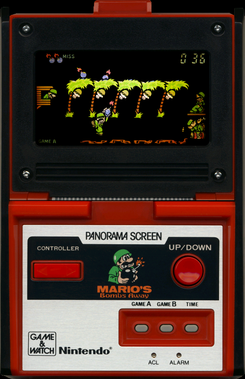
MARIO’S BOMBS AWAY!!
Nintendo Panorama (1983)
Gameplay Type: Cross the Road

Mario's Bombs Away (Nintendo, Panorama Screen)-220718-131633

Another “cross the road” format game. Honestly, the best Game & Watch titles follow that formula. It’s simple and allows for the most variations without feeling like you’re just copying one game over and over. Here, you’re Mario fighting in an actual war (holy shit!), carrying bombs across enemy lines so you can blow up the camping soldiers (HOLY SHIT!!). I mean, Jesus Christ! Mario was a solider! With a body count! Do you wonder if all the “adventures” he went on afterwards were a coping mechanism fantasy to deal with the PTSD he developed from all the terrible atrocities he had to commit here? It can’t be ruled out.

This slideshow requires JavaScript.

indie-gamer-chick-approvedAnyway, this is one of the better LCD games I’ve played so far. You have to raise and lower the bomb you carry to avoid the enemy’s torches and the flame started by one of your own guys chain smoking and tossing the butts into a leaky canister of gasoline that causes a flame to go across the ground. It’s actually pretty intense. While it’s hard to get the timing down of when the torches will light the bomb fuse without being able to see motion, I’m revising my verdict and awarding Mario’s Bombs Away my seal of approval. It’s an original, intense, quality cross the road game. And also, look at Mario’s face on the device. That’s the face of a dude that’s seen things. Horrible, horrible things.

DONKEY KONG JR.!!
Nintendo Game & Watch (1983)
Game Type: Cross the Road

There’s more LCD versions of DK Jr. than there are Army of Darkness DVDs.

This is not to be confused with Donkey Kong II or the Tabletop/Panorama LCD (which was made by Nintendo but released outside of Japan by Coleco). This is like a smaller version of Donkey Kong II BUT with a larger emphasis of using the vines. Once again, you have to grab a key and zig-zag Junior to the top of the screen to unlock your Daddy. Honestly, I think this game plays better than Donkey Kong II. It combines elements from several authentic DK Jr. stages and even has the “drop a fruit on the enemy to score points mechanic” that, to be honest, I would never have expected to have been attempted in one of these.

Is it fun? Well…………… no. But I did have to think about it this time.

EGG!! and MICKEY MOUSE!!
Nintendo Game & Watch (1981)
Gameplay Type: Spinning-Plate

Screw eating the eggs. That hat you’re using seems to have an unlimited capacity. Patent it and feast upon filet mignon for the rest of your days.

Nintendo reskinned several Game & Watch games to star Disney’s cash rat. Thus, Egg became Mickey Mouse and Donkey Kong Circus became.. well.. Mickey Mouse. That must have been confusing. Weirdly, Egg and Mickey Mouse both came out on the same day in August, 1981. Besides cross-the-road games, the other common, easy to execute LCD gameplay style is “spin the plate” games, where you have to judge which of several objects is the next one you have to touch. Also, this might be the first ever video game where you play as the villain. Because in Egg, you play as the Big Bad Wolf, stealing eggs from chickens. Wouldn’t the Big Bad Wolf.. you know.. EAT THE CHICKENS?

Imagine a parent in 1981 trying to REALLY make their child happy and buying both Egg and Mickey Moues, thinking they’re different games. You know this had to have happened at least once.

Well, I think the issue is Nintendo was trying to get the Disney license (they’d worked together for decades when Nintendo made playing cards) but wasn’t sure if they would get it. So they made two versions of this, and had to design a character that could seamlessly replace the Mickey Mouse character if they couldn’t work with the House of Mouse. That’s my theory, at least. Anyway, I’m not a fan of these because it becomes too hard to determine the speed after a while. This is one (two) of those games where Game & Watch Gallery had a really easy time making the concept more playable. Just add motion and poof: you’re 80% less boring. 20% being purely genetic.

Does that count as eight? Only seven? Fine.

OCTOPUS!!
Nintendo Game & Watch (1981)
Gameplay Type: Cross the Road

The Octopus should seriously come back as a boss somewhere. Great character model.

I figure the surest way for a Game & Watch game, or any LCD game for that matter, to win the Indie Gamer Chick Seal of Approval, is to be a cross-the-road game that has a unique, addictive play mechanic. Octopus is almost that. That idea is you have to wait for the tentacles to coil and uncoil, move to the treasure chest in the bottom corner of the screen and scoop up as much loot as possible, then return to the ship for bonus points. The more points you score, the faster the tentacles move. And that’s really it. It’s almost fun. It’s so close, but the lack of motion hurts this one. It’s why the remake on Game & Watch Gallery is so strong. This is just short of that.

And now I feel like I’m on a quest to find a good one of these LCDs. I just bought every DSi Game & Watch release, plus the first three Game & Watch Gallery titles on Virtual Console for comparison sake. Weirdly enough, playing these games does make me feel like I missed out on something. I’m gaining an understanding of the gaming upbringing of my older fans, and a better appreciation for the era that I came into the hobby, from 1996 – 1998. By that point, I never had to worry about getting stuck with one of these crappy “games.” Nope. I just have to hear older people say that this is all they had and they walked uphill in three feet of snow both ways to get them and they liked them. Weirdos.

LCD Games of the 80s

INDIE GAMER CHICK’S LCD GUIDE: PART II – PART IIIPART IVPART VPART VIPART VIIPART VIII

WE INTERRUPT INDIE GAMER CHICK’S SIX GAME ARCADE ARCHIVE MARATHON TO BRING YOU CATHY BEING SUBJECTED TO LCD HANDHELD GAMES FROM THE 1980s

We what?

Oh fuck my life.

I never owned those cheap Tiger LCDs as a kid and Game & Watch as a series was all but dead by time I was born. The Game Boy came out in the United States just a month after I did. And both of us were discolored and coated disgusting fluids. Or maybe that was just me. But you fuckers haven’t shut up about how “good” these were on Twitter since I started this retro voyage of mine.

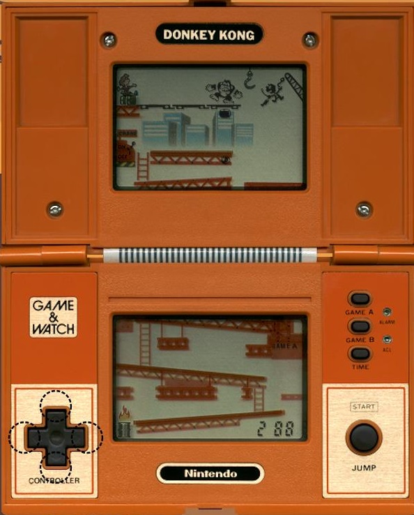
DONKEY KONG!!
Nintendo Game & Watch (1982)
Gameplay Type: Cross the Road

Nintendo has done a series of Game & Watch Gallery games. They might as well do another round and include them with Switch online.

It took me a while to figure out that you can’t jump if there’s a girder above you. The object is to climb to the second screen, activate a crane, then jump onto the swinging hook to cut wires that support Donkey Kong. Every time you cut a wire you end up having to start at the bottom and climb your way back up, this time with faster barrels and girders that are deadly to you. The concept is fine, and honestly the gameplay, while too easy and boring, is genuinely better than the Donkey Kong 3 arcade game. This is also the game that gave birth to the plus-shaped D-Pad. But I didn’t play with an authentic device so I can’t tell you how it feels. Still, this is a pretty historic game. Crappy, but historic.

Crappy and historic.. shit, this really is a Donkey Kong game!

DONKEY KONG!!
Coleco (1981)
Gameplay Type: Cross the Road

What an absolutely terrible game. Unlike the Game & Watch game (which, to be fair, came out a year after this and could learn from this game’s mistakes), this Donkey Kong actually tried to be as faithful as possible to Donkey Kong. It failed. It failed badly. It’s a fail whale. Hail hail the fail whale. I mean, look at it.

The yellow lines are the ladders. The yellow spots on the floor are supposed to be the rivets. The packages of McDonalds french fries are supposed to be the fireballs. This is Gaming Hell, people.

It’s clunky. Without movement it’s hard to know what stuff like the fireballs in stage two (which tries to mimic the rivet board from the arcade game) will actually do. It’s even ugly to look at. At least Game & Watch releases had neat, clear looking LCD characters that had funny, distinctive faces. They were so nice looking that they became a Smash Bros. character. This? Imagine being a kid in 1981, seeing this in stores, and begging your parents for this for Christmas. It cost $60 in 1981, which is over $150 today. A lot of money for most families. And then you get it, and you play it, and you realize there’s no Santa Claus. And your parents hate you because they just spent over $150 in 2019-equivalent dollars on something you can’t possibly play for more than 10 minutes before wanting to die.

Nice cameo in Gremlins though.

DONKEY KONG II!!
Nintendo Game & Watch (1983)
Gameplay Type: Cross the Road

Again, shockingly, this is more engaging than Donkey Kong 3. It really speaks to how bad of an idea that game was.

Not to be confused with Donkey Kong Jr., though the game actually stars Junior and seems based on his game. You start on the bottom screen, jump up to get a key, then zig-zag your way to the top screen, where you have to again jump for the key, then push it into one of the locks caging Donkey Kong. Unlike Donkey Kong, where you automatically go to the bottom screen upon completing a cycle, in DK II you have to get to manually make your way back to the bottom to start the cycle over. Or, you can sacrifice a life to get there. The concept is fine, but like every other game I’ve played, getting the timing down is hard because there’s no actual motion to track. It’s guess work, and if you have no sense of timing, you’re fucked. Also, there seemed to be a few times that I don’t think surviving was possible because any direction moved, including jumping, would lead to my death based on where the enemies were. Another turd.

DONKEY KONG JR.!!
Coleco/Nintendo (1983)
Gameplay Type: Cross the Road

This slideshow requires JavaScript.

indie-gamer-chick-approvedThis is an odd cat. Unlike the Donkey Kong tabletop that was developed by Coleco, this one was made by Nintendo, presumably to show Coleco how to make a decent LCD game. Not that Nintendo’s Game & Watch games were amazing or anything, but compared to the shit Coleco seemed to have been vomiting up, they were incredible. And this is actually one of the better games. You grab a key and zig-zag Junior to the right of the screen, where you ride umbrellas downward and balloons upward to free your Daddy. It’s weird that you don’t have to locate the key and you start every level by jumping up to get it, but the twist there is, if you miss hitting the lock that Donkey Kong swings up and down, you drop the key and have to make your way back to the start to get another. I’d still rather play anything else, but if.. okay WHEN.. I go to Hell, if Satan tells me my only options are to play LCD games, if this is on the menu it won’t be so bad.

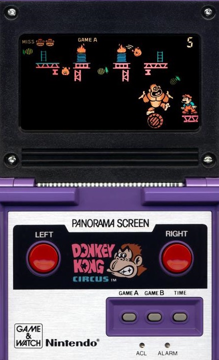
DONKEY KONG CIRCUS / MICKEY MOUSE
Nintendo Panorama (1984)
Gameplay Type: Spinning-Plate/Juggler

Mario is a cruel taskmaster. Which is the original origin story of Donkey Kong. It’s true.

It’s juggling. With Donkey Kong or Mickey Mouse. It’s boring. Please shoot me.

DUNGEONS & DRAGONS COMPUTER FANTASY GAME!!
Mattel Electronics (1981)
Gameplay Type: Minimalist Adventure

You’re warned if there’s pits nearby. ET really could have used that.

This is an interesting one that requires you to draw a map using pen and paper like a fucking savage. You’re placed in grid that’s full of pits. Somewhere in the maze is a magic arrow and a dragon. You have to find the arrow, then sort out what room the dragon is in, get next to that room, point at it and shoot the arrow. It sort of defeats the purpose of being a handheld game by needing pen & paper to play it, though I guess it’s not really D&D without those materials either. It’s an incredibly simple concept, but it works. It’s not really fun in the strictest sense but it’s a decent enough time waster. And with all the pits, I’m curious if Howard Scott Warshaw owned one of these.

MARIO BROS.!!
Nintendo Game & Watch (1983)
Gameplay Type: Spinning-Plate/Juggler

Mario Bros. (Nintendo, Multi Screen)-220718-144832

This one makes no effort to play like the arcade game, because at the time, Nintendo’s concept was that Mario would be the “every-man” who worked a variety of odd jobs. Here, you have to pass packages between Mario and Luigi up a series of conveyor belts. It’s another take on the plate-spinning style gameplay with the twist being that you have to move two characters on two different screens independent of each-other. Even with the twist, I find most of these type of games boring, and this one is no exception.

TRON!!
Tomy (1982)
Gameplay Type: Snake-Like

This slideshow requires JavaScript.

This one tries to recreate the light-cycle scene from the movie, but in over ten minutes of playing I couldn’t once beat the computer. Even when I had a speed advantage and got in front of it, it would always turn fast enough to hang in there. When I finally thought I had boxed it in, I simply died anyway. It makes me think the Donkey Kong Jr. game above had the right idea by trying to play tribute to the spirit of the game while also making something original that is more tailored to the hardware.

Shit like these games makes me appreciate my gaming upbringing a little more. I’ve had a LOT of my older fans wax nostalgically about the glory days of these things. I hope this doesn’t come across as condescending, but I feel a little sorry for them. Because these are terrible games. I honestly can’t believe they were ever considered an acceptable substitute to arcade games or even the most primitive Atari 2600 games. At least with the 2600 you could see objects move. Here they just sort of blink out of existence in one part of the screen and reemerge somewhere else. Maybe you guys from that time felt like you were getting away with something naughty by playing these at church or at school. Maybe they were bad deliberately, as part of a conspiracy. By teachers. Because compared to these, school work.. any school work.. would probably look pretty damn stimulating.

Nessie

It might surprise you to hear that I actually quite enjoyed those old Game & Watch Gallery collections they put out on Game Boy Color and Game Boy Advance back in the day.  Most people perceive me as having some kind of bias against old school games.  I don’t.  I just don’t think they hold up today as well as many will claim.  Game & Watches are kind of exempt from that, because even back in the day, they were probably only good for fifteen minutes before getting boring.  Even those Game & Watch collections that I really enjoyed as a kid didn’t get a whole lot of playtime from me.  Still, they had their place.  As my buddy Cyril of Defunct Games said to me, “in a time before Game Boys and cell phones, they were the Fruit Ninja of their day.”  You know, that guy is pretty smart when he’s not reviewing magazine covers.

Having said that, it’s really weird that someone would make an original G&W today, in 2012.  I know nostalgia is trendy right now, but that’s a bizarre choice.  You know how some stores started carrying turntables and vinyl records a few years ago to cash in on the long-faded memories of old people who smell like aspirin and bath salts?  Yea, well this would be like someone cashing in on that craze by bringing back typewriters.  Some people might genuinely long for them, but it’s probably not a viable commercial idea.  Even if they work.

In a way, this is a picture of the Loch Ness Monster AND a zombie.

And Nessie, today’s attempt at bringing back Game & Watch, does work.  As far as I can tell, it’s an original concept.  You play as the Loch Ness Monster (last seen playing The Last Guardian with Jimmy Hoffa), and you score points by not being seen by a guy on a boat and a guy on shore with a telescope.  As you play, your air supply starts to run out and you have to surface without being seen by either guy.  It’s tricky, takes some getting used to, settles into a groove, provides a worthy challenge, and then gets dull all in the span of fifteen minutes.  Not a bad fifteen minutes by any means.  And it really does look and sound like a Game & Watch, so mission accomplished there.  I got about as much playtime with it as I got with the Game & Watch: Ball replica I got from Club Nintendo by spending 1200 points, or the two Game & Watch collections on Nintendo DS that I paid 800 points for apiece.  If my math is accurate, that’s about $8,942,104 I had to spend to get those.  80 Microsoft Points (roughly $256.31, although my calculator seems to be broken so disregard all dollar amounts in this review) is obviously a much better deal for a gaming’s version of the butterfly: fun to look at, but once you start interacting with it, it dies in about fifteen minutes.

Nessie was developed by Those 30 Ninjas

80 Microsoft Points had a feeling this game would be good for cranking out a quickie review in the making of this review.

Nessie is Chick Approved and ranked on the Indie Gamer Chick Leaderboard.  Yea, I’m fucking shocked by that too.