Atari 50: The Games They Couldn’t Include – The Definitive Review (Part Two)
February 2, 2023 4 Comments
Welcome to Part Two of the ongoing Indie Gamer Chick Atari Saga! And it really is set to be a saga at this point. In addition to the massive 100+ game Atari 50: The Anniversary Celebration review, which will be posted this month to Indie Gamer Chick, it looks like I’m set to do at least six installments of The Games They Couldn’t Include for Atari 50. There’s a LOT of Atari history to cover, and I really have enjoyed this whole voyage through the history of the company who “Took Fun Seriously” long before I was born. Which, by the way, “We Take Fun Seriously” is a great slogan for a video game company. The Atari that exists today should bring it back. It’s wonderfully whimsy.

I might actually buy an Atari 5200 off eBay just to authentically experience the historic badness that is its controller. It looks fine, doesn’t it? But, nothing centers that joystick. You have to manually bring it back to the center. TOOPID!
Atari 50: The Games They Couldn’t Include is quite the endeavor. Part One contained the first thirty games. My review for the infamous E.T. for the Atari 2600 got so bloated I moved it to its own post. Part Two, which you’re reading now, contains a whopping fifty-two games for the Atari 2600, Atari 5200, and Atari 7800. These games are all titles that would require some kind of licensing agreement to include in a collection like Atari 50. While I wish the rights holders to these titles would tip their hats to gaming’s past and grant the modern Atari a reasonably cheap license without any strings attached, let’s face it.. it’s not happening. There’s so many games for those vintage Atari consoles that there’s no way I could ever hope to review them all. In selecting the lineups for The Games They Couldn’t Include, I wanted to choose notable games, some of which have odd, amusing, or even frustrating histories behind them. A few of these never released at all, and others are ones you might never have heard of. I hadn’t. Not until I started this project. I have a pool of over ninety Atari 2600/5200/7800 games left to create The Games They Couldn’t Include Parts Three & Four from, which I’ll leave in a comment below. If there’s a game missing I haven’t done yet that you want to see me review in part three of four, leave a comment! No, I’m not reviewing that one game that rhymes with Mustard’s Stonehenge. Not happening.
I’m still leaving out Activision, as I fully expect the Activision Anthology franchise to return in the near future. That’s also why I left games by Imagic, the other big Atari third-party, out of the mix. Activision owns all their work. As for modern “homebrew” games, (1) I hate that name, so instead I’ll be calling them Indies on Atari and (2) I will be doing them as a separate feature at some point in 2023. I did choose many third party games this time around. In addition to the works of Atari themselves, you’ll be seeing games by Coleco, Parker Bros., Mattel, Xonox, Spectravision, Data Age, and Fox Games in this feature! In Part Three, even more third parties will be covered. My dear friend, the great Al Nilsen, made a wonderful suggestion that I totally agree with: cover as many games by individual designers as possible. So many of these games were lead by unknown designers, but by golly, I’m going to try to get in a game by every known classic Atari designer.

“Where are all the Lynx games?” Part Five will be entirely licensed Atari Lynx games. “‘Jaguar?” I might not do Jaguar as much, but I promise I’ll do at least one game for it eventually. You can probably guess which one. “What about the Atari 8 Bit computers?” Coming, but, if I did the Atari 5200 version, I don’t really see the point in doing the 400/800 ports. For anything that doesn’t include, I haven’t figured out when, but I’ll do them at some point.
Before we get to the reviews, I want to once again give a shout out to three websites who provided such incredible information for this project: Atari Age, AtariMania, and AtariProtos. Without them, this wouldn’t have been anywhere near as fun. And, I also want to thank the entire Atari community. Gaming has a reputation for gatekeeping, but honestly, the Atari community has never once made me feel like a party crasher. I’ve even made a few new friends from this project. While I’m not going to enjoy all your childhood favorites, I’m not hunting these games for sport. I’m only asking whether or not games hold up TODAY, in 2023, without any historic context. Maybe not, but there’s dozens of people who have the nostalgia goggles on when they write reviews. Someone ought to ask “are they still fun today?” I can’t review YOUR nostalgia. I wasn’t even born yet when these consoles released. But, I do respect what these games meant to you, even if I might lightly tease you over them. Yea, a few people have taken my dislike of their favorites too personally, but they’re outliers. The Atari community has been amazing, and from the bottom of my heart: THANK YOU! You all helped make this so much fun! ♥ I’ve had a blast! Let’s do hundred more! ON WITH THE REVIEWS!
GAME REVIEWS
For those not familiar with my way of thinking of how retro games should be reviewed, I take NO historical context into account. I don’t care how important a game was to the industry, because that doesn’t make a game worth playing today. The test of time is the cruelest test of all, but every video game must face it. I might not be here if not for Pong’s success, but I wouldn’t want to play it today. Not when there’s better options. Therefore, when I review retro games, every game gets either a YES! or a NO!
YES! means the game is still fun and has actual gameplay value when played today and is worth seeking out.
NO! means the game didn’t age gracefully and is not worth seeking out, and certainly not worth spending money on.
Adventures of TRON
Platform: Atari 2600
Year: 1983
Designed by Hal Finney
Published by Mattel

Either Atari or AtGames co-owns the rights to all the games from Mattel I’m showing here. I’m not entirely sure who, but M Network games have shown up in collections before.
Tron is yet another property that Warner Bros. executives were shell shocked they let slip through their fingers. It’s the same situation as Donkey Kong: Disney wanted to work with Atari and said “just match Mattel’s offer. Not beat the offer. Just match it!” Ray Kassar refused, because they wanted something like a $2 royalty per unit. We’ll never know what Atari would have done, but Mattel put out a pair of games for their Intellivision, then loosely ported them to the Atari 2600. Adventures of Tron is one of the most simple games on the VCS. You start at the bottom of the screen and must hop over enemies and zig-zag your way up elevators. The object is to jump up and grab the items that float above your head. The only challenge comes from not allowing you to keep riding an elevator upward. You can only go up one floor before you have to cross the screen to get to the other elevator, forcing you to leap over baddies. Maybe it was a big deal back when jumping was new in games, but this aged badly. It’s not that hard. Besides having some of the sprites look similar to the film, this has nothing at all to do with TRON, and captures NOTHING from the movie. It’s a really dull concept that has no longevity. WAIT, I take back what I just said. It perfectly captures the TRON viewing experience.
Verdict: NO!
Hey hey! One review down and I didn’t even need multiple paragraphs! Take that, Part One!
Alien
Platform: Atari 2600
Year: 1982
Designed by Doug Neubauer
Published by Fox Video Games

You know the famous story about how Steven Spielberg wondered why E.T. couldn’t be like Pac-Man? I wonder if Fox Video Games caught wind of that story and this is a “shots fired” situation?
Yes, this is based on the movie. Don’t those aliens in the picture above look just like xenomorphs? No? Nothing like them at all? Well, I suppose it’s the thought that counts. Alien really is just a fairly generic maze-chase. It’s not completely shoehorning the Alien IP onto an unrelated game. You can tell because, occasionally, you’ll get a flamethrower, just like in the flick! You can’t actually kill the aliens with it, though. In fact, all it seems to do is make them wiggle back and forth for one second before they resume chasing you. The only scenario I can imagine where it’s useful is if you’re committed to one direction and an enemy goes to cut-you-off. You can spray it with the fire to buy yourself enough time to turn around. In theory, at least. Such a situation never came up. I even tried to deliberately set-up the circumstances for it, and I actually couldn’t, or at least never in a way where the flame thrower was useful at all. It’s kind of remarkable. A flamethrower.. the coolest use of fire on God’s green Earth.. made completely worthless. How is that even possible, short of arming a security guard at a firework factory with one?

After each maze is cleared, there’s a Frogger-like cross-the-road bonus game that, once or twice, I beat without having to pause for even a second to watch for traffic. What a bizarre use of the Alien license.
So, what you’re left with is a completely generic Pac-Man knock-off, albeit one that has the movie poster for Alien stuck to the cartridge. It even sounds just like the arcade Pac-Man when you’re not collecting the dots. That idle WUUU-WUUU-WUUU sound? Yea, that’s really here! Weird. But, despite the complete soullessness of all this, and despite having the single most worthless weapon I’ve seen in a video game, it’s actually not a bad little Pac-Man wannabe. As always, the chase matters most, and here, you can adjust the difficulty to make the aliens more aggressive. There’s only three aliens chasing you, but it works great with the design of the maze, which has a hidden elegance to it. I like how the exits (another element stolen shamelessly from Pac-Man) stick out from the wall, so if you’re grabbing the dots in the corner, you actually have to do so with enough room to shimmy to the side if you want to utilize them. Alien has one of the better mazes the genre saw on the Atari 2600. The power pellets.. yes, those are here too, and yes, they work just like in Pac-Man.. only appear one at a time in pseudo-random spots, but that works in service to the chase. When I turned-up the difficulty, I found Alien to be perfectly decent, if not outright good, version of Pac-Man that has been historically trounced because it’s a Pac-Man knock off that uses the Alien license but features aliens that look nothing like Alien’s alien. Who cares? The game’s fun. That’s all I ever cared about.
Verdict: YES!
Burgertime
Platform: Atari 2600
Year: 1983
Designed by Ron Surratt
Published by Mattel

Mattel could make pretty generic, lifeless Atari 2600 games. But when they put in the effort, they did pretty good.
If there’s one game from the Golden Age that consistently confounds me, it’s Burgertime. It sure seems like something I should love, since it’s such a layered game.. no pun intended. It’s a maze chase that thrives on close-calls and near misses, which is that sweet spot I crave so much. Additionally, no maze chase better incorporates the “turn the tables” style of gameplay into the actual pursuit better. The closer you keep the enemies to you, the more likely you are to take them out when you drop the burger parts. I should LOVE Burgertime, but I never have. I don’t hate it or anything, either. It’s just never been one of my favorite games. After multiple attempts across multiple platforms, I’m still waiting to play one where I don’t spend most of the play session frustrated by the movement physics. It’s those damn ladders. No matter which port I play, I’m constantly getting hung-up on them. So, it’s not like the Atari 2600 version is uniquely problematic.

Although the slow movement makes it feel like a Burgertime that takes place waist-deep in invisible quicksand, it’s unquestionably a well-done port.
In fact, I honestly was stunned by how well Burgertime on the VCS plays. I’ve never heard anyone bring it up, possibly because it’s an M Network game, but this is genuinely one of the best arcade ports I’ve played on the console. Sure, it’s ugly and the enemies mostly look like squares chasing you, but there’s no question this is authentically Burgertime. It’s an impressive effort that carries over all the mechanics that matter. Dropping the stacks into enemies? Here and works. Salting enemies to run past them? Here and works. It’s slow, but Burgertime was never fast-paced to begin with. The ladders are still the bane of my existence, but I honestly dealt with them better here than I did in other versions. Huh. You know what? Burgertime 2600 proves that Mattel didn’t half-ass their Atari efforts in order to make their own Intellivision look good. I might not be the biggest Burgertime fan, but I don’t hate it either. In fact, I’m genuinely happy for Atari fans that they had access to such a shockingly accurate port of a beloved coin-op that, on the surface, seems like it would be too complex for the platform. Where there’s a will, there’s a way.
Verdict: YES!
Carnival
Platform: Atari 2600
Year: 1982
Designed by Steve Kitchen
Published by Coleco
I consider Carnival to be the very best gallery shooter that was released in the wake of Space Invaders. Well, the arcade version, at least. Coleco snatched-up the rights to it, and one of these days, I’ll get around to doing Colecovision: The Definitive Review. But, the Atari 2600 port isn’t too shabby. Sure, the pipes are a lot harder to hit (how is that even possible?) and the B-O-N-U-S letters are missing, as is the bonus round between stages. Oh, and only one duck attacks at a time, which really nerfs the difficulty. I wasn’t sure if the game had been reduced to just pinging targets, but there is still some tiny little details in this one. For example, the more moving targets you shoot before you hit the pipes, the more ducks appear. The pipes themselves don’t break one piece at a time like in the arcade, making it essentially one big target that takes damage. There’s still a twist attached to it: it changes colors, and you get a bonus for shooting it when it’s the same color twice in a row. And.. actually that seems to be it as far as the idiosyncrasies of the game go. Carnival is still an okay port, except for when the targets just randomly speed up (I couldn’t figure out what was causing that), the intensity is almost completely lost. Oddly enough, a game that I felt was THE Space Invaders killer in arcades is actually slain by the Atari 2600 Space Invaders port, which has more options, and is just straight-up better effort. Carnival’s options are “one player or two?” Still fun? Yea, but I actually had to think about it, and I wasn’t expecting that. Carnival 2600 is like a nutritious food that has all the nutrients deep-fried out of it.
Verdict: YES!
Chase the Chuck Wagon
Platform: Atari 2600
Year: 1983
Designed by Mike Schwartz
Published by Spectravision
If you want to test the credibility of someone talking about the Video Game Crash of 1983, see if they cite Chase the Chuck Wagon as one of the examples of why the bottom fell out. The way some “journalists” make it out to be, consumers saw a game designed to advertise.. I swear to God I’m not making this up.. Purina’s Chuck Wagon branded dog food, and said “this video game stuff is getting lame. Let’s buy something else instead.” In reality, it’s not even possible consumers saw Chase the Chuck Wagon on store shelves at all. You had to buy a 25lb bag of Chuck Wagon dog food, then clip the UPC and include a check for $12.95 to get it via mail order. This might not be the worst idea, either. You see, dog food is famously one of the hardest products to market, so, in theory, creating a promotion based around a low-cost video game tied directly to a specific kind of food is a savvy way to get children to pester their parents to switch from Alpo or Kibbles & Bits (note that changing diets like that is unhealthy for dogs). Like most Atari games sold through mail order only (including many Atari-published titles such as Quadrun or SwordQuest: Water World), this is one of the rarest games on the VCS. It’s rated an 8 out of 10 by Atari Age. I wasn’t sure what this meant, but according to my collecting friends, it means the game is so exceptionally rare that, excluding online sources like eBay, a person who actively travels around to garage sales, second hand stores such as Goodwill or Salvation Army, or flea markets would be lucky to find any 8-out-of-10 game even once, even after decades of searching.

Not all games that were mail-order were rare. Kool-Aid Man (reviewed below) was a mail-order game too, but it could also be bought in stores. This couldn’t be.
So, it’s weird that this is held up as this canary in the video game coalmine. Games have always been used for marketing. Chase the Chuck Wagon didn’t start it, and the practice continued to long after the crash, whether it was for Domino’s Pizza or Skittles or McDonalds or 7 Up. Chase the Chuck Wagon just so happens to make a convenient scapegoat, because it’s a terrible game nobody in their right minds would defend. A simple maze chase with one of the most brain dead AI pursuers. The biggest challenge of Chase is getting hung-up on walls as you try to fit yourself through narrow passages and turn corners. There’s also an object that ricochets around the level, and if you touch it, you freeze in place for a few moments. Sometimes it might pass over you multiple times, but since the AI chaser seems to mirror your moves, it poses almost no threat to you. Some of the mazes are so easy that you wonder if this was really meant to be the first video game created to be played by dogs, but my little deaf fur-friend, Kunoichi, would find this too stupid and simple. How did THIS become the “gaming is out of hand” mascot? Sure, that it exists at all is such a obviously soulless, arbitrary promotional tactic that it makes for a great villain. I don’t get it. It’s rare, but not as rare as game collectors make out to be. Bad, but not so bad that it contributed in any way to the evaporation of the game market. Chase the Chuck Wagon should be a non-entity historically. Instead, it lives in infamy. Its notoriety comes entirely from being a game based on a dog food commercial that released as the market was collapsing around it. The poster child for all of gaming’s ills during this era, even if almost nobody owned it or even knew about it. No game deserves to be infamous less. Said the girl who just gave it two paragraphs of coverage.
Verdict: NO!
Crazy Climber
Platform: Atari 2600
Year: 1982
Designed by Alex Leavens

I want to play as the people trying to knock the guy off the building. It seems like that would be more fun. Also, I might be evil.
Hey, speaking of rare games that could only be purchased through mail order, Crazy Climber is a “holy grail” for many Atari collectors. The object is simple: climb a building by pumping the controller up and down. It’s nowhere near as complicated as the arcade game, where you had to move your arms independently of each-other with a dual joystick layout. Here, you just have to move up and down. Hypothetically, it works, and the challenge comes from avoiding the various stuff that’s thrown down at you, along with watching to make sure the windows aren’t slammed on your fingers. So what’s the problem? Well, the whole point of the arcade original is lost completely with this new control scheme. The coin-op’s controls have a sharp learning curve that’s really the whole basis for the gameplay. It’s a game that challenges you to get used to a very difficult-to-master setup. Take that away, and you have a really boring, lifeless game. Even the parts where you have to wait for a window to open so you can proceed are made worse here, because you don’t ever have to think about what movements are required next. I don’t like Crazy Climber’s arcade version either, but I totally get why Atari decided against a wide release for this. I have no clue why they didn’t utilize a dual-stick layout, like Raiders of the Lost Ark proved the Atari 2600 could handle.
Verdict: NO!
Dig Dug
Platform: Atari 2600
Year: 1983
Designed by Doug Macrae
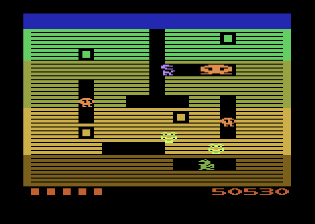
Mechanically impressive, and yet totally wrong.
Like many of General Computer’s Atari 2600 efforts, Dig Dug is actually impressive, given the limitations. If you were a fan of the coin-op and had an Atari 2600, you were in luck. I mean, look at this! Sure, the dragons look more like obese toads and it’s nowhere near as satisfying to burst the enemies. There’s no death sprite, so enemies just vanish when you explode them. But, it’s still Dig Dug. It even does the bit where if you stand right next to a teeny-tiny sliver of wall, your hose can pass through to the gap on the other side, just like in the arcade. So, what’s the problem? Well, Dig Dug 2600 is a completely toothless experience. It took me a while to figure out the why. I had to keep swapping back and forth between the arcade and VCS versions. I believe the game is nerfed because, on Atari, enemies have fewer frames of inflation. The Atari 2600 version only has two, while Dig Dug Arcade has three (four counting the final explosion) so when you attack, enemies can die much faster. That one extra frame means it doesn’t matter if enemies gang-up, because you can still kill them much faster, even without the multiple-pump trick. Plus, they’re not aggressive enough, and the only adjustable difficulty is to make the game even easier with the kid’s mode. It’s always better for a game to be too easy instead of too hard, but Dig Dug 2600’s total lack of tension and challenge makes it a bore.
Verdict: NO!
Dig Dug
Platform: Atari 5200
Year: 1983

$600 for a marginal graphical upgrade and an analog stick that doesn’t self-center. Imagine playing ANY PlayStation, Xbox, or Switch game with an analog stick that you had to manually hold in the center yourself. Well, that’s the entire Atari 5200 experience. Thankfully, that’s a non-issue for us whippersnappers on an emulator. A reminder to you purists that my generation has it better than you did.
I have to take time to remind myself that the Atari 5200 was, adjusted for inflation, more expensive than today’s consoles. Was it worth being that? Not at all. Most of the games are really ugly, but not in that charming Atari 2600 kind of way. Most also have this spooky slowness to them, like a recently deceased zombie where the decay hasn’t quite started setting-in. Dig Dug is right there with them. It looks better than the 2600 version, but it’s not even close to arcade accurate. The graphics are still pretty ugly, with different sprites missing from the act of blowing-up enemies. The timing is better, but Dig Dug 5200 is missing nuances. The “hose goes through a sliver of the wall” thing is here, but it doesn’t work consistently. In fact, I couldn’t figure out why it worked sometimes, but not every time. It seemed to have nothing to do with distance from the wall. It was weird. So was the “quick burst method” where, again, sometimes it worked and I could quickly explode enemies, and sometimes I couldn’t. It usually worked if I was walking towards the enemies, but it wasn’t a guarantee. Dig Dug is so oddly inconsistent that I often questioned how much testing it got.
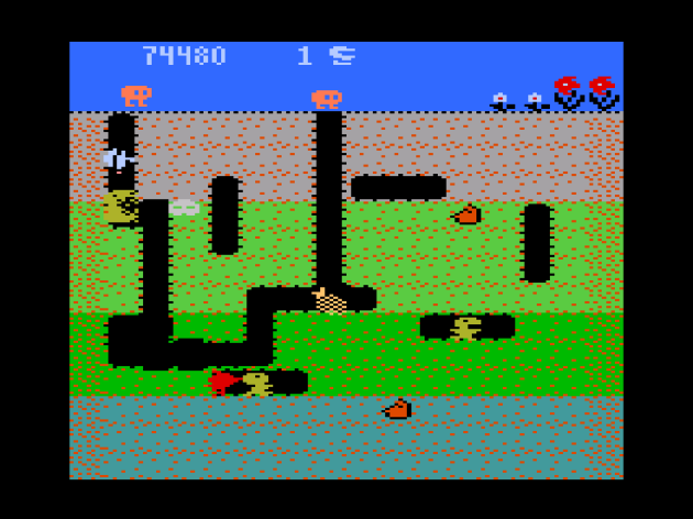
Well, at least the exploded enemies don’t just vanish from the screen, I guess.
Actually, the only element of Dig Dug 5200 that was ever-present was poor play control. Even with my PlayStation 5 controller’s D-Pad (which was my primary controller for all the games in this feature), this was a miserable experience. Cornering was brutal. Turning around was worse. I lost most of my lives when I was trying to scratch-out distance between me and the enemies and instead watched in horror as I steered right into the bastards. My heart aches for those sad sacks who had an actual Atari 5200 and had to play this thing with THAT controller. That non-self-centering analog pad that seems like it was a plot to make children lose interest in video games. I’ve noticed that a lot of Atari 5200 games have similar “changing directions is a pain in the butt” control issues. If not for friends of mine assuring me these problems are still present on authentic hardware, I’d of sworn they were some kind of bizarre attempt to compensate for the controller that ironically ruined the experience for those using an emulator. That obviously isn’t the case. Dig Dug 5200 has other little issues, like the Fygars not giving any flashing warning before they fire upon you, and the enemies seemingly gravitating towards the top of the playfield until the “too much time” warning sounds. An improvement over the Atari 2600 version? Sure. Fun? Not really. Even with the audio-visual upgrades, the charm is still gone. In fact, I think this is about as soulless and unlikable as Dig Dug gets.
Verdict: NO!
Dig Dug
Platform: Atari 7800
Year: 1986

I think this was the most enemies I’ve ever dropped a single bolder on in any Dig Dug. I literally cheered!
I learned a valuable lesson during this chapter of The Games They Couldn’t Include: a little Dig Dug goes a LONG ways. This was the final review I wrote for Part Two. Well, it would have been, except I forgot to include Frogger 5200, and since fifty-one games was a lame number to end on, I added one more in Carnival 2600. But, I intended for this to be the last game, because by time I reached this point, I was Dig Dugged out. I almost wish I had done the games in reverse order, because Dig Dug 7800 was a really decent experience. While it decidedly looks off, with pixels that seem to bleed into each-other, it plays just like the arcade game. The timing is right. The amount of frames enemies need before bursting is right. The only thing off is the sound. In case you didn’t know, the Atari 7800 uses the exact same sound technology the Atari 2600 did. So, yep, Dig Dug 7800 literally uses all the same sound effects as the 2600 version, along with that annoying “dolololodolododolo” movement music that sounds more like a canary in its death rattle. BUT, if you had an Atari 7800 instead of an NES (which didn’t get Dig Dug in the United States.. only the much crappier Dig Dug 2), you were in luck! You got yourself a pretty good port of a game that’s fun. In small doses, at least.
Verdict: YES!
Donkey Kong
Platform: Atari 2600
Year: 1982
Designed by Garry Kitchen
Published by Coleco

Garry will kill me for this, but I’m going to reveal the dark secret of Donkey Kong 2600: he actually took a bribe under-the-table from General Mills to add subliminal advertising for Cookie Crisp cereal. WAS IT WORTH YOUR SOUL, GARRY?
Okay, so I might have made the Cookie Crisp story up, but making up stories about Donkey Kong for the Atari 2600 seems to be the order of the day. The long-standing urban legend is that Garry Kitchen was under strict orders from his bosses at Coleco make a less-than-quality Donkey Kong game in order to make the more authentic Colecovision DK pack-in more desirable. This legend actually evolved from a prior legend about the Intellivision port being sandbagged. Neither is true. Now, in the interest of full disclosure: Garry is one of my favorite people and a good friend, but that doesn’t factor into this review at all, as I’m sure you’ll guess from what my verdict is. But, having gotten to know Garry and learn about what went into the making of Donkey Kong, he has my sympathy. This is a historically villainized port, and I don’t think it deserves to be that. While sympathetic gamers of all stripes bend over backwards to excuse E.T. on the grounds of having an unreasonable production deadline, Donkey Kong 2600 (as well as Donkey Kong on the INTV) had deadlines straight out of a nightmare too. And, given the circumstances, I think it’s impressive that the final product doesn’t feel like a cheap bootleg of the advertised game, like Atari’s Pac-Man did.

I think the hammer lasts too long in this the second level, especially since you can’t let go of it, nor do the enemies respawn. You’re just stuck there, doing nothing, waiting FOREVER for the thing to disappear. If you’re interested in more about the history of these games, head over to the Video Game Historian’s feature on these titles.
Not that such a distinction helps it survive the test of time. I wouldn’t want to play Donkey Kong 2600 today. Well, except as part of a project like this one. Although it does an admirable job of feeling Donkey Kong-ish, I wasn’t the biggest fan of the original game to begin with. The two stages are also stripped down in terms of challenge. Garry’s biggest struggle was getting the stages to slant downward so that the game would be authentic, but that didn’t leave time for Garry to program the items into the rivet stage. There’s no fireballs in the first stage, and enemies don’t respawn in the second or climb up the ladders. Speaking of which, I was constantly getting stuck on the ladders, even using a modern controller. Do I think Donkey Kong is a lot better than anyone gives it credit for? Yep. It has some of the better jumping mechanics on the Atari 2600. But Donkey Kong was meant to be an at-home solution for Atari 2600 owners in 1982, and not something that would retain gameplay value for forty years.
Verdict: NO!
Donkey Kong
Platform: Atari 7800
Year: 1988

Legit question here: what exactly is keeping the left side of the structure up? If I removed all the rivets from that side, shouldn’t I have collapsed Donkey Kong? It should have been.. like.. a slide. A really big slide. Well, then again, Pauline seems to be on a platform that’s floating in air.
Had the Atari 7800 launched in the Fall of 1984, like the plan had been, Atari would have had a hell of a crowing point with Donkey Kong. It looks and plays better than any previous port.. that was released in North America. By this point, the Famicom had hit Japan, and along with it, Donkey Kong. Or, rather 75% of Donkey Kong. The cement factory, AKA the pie factory, is missing from that version. Guess what? It’s gone here as well. It was also missing from the Colecovision version. Imagine being a Donkey Kong purist and buying every new console DK showed up on, excited that THIS TIME FOR SURE you’re getting all four levels, but it doesn’t happen. Hell, Nintendo themselves did it TWICE with Donkey Kong and then with Donkey Kong Classics, which packed Donkey Kong and Donkey Kong Jr. together. Apparently the cement factory was axed to save space on cartridges. Which doesn’t explain why Nintendo keeps re-releasing versions of Donkey Kong that don’t have it. STOP IT!!

I’m hardly an expert at this game, but this ain’t a bad version of it or anything, assuming you really like Donkey Kong and don’t mind playing 75% of it. One thing I did notice was that, even on expert mode, only one of the springs come out one at a time. In the arcades, they come out in continuous streams after a few cycles.
As for the Atari 7800 version, well, it’s fine, honestly. And missing 25% of the game SORRY I’M NOT LETTING THAT GO! It’s not even that good a level, but neither are the swimming stages in Super Mario Bros. Yet, it would be weird if they were cut for space, wouldn’t it? But seriously, this is a perfectly decent port of Donkey Kong. Oh, it sounds terrible, like all Atari 7800 games do. I mean, that noise that Mario’s walking makes is grating as all hell. It could replace Jim Carrey’s “want to hear the most annoying sound in the world?” bit from Dumb & Dumber and nobody would notice. But, if you mute the game, it’s fine. Of course, this didn’t come out in 1984. It came out in 1986, after the NES. If your family could only afford the Atari 7800 and you were a huge Donkey Kong fan, you weren’t totally screwed, even if it doesn’t look exactly like the arcade version. I’m not entirely sure such a kid existed (and judging by the 7800’s sales, they didn’t), as by that point, they probably all wanted Super Mario Bros. and Donkey Kong was yesterday’s news. I’m sure Donkey Kong was ground breaking in 1981. 1986 was just a bad time to launch this. Too old to be relevant. Too young to be nostalgic. And if you were nostalgic, there was a better option you could get just by saving an extra $30 or so and springing for an NES. In 2023, I’m not recommending it, as I don’t think it holds up to the test of time. Don’t take it personally, Atari fans. The arcade version got a NO! as well, and the NES version will eventually.
Verdict: NO!
Donkey Kong Junior
Platform: Atari 2600
Year: 1982
Designed by Harley H. Puthuff Jr.
Published by Coleco
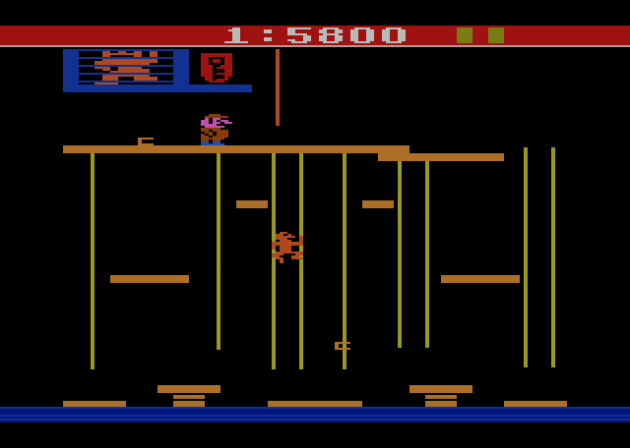
The Game & Watch did a much better job. That’s saying something.
Junior’s VCS conversion is one of the worst on the Atari 2600. Yes, this is another example of an unreasonable time crunch, but unlike Garry Kitchen’s Donkey Kong, this one does feel like a knock-off instead of an officially-sanctioned port. The vine climbing mechanics seem close enough at first. Climb faster when holding two vines at once, then slide down a vine faster using only one vine. Great! It’s there! Well, in the first stage. In the second stage, apparently they forgot to program in the “move faster going down on one vine” part. Also, there’s no fruit, meaning no way to kill enemies, meaning this is purely an avoider-type game. It would be like doing the original Donkey Kong without the hammer. You HAVE to have that in the game, or it’s not Donkey Kong. And you have to have the fruit, or it’s not DK Jr. Even the Game & Watch had them, but this doesn’t? Are you kidding me?

This is the third level, and I think they made it as such because it’s broken. You can’t move all the way over to the wall, but the game is also really fickle about where you can let go of the vines.
There’s lots of weirdness too, like enemies will just end up stuck in place on the floor and you have to wait for them to vanish to move. The game is anal about getting off the vines, and on the third stage especially, it becomes nearly unplayable as a result of it. The second level is probably the best, since it retains the “push the keys into the lock” gameplay of the arcade game, albeit with only three keys to score. That’s assuming you don’t get immediately spawn-killed by a bird that is literally right there to kill you as soon as you press the button to begin. Ultimately, this is Donkey Kong Jr. with all potential for fun removed, and it doesn’t even have that typical Atari 2600 charm taking its place. Donkey Kong had charm. This feels like a game that can’t believe it exists.
Verdict: NO!
Donkey Kong Junior
Platform: Atari 7800
Year: 1988
Wait.. how come Donkey Kong is always missing a level but Donkey Kong Jr. isn’t? Hardly seems fair, not that I’m complaining or anything. All four levels are present here, and if you’re a huge fan of the arcade game, they seem to be pretty accurate. Much like the arcade game, I’m THIS CLOSE to recommending Donkey Kong Jr. for the Atari 7800. And, much like the arcade game, I’m ultimately not. I’ve always found Donkey Kong Jr. to feel too limited and not offer enough flexibility. Despite the fact that I don’t really like it and I just get really bored quickly playing it, I’d actually love to see this specific gameplay expanded. Make a game with Donkey Kong Jr., with the vine and fruit mechanics, but make the levels bigger than the screen. I really think there’s a potentially great game inside there. Yea, some of Donkey Kong for the Game Boy’s levels were like that. Well, I rest my case, really. That’s a great game! I reviewed it, and despite being shooting-gorillas-in-a-barrel levels of easy, it’s a very enjoyable game. Meanwhile, this 7800 port does have weird-feeling jumping, but since you almost never use that, it doesn’t take long to get used to it. Everything I said about Donkey Kong 7800 could apply to DK Jr. Whatever advantage it would have offered Atari in 1984 was gone by 1986, but this is the better game, at least. Despite having awful sound, this is just a slightly uglier version of Donkey Kong Jr. For better and for worse.
Verdict: NO!
Dumbo’s Flying Circus
Platform: Atari 2600
Unreleased Prototype
Designed by Peter Niday
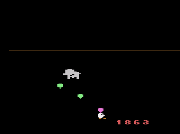
Eh, still didn’t butcher the movie as bad as Tim Burton did.
Created as part of the Atari-Disney partnership, Dumbo’s Flying Circus is a 100% completed prototype that never released. It wasn’t the only Disney game that got canned, as completed (or close enough) prototypes exist based on Donald Duck and Snow White, along with a Goofy Sports game for the Atari 5200. Sometimes, I’m completely floored when I play an unreleased Atari game. Take Saboteur, which I love. But, in the case of Dumbo’s Flying Circus, it’s not hard to see why it never saw the light of day. Like the other Disney games (see Sorcerer’s Apprentice from Part One) Dumbo was meant to be marketed to little kids. What kind of game is it? A simple flying game where you have to maneuver agilely, collecting balloons, shooting bombs, and catching clowns. Every balloon you miss lowers the ceiling more and more, until you have no room left to maneuver. Hey, that actually sounds like a great game for small children! A nice, simple concept to ease young ones into video games. So, how does Dumbo control? Heavy. Sluggish. Unresponsive. Inconsistent, too. Sometimes it feels like turning around takes longer than other times. When clowns rise up from the bottom of the screen, you’re supposed to shoot the balloon THEN swoop down and catch them, but they didn’t make a game designed with tight turning controls. You can collect the balloons manually, but you can also shoot them with (presumably) peanuts fired out of your trunk. Also, you can’t just collect the balloons that carry the clowns. But you don’t have precise controls and the targets are relatively small.
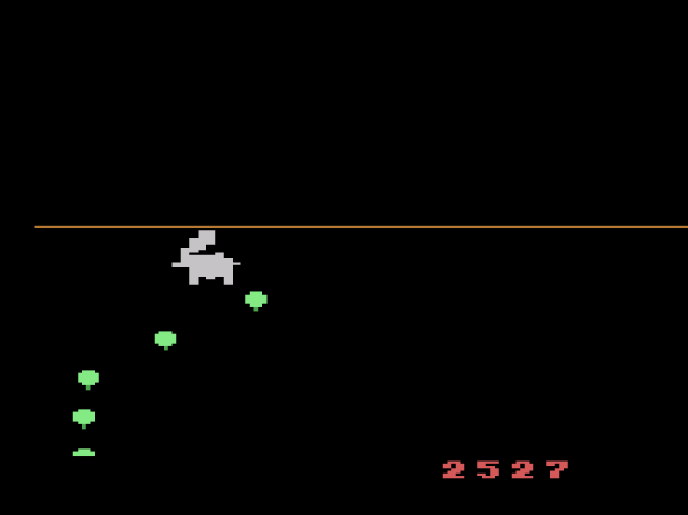
Come to think of it: the lowering of the ceiling bit is weird too. You have LIVES. That should be the fail condition. Presumably the lowering ceiling was to prevent kids from lasting forever. Oh trust me, in a game like this, they won’t last very long at all.
I guess the thought process with creating the movement physics and wet-cement-like play control was “well, it’s an elephant. It should be hard to control!” #1: That’s stupid. #2: It’s a baby elephant. #3: THAT’S THE JOKE! Elephants can’t fly! They’re big and slow! That’s why it’s a fantasy! And hey, wait.. doesn’t Dumbo fly gracefully in the film? (checks) HE DID! So then, what exactly was the inspiration for having him fly like a shopping cart with wings.. that uh.. lost its wings? Good lord, and I thought Bugs Bunny was a dumb idea in part one. A few cancelled Atari 2600 games are good enough to break your heart. This one warmed my heart. A reminder that, despite being the console that birthed Pac-Man 2600 and E.T., Atari DID have quality control at one point. I mean, not so much that a game this obviously bad wasn’t smothered in the crib, but at least it never was actually released. It shows even Atari wasn’t so soulless that they’d put this in stores and allow parents to think THIS was a quality children’s game. Dumbo is dumb, yo.
Verdict: NO!
Elevator Action
Platform: Atari 2600
Unfinished Prototype
Designed by Dan Hitchens
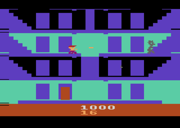
When I started this project, I told myself “no incomplete prototypes.” But, what was already done with Elevator Action was so impressive I just had to talk about it.
At only 75% complete, Elevator Action is the least finished prototype I will cover for Atari 50: The Games They Couldn’t Include. While it’s highly playable, it’s buggy as hell and has no sound or music. The jumping isn’t complete, in the sense that the game hasn’t created the actual physics for it, so as long as you hold up, you don’t come down when you jump. If you time this right, you can fly horizontally. But, if you show self-restraint, you can ignore this ability, since it was going to be coded-out of the final game anyway. What’s left is potentially one of THE great Atari 2600 arcade ports. It’s actually remarkable how this plays like the Elevator Action, which I’ve always enjoyed to begin with. All the personality is retained, and the charm too. WOW! Okay, so you don’t have to walk through doors to grab the briefcases, but hey, close enough!

This is as far as I made it. AtariProtos.com insists the elevators will eventually come to this floor, but I waited fifteen minutes and they never showed up.
It’s hard to criticize an unfinished project since you can’t know 100% for sure what the final product would have looked like. Presumably the elevators themselves would have been fixed. I’m almost certain I’ve previously tried this prototype and never even got to start the game because the first elevator never went up high enough to get me, and the two sessions I attempted here never had the elevators come and get me on the ninth floor. So I’m not rendering a verdict on Elevator Action. This is more about how I wish stuff like this COULD be included in collections like Atari 50. Do you know how many prototypes of games that never released, complete or otherwise, are out there? Go look at the list for just the Atari 2600! It’s a lot. I wish everybody could have legal access to them. Not only them, but access to unfinished prototypes of games that did release. The educational value for developers would be through the roof. Finally, I’d like to make a plea to game collectors who have gotten their hands on one-of-a-kind prototypes from this era: don’t be a hoarder. These prototypes are reaching the age where they will fail. Prototypes are not hard-wired into the ROMs. They suffer this phenomena knows as Bit Rot (read about that here). It’s rare when people are in a position to give a gift to the entire world FOREVER, but if you have a one-of-a-kind gaming prototype, you’re in that lucky position. You can either be the villain who let an irreplaceable piece of gaming history die, or you can give back to gaming for all it has given you.
Frankenstein’s Monster
Platform: Atari 2600
Year: 1983
Published by Data Age

This one hurts. Quite a lot. I try to act the tough girl, but the more I learned about Data Age, the more I started choking-up and wiping tears away. Historically bad timing, one REALLY bad management decision, and a slew of mediocre starting titles killed them right out of the starting gate. And yet, they proved they had a LOT of talent with this, one of the best games on the Atari 2600. Damnit (wipes tears) this job ain’t always fun. It’s never fun to see talent rot on the vine.
Data Age is one of the tragedies of the Crash of 1983. They had just gotten their start. I mean, their office probably still smelled like fresh paint when they debuted their opening library in October of 1982. While their initial lineup was considered wildly inconsistent, if not outright mediocre, they proved with Frankenstein’s Monster in March of 1983 that they actually had real talent, gutsy ambition, and a vision. Unfortunately, they’d already bet the farm.. and lost.. on the significantly less ambitious, but theoretically more viable Journey Escape (see below for that review). By time this came out, their backers weren’t paying up to advertise Frankenstein’s Monster, one of the very best third party games on the Atari 2600 that wasn’t by a company whose name rhymes with “Smacktivision.” This is one of the more high-concept VCS games. It’s a race against the clock as you have to zig-zag your way up and down an obstacle course to collect a brick, then return to the top floor, where that brick forms a barrier. The object of the game is to return enough bricks to form a complete barrier around the monster before the green fills his body, symbolizing him fully energizing.
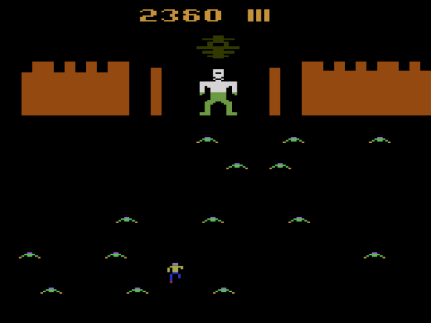
The weak link of Frankenstein’s Monster is the segment with the bats. The further you advance, the less any perceptible pattern shows itself. The bats don’t harm you, but they push you backwards. Data Age had already made Journey Escape, a game built around this concept, that just plain isn’t any fun. In Part Three, I’ll take a look at a couple more games of theirs.
Frankenstein’s Monster is perhaps the best controlling platformer on the Atari 2600. There is a learning curve to the jumping angle/physics that might take a full round or two to get the hang of. Once you do, you should be able to instinctively judge distances and know your limitations. Unlike so many VCS games, there’s no infinite gameplay loop to Frankenstein. The game ends when you build the barrier, and the challenge comes from avoiding the enemies (which stun you) and completing the game in the quickest time for a high score. There’s only one level, plus an annoying challenge that feels like it belongs in one of the SwordQuest games or something. The only knock I have on it is that it doesn’t do more. Even one more level would have been nice, especially since few Atari games do so much right: controls, collision, and a novel concept. Hell, this is even an early example of successfully incorporating horror elements. It’s not AMAZING or anything, but I kind of wish someone would remake this with more levels. The idea is dead, but.. like.. it’s Frankenstein, yo! Coming back from the dead is what it does!
Verdict: YES!
Frogger
Platform: Atari 2600
Year: 1982
Designed by Ed English
Published by Parker Bros.

I was stunned this took as good a screenshot as it did, given how much flicker this had.
Frogger was the best-selling video game ever published by Parker Bros., the 4th-highest selling Atari 2600 game, almost the best selling third party game on the VCS (coming less than 200,000 units shy of Donkey Kong’s record), and oft-cited as one of the best arcade translations on the entire platform. And.. yea, it deserves all that recognition. Frogger is (almost) always fun, and it’s so hard to botch that it became one of the best LCD games I’ve reviewed as well. With the exception of the brutal, non-stop flicker, this is pretty dang accurate. If anything, I think this might play slightly better than the arcade version, since there’s no animation in the movement. This is one of the rare times that works for you. You automatically teleport from space to space, like an LCD game. It renders any potential timing issue, including hopping on-and-off the sinking stones, a non-factor. Really, the only thing missing from the arcade version are the otters. They never really added anything to the game, anyway.
Is Frogger the best arcade translation for the Atari 2600 released during the natural lifecycle of the VCS?
Yes. Yes it is.
Verdict: YES!
Oh, but not THAT Frogger. No, the Parker Bros. one is great and the second best arcade translation on the VCS.
But, there’s actually another..
The Official Frogger
Platform: Atari 2600 – Starpath Supercharger
Year: 1982
Designed by Stephen Landrum
Published by Starpath
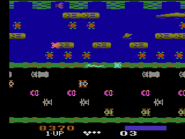
Yes, indeed.. Atari 2600 games COULD look and play this well in 1982. Whoa!!
In recent times, homebrewers.. a term I hate, so I’ll call them indie developers.. have been able to ignore the types of file size and various other limitations common to the Atari 2600. So, for example, Donkey Kong can now look and play like this. Go ahead, go try it. Neat, huh? That was cost prohibitive in 1982, unless, say.. you used a special device that worked with games stored on standard audio cassettes. In theory, such a device could store a lot more data at a lot less cost. Enter the Starpath Supercharger, which could plug into any audio tape player. The Supercharger gave the VCS an extra 6KB of RAM, which doesn’t sound like a lot, until you remember that the console only natively had 128 BYTES.
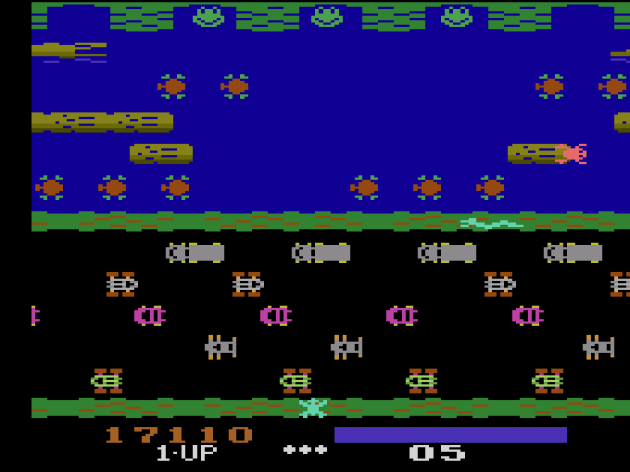
I’ll be doing more SuperCharger games in parts three and four.
With that nearly fifty-fold increase, you could do games like The Official Frogger. It still has some flicker, but it also looks terrific, plays terrific, and even adds everything missing from the also sublime Parker Bros. port. The otter? It’s back. The music? While I’m not entirely sure what Yankee Doodle has to do with a frog crossing the street, it’s back too. Plus, the graphics look much closer to the arcade original. Oh, and that LCD-like “teleport seamlessly from space-to-space” quirk that might actually make the Parker Bros. port easier than the arcade version? Even that’s here. Most importantly: Frogger is just plain fun. So is the Parker Bros. version, but this one really stands out. This is certainly the best arcade translation ever released for the VCS during its natural life cycle. It almost feels unfair to name it as such, but it’s technically accurate. As Futurama taught us, that’s the best kind of accurate.
Verdict: YES!
Frogger
Platform: Atari 5200
Year: 1983
Designed by Steve Kranish
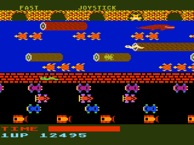
The advanced Atari 5200 is doused in gasoline and lit ablaze by an accessory that stores games on cassette tapes. And if you think THIS is a bad effort, just wait until you see Q*Bert 5200!
Frogger for the Atari 5200 makes you wonder why Atari didn’t just license the SuperCharger and call it their next generation console. This Parker Bros. port looks like a downgrade over the StarPath SuperCharger’s Frogger for the Atari 2600, and the gameplay is right there with it. Going into this port, I wondered “how exactly would you even play Frogger with a controller that doesn’t self-center?” The answer is you have to press a button BEFORE you use whatever directional controller you’re using. Wow. Yea, I mean.. that’s one way of doing it, I suppose. Parker Bros. could have made themselves the hero of Atari 5200 owners everywhere by just making a new, non-sucky controller and bundling it with the highly-desirable Frogger, which was the fourth best-selling Atari 2600 game. People wanted it. Lots of people. This port doesn’t offer much over the VCS version they did. It doesn’t even have the otter. Just the typical slow and sloppy 5200 gameplay I’ve come to expect and weirdly greenish-red graphics that IN THEORY are an upgrade over the 2600, but they’re so unpleasant to look at. Honestly, I’d rather play the 2600 Frogger.. hell, I’d rather play Coleco’s LCD Frogger, and instead drown this one in a pond next to a busy freeway.
Verdict: NO!
Ghost Manor
Platform: Atari 2600
Year: 1983
Published by Xonox

Ghost Manor and Spike’s Peak are both among the most ambitious and multi-faceted games on the Atari 2600. Each game is broken up into multiple different segments that look and play differently. I didn’t expect the people who hocked useless kitchen appliances to stoners at 3AM to be among the more ambitious Atari 2600 designers. This console keeps surprising me.
In searching through the entire Atari 2600 library, I encountered these bizarre double-ended cartridges by a company called Xonox. Who are they? Well, this is actually kind of funny. Xonox was created in 1983 as the publishing wing of K-tel, a multinational that, like so many others, lost billions in the Dot Com Bubble. K-tel makes its money today through the 200,000 songs it owns the distribution rights for. BUT, in 1983, they were the market leaders in infomercials, with their #1 earning product being.. not kidding.. the Veg-o-Matic. So, yea, even the Veg-o-Matic people saw the Atari 2600 and said “what about me?” In order to stand out in the crowded field, they created double-ended cartridges, letting consumers get two games for the price of.. well, one-and-a-half, since Xonox carts were about $15 to $20 more than average carts. Whether this was the wisest idea or not is debatable, especially considering that they’d mix-and-match the same games in different order. For example, there were FOUR carts where Ghost Manor was one of the two games. Logically, it would always be packed with one game, and the other two games would be bundled into a single configuration. This model was disastrous, and after a handful of double carts, Xonox briefly tried solo carts of the same games before it abandoned game development as the industry collapsed. The Ghost Manor/Spike’s Peak double cart was their best seller, so I figured I’d take a look at them.

According to the instruction book, the Jason-like killer is actually supposed to be a mummy. I’d accept “the grim reaper” but to me it felt like a slasher movie killer. Whatever.
Spike’s Peak is down below, but as for this game? Ghost Manor is quite ambitious, as far as Atari games go. A genre smörgåsbord consisting of four challenges that are.. less than ideally thought-out, though you can choose whether you want to be a boy recusing a girl OR a girl rescuing a boy. That’s pretty progressive for this era. In the first part, you have to play tag with a friendly ghost (or skeleton, depending on your dip switch configuration). This is a no-fail time waster. You just have to run alongside the ghost as it scurries in the same pattern across the tombstones. Once you get twenty-five “hits” doing this, you move the second section. This is a shooting gallery with a Jason Voorhees-like slasher with a hockey stick and seven targets flying back and forth across a castle. You have to avoid Jason’s hockey stick attacks and shoot down all seven targets with the twenty-five bullets you got in the graveyard. Once you shoot all the targets, you can finally shoot the slasher and move to the third challenge, which is a maze. The maze has a bar that moves back and forth, and the object is to not be crushed. It offers about zero challenge, except for the coffins. You can search the coffins to get extra points and crosses that you use to repel the vampire that bears more than a passing resemblance to Lon Cheney Sr.’s get-up in London After Midnight.
The mazes are where Ghost Manor falls completely apart, as it becomes apparently most of the game is really sloppily coded. You don’t know WHERE exactly on them you have to press up against to search them, and you have to press the fire button too. There’s a god awful ringing noise when you finally find the sweet spot, but it’s just really awfully done. It’s made even worse by the fact that you don’t even need to do this. You get a cross just by making it to the final room in general. The cross DOES wear off and the final boss is also coded badly, so it helps to have more one in the final room into a jail cell in the final room. In that final room, Lon Cheney stalks you, matching your vertical movement but just a step behind you. There’s an empty jail cell to the far right of the screen, and to win, you just have to wait for him to get close, then dash to the bottom of the screen so that you get below him, then hit the fire button and repel him into the cell. Sometimes it works, and sometimes he just clips right through the screen, eventually returning to the playfield. It’s never consistent, and I couldn’t find a specific spot where it works every time. When you finally do succeed, your partner is released and then you just have to wait for them to slowly walk to the stairs. I can’t fault Ghost Manor for trying to do more than most VCS games, but the first level is just stupid, and levels three and four are badly programmed. The shooting gallery is the best part, and it’s been done better in dozens of other games. Feel free to ghost this one.
Verdict: NO!
Halloween
Platform: Atari 2600
Year: 1983
Designed by Ed Salvo and Timothy G. Martin
Published by Wizard Video Games

A fun note about my Atari 50 marathon: I made rules for myself that I felt would help bring strengths and weaknesses of each game into a clearer focus. One of those rules is I don’t read the instruction books for any game to start. It’s my way of seeing how intuitive the gameplay is, and how self-evident the object and rules for a game are. For Halloween, I kept checking the book to make sure I wasn’t missing anything. It’s so simple.
Where do I begin with this one? There really was no Wizard Video Games. There was just Wizard Video, who movie aficionados will recognize as the distributor of such horror films as Texas Chainsaw Massacre, Zombie 2 (a VHS cover that messed me up very badly when I saw it at a young age) and I Spit on Your Grave. Wizard created a label to release two, and only two, Atari 2600 games based on movies they had distribution rights for at the time. One was Texas Chainsaw Massacre (which I’ll review in Part Three), and the other was Halloween, which they didn’t even distribute on VHS in the US. These were the first truly violent home video games, and many stores refused to carry them (in part because of shoddy packaging that might include using hand-written labels). The majority of those who did would keep the game under the counter and only let customers know they had it upon request. Without social media or a large marketing budget, how was anyone to know these even existed, especially since video game magazines weren’t very big in 1983?
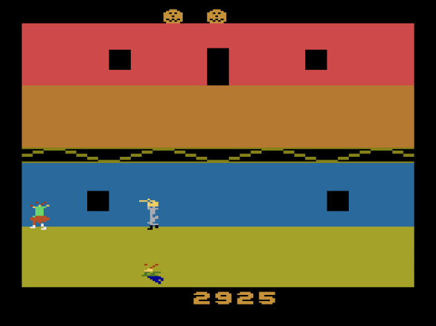
In 2023, this is tame. In 1983? It was the Big Bullsh*t Fake Outrage of the Day™, even though Halloween, along with Texas Chainsaw Massacre (reviewed below) is rated a 7 out of 10 in rarity by Atari Age. Hell, the one with a handmade label is even rarer at an 8 out of 10. In other words, almost nobody owned either game, or even knew they existed.
As far as the game goes, it’s a fairly simple point-grinder. You play as a babysitter who must locate children and escort them to either of the safe rooms, which are located on the furthest rooms on the left and right inside the house. The house is divided into two floors and two “sides” that you can move between using doors. The children will always run along the bottom of whatever floor they’re on, even when you’re guiding them. When you press the button over them, they start to follow you. The twist is that you never know when Michael Myers, complete with iconic theme, will show up, or what direction he’ll come out of. It does actually make for a chilling atmosphere, which I found genuinely impressive. Early on, I figured out that I could easily just run past him as long as I zig-zagged. If a child is in the room, Michael will always go after them first, but I could still often run right past him and keep both safe. BUT, just when I thought “well, this is too easy” I started to realize Michael had gained speed. Yep, it turns out that he gets faster every five kids, and suddenly I was doing the Scooby Doo Run. You know.. the Scooby Doo Run! Where you run one direction, then crap yourself when the monster is there and turn around and run the other? Yea, I did that a lot.

You can’t really see it here, but I’m stabbing Michael with a knife I found. It appears randomly, and it allows you to stab him for points, and he’ll also harmlessly run away if you score the hit. Two knife hits is the equivalent of rescuing five kids and levels-up the game.
So, Halloween provides genuine scares, still today, in 2023. A YES! then, right? Well, unfortunately, it only takes about five minutes worth of thinking it through to realize how absurdly clockable a game Halloween is. For example, if you’re moving left, sometimes Michael will keep coming out the right side and forcing you to double back. OR, instead of running away, you can stand close (but not too close) to the edge of a room to “tempt” Michael to come out the side closest to you, and then just sprint across to the direction you wanted to go when he does appear. You can also use the fact that Michael always goes for the child first to your advantage. If he appears when you’re nearly halfway across the room, you can just keep moving towards him. He’ll walk down at the kid, even if you’re the closer target, and you’ll both safely run right past him. This usually works even after he gains speed. And hell, you don’t lose a life or points or anything if he kills one of the kids. Since there’s no ending and the game just keeps spawning kids until you run out of lives, there’s no pressure to keep them alive. Also, sometimes it’s a chore getting the kids to follow you, so it’s fun to let Michael skewer the little bastards. Sigh. It’s almost tragic, because Halloween was this close to being the first genuinely fun survival horror game, and a title that did more to advance the genre. I thought I might like this even more so than Atari’s Haunted House, but at least Haunted House offers more things to seek out. History hasn’t been kind to Halloween 2600, and that’s not fair. It was so very, very close to winning me over.. but there’s just no stakes here.
Verdict: NO!
Journey Escape
Platform: Atari 2600
Year: 1982
Published by Data Age

The cop-looking things are “shifty-eyed managers” and the hearts are “love-crazed groupies.” Yea, this game is bonkers.
A few weeks ago, I reviewed Bally’s minigame mash-up Journey, a game with a behind the scenes story that’s memorably insane, but the game itself is just really dull. Well, that seems to be the running theme with this band and video games. Journey Escape killed ambitious start-up Data Age right out of the starting gate, and became a typical cautionary tale for a 1982 pre-crash release. Data Age, still in start-up, put-up a whopping advertising budget of $4,500,000 in 1982 dollars, which is between $13.5 to $14 million dollars today, in 2023. But, it’s even worse than it sounds. You see, despite having fewer TV channels and a lot less commercial airtime for sale, advertising got you a LOT more bang for your buck in 1982 than the same money, even adjusted for inflation, gets you today. Using the Super Bowl isn’t entirely fair, but it’s the easiest example. In 1982, a thirty-second Super Bowl spot would cost you $300,000, give or take, which is about $900K to $1,000,000 in 2023. But, for Super Bowl LVII in 2023, that same amount of time costs $6M – $7M. Print ads were cheaper. Magazine ads. So, that $4,500,000 budget, for a game publisher’s very first ever release? Kind of nuts. Granted, Journey was hot at the time, but Data Age should have been focused on establishing their brand, so that consumers understood they were making games for the Atari console.

See the little Kool-Aid Man looking thing? It’s really the “Mighty Manager” and it’s the most over-powered item on the Atari 2600, because it allows you to run through every single obstacle without losing points or being pushed backwards. How long? For the rest of the stage. Wha? I’d say that it would make more sense if there was a temporary version of it, BUT THERE IS! These little green aliens (that are supposed to be roadies) do that. Weird.
Then you get to the game, which has been historically lambasted, but.. it’s not THAT bad, people. Sure, a big part of my entertainment came from reading the instruction book at AtariMania. The idea is you have to navigate all five band members to the band’s spaceship, but along the way, there’s four types of obstacles that you will bump into. Scoring is interesting: you start with $50,000 and every time you collide with something, you lose money. It’s where the game makes the band sound like they have some kind of persecution complex. Run into a shifty eyed promoter? $2,000. The flashbulbs of the paparazzi? $600 to “secure the negatives.” I swear to God, the instructions say that. Run into a love-crazed groupie? It costs you $300, which is presumably the cost of a visit to a walk-in clinic and a bottle of antibiotics. You know, in 1982 dollars. While I had fun cracking-up my family saying “oh sh*t, watch out! That one has syphilis!” honestly Journey is really very empty on gameplay. You just dodge out of the way of things that fly onto the screen in different patterns. If you touch them, you lose money and get pushed back. You have to scroll the screen upwards and touch your spaceship before time runs out. It’s kind of like Frogger without parameters, and while it’s not an abomination or anything, it gets dull fast. It’s especially weird that the game only has one challenge element, and there’s an item that eliminates that lets you just skip all that for the length of a level. $4,500,000 to advertise such a nothing game, which is especially painful given that they had the high concept Frankenstein’s Monster releasing roughly four months later. Huh. Yea, I can’t imagine how the bottom fell out of the game industry in 1983.
Verdict: NO!
Joust
Platform: Atari 2600
Year: 1983
Designed by Kevin Osborn and Mike Feinstein

It looks the part, but like so many conversions on the Atari 2600, Joust is missing the little idiosyncrasies that ultimately make the game work.
I’ve never been the biggest Joust fan. Of course, I said that in my Vs. Balloon Fight review and I gave that a YES! so, hey, nobody can accuse me of being close-minded. I was even open to liking this Atari 2600 version. I wanted to. Joust is charming. Flying ostriches and fencing lances and pterodactyls, all taking place on top of lava? I kind of hate myself for not enjoying the arcade version. The Atari 2600 I have no such problem with. The object is to come crashing down an opponent. In the coin-op, you have to have sufficient height, or your bird squeals as you clank into each other. Here, there’s no clanking. If you and an enemy hit each other in the front, one of you is dying. It dramatically changes the dynamic of Joust and takes all the intensity out of it. In this formula, the most nail-biting, exhilarating moments are where you and an enemy are bouncing off each-other, each jockeying for position. Remove that, and it just becomes tag with birds. I got a chuckle out of how the eggs fly through the sky like feathers, but Joust for the 2600 is just awful.
Verdict: NO!
Joust
Platform: Atari 5200
Year: 1983

Yep, that sure is Joust alright.
One thing about being a good video game critic is you have to be open to the possibility of liking any game, but totally honest when a competent game just doesn’t “do it” for you. That’s the case with Joust in general for me. I don’t get it. I don’t think it’s fun at all. And yes, I’ve played it two players and tried to kill my partner with it. It’s funny the first time you betray them, but less funny once you both expect it. If you’re both trying to kill each-other, the game will inevitably devolve into both of you flying at the top of the screen, bouncing off of each-other, waiting for one or the other to get tired. At least Balloon Fight has different arenas. Joust becomes a grind to play, but if you do like it, the Atari 5200 port seems decent enough. Yes, you clank this time. Yes, the birds screech in pain when you do. Yes, you can kill the pterodactyl just like in arcades (if anything, I think it’s much easier).

This is one of those “fundamentally different” moments, since the eggs don’t work like they do in arcades.
Actually, it’s not entirely perfect, as the eggs just hatch into combat-ready enemies instead of soldiers who have to wait for their mounts, giving you a few seconds to pick them off. Oh, and flying requires a lot less button mashing than the arcade game does, and it might actually shoot the moon and becomes too floaty. The timing never felt right to me, and I found myself overshooting enemies. When playing the arcade game, there were many instances where I could just walk off a ledge and crash down on an enemy, and I could flap once to overcome any timing issues on my part. That wasn’t the case here. Flapping once just launched me too high. Not that any of this would have mattered. I gave the arcade version of Joust a NO! and, having just played it again to check this version’s physics over the arcade one, I still don’t like it. If you were a BIG Joust fan in 1983 and owned an Atari 5200, lucky you. You got a decent enough port of an overrated game that I’ve never understood the appeal of.
Verdict: NO!
Joust
Platform: Atari 7800
Year: 1986

If the 5200 is the “everything is Eye-Sore Red and Sickly Green” Console, the Atari 7800 is “Graphics that Bleed Into Each-Other” console. It’s not that it’s bad looking, but colors just feel like they overlap too much. I don’t know how else to put it.
Joust for the 7800 is basically an arcade-accurate port with ugly graphics. Take all the improvements that Atari 5200 version added over the Atari 2600 version, and add the “eggs hatch into soldiers” bit where you still have a chance to kill them if you can beat their mount to the hatchling. So, that part is nice. There’s also more classes of enemies. And yes, you can kill the pterodactyl. I actually forgot to check to make sure you could, so I went back and scored one final highlight for this feature: killing three pterodactyls in a six-second span. My Dad was watching and the two of us exploded in jubilation. Too bad the rest of the game just isn’t that fun. Joust just isn’t a game I’ll ever get, and I’ve now played enough versions across enough platforms to know that it’s just not for me, so take this review with a grain of salt because I just find the format boring. The setting, theme, and larger levels barely saved Vs. Balloon Fight for me, but that won’t take here. It’s just not interesting enough. Also, the light flapping is back from the 5200 version, but actually, I don’t think it’s that bad here, which makes Joust 7800 probably the best version of Joust I’ve ever played. If this version didn’t get a YES! it’s unlikely any version will. But hey, my fingers are crossed for the NES port!
Verdict: NO!
Jungle Hunt
Platform: Atari 2600
Year: 1983
Designed by John Allred and Michael Feinstein

Weeeeeeeeeeeeeeeeeeeeeeeeeeeeeeeeeeeee!
Originally called Jungle King in arcades and based on Tarzan, at least until Taito got a cease and desist order, the rechristened Jungle Hunt is one of the more impressive arcade translations for the Atari 2600. It looks great, considering all the limitations. It plays pretty similar to the arcade version. There’s no missing elements, with only a minor alteration to the fourth segment’s structure, where instead of jumping over two.. um.. less than politically correct enemies, you have to jump over one at a time. Besides that, probably the most notable alteration is that the boulder-dodging section takes place on a flat surface instead of running up a hill. The game also dumps straight from one level to the next, with no victory animations between them. You can’t even say the charm has been stripped out, because Taito already removed things like the Tarzan yell to avoid a lawsuit. No, this is a really accurate take on the arcade experience.
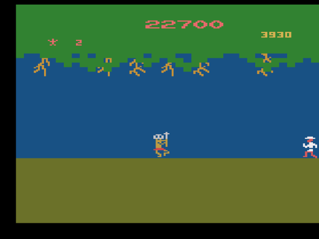
Alright, let’s talk about the racism. It was 1983, and Jungle Hunt had explorer theme.. in a jungle setting.. and.. this sort of feels inevitable, doesn’t it? But, you know what? It actually makes me really proud. Just forty years later, and stuff like this rightfully wouldn’t fly in 2023. That’s cultural progress you can measure, without any ambiguity.
But.. to be honest, I don’t think Jungle Hunt is all that. I didn’t like the arcade game, and so being accurate to that isn’t going to help it all that much here. And that’s not to mention the Atari 2600 version being significantly easier. After one cycle, the boulder section becomes difficult, to the point that the ability to duck seems functionally useless. But, the rope swinging section is completely nerfed, and I never came close to dying in the swimming section or the final challenge, where the.. stereotypes.. don’t even raise their spears up like they do in the arcade game, which eliminates the entire challenge. Look, don’t get wrong: Jungle Hunt had big fans in 1983, and I’m really happy for them that they had such a surprisingly accurate.. and even good looking.. Atari 2600 port. But, this is about the test of time, and Jungle Hunt didn’t stand a chance at it. Games today do all these same elements together, in single stages. What was innovative in the early 80s is old hat now.
Verdict: NO!
Jungle Hunt
Platform: Atari 5200
Year: 1983
Designed by Alan Merrell
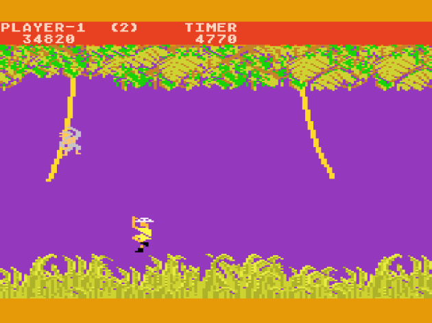
The monkey is like “hey, weren’t you Tarzan a few months ago?” And the explorer is like “bruh, it’s a long story.”
Golly. I know I sound like a broken record but the Atari 5200 is SLOW. I don’t even like Jungle Hunt, but each of the four segments have a precise rhythm to them. Well, three of the four. The swimming section feels like it belongs to an entirely different game. The other three challenges are leaping-based, and they suck here. I mean.. they suck in the arcade game too. Why would you be able to fly so far forward when the vine is swinging backwards? I feel like Newton would have an aneurysm seeing someone play Jungle Hunt. But, stupid as that is, there IS a beat to it, and the 5200 port feels like it doesn’t quite get it. Is it fun? Well, not really, because the original arcade version isn’t that fun. I seriously don’t get how anyone in 2023 can say this is still fun. It’s just so limited.
But, while I might not like Jungle Hunt in arcades, at least it zips on by at a lightning pace. You can’t say that about the Atari 5200 version. It’s just not possible to get into a rhythm. It’s slow, but not consistently so. It feels clunky. Oh, and after one cycle of levels, you have to deal with monkeys on the vines, and the timing of when to let go of the vine to go to the next becomes especially fickle. Even when I used rewind, it sure seemed like jumping from different segments still took me to the exact same spot that was killing me. Sigh. Well, at least you can duck the boulders on stage 3, and hey, sometimes it even works! Sometimes. Most of the time you still die even if the boulder doesn’t look like it touches you. I suppose if someone were a huge fan of Jungle Hunt in 1983 and somehow wouldn’t get bored playing it after like ten minutes, this is a port they could sink their teeth into. It’s close to the coin-op, only unclockable. Maybe in that sense it makes it more interesting than the real deal . I guess. I mean.. feels like a stretch to say that. That’s really the Atari 5200 experience in a nutshell: being forced to gaslight yourself into believing you’re better off with it.
Verdict: NO!
Kangaroo
Platform: Atari 2600
Year: 1983
Designed by Kevin Osborn
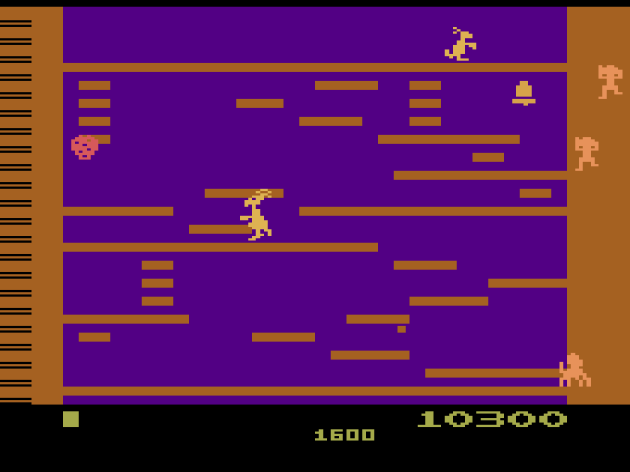
The new third stage. It’s such a simple looking game, isn’t it? In comparison, remember Jungle Hunt for the Atari 2600 from above? It released on the exact same day as this, and it looks great! This looks like someone won a minimalism bet.
Having just reviewed the coin-op Kangaroo, I’ll say that the Atari 2600 game isn’t a completely awful approximation of the arcade experience. I mean.. the Atari game sucks, but the original game sucks, so there really wasn’t all that much to lose in translation. On the VCS, the first two levels from the arcade game carry over. The stage where you punch the stack of monkeys is not here, nor is the ladder maze fourth stage. To Kevin Osborn’s credit, he designed an original third stage. Unfortunately, it’s just as nonsensical as the second stage. Broken ladders? Ladders that don’t go anywhere? Huh, why, that’s something Donkey Kong did too! Actually, in fairness, Kangaroo 2600 is probably better than Donkey Kong 2600, but only barely so. This port comes with its own problems. After two complete cycles, the enemy projectiles rain down on the ladder you need to climb up so frequently I’m not even sure how I’d get past them. Even after rewinding multiple times and trying to “lure” the fruit away, I couldn’t do it. Regardless of that, Kangaroo just plain isn’t fun. It’s simple and lacks what little minuscule charm the coin-op had.
Verdict: NO!
Kangaroo
Platform: Atari 5200
Year: 1983
Well, the monkey stack level is back. So, Kangaroo 5200 at least replicates all four levels from the arcade version. The jumping physics are completely different. You don’t get the height you used to get, so now you have to get right up to edges to jump over even small gaps. Weirdly, you still have to press UP to jump instead of a button. There’s seriously like fifty buttons on the crappy Atari 5200 controller and you still have to press a direction to leap. That’s Bill Laimbeer’s Combat Basketball levels of objectively stupid design. Otherwise, eh, this isn’t far off from the janky arcade game. The monkey stack is more frustrating to deal with. The already fickle collision is even worse. I’ll give Kangaroo this: it makes a better Atari 5200 game than an arcade game. The arcade game is, frankly, stunning in how haphazardly designed it was. You expect that from home games from this era, but not from coin-ops. There’s probably a good game buried in Kangaroo somewhere. It’d make a good candidate for a modern remake, as long as someone.. you know.. took the time to design levels that don’t make you stare blankly at the screen and wonder what they were thinking when they came up with these layouts.
Verdict: NO!
Kool-Aid Man
Platform: Atari 2600
Year: 1983
Designed by Steve Tatsumi & Jane Terjung
Published by Mattel
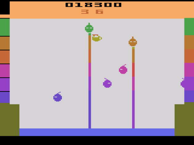
Despite being developed and published by Mattel, this has no relationship with the Intellivsion game that looks more like a Keystone Kapers ripoff.
I had to stop and think really, really hard if I’ve ever even drank Kool-Aid. I don’t think I have, but, when I was a very little kid.. like, four or five years old.. my Dad brought home popsicle molds and a thing of Kool-Aid mix, hyping-up that me and him were going to make home made popsicles! Yes, I have a cool Dad. The best. I’m very lucky, but, I wasn’t so lucky that night. I spent the rest of the day waiting.. FOR HOURS.. staring at the freezer, with all the anticipation of a birthday and Christmas morning rolled into one, bugging the poor bastard every two or three minutes with “are they done yet?” When they finally were, the end result was so bland. I distinctly remember him making a face like “that doesn’t seem right” and chomping the concoction and finally sighing, “I think it needed more sugar.. or less water.” It turns out it was less water, as you don’t make the popsicles the same way you do the beverage. Dad, still being awesome, said “how about we go out and get some ice cream, Ninita (little girl)?”

They made a Kool-Aid Man game that doesn’t involve crashing through walls? Seriously?
That had NOTHING to do with the Kool-Aid Man game, but hey, you try to make an interesting review out of this thing. It’s a really simply premise: you’re a pitcher of Kool Aid who must stop enemies from drinking all the water out of a what’s supposed to be a swimming pool. Yea, that’s exactly the water source myself and everybody else wants to create their sugar water out of. I say let the enemies win, and if they don’t get sick from drinking sweat and piss, the chlorine will give them bowel cancer. But, the game doesn’t let you win that way. You have to avoid the enemies when they’re just traffic, but when they stop to drop their straw, you can touch them to eliminate them. If they touch you, or notably, you go ricocheting around the playfield and need a few seconds to regain control. This also happens if you touch the wall or ceiling, and whatever the case is, any enemies you hit while bouncing around out of control add to the length you have to wait to regain the controls. The game ends when they empty the pool. You can turn the pitcher into Kool-Aid Man by grabbing one of three ingredients (Kool-Aid Mix, Sugar, or Water) that fly in from the sides. It’s honestly not the worst premise and can’t make for some exciting close calls, especially when you get stuck bouncing around the playfield for ten or more seconds. I figured I’d play this for fifteen minutes, and then next thing I knew, an hour had passed, and I never got bored. This might be one of the biggest shockers of my Atari run so far. I’m stunned. Truly.
Verdict: (Breaks through a Wall) OH YEA! (That would be a YES!)
Lock ‘n’ Chase
Platform: Atari 2600
Year: 1982
Designed by Bruce Pedersen
Published by Mattel Electronic

One thing I appreciate about Lock ‘n’ Chase is there’s no blinking or slowdown. It’s as smooth as butter. Too bad it’s not a better game.
In the wake of Pac-Man, Lock ‘n Chase was one of the most well known copy-cats. It’s basically the same concept: you, a maze, four chasers, dots to collect, bonuses in the center, and exits where you go through one side and pop out the other. As far as coattail riders go, this one is uncomfortably close. As always, there’s a couple twists. The most notable one is that you can put up a couple temporary barriers to help yourself scratch-out distance between you and the chasers. I never really got them to work quite the way I wanted them to and just as often killed myself trying to utilize them. The more significant change was that, as far as I could tell, there’s no way to defeat the enemies. I’m of the opinion that maze chases need the pursuit to be the best part, and that turning the tables on enemies is a nice extra, but not necessary as long as the chase is fun. Lock ‘n’ Chase tested my certainty on that, because it almost seems fine, but it’s just not fun. I think the problem is the maze is just not excitingly designed. It’s a dull layout that doesn’t lend itself to the close calls that are the hallmark of a great maze chase. Lock ‘n’ Chase is probably one of the Atari 2600’s better examples of this genre, and I’m sure it was a lot better in 1982, but it certainly doesn’t hold up to the test of time.
Verdict: NO!
Mario Bros.
Platform: Atari 2600
Year: 1983
Designed by Dan Hitchens

I’m sounding like a broken record in Part Two, but again: so many games LOOK the part, but it’s the idiosyncrasies that make the game that they’re missing.
I’ve met a lot of people who consider Mario Bros. 2600 a strong effort. But, saying this does the absolute bare minimum to qualify as an adaption of the 1983 Nintendo coin-op is an understatement. It has the four enemies and their relative behavior correctly, and it has the sliding movement that annoyed me enough to not like the arcade game at all, so go figure, that’s the one aspect they kept. What’s missing is the nuances of the bumping attacks. There’s no horizontal momentum. When you do a bump, the enemies are just stunned in place. They don’t fly off to the left or right if you angle it, like in the arcade game. That’s the fun part. The cartoonish, almost slapstick action. That’s completely gone, which means you ALWAYS have to jump onto the platform they’re on. Without the ultra-satisfying “hit an enemy at an angle so it flies off the ledge and you eliminate it before it even lands” combat, what else does Mario Bros. have going for it? Co-op where you can actually work against the other player? So what? The combat is so stripped down and reduced that it virtually renders Mario Bros. 2600 an LCD game with animation.

I didn’t get a chance to play this co-op. I’m certain it wouldn’t have changed the verdict. This is a terrible game.
It’s missing other aspects too. Like being able to dodge and defend yourself against the fireballs. Instead of bouncing around, the fireballs are large and travel in a straight-line down channels. You can’t destroy them with a bump, and since they don’t wiggle up and down, you can’t avoid them unless you’re dead-center in the middle channel and jump over them. Since angled bumps are gone and you have to directly kick the enemies to eliminate them, you’re often left at the mercy of the randomly-spawning fireballs, which can prevent you from being able to bump and attack the enemies. The best thing I can say about it is that it’s just accurate enough to feel like an official product, and not a cheap knock-off. But, while I personally might not be the biggest Mario Bros. fan, it just feels like everything someone who is a fan could adore about it is not here. The personality. The charm. The satisfaction of taking out enemies in one fluid motion. I can’t believe this has fans, apparently on the basis that the core gameplay is retained. With everything that IS missing from the coin-op, ask yourselves: is this REALLY the gameplay you loved so much? Really?
Verdict: NO!
Mario Bros.
Platform: Atari 5200
Year: 1984
Designed by Bob Merrell
Hooooo boy! WOW! Where do I begin with Mario Bros. 5200? Easily one of the most inept ports I’ve ever experienced. It’s ugly. SO very, very ugly. The movement feels skippy, even by the standards of the Atari 5200. But, the combat is where this version of Mario Bros. suffers the most. At first, I was like “hey, look at that: you can boink enemies at an angle so they come right to you on a lower floor!” That probably would have been enough for me to call Mario Bros. 2600 a decent port. I mean, I’d of likely still given it a NO! because I think Mario Bros. is really boring in general. Seriously, it and Joust are the two Golden Age of Arcades I just don’t get the reverence for. They suck. But, suck as they might, they still had fans, and this chick is heartbroken for Mario Bros. fans who thought the Atari 5200 would give them a close approximation to the arcade experience. Movement is always bad, and oddly, often has the ice-based sliding regardless of whether the ice monster freezes a platform or not. IN FACT, I could swear I was less likely to slide once one of them fully melted and froze the ground.

After you move past the first color scheme, this weird midnight lightning lingers for the rest of the game. Also, I didn’t edit this. You really do become a cross of Cyndi Lauper and Albert Einstein if you get hit by a fireball.
The bumping physics are the worse I’ve ever seen in any Mario Bros. port, including the Atari 2600 version. The VCS version has no movement when you bump, but at least bumping fundamentally works and is predictable. In this build, sometimes the enemies fly the wrong direction. Sometimes I’d bump right under an enemy, even the non-bouncing ones, and nothing would happen. And, when I say “nothing would happen” I mean NOTHING! Not even the graphics of the floor curling up. Mario Bros. 5200 feels like an early beta build. The flies are the worst. They seem to have a very small collision box when you go to bump them from underneath, and a small window of when you actually can, regardless of whether they appear to have their body planted on the platform or not. Had the Atari 5200 been more popular, I could actually see a scenario where this game takes its place alongside E.T. and Pac-Man as a commonly-cited cause of the 1983 video game crash. Because this, ladies and gentlemen, is as bad as it gets. One of the worst arcade ports I’ve ever seen. Absolutely horrible and a genuine contender for the worst video game ever made.
Verdict: NO!
Mario Bros.
Platform: Atari 7800
Year: 1988

Nope. Still not right, Atari. Someone give them another 8 bits and maybe they’ll finally be in the ballpark.
Three tries. That’s how many Atari had to get a halfway decent version of Mario Bros. up and running. Three tries, one of which unfortunate early 80s children had to convince themselves was good enough, but really, none of them were even close. Mario Bros. for the 7800 is by far the worst game of Nintendo’s Atari 7800 trilogy. It looks like it could be fine, but the jumping is all wrong, and the bumping has something horribly off about it too. Angled bumps feel like you have to hit too far away from the enemy. To give y’all a peek behind the scenes, I actually jumped back-and-forth between MAME and various Atari emulators in the making of this feature. For Mario Bros., I could feel something was horribly off, but I had trouble figuring it out. The bump angle is better than the Atari 5200, but not consistent, especially as you get near the edges of ledges, where the. Assuming you don’t just clip right through the edge of the damn thing, like this:

This is going up, not coming down. The rewind thing is because I had to make sure I got the screenshot at the exact right moment.
That’s even worse than the NES version, which was pretty bad. I went back and tried to do that on the arcade version. There, while you CAN clip through the edges, you practically have to try to do it. THAT is Ice Climber levels of bad, and shameful. I’m not completely done with Mario Bros. At some point in 2023, I’ll be doing Nintendo Black Boxes: The Definitive Review (yes, really) and that means giving the OG Mario Bros. one final “please God, never again” play-through. I can like this formula, or something close to it. My review of Mario Clash hopefully proved that once and for all, especially since that game has more issues than Sports Illustrated. I’d like to see more of this. With the cast of Mario characters now, plus bigger gaming screens and more powerful consoles, you could probably make a rockin’ four player co-op Mario Bros. The OG Mario Bros. at its very best, the arcade version, doesn’t hold up to the test of time. Clunky or otherwise, the 7800 sure can’t.
Verdict: NO!
Mouse Trap
Platform: Atari 2600
Year: 1981
Designed by Henry C. Will IV and Sylvia Day
Published by Coleco

This would probably be an excellent way to introduce young children to maze chases. Like.. really young. Like.. maybe right after they speak their first words.
Mouse Trap comes with a reputation of being one of the Atari 2600’s best maze chases, and I don’t get it at all. It’s the typical Pac-Man-like “rack up dots” game with a pair of twists, and the best thing I can say about it is that this is one of the better jobs of merging two functions into one button on the Atari 2600. There’s gates scattered throughout the maze, and there’s Xs that are supposed to represent dog bones. By holding the action button next to a gate, you open it and change the shape of the maze. The whole maze, and not just the individual gate. Tapping the button uses one of the dog bones you’ve collected and turns the mouse into a dog, effectively a power pellet that allows you to eat the cats. It sounds fine, but there’s only one maze, and it’s completely lacking in tension. Even with the difficulty adjusted to make the cats faster and smarter, they still posed no threat. Why? (1) There’s only three of them. (2) There’s four dog bones every round. (4) You bank the dog bones, to use whenever you need. I’ve never played a maze chase where the overwhelming advantage belongs to the player as much as Mouse Trap 2600. Consequently, it just isn’t fun at all. It’s fish in a barrel. It also doesn’t come remotely close to the complicated Mouse Trap arcade game, which had three different colors of gates and a lot more grit. This isn’t a port so much as a full-frontal lobotomy of it.
Verdict: NO!
Mr. Do!
Platform: Atari 2600
Year: 1983
Designed by Ed English
Published by Coleco

This is a very flicker-heavy game. Come to think of it, they should have come up with some kind of marketing gimmick with the flicker in Atari games. “Mr. Do! presented in FLICKERVISION™!” Also, the remaining lives look like sperm. I know they’re supposed to be Mr. Do’s head, but.. no, they’re just sperm. I mean, I’m not using all that much imagination with this one.
An adaption of that game that people remember as “the one that’s like Dig Dug but kind of like Pac-Man too, but mostly Dig Dug. Like, 80% Dig Dug.. maybe 85% if I’m being honest.” Just like Dig Dug, the VCS port seems okay on the surface, until you realize all the little idiosyncrasies that made the arcade game really fun are completely gone. Unlike the Atari 2600 Dig Dug port, this didn’t even get the digging aspect right. One of the fun parts of coin-op are those little bits of wall left over as you tunnel through the playfield, creating a path that enemies have to follow. Well, that’s gone here. The entire square of soil disappears in the VCS port, which completely changes the game’s pursuit dynamic and makes it.. well.. boring. There’s also only two enemies chasing you, but given that the fundamental nature of the chase was lost in translation, that might be a good thing. I admire that this has a lot more levels than the average arcade port to the VCS did, cleverly extended by mirroring levels. But, with the way it’s set up, especially with the enemy that eats through the dirt, this is just not fun. Mr. Do! is often cited as a good port, too, presumably because it retains the DO-RE-ME music when you get the fruit. BUT, even that’s been reduced from bunches of eight to bunches of six. Mr. Do! 2600 is lacking everything that made the arcade version work, and worst of all, what’s left isn’t even charming.
Verdict: NO!
Pole Position
Platform: Atari 2600
Year: 1983
Designed by Doug Macrae

Better than I expected. A LOT better than I expected. But, my retro reviews aren’t about that. They’re about the test of time.
For those who think I hunt these games for sport, trust me, I don’t. In fact, I feel pretty awful doing this review. If I had know zero about the Atari 2600 but retained all my arcade knowledge, and you provided me with a list of coin-op translations on the platform, I might have guessed Pole Position would be the one that suffered the most in the journey home. Before I fired this up, I predicted “there’s no way the sense of speed was retained. None” But, it’s actually here. In fact, the feeling that you’re in a car that’s zooming down a track is so strong that I was genuinely stunned. Completely, utterly stunned. It’s also really kind of smart how they handled having only one button: the gas is just automatic. Yea, really. Up and down shift gears, while the action button handles the breaks, and as my Dad said, “maybe that’s a smart idea, since you actually remembered there was a break and you could use it. There really is a first time for everything!” He’s such a delight. It’s a really impressive technical feat. Pole Position 2600 IS missing the billboards that you crash into if you go off the road, and the rival cars are ugly yellow.. things, but this looks and even feels like the arcade Pole Position. I couldn’t believe what I was seeing. It was one of the biggest surprises of this entire Atari project I’m doing.

I’m not sure what you’re racing, exactly. Kind of looks like.. a crown? I think it’s a crown.
And I have to give it a NO! anyway. I feel like a complete bitch for it, but I have to. The Atari 2600 version of Pole Position is just not fun. Like the original Pole Position, there’s only one track. So, the entire experience is one course that you do the qualifying lap and then the race. There’s also no difficulty options, so what you see is entirely what you get. As technically impressive as I found it to be, the gameplay is too limited, too shallow, and it’s missing the charm of playing with a steering wheel, pedals, and a gear shift. I have a fond memory of my Dad and me climbing into the cockpit of Pole Position II at a pizzeria, and him letting me handle the steering while he did all the complicated stuff. I’d drive us to our death over and over until time ran out, giggling my sadistic ass off. I made the car go boom. I made it go boom VERY good. Well, that experience is lost in translation. The home version is just a very bland racer, and my review format that is asking if a game is fun, on its own merit, in 2023. I’m going to be honest: even if they were a HUGE Pole Position fan, I think the average Atari-owning child of 1983 would have had buyer’s remorse about twenty minutes after booting this up for the first time. It’s just done too quick, with nothing else to offer except challenging for a high score in an arcade port that’s missing everything that makes Pole Position.. well, Pole Position!
Verdict: NO!
Pole Position
Platform: Atari 5200
Year: 1983
Designed by Doug Macrae
I have a slight conundrum with these racing reviews. See, in theory, I think I COULD review them with a steering wheel. I think. I didn’t actually try it, because I didn’t want to go through the process of configuring it. But, since steering wheels wouldn’t be part of a hypothetical collection, I decided against it.
Really, everything that I said about the Atari 2600 version of Pole Position could apply to this version. There’s more traffic, so you could encounter up to three cars at once, adding some challenge. And hey, the billboards are back, so there’s one more thing you can crash into. I mean, the traffic lacks smoothness, which makes judging the distance between the cars a pain in the ass. And no, that’s not a positive, because you’re trying to guess how the game will mess up, which doesn’t feel like it’s in the spirit of the game itself. But, yea, this is Pole Position. Except, it’s missing the charm. This is NOT a game you can bring home. At least the original one. In Part Three of The Games They Couldn’t Include, I’ll be looking at Pole Position II, which at least has more than one track. In 1983, Pole Position would have been fun to sit down inside of, pop a quarter in it.. maybe twice.. and then walk away a satisfied arcade-goer. I can’t imagine wanting to bring it, of all games, home. I get why Atari did. It’s one of the highest-earning arcade games ever. It was popular enough to get a loosely-based cartoon series. But, without the steering wheel, gear shift, and pedals, what’s the point?
Verdict: NO!
Popeye
Platform: Atari 2600
Year: 1983
Designed by Joseph Gaucher
Published by Parker Bros.
Oh Popeye. What have they done to you?
I’m just a few weeks removed from my love letter to Popeye. I adore Nintendo’s Popeye, but I didn’t always. It grew on me, like a benign tumor that toots on a corncob pipe. It’s not like, say, Defender, my favorite Golden Age game that I discovered around the age of 11 (so circa roughly 2000, 2001, somewhere in there, via Williams Arcade’s Greatest Hits) where it was love at first sight. Popeye I felt was okay, but too short at three levels. I didn’t have the experience with maze chases or Golden Age games in general to appreciate that it did things other chase-based games don’t do. Or, if they try to, they do it wrong. Random item placement? Popeye gets that right through the floating/drifting items raining down on the playfield. One single pursuer? Popeye UNIQUELY gets it right through the balanced-but-relentless Bluto. Play-fields optimized for close encounters and nail-biting near misses? Maybe it only has three levels, but those levels are nearly perfect. Playing Popeye is like meeting someone who is secretly a genius, but hides it because they just want to blend in with their peers. The more you get to know them, the more you see that underlining, breathtaking intelligence that leaves you wondering why they’re not doing more with their existence?

The second stage is where it feels like the fun was surgically removed from Popeye. The way the basement is set up, with two teeter-totters, two staircases with the base being near the center the of the screen, no screen wrap-around, and no ladders removes the balance in the chase and gives the overwhelming advantage to Bluto.
Well, there was no way that such a layered, nuanced game was going to carry over its hidden intelligence in a 1983 port by Parker Brothers. A game that they only got because, frankly, Coleco and Atari didn’t want to pay the licensing fee to King Syndicate. Now, Parker Bros. had established their bonafides with Frogger, which is the best arcade translation on the VCS that isn’t housed in a cassette tape. But, let’s face it, the degree of difficulty in translating Frogger was minimum. Cross-the-road is a genre that even LCDs can absolutely nail (and in fact, Coleco’s Frogger is a contender for best LCD ever). Popeye, a complicated maze chase viewed from the side instead of above, was never happening. MAYBE. I mean, maybe it could have with better level design. The first level is as close to the first level of the arcade game as you can get, and while the projectiles coming at you being barely-visible orange dots was annoying, and the behavior of the falling hearts had this uncanny valley “something is wrong” vibe about it, it’s still distinctly the arcade Popeye. “Hey, this may not be too bad.” Then you get to the second level, where the layout is just all wrong. Completely, totally wrong, and it turns over the advantage too much to Bluto.

I was stunned all three levels were represented, though the moving platform seems to be missing. There’s this weird flashing thing where it should be, but I never had a problem crossing over it. Oh, and the buzzard. The buzzard is missing.
You see, the dirty little secret about maze chase games is that the player must always have the advantage over the chasers, and the trick is masking that advantage to look like a disadvantage. But, on the second level’s basement, Bluto has your number. The ladders from the arcade game are completely gone, replaced with two staircases. The base of those staircases are closer to the middle of the screen, and there’s no wrap-around. Once you get to the basement, if you’ve already used the spinach (and that’s assuming it will even appear on the side of the screen you’re on), you have no means to escape Bluto since you have to run to the center. Now, he’s dumb in this version, so he might walk right up to you and turn around. That happened to me once. But, if you allow the notes to slip to the basement too soon, you’re going to lose a life. Either Bluto will block your means to get them and you’ll die from timing-out, or he’ll just rush you. Oh, and after one level cycle, Bluto throws his bottles so fast and your PITIFUL punch animation is so slow to reset that, if he’s less than half the screen away from you, it’s impossible to time punching all three. Eventually one will get through while you wait to pull your arm back. Popeye never stood at chance on the Atari 2600, but I didn’t expect it to be THIS bad. Because, folks, this is BAD!
Verdict: NO!
Popeye
Platform: Atari 5200
Year: 1983
Published by Parker Bros.
Well, blow me down! The 5200 version of Popeye is so close to being true to the arcade original that it can taste the it. The level layouts are accurate. The bucket gag is back in the first level, Wimpy and Swee’Pea are in the second level, and the moving platform and the buzzard return to the third level. It lacks the cartoonish personality of the arcade port, but hell, so does the NES version! So, what’s the problem? Well, you might want to hold onto something when I lay down this mind-shattering revelation: Popeye on the Atari 5200 is.. get this.. SLOW! I know, right? The stuff Olive Oyl throws down to you can linger on a single floor for quite a while, removing the urgency. Plus, Bluto has been completely nerfed. He’s incredibly easy to outwit, and so the game lacks the type of intensity it needs to work. Popeye works in arcades because of a constant sense of urgency that this port is devoid of. Consequently, it has no tension. I’m grateful that Popeye 5200 exists, because it shows me what a minor miracle the arcade version is. Sometimes, the gap between masterpiece and boring slog isn’t as big as you’d think. Popeye 5200 looks the part, but is just wrong enough to turn an all-time classic into a chore.
Verdict: NO!
Q*Bert
Platform: Atari 2600
Year: 1982
Designed by Dave Hampton
Published by Parker Bros.
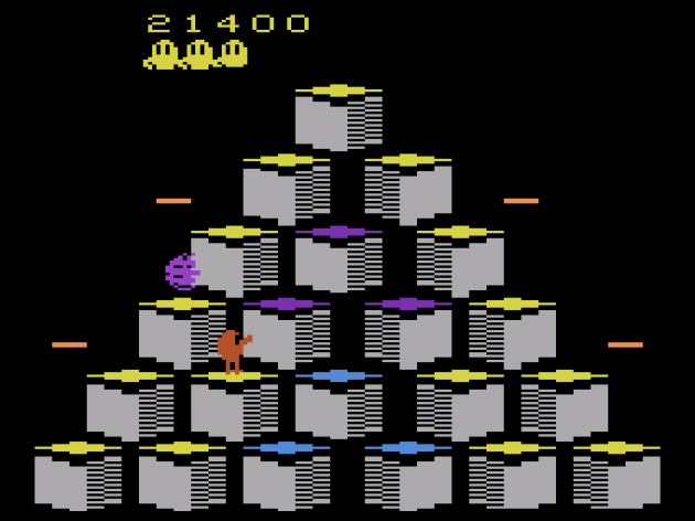
I don’t know what went wrong with Popeye, because Parker Bros. really did do some very impressive arcade-to-VCS ports.
Apparently, the response to Q*Bert 2600 when it first launched was mixed, and to this day, it still has detractors. The pyramid of cubes is missing the bottom row of seven cubes from the arcade version, while the enemies who hop along the sides of the cubes are missing completely. Plus, the Atari wasn’t exactly capable of replicating the eye-catching graphical style of the arcade game, or the memorable gibberish-like alien swearing. There is a noise that sounds similar to Charlie Brown’s teacher (“WAHWAHMP!”) but it’s not the same, nor could it ever hope to be. Given the response, I figured this would be pretty bad. But, actually, Q*Bert 2600 is yet another solid port from Parker Bros. Sure, it’s nowhere near as challenging with characters like Wrong Way and Ugg missing, but once you get to the pyramids where the colors change back if you cross a block again, Q*Bert becomes genuinely fun. That’s especially surprising, because I hated those levels in the arcade version. I wanted to like them, but there’s too many things to dodge and too many things that undo your progress. In arcades, Q*Bert practically becomes a war of attrition.

Yes, it’s true: I actually liked this version better than the arcade version, which I think gets too overwhelming.
So, yea, stripping out the majority of the enemies actually works to the game’s advantage. When you get to the stages that play out like a puzzle, you’re free to use intelligence and strategy and not scream in agony as you watch all the squares you need to change get saturated by enemies. And hell, if you want extra challenge, you actually can add the red balls that drop with alarming frequency by toggling the difficulty switch, and you can even turn it on and off as you play. I found that Q*Bert gets off to a slow start, and it’s far too easy with only the one highly-manipulable snake and occasionally the thing that turns the cubes you’ve changed back. But, it’s manageable, and it becomes genuinely fun once you get to the switch-back cubes, where you have to actually use the discs to help you beat the stage. On top of all that, I even found this to be the best-controlling home version of Q*Bert I’ve played yet, and I’ve played many. It’s the only one that felt like it had intuitive movement. So many 2600 arcade ports lose their arcade charm and have to cross their fingers that they pick up some of that primitive Atari charm along the way. Q*Bert 2600 should especially suffer. It’s missing the M. C. Escher appearance, the gibberish, the pinball knocker in the cabinet (which developer Gottlieb, giant of pinball, had in surplus), more than half the enemies, and 25% of the cubes. It doesn’t get that charm back, but it makes up for it with arguably superior gameplay. Purists might disagree, but it’s at least up for debate, and that’s saying something.
Verdict: YES!
Q*Bert
Platform: Atari 5200
Year: 1983
Published by Parker Bros.

A couple pennies per unit. That’s about what Atari saved by not having a self-centering joystick. Ray Kassar: you were the worst.
Remember how I told you about having to press a button before you could move in Frogger for the Atari 5200? Yea, that’s how it works in Q*Bert too. Apparently, that was Parker Bros.’s solution to the crappy Atari 5200 controller’s lack of self-centering joystick: press a button to confirm you’re ready to move again. Well, their solution makes Q*Bert 5200 unplayable. Q*Bert requires even faster movement than Frogger, which requires pretty fast movement. It doesn’t help that all the enemies from the arcade version are here too. Everything is wrong about this. Q*Bert 2600 did the unthinkable: it made Q*Bert’s movement intuitive. I never had a problem jumping to the wrong square. Here, if I needed to change directions, it was so bad that I almost was left in a state of shock when I jumped to the square I actually meant to. Without rewinding, I couldn’t couldn’t make it past the fourth stage, and my jaw hurt from grimacing at the badness of it. You know what? Someone at Parker Bros. should have said “Q*Bert is just not possible with this controller.” It really speaks to how badly done Mario Bros. 5200 is that Q*Bert doesn’t contend for the worst 5200 game. It should though. An unresponsive nightmare this one is.
Verdict: @!#?@! (That would be NO!)
Q*Bert’s Qubes
Platform: Atari 2600
Year: 1983
Designed by Todd Marshall
Published by Parker Bros.

Many of the Atari collectors who helped me to better understand that scene told me that Atari Age isn’t considered the be-all, end-all of rarity charting. While they’re considered mostly accurate, there’s a few games where their rarity is called into question. This is one such game. They have Q*Bert’s Qubes listed as a 9-out-of-10 in rarity, but most of the people I spoke with say that it’s probably closer to a 7 or an 8. Still incredibly hard to find, so much so that someone randomly stumbling upon a copy without actively searching for it would be a very lucky person, indeed. But, compared to other games in that 9 out of 10 range, which are holy grail levels of “oh my god” for game collectors, Q*Bert’s Qubes doesn’t seem ungodly rare. The apparent disconnect between its perceived rarity and its actual rarity might be a territorial thing. Q*Bert’s Qubes was distributed in limited quantities only to some Sears locations in the eastern US, along with a department chain called Hills. It’s possible that the game was never sold west of Eastern Ohio, and if collectors from the western United States never just found it at garage sales or second hand stores, it might have given off the impression of Q*Bert’s Qubes being more scarce than it actually is.
Q*Bert Qubes is a fairly impressive technical effort, and I kind of wish I liked it a lot more than I did. Which, if I’m being honest, isn’t much at all. There’s a diamond made of sixteen cubes that you have to rotate by hopping around them, Q*Bert-style. Just barely outside the playfield.. in fact, it looks like it COULD be part of the playfield.. is a target cube, and the object is to match the cubes to the pattern it shows. To clear a level, you have to match any of the patterns you’re shown at the start, starting with a simple tic-tac-toe like straight line, but eventually being multiple blocks that zig-zag around. While you do this, enemies hop around at you. You know you have the right orientation when a cube turns completely green, and in early stages, it locks into place. After so many levels, you can undo the correct position, and you’ll have to just to avoid enemies. It seems fun, but I found Q*Bert’s Qubes to be a completely joyless grind, really. Once you figure out how to quickly rotate the cubes the way you want, it’s a bore. I actually liked the enemy design the most. The rat that dies if you get it to hop onto a cube still rotating from your leap is a clever idea, but that’s all Qubes has going for it.
Verdict: NO!
Save the Whales
Platform: Atari 2600
Released through Control Video Corporation’s GameLine Modem
Designed by Steve Beck
Would have been published by Fox, Distributed by Control Video Corporation
The other two games in this Greenpeace-based series would have been based around Dutch Elm Disease (“Dutch Elm Defender”) and seal clubbing (“Attack of the Baby Seals”). I swear to God, I’m not making those names up.
There’s so many Atari 2600 games where the story behind them is so much more interesting than the game itself. Save the Whales is an incredibly bland and shallow experience based around shooting nets and pollution with a submarine. The nets that drop down too fast, and if they get all the whales, it’s game over. It’s not well designed, as sometimes the nets will come in too close to the wrap-around side, which prevents you from being able to defend the whale at all. I experimented with rewinding and it just wasn’t possible to get a defensive shot off from anywhere. So, Save the Whales is terrible, but that’s fitting because the story behind it is too. Fox collaborated with environmental organization Greenpeace on it, and all the proceeds were supposed to go to them. But then Fox left game development and the rights to all their games were snatched-up by Control Video Corporation for their GameLine modem. The modem bombed due to its outrageous costs: $60 for the hardware ($180 in 2023), $15 per month subscription fee ($45 in 2023) and $1 per game ($3 in 2023) which you only got to keep for one week or so. Save the Whales was available on that service, but that didn’t include the plans to donate to Greenpeace. Control Video Corporation is still around. You know them as AOL. Yes, really. Maybe they didn’t have the money back then to kick the $1 rental fees over to Greenpeace.
It’s GamePass before that was a thing, only more expensive, with a crappier lineup, and you only got the games for one week. Oh, and I forgot to mention that it had to make a long distance call to download the game over dial up, which means that your phone bill would go through the roof too.
Save the Whales is a horrible, horrible game.. but I did play it. And so the Vice Family is going to donate $100 to Greenpeace, which adjusted for inflation, is about what a third-party Atari 2600 game cost in 1982-83. If you’ve enjoyed my Atari coverage, look, I don’t have a Patreon or anything like that. This is what I do for fun, as a hobby. But, if you DO want to show your support or appreciate my efforts, well, Greenpeace kind of got hosed in this whole Fox/CVC Save the Whales thing, and that ain’t right. So, head over their website and kick them a few bucks. If you’re not a fan of Greenpeace, the two charities I typically support the most are The Epilepsy Foundation and Direct Relief. Hell, donate to all three and save the epileptic whales who lost their homes to wild fires!
Verdict: NO!
Sky Skipper
Platform: Atari 2600
Year: 1983
Published by Parker Bros.
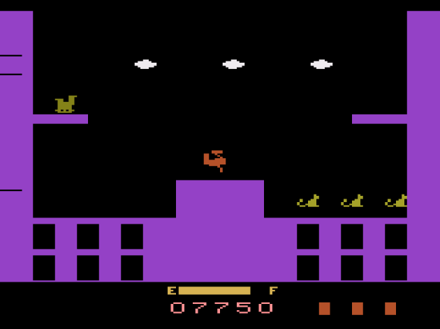
I have no clue what went into the development of this. I couldn’t find the programmer. But, I get the distinct impression that the designer never played the arcade game and based their design on either a video tape or some kind of design document.
On my 30th birthday, I reviewed Sky Skipper in my attempt to be inspirational to game developers, since it was designed by Shigeru Miyamoto and never made it out of route testing in the US or Japan. My way of saying to indie studios “you will fail, and that’s okay.” Despite Sky Skipper being such a bonkers anomaly in the annals of gaming, it’s not the most memorable game experience. By far the most crazy thing about it is that it was actually ported to the Atari 2600. It even got a wide release! According to the experts at Atari Age, it’s a 3 out of 10 in rarity, with a nearly identical pressing as the next game on this list: Spider-Man. Everybody I’ve met that owned it wasn’t even aware it was based on a Nintendo arcade game until modern times. They just thought they Parker Bros. came out with a truly horrible, generic, shallow biplane game. This is low-key contender for the worst game on the Atari 2600 AND the most stripped-down arcade port. Hell, calling this stripped down feels generous. This isn’t even a skeleton of the arcade game. It’s trace amounts of rotten bone marrow.

Two levels, one of them so basic that it’s insulting. The other is just bland as tofu. What a terrible game.
Sky Skipper consists of two short stages with “enemies” that don’t move. Drop a bomb on one of them to temporarily knock it out, then fly over to the chambers where animals (replacing the playing cards from the arcade game) hop up and down. You don’t stop moving, and if you hit a wall or run out of gas, you die. You’ll mostly die from crashing into the walls, but that’s literally the only challenge. Dodging the clouds that spawn after one cycle of the two levels is a cinch, and since the gorillas don’t swing at you, throw stuff at you, reach for you, jump at you, or do anything besides try to bore you to death, gameplay consists of dropping a load on them, grabbing the three animals that hop up and down, and parking yourself above them and flying back and forth while you wait for it to respawn, since you probably won’t have enough time to grab all the animals before they wake-up. With each cycle, your speed increases, which actually works to your benefit, since you can scoop up more of the freed animals in every bombing run. In my Sky Skipper arcade review, I said Sky Skipper 2600 seemed fine, but I admit, I only played it for about a minute. it wasn’t the focus of the review, and in 2019, I wasn’t exactly an Atari expert. I still ain’t, but having put time into this now? Wow. Yea, bad. Bad bad. Everything interesting from the arcade game, including the complex scoring system, is gone. There are many adaptions on the VCS I jokingly say “I can’t believe this exists” but with Sky Skipper, I can’t believe this exists. If the game has sentience, I’m guessing it wouldn’t believe it, either.
Verdict: NO!
Spider-Man
Platform: Atari 2600
Year: 1982
Designed by Laura Nikolich
Published by Parker Bros.

Well, at least Green Goblin looks like Green Goblin. Even has the Goblin Glider. That’s literally the only thing it has over Superman 2600, but hey, the villain looking like the villain does help.
Unlike Atari’s Superman, Parker Brothers’ Spidey didn’t defeat its greatest enemy: the Test of Time. Honestly, I’m not entirely sure it beat the Test of NOW in 1982. A derivative of Crazy Climber where you launch a web upwards, either straight ahead or diagonally, attempting to collect bombs, rescue people, get past the Green.. wait, what? The people in the windows are supposed to be bad guys? (reads instruction book) What the fudge? Why would you want to touch bad guys? Or collect them? How’s that even make sense? Okay, those are bad guys.. that you collect.. and then you have to get past the Green Goblin and touch a square at the top of the screen. The difficulty comes from aiming your web, which can only touch the building, and not the windows or empty spots. But, you have to sort of angle yourself so that you don’t touch the people or the bombs scattered around the stage directly. You have to sort of swing into them, but doing so restores your web fluid, which is an automatic loss of life if you run out of it. Spider-Man is pretty boring. The building is always the same shape, and the action is just dull and repetitive. Maybe this exact concept could have worked with a second action button that lets you fire web bullets at the window people. What’s here is too simple and not exciting.
Verdict: NO!
Spike’s Peak
Platform: Atari 2600
Year: 1983
Published by Xonox
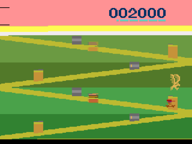
Well this is a piece of.. uh.. ambitious software. Yes. Yes, a piece of ambitious software. (Nods)
The other half of the the Veg-o-Matic people’s best selling Atari game(s), and like Ghost Manor, it’s a pretty ambitious effort. It sucks, but it’s ambitious. You’re a mountain climber who I swear looks exactly like Freddy Krueger, and you have to make it past three screens and plant your flag on top of the mountain. Along the way, you have to dodge wildlife, falling rocks, avalanches, boulders, and the Abominable Snowman. It sounds like a perfectly fine premise for a game, and maybe it could have been. But, Spike’s Peak couldn’t decide what kind of game it wanted to be. The first level is the best, and given how problematic it is, that’s a sad statement. You zig-zag up a curvy path at the base of the mountain. Bears lurk back and forth, occasionally hiding in barrels. You can jump over the bears, or you can hide in a barrel. When you hear a bird start screeching, you have to hide in a barrel, as they can swoop in and kill you pretty quickly. Weirdly, if you use the difficulty toggles, it does it by adding lag to your jump. Are you f’n kidding me? That’d be like buying a Nintendo Switch game that comes with a bottle of moonshine labeled DRINK TO TURN ON HARD MODE!
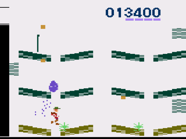
This is where it really gets weird. The side-scrolling, jumping, “I wanna be like Donkey Kong” crapola is still here, BUT you also vertically scale upwards too, and even after reading the instruction book, I’m still not entirely sure what the action button does. I think it’s SUPPOSED to block the boulder that ricochets around like a screen saver, but it passed right through it.
Even without deliberately inflicting controller lag (seriously, anyone else getting “it’s not a bug! It’s a feature!” vibes out of that?), the controls of Spike’s Peak’s first level are unresponsive, but I’ve played a lot worse. But then you get to the second level, and technically the platforms are still there. But, you can also now just scale up the mountain by pressing up. In fact, that seems to be the main thing you’re supposed to do. There’s rock slides that can knock you off and this ricocheting boulder that apparently you can block with this stick, but I never did. The pattern does seem to be totally random, and at one point, I was able to sprint.. poor choice of words since you move about as slow as a terminally ill snail.. and just shimmy up the wall without being stopped, with minimal left and right movement. And it was so boring.
I initially almost quit the third and final actual level segment, which I thought was a similar “zig-zag up the hill” bit like in stage one, only with a Yeti that you have to throw a snorkel-looking thing at. I couldn’t make any progress on this, even with cheating. After about an hour of trying, I threw in the towel. The original review for this noted it was the only time in nearly 200 Atari games so far for my Atari 50 project that I’d quit. AND THEN I needed more media, went back, and accidentally discovered you can ignore the trail and climb up the side of the hill, like in the second segment. About a minute later, I was planting my flag in the top of the mountain. I’ll be looking at more Xonox games in Part Three of the Atari 50: The Games They Couldn’t Include, but so far the most consistent theme is “ambitious titles, bad coding.” Spike’s Peak was even sloppier than its best-selling cartmate, Ghost Manor. It’s bad. Bad jumping physics, bad level design. For those Atari games that hold up to the test of time, they usually focus on one gameplay element and just do that one thing well enough to be engaging. So far, Xonox’s games seem like they’re trying to be everything all at once, and thus ironically do nothing right.
Verdict: NO!
Star Wars: The Empire Strikes Back
Platform: Atari 2600
Year: 1982
Designed by Rex E. Bradford
Published by Parker Bros.

In the unlikely event that you actually play this, take my word for it go all the way to mode 16, which is the highest difficulty. It’s the only one I found remotely stimulating. In it, the Walkers move fast, you die if you touch their body (their legs are safe) AND the weak point flies off the walkers and attacks you. This was ALMOST good.
How do you make the Battle of Hoth scene from Empire Strikes Back boring? Take away the cables the Rebel Alliance used to defeat the AT-AT walkers. Empire Strikes back has you shooting an endless stream of AT-AT walkers. Shooting them. Where’s the fun in that? The answer is, there isn’t any. You just have to shoot the walkers 48 times, or once if you can hit the sweet spot on it that blinks, though usually their head gets in the way of it. There’s actually a defensive aspect to the game: you’re defending the power generator. But, I never came that close to dying via that method. You can shoot the bullets the AT-ATs fire at you out of the air, and if you stay alive for two minutes, you gain THE FORCE and can’t die for a while. And it’s SO BORING! Thank god I looked up the instruction book (thank you as always, AtariMania!) and found out what the different modes do. Mode 16 is the one to play (see the caption above for why). Once I upped the difficulty, Empire Strikes Back was still a limited, shallow, nothing of a game, but it was ALMOST exciting enough to make up for all the time I spent staring at the screen like a zombie, slack-jawed at how boring a concept this was. Almost. The fatal problem is that you can repair damages to your ship just by landing on the ground. On the right mode, Empire Strikes Back isn’t as bad as people make it out to be. It’s just not fun.
Verdict: NO!
Tapper
Platform: Atari 2600
Year: 1984
Published by Sega

It ain’t much to look at, but this is pretty accurate. I just don’t happen to like Tapper at all. Also, I’m not entirely sure why the game is giving you the finger up there in the scoreboard, but it’s clearly, no doubt about it, flipping the bird.
Yep, Sega published games to the VCS too. Not just their own arcade adaptions, either. They did adaptions of Bally titles Spy Hunter (yes, there’s a Spy Hunter 2600, which is going to be in The Games They Couldn’t Include, Part Three!) and this game. Tapper was one of the first product-placement games. It was originally designed for bars and sponsored by Anheuser-Busch to promote their Budweiser label, but then turned into the generic Root Beer Tapper for normal arcades. The Atari version promotes Mountain Dew, which I’ve always thought tastes nasty. I can’t stress enough that my vision of Hell involves lots and lots of Mountain Dew. Despite my issues with drugs, I’ve never been a drinker, and I no longer consume caffeine or soda either (yea, it’s as boring as it sounds), though alcohol is tempting now. I might have actually enjoyed Tapper for once. I never have, but then again, I’ve never really played Tapper the way it’s meant to be played. In arcades, you fill mugs with an actual tap-shaped lever. It’s one of those “the charm is lost” games, and in Tapper’s case, charm is all it had going for it.
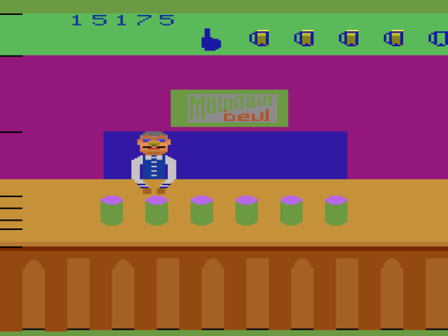
Notice how you can barely see the Mountain Dew logo. I wonder how much they paid for this? It looks like it’s saying “Mountain beuj” or “Mountain bew” doesn’t it? WHY IS THAT SINGLE RED DOT THERE? It’s weird!!
Tapper is probably the definitive arcade spinning-plate game. Shoot a mug of suds down at customers before they reach the end of the counter. Sometimes the customers will finish the glass and send it sliding back and you have to send them another. You lose a life if a customer reaches the end of the counter, or if they send a glass back that you don’t catch, or if you send too many mugs. That was the main way I died. It’s the strangest thing, because the same exact thing that gets me in the arcade version gets me here: I could swear that filled two mugs for two customers, or three mugs for three customers, but instead I’ll send two for three, and three for four. How does that keep happening, no matter which version I’m playing? Maybe I’m just not cut out for this one, but I’ve never enjoyed it, though I’d like to note that I think it’d probably make a perfectly decent LCD game.
Verdict: NO!
Taz
Platform: Atari 2600
Year: 1984
Designed by Steve Woita
Released in Europe as Asterix
From the same designer who said that the real reason Quadrun got such a limited release on the Atari 2600 was because Atari used us filthy vagina people.. meaning icky, ICKY girls.. to play test it, and the girls scoffed that Quadrun wasn’t like Ms. Pac-Man. Because, you see, they’re girls, and girls can’t understand a game that doesn’t have a girl as the star, with makeup and a bow, because women be shoppin’ and stuff. Yea, it couldn’t have been because Quadrun sucked or anything. It’s us toilet sitters who blew it for that game. This is the same guy who later worked on Waterworld for the Virtual Boy, which I’m sure bombed because the red water reminded the girls who play tested it of our periods. This was his Atari game that DID come out, and it’s boring. You move up and down eight channels, grabbing food that slides across the channel and avoiding dynamite. After you grab fifty of the current food, the food changes and its value increases. After a few waves it teases something called the “crazed wave” but it’s really just an increase in speed. That’s the whole game. The whole thing. This came out six years after the Atari 2600 launched, and they’d mostly moved past games this simplistic. What can I say about it? It’s boring. I mean, it ain’t no Ms. Pac-Man, right Mr. Woita? The only notable aspect is that they reskinned this for Europe with popular French comic strip character Asterix the Gaul. It’s the same game with different sprites. I’m sure Taz/Asterix was made for little kids, but I’d think even they would get bored with this. Or maybe I just don’t understand this because I’m too busy talking about boys and gossiping on the phone.
Verdict: NO!
Vanguard
Platform: Atari 2600
Year: 1982
Designed by David W. Payne

It’s fitting the ship looks sort of like the Loch Ness Monster, because this is a rare sighting indeed: a really good arcade conversion on the Atari 2600 that doesn’t suffer from the usual technical hang-ups. No flicker. No slowdown. Decent sound design. I’m truly impressed.
Whoa! Hold on.. where’d this come from? Apparently 21st on the Atari 2600 all-time best seller list (I’m not sure if that’s dubious or not), and yet, nobody talks about Vanguard. Baffling, because this is pretty okay, as far as Atari 2600 ports of relatively complex arcade games go. Not only that, but it feels like a true landmark in the evolution of the shmup, creating a template for where the genre would go over the course of the NES and beyond. When I first discovered Vanguard 2600, I was familiar with the arcade game. I’d played SNK 40th Anniversary, and had I used the Definitive Review format back then, it would have gotten a YES! and been a contender for best game in that set. I played this port a year or two later, and was blown away by the impressive approximation David W. Payne came up with. I might have slightly overrated it, but it’s still an excellent example of making up for the hardware’s shortcomings.
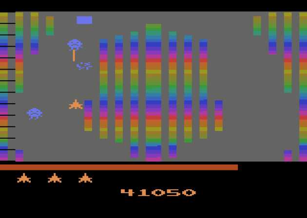
There is ONE spot in the second “tunnel” where, after multiple instances of rewinding it, I’ve come to the determination that you can’t actually survive it. It’s at the very start of the “Striped Zone” and, as far as I was able to tell, the game moves too fast and you don’t move fast enough, and thus crashing into the central wall to begin the level is inevitable. SO FRUSTRATING! Like, how did they make one of the best conversions on the entire platform AND have such an inexcusable design flaw in it?
In the arcade, you can shoot in four directions. They carried that over to the Atari 2600 game despite a control not remotely suitable for it. You don’t need to even really press the button to shoot in the port. Just wiggle the joystick and you can shoot in four directions. OR, if you don’t like that, you can adjust it with the difficulty switches on the console. I used the default setting and I thought it worked surprisingly well. It helps that the combat is very satisfying. There’s a nice variety of enemy waves, and the game has actual levels, not to mention a whole other game world that plays much faster after you beat the boss.
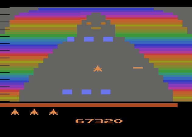
This is the “boss” which takes not even one full second to defeat. That’s not an exaggeration. You should instantly win a half second after the stage begins. This is NOT a battle. It’s a glorified interactive ending designed to make sure players didn’t slip into a coma after the previous stage.
Now, having gushed all over Vanguard, it needs to be said that I previously had this pegged as the best Atari 2600 game. It’s not. Nah, and it’s not even that close, either. The levels are just too basic, and once you get over the excitement of a game that is THIS technically impressive.. no flicker, no slowdown, wide variety of enemies, different levels, etc.. you realize that Vanguard 2600 is almost as basic as a shmup can get. The level design is mostly just a straight line with all the lethal scenery off to the sides. In theory, you can die from being careless as you try to grab the ENERGY that grants you temporary invincibility, but I only did that once in four full tunnels. The most complicated level involves forks in the road and picking between two directions, but the game seems to play out the same no matter which way you pick. It’s not a very hard game at all, and honestly, it feels like letting the players rack up a high body count is kind of the point. It’s almost like a zone-out, popping bubble-wrap type of shmup. It’s not the type of game you have to pay attention to while you play it. Is it fun? Yes, actually. Does it hold up to the test of time? Almost certainly not for repeated play. BUT, I do think what’s in Vanguard is satisfying enough for one complete two circuit trip. Plus, while I don’t take historic context into account, I do admit it’s always fun watching a genre emerge from gaming’s primordial soup.
Verdict: YES!
Vanguard
Platform: Atari 5200
Year: 1983
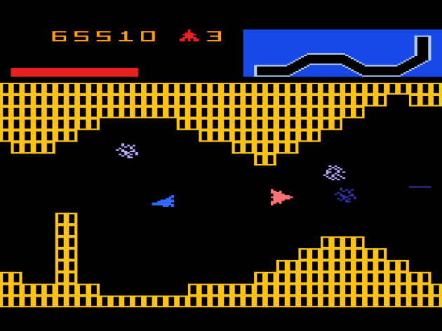
Hey look! You don’t just fly a straight line in most stages! Always nice!
Vanguard 5200 is a genuine, no-strings-attached improvement over the Atari 2600 version, and one of the best games on the entire Atari 5200. If the VCS port feels like witnessing the shmup genre crawling out of the primordial soup of gaming, then Vanguard 5200 is like witnessing the first time a great ape began walking on two legs. There’s actual level design, with stage elements to dodge around, and legitimate challenge to the boss. You still only need to hit it with a single bullet, and the first time I fought it, I once again beat it in less than one second (yes, I really checked). The second time around, I needed a while before I got the winning shot off. I finally realized what the actual challenge is. The boss has two barriers with a small hole in them, and you have to shoot when those two holes align.

That is one angry looking lady bug.
Oh, and you actually have to press a button to fire to shoot, which I find helps with immersion. I think it’s unlikely a space ship would just automatically fire its weapons. Seems like someone could get hurt doing something like that. Vanguard is still pretty simplistic, with some levels still being just straight (albeit narrow) corridors. Oh, and only one level actually is vertical, with the rest being horizontal or diagonal. It’s not incredible by any stretch of the imagination, but it holds up to the test of time and probably contends for the best game on the Atari 5200. It helps that the blazing sense of speed stays around this time, instead of going away after every-other cycle. I’ve been really tough on the Atari 5200 over the course of Indie Gamer Chick’s Atari 50 Saga, but games like Vanguard 5200 show why that is: because the 5200 is capable of great gameplay. This is a pretty good effort and I’m so happy I found it.
Verdict: YES!
Venture
Platform: Atari 2600
Year: 1982
Designed by Joseph R. Biel

This isn’t a real screenshot of Venture. The Atari 2600 port of Venture uses flicker, and it’s one of those games where individual screenshots don’t make any sense. I had to sort of stitch multiple captures together for this to work. Anyway, there’s a few changes from the arcade version, like the moving walls in this one being lethal to the touch. That’s not from the arcade game. Which, frankly, isn’t as good as I originally believed, either.
Venture is sort of like Berzerk with an actual point and stuff to do. There’s two levels, each with four rooms. You start on an overworld and have to dodge Space Invaders-looking enemies while you make your way to the rooms. Once you enter the door, you’re placed in a room with three enemies (except in the picture above, where there’s moving walls to dodge) that you have to either shoot or dodge. The rooms have a treasure that you must get and exit in a timely manner. If you take too long, a dragon appears and try to kill you. It’s actually genuinely startling when it appears. A lot more frightening than the evil emoji from Berzerk. Once you get all four treasures, you move to the next level. After two levels, the game cycles up in difficulty and you just repeat the process until you run out of lives.

One thing about the arcade game is the enemies practically teleport away from your bullets. It’s annoying. Here, they don’t actively dodge, and it leaves this too easy, regardless of whether you tinker with the difficulty switches.
Sigh. Yea, this one hurts. You see, the first time I played Venture, I thought it was one of the best Atari 2600 games, and one of the most ambitious. It made me want to check out the arcade game, which further blew me away. Well, I just played both again, and they didn’t hold up to repeat playing at all. I’ll get to the arcade game sometime in coming months, but as for the Atari 2600 game, it’s just repetitive and dull. The enemies don’t fire, and so they just sort of slither around. Weirdly, their bodies linger on the screen after you kill them and remain deadly if you touch them. It theory, that should add challenge, since the bodies can block your path to the treasure and eat up time, thus putting the dragon into play. In reality, it’s just annoying. I just spent the last forty minutes playing this over and over, and while the dragon did appear frequently, it never came close to me. I had already gotten the treasure and was heading out the door. Even toggling the difficulty switches (which weirdly can skip you to the second level to start) doesn’t do enough. The action gets faster, but you also seem to gain speed, so it’s a wash. God, I spent all this time looking forward to revisiting Venture. It was neat finding it a couple years ago, but it’s just a toothless bore now.
Verdict: NO!



 Arcade Archives: Mario Bros. was developed by Hamster
You must be logged in to post a comment.