Colored Effects (Indie Review)

Colored Effects
Platforms: Nintendo Switch, Steam
Developed by TacSou
Published by Flynn’s Arcade

The graphics are nice, clean, and distinctive. TacSou never put the trees in locations that would be distracting. It’s a game that allows you to process everything quickly with no visual loudness.

I’ve had a bitch of a time trying to write this review for Colored Effects, an indie puzzler where you have to dip your character in superpower-granting paints in order to solve logic puzzles. I’ve not been struggling because Colored Effects is bad or boring or anything scandalous like that. Actually, it’s really good. I can’t stress enough how good the controls are. Colored Effects has accurate, intuitive movement physics, effortless jumping physics, and some of the best box-shoving mechanics I’ve seen (with one tiny but annoying exception, see the next caption). Seriously, I hope developer TacSou wrote down the recipe for this (I assume video games are made with recipes) because the controls are gosh darned perfect.

This is the one and only exception to the controls/movement being flawless. Here, a box I wanted to fall through a trapdoor when I activated a lever didn’t fall, instead defiantly balancing on a single pixel. Take that, Newton!

The color concept works great, and it’s largely because of those intuitive controls. You can only be one color at a time, and each color has unique special abilities. Green allows you to clone yourself and claim a carbon tax credit. Yellow gives you a dash move and grants you immunity from Green Lantern’s ring. Turning red lets you throw fireballs and gives you dictatorial authority over all other Power Rangers (unless it’s the Alien Rangers or Time Force squad, where you’re relegated to field command). Purple allows you to warp just far enough to pass through nearby walls and also will make televangelists speculate as to whether you’re supposed to be “the gay one” or not. Dipping yourself in blue gives you a double jump and also assures you’re a shoe-in to win California’s electoral votes. There’s almost no learning curve to any of the superpowers and their limitations. The clones of yourself are lifeless blocks that vanish if you leave the bubble surrounding them. The warping ability is the neatest, because when you’re choosing the direction to warp, the game doesn’t pause, so you can be hovering mid-air. Yes, this is worked into the level design, too! These are really basic platforming/puzzling tropes, but they’re used so cleverly.

There’s a few technical annoyances. There’s checkpoint billboards you can use. See the box with the little character below the two switches on the left of the picture? That’s it, and it’s 100% optional to activate. They’re much appreciated, but they also come with a monkey’s paw-like glitchy drawback. Sometimes I’d activate them only to realize I’d made the wrong move, so I’d pause the game and restart the whole level from scratch. Then I’d go about puzzling, realize I’d made another mistake and hit the quick restart button, which should start the whole level over, right? Only, it wouldn’t. The game would revert back to the previous checkpoint I’d already deliberately erased, which meant I had to pause the game and click the restart level option again. That happened constantly and it was so annoying.

And the puzzles are fun little test chambers that mostly accomplish what I call “The Big Overwhelm.” That’s my term for levels so big and vast and multifaceted that the first time you see the layout, you think “there’s no way I’ll ever make sense of it.” Which is awesome, by the way. The Big Overwhelm is the secret sauce that makes classic puzzlers Portal and Baba is You work. I dare say no logic puzzler can be great without it. Not every level of Colored Effects pulls it off. In general, any puzzle game can usually be sussed out by figuring out what the final move of a level is and reverse-engineering it from there. Well, quite a few stages in Colored Effects suffer from “First Move Syndrome” where a puzzle is too easy because the first move is so obvious that the rest of the design logic instantly reveals itself. Even late in the game this happens. Scaling is super hard to do in a puzzler. You can add extra steps or red herrings till the cows come home, but it’s just so hard to gauge what is going to throw someone off. Scratching your head is an entirely personal experience, and unless a developer is able to use something along the lines of focus testing to reorder levels based on average completion times, you’re going to end up with a difficulty curve that looks like the recordings of a seismograph. It’s kind of inevitable.

This was really the only boss I enjoyed fighting because it was the only one that felt like a PUZZLE in this PUZZLE GAME that ended when you solved the PUZZLE instead of having to redo certain steps because it’s a boss and bosses are supposed to have “hit points.” This boss requires you to actually stop and think. Good stuff.

TacSou’s concept was you’d earn new colors by fighting bosses. Solid idea if the boss battles are true to the rest of the game. But, only the one I pictured above accomplishes that, while the rest don’t feel right for this game at all. And the pacing is truly strange. Colored Effects has 40 levels. Which levels have the bosses? 2, 6, 10, 14, and 40. Yes, really! You go from three levels and a boss fight to a twenty-five level gap between them. And I’m not complaining, by the way, because the levels are fun and the bosses, well, aren’t. The final boss has roughly fifty-thousand goddamned different phases (but who’s counting?) and goes on FOREVER because each color has its own segment, and it never feels puzzley. Not for a single second. Mind you, there are no enemies in the puzzle stages, yet you have to fight airplanes shooting bullet hell-ish projectiles at you to finish the game, and it’s so out of place. None of the bosses are bad in the traditional sense. It’s only by virtue of how wrong they are for Colored Effects that they’re unwelcome speed bumps, with that one exception above. And that one exception is why I can’t overlook this, because TacSou proved they COULD make bosses that combined genuine logic puzzle goodness with traditional game bosses. The rest are so cookie cutter they feel like any generic platformer’s bosses. Shame, because this is NOT a generic game!

In the first few levels, you have to collect gems that open gates to the room exit. Then, Colored Effects adds a twist. Some of the levels require you to reach the exit once with each color available, at which point you come out the starting door and have to do it again as a different color. Once you’ve gone through the door in a color, it’s checked off, but you can’t go through the exit as that color again. It works and it’s unique, but these also tended to be the puzzles that were easiest because either the first move or the last move you’d make became too obvious. Oh, and if you’re curious what color blind mode looks like, here it is.

80% of the bosses being lame aside, Colored Effects is a very good puzzler. I really don’t have too many notes on the puzzle logic itself, because movement and the box shoving physics are so accurate that you don’t even stress them. There’s no pixel-perfect jumping required. I can only think of one single level where I felt the timing of activating switches and special moves at the correct moments was so precise that novice gamers might struggle with performing it even if they figure out the solution. No, this is actually nearly perfect as far as this genre goes because the movement/timing is so fine tuned that it really becomes your wits versus the puzzle design, and the controller isn’t a factor at all. And they’re really good puzzles too. You don’t have to be a brain surgeon to enjoy Colored Effects. In many ways, it’s the ideal Nintendo Switch puzzler. The toughest part of Colored Effects for me was writing this review, really. What can I say? It’s hard to write about a game that does so little wrong.
Verdict: YES!
Colored Effects is Chick-Approved and ranked on the Indie Gamer Chick Leaderboard.
$3.99 (Normally $4.99) were dipped in brown paint and rolled in bread crumbs in the making of this review.
A Review Copy of Colored Effects was supplied by Flynn’s Arcade. Upon release, a copy of it was purchased by a member of the Vice Family. Two, in fact! I bought my nephew one, too. Hopefully he can put down Fortnite long enough to try it.

Project Blue (Review)

If you play Project Blue on the Nintendo Switch or Xbox, there’s NO ability to save your progress. There are no save files, and despite being an NES game running on an emulator, there are no save states. That means if you want to play this on your Nintendo Switch and intend to finish the game, you can’t play anything else until you defeat the final boss. That might change eventually via a patch, but keep in mind that Project Blue is a fairly difficult game, even on its lowest difficulty setting. It’s also a game that features lengthy levels with two tiers of checkpoints: “lose a life” checkpoints that are much more generous and “game over” checkpoints that could potentially send you quite a ways back. While it’s a lot of fun, it also means you can’t knock out one stage at a time while playing other games. You can put your console on sleep mode, but once you turn off Project Blue, you have to start over from the beginning. If this was a twenty hour game, that’d obviously be a deal breaker. However, Project Blue thankfully only has four levels that I’d think an average player would need three to five hours to finish. At least on their first attempt. It’s still very annoying that a game in 2023 doesn’t use our space age technology to allow you to record your progress, but you could finish Project Blue on your first attempt during a screening of Avatar. You know, keeping with the blue theme.

What the Xbox/Switch package DOES come with is a damn good instruction book. Seriously, this thing is so NES authentic WHILE being kind of morbidly dark. Hey, it made me smile. I should also note that this is the ONLY WAY you can get the story of the game. While the graphics are good enough to immerse you in the in-game universe, you really don’t get a whole lot of story out of it. What story there is, well, just read the book. It’s all kinds of delightfully twisted.

I didn’t beat Project Blue on Switch. I swapped over to my PC and an NES emulator, because I wanted to play other games on my Switch too. Oh, and because I wanted to cheat. A lot, actually. With rewind and save states. Mostly save states, because those allow for SOME challenge. It’s how I maximize my own enjoyment, which is the whole point of playing games. Also, with a game like this, or any other “difficult” platformer, I normally prefer to knock out a few rooms at a time, then take a break. I probably should have played this more this week, because now it’s 1:19 in the morning and I’m rushing to get this out by time the game releases on Switch and Xbox, because Project Blue is really good and I want people to see this review as it launches. Take all my guesses on how much time you’ll need with a grain of salt. You’ll probably play Project Blue better than I did. It kicked my ass. And I kind of loved it for it.

I’m almost certain this would break your neck. By the way, there’s a handful of different colored borders if you get the Switch/Xbox version. I found the red one to be distracting, but the other two work really well AND took actual effort. Some of the best borders I’ve seen, and I play a lot of games that use borders. I just did Taito Milestones 2, which phones in the borders for 9 out of the 10 games. “Who does this bitch think she is? The border patrol?” Thank you! Don’t forget to tip your waiter!

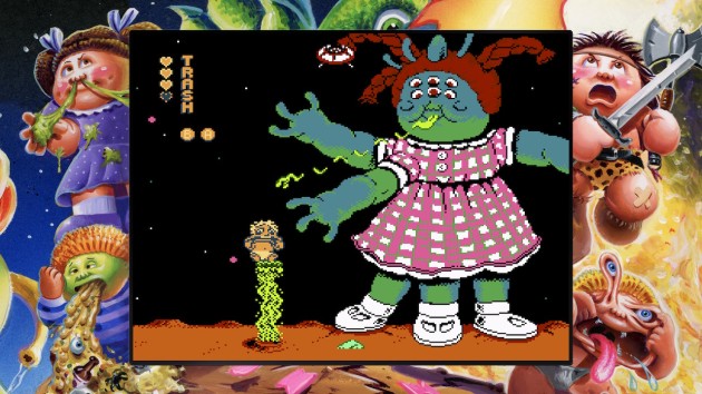
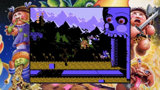
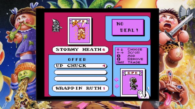
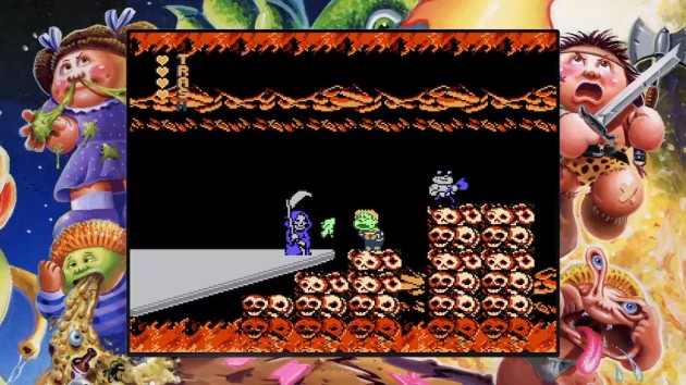
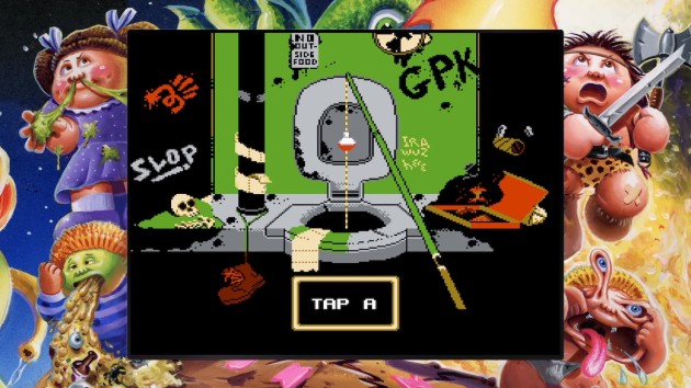
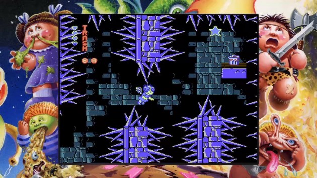
Project Blue is maybe the most conventional NES game I’ve played as of yet that also pulls double duty as an elite-tier indie game. Despite being made within the last few years, there’s no modern strings attached. Which.. yea, come to think of it, the whole “you cannot save” thing tracks with that. But I’m speaking in terms of raw gameplay. You, me, and anyone else could believe that this is a genuine lost 1988-1991 NES release that somehow fell through a time warp. It didn’t succumb to the temptation of featuring gore or swearing like so many modern NES indies, nor does it use state-of-the-art (for NES at least) graphics chips to buff up the appearance. It passes the eye test, but it’s not just the presentation that makes it convincing. I’ve played four NES indies now (along with last year’s Garbage Pail Kids, micro-sized metroidvania Böbl, and Tetris tribute From Below) that are good enough to crack my top 100. Project Blue is probably the most believable as a genuine 80s/90s NES release. Defeating Garbage Pail Kids for that title is no small feat. It’s close, but I think the authenticity edge goes to Project Blue.

Even on the “normal” difficulty, this is a tough one.

Do you know what the secret sauce is? This is going to sound incredibly counter-intuitive, but the way to make your game perfectly NES-like is through imperfections, especially in movement and controls. Now, keep in mind that I don’t mean BAD controls. If you have unresponsive or sluggish inputs, your game is probably going to suck. Rather, I’m talking about good controls and movement physics that have a sharp learning curve to them. When that happens, it hearkens back to a time when developers (including Nintendo) hadn’t quite perfected the art of jumping around. In the case of Project Blue, it’s a game based around platforming and shooting your way through a series of interconnecting single-screen rooms. While enemies play a big role, I found the majority of the excitement came from the level layouts. The rooms are built around creating as many hold-your-breath jumps and close calls as any 8-bit game could possibly squeeze in. It’s nearly non-stop, even after you reach the point where the physics are intuitive. Project Blue is like an assembly line that turns out nail-biting platforming moments. And mind you, this isn’t a Super Meat Boy-like punisher. This is more like a Mega Man-style hop ‘n pop action game.

I confess that, after the first boss, I was worried that future boss encounters would be the low-point of Project Blue. But all the other bosses are an absolute blast to battle. Difficult, but clockable and fair. I really love this one, folks.

You don’t hold a button to run, but rather your movement speed builds automatically. Project Blue leans heavily on having to get a running start to make both high jumps AND long jumps. This premise, combined with movement that has a real sense of momentum and inertia, makes for a truly thrilling 8-bit experience. One that somehow feels totally unique while also feeling like dozens of other era-specific games. You get a little bit of Mega Man, but also a little bit of Blaster Master, or maybe Metroid or Journey to Silius, and probably tons of other NES games I’ve never even played. It feels like the developers set out to make each of the rooms feel unique from all other ones, but they didn’t stop there. Enemy placement is so measured and works in collaboration with the harrowing jumps that it feels practically scientific. Some rooms are optimized for combat, while others are optimized for jumping bits. Some combine the two, and some even have the enemies hopping off springs with you. But the bottom line is that nearly every single room offers some kind of unique challenge. Project Blue never feels repetitive. It never feels like they’re just recycling layouts. It never feels like they phoned it in and said “screw it, just shove a placeholder in here!” There’s nothing lazy about Project Blue. It really feels like it explored most everything the basic engine they created could do.

Project Blue also avoided the very worst NES platforming tropes. While I certainly won’t say there’s NO “gotchas” (I legitimately injured my throat trying to comically feign outrage at one death) there’s no invisible floors, no sliding on ice, no enemies that snipe you as soon as you enter a room, no invisible traps, and the bosses aren’t spongy. Project Blue’s challenge is as pure as the driven snow. I genuinely have no clue why driven snow is especially pure. I don’t know, folks. It’s the term. Work with me here.

And I swear, while the movement and the jumping physics are tough to learn, especially compared to modern 2D games, it DOES eventually become second nature thanks to stellar level design. Early on in the game, I struggled with measuring out which jumps I would need to build-up speed in order to clear. By the end of the game, I knew as soon as I entered a room “okay, that last platform I’m going to need a full running start for.” You typically have time to plot out a course. There’s only a couple “think fast” levels sprung on players, and they don’t really happen until the very end of Project Blue. The funny thing is, despite borrowing heavily from sci-fi run-n-jump shooters, the combat takes a back seat to the platforming. Honestly, I think I would have liked Project Blue equally as much if there was no shooting. It’s the rare action game where you could remove that element entirely and lose almost no excitement. It’s not as if the combat is crap, either. But, when I decided the safest strategy was to avoid enemies and leg it for the door, IT WAS STILL EXCITING! Holy cow, when does THAT ever happen? Where a game has good combat, but it could still do without it and be just as well? Almost never. That’s how special Project Blue is.

This slideshow requires JavaScript.

Sometimes the decision to make a run for my life was made for me. Not all enemies can be killed, and sometimes you have to weave your way around them while hopping over instakill cliffs AND keeping enough momentum to reach the final platform. Especially once you near the end of the game, the biggest gameplay theme becomes “try not to stop moving.” It’s almost Sonic-like in that regard. And hey, that’s yet another classic game this seems to take inspiration from. That’s the thing about Project Blue: it’s not just borrowing ANY bits from classic games. It’s taking their best parts AND maintaining a sense of originality. It’s really remarkable in that regard, and it also doesn’t feel like it cheated by doing things that modern games would take for granted. It has a minimum amount of enemy designs, like so many NES games do. But, it’s not about how many enemies there are, but rather what the developers could do with them. In Project Blue, their usage is stretched to their absolute limits. Just when you think you’ve seen every possible way the invincible tanks can put up a challenge, you’ll enter a room with a pair of them flying off springs and hitting walls in perfect synchronization. Wow. Project Blue pulls off situations like that all the time, and it always took my breath away.

It’s a looker, too. Lots of tiny little details that give the world a lived-in sense.

Okay, besides those opening paragraphs, this is a little too lovey-dovey of a review, so here’s what I didn’t like: what you see IS what you get with Project Blue. If there’s hidden rooms, breakaway walls, etc, I didn’t find them. There’s only one gun upgrade that has limited ammo. With no permanent weapon upgrades and a linear level design, Project Blue kind of feels a bit on the bare-bones side. It also looks like you’re navigating a series of mazes, but you really aren’t. I figured the game would feature Kid Icarus-style mazes along the lines of the temple levels in that game, but that isn’t the case at all. I never got lost once. For the most part, each room has one entrance and exit. Typically if there are multiple points of entry and exit, they’re blocked off until you zig-zag around in a very linear fashion before coming back to them from a different angle. There ARE moments where I know I could have gone in another direction, typically via some ultra-long jump. But, I didn’t hit those jumps, and I didn’t want to replay Project Blue until I did. I don’t know what I missed, but I’m not going to lose any sleep over it. When I finished the game, as much fun as I had, I was also ready for it to be done. At least with Project Blue 1. If they ever do a sequel, I’ll be first in line.

With rewind/save states, I needed about ninety minutes to beat Project Blue, but mind you, I had beaten the first world three times before. It takes about thirty minutes per world with cheating. Without? Probably an hour per world. Ninety minutes, max.

BUT, if they ever do a sequel, what my challenge to the development team would be is to turn the worlds into genuine labyrinths that require navigation and maps, and maybe even permanent upgrades. I’m not suggesting they do a full-blown Metroidvania. There’s so many of those nowadays that it’s exhausting. Stick with levels, BUT, make them mazes. Clearly the developers have the talent to pull that off. I can’t stress enough: I have NO nostalgia for the NES. I’m a child of the PlayStation/Nintendo 64/Dreamcast era. This isn’t my wheelhouse. The novelty of playing an era-authentic NES indie in 2023 doesn’t mean squat to me. I’m never going to play Project Blue on a cartridge. No, for as minimalist as Project Blue is, it really holds up on its own as a truly great video game experience. Project Blue is intense and exciting and white knuckle. The combat is solid, but the level design shines like few other back-to-basics action games can do. It doesn’t matter if Project Blue feels like it comes from a different time or not, because all its best qualities are timeless.

Project Blue is Chick-Approved
Leaderboard Ranking: #36 of 309 Indie Gamer Chick-Approved Indie Games*
Top 94.4 Percentile of All 640 IGC-Reviewed Indie Games
Top 88.4 Percentile of All 306 IGC-Approved Indie Games
*Rankings based on time of publication. Check the Leaderboard for updated standings.

Project Blue was developed by toggleswitch, FrankenGraphics, and M-Tee
Point of Sale: Nintendo Switch, Xbox, Itch.io

$9.99 sang the blues in the making of this review.

A review copy was supplied for Nintendo Switch. Either a second Switch copy or an Xbox copy will be paid for out of pocket by Indie Gamer Chick. Or, rather her father, who wants to play it too. He’s cool like that.

NEScape! (NES Indie Review)

“Oh GOD, she’s doing another escape game.” Yea, in case you haven’t noticed, my family is obsessed with escape rooms, including mail-order “escape crates” and board games that are functionally single-use mysteries that may or may not be destroyed in the process of playing them. Hell, they even make Clue-branded ones now. Of course, our favorites are the actual brick & mortar ones. They’re like real life video games. It’s you, your friends and/or family, and a room full of puzzles. The object is to just get out the door, typically within a one hour time limit. Taking an experience that’s supposed to replicate the feel of a video game IN REAL LIFE and putting it in, well, a video game, seems redundant, but I’m so happy they exist. Escape Rooms can be hell of expensive (we spend usually $100 to $150 per one hour session). Not only do video escape rooms let people test the waters to see if this is the type of thing they’d like to go try, but they’re cost-efficient too! But, they have to be done right. Escape Simulator has shown how (just stay away from the user rooms unless you like old-school adventure video games since that’s what users tend to do with the engine). And hell, they don’t even need to be truly 3D or “high tech” to do well. Look at Cape’s Escape Games on Nintendo Switch. We’ve enjoyed them all, along with the Japanese Escape Game series that uses basically the same interface but is apparently a different company. There’s also tons of 3D escape rooms of, shall we say, less than stable build quality. About the only thing the Vice Family has not attempted is an 8-bit escape room. Until now.

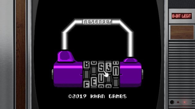
Even the title screen is a puzzle. Thankfully, you can skip it if.. likely WHEN.. you need to replay the game.

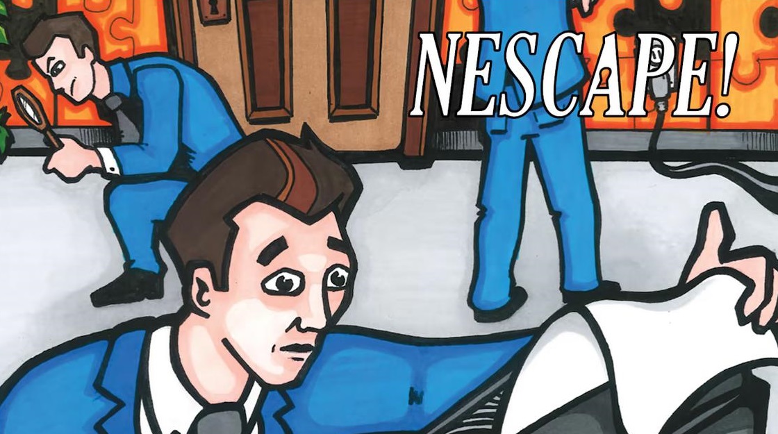
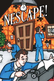
I wanted to like this so much. Going into NEScape, I figured it’d be a novelty-at-best experience. Hey, it’s the Escape Room phenomena, only as a Nintendo Entertainment System cartridge. But, my expectations were quickly tempered. There were a few warning signs, the first of which was the hideous cover art that looked like absolutely no thought or consideration was put into it. At the point of sale, your first impression is the cover/logo for your game. You’re not supposed to judge a book by its cover, but when the cover art looks like this:

.. yea, that’s a red flag. Why not have 8-bit pixel art showing escape room elements? That’s the point of the game, right? The only reason you’d want to play it: an 8-bit escape room on the NES. Not only that, but there are people who specifically like pixel art style games. I’m one of them. But, if I had seen this on the store page, I’m not entirely sure I’d of clicked the page to see what the graphics actually look like. Not with this cover. Just having “NES” in the name isn’t enough. Yes, that’s an incredibly nit-picky thing to whine about, but a pet peeve of mine is bad cover art. It bothers me even for games I don’t like. You went through all the effort of making a video game, and THIS is the first impression you want to make at the point of sale? NEScape actually has really good graphics as far as NES Indies go, but you wouldn’t know it from this.

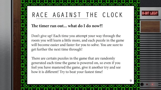
So, that was ominous sign of the type of consideration that went into making this. But the real canary in the coalmine was the instruction book’s warning about time running out and how not to give up, because you’ll make it a little further every time. Oh dear. Yes, hour time limits are the primary challenge in real escape rooms. But, strict time limits should not carry over to video game escape rooms. Among other reasons, real rooms have a better user interface. It’s called reality. You don’t have to figure out the controls of reality. You just act. You can pick stuff up and examine it with your own hands. You can move about freely. You can focus on whatever you want to without having to move a cursor around to switch rooms or click on objects to get a close look. Escape Rooms also need the time limit because they’re a business that has to do multiple sessions every day to be economically viable. On days where they’re not jam-packed or have no walk-ins, most generally allow players to continue past the time limit if they fail (especially if they’re close to the end). Strict time limits only make sense in real rooms on busy days.

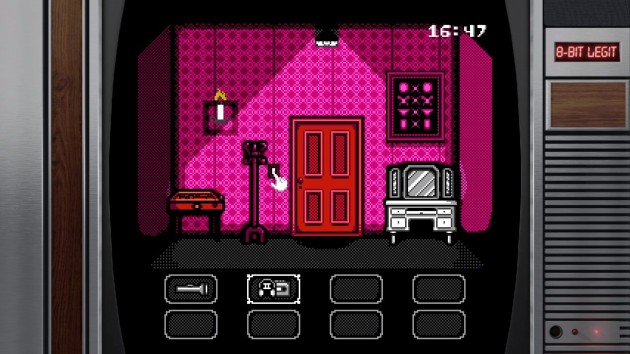
There’s four “rooms” to look at (hypothetically one room with four sides. This house wasn’t made by Thomas Jefferson). There’s a curve to figuring out where to click to advance to the next room.

In the non-corporeal world of video games, you DO have to fumble with interfaces. You DO have to fumble with a cursor. You DO have to fumble with navigation, like where exactly on the screen you click to change rooms. You DO have to fumble with item usage. You DO have to fumble with what’s clicklable and what isn’t. Video games are always going to be more clunky, and you have to take that into account. NEScape doesn’t at all. It seems to expect players to fail and then start over from the beginning. That’s why the instruction book says this:

By the way, that design logic is fine.. provided you make a game that’s fun to get back to the part you died on. An escape room is almost never going to be that, randomized puzzles or not. You already know what item you use on what thing, and that part doesn’t change. Even the random elements won’t matter because it’s not WHAT the solution is but how to come to that solution that’s the fun part. Staring over from the beginning and working your back to the part you lost on is just a chore, and it’s going to be a longer chore every single time you fail. Well, NEScape goes strictly by the timer. The moment it runs out, you return to the title screen. They didn’t even do an alarm or a gong or anything. I mean, come on! It’d be like a Mario game without the death animation and fail music. Have a little pomp to your game! I’m surprised they didn’t have a buzzer, because the one good thing I can say about NEScape, besides having good graphics, is that it has pretty good sound design too. I really liked that the game changes to a different chip tune every time the lights dramatically cut-out to signify a major turning point in the ultimate puzzle. That’s a great idea and I hope other video escape rooms do something similar. But, that’s where my complements end.

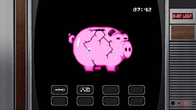
Ah, video game logic. There’s a piggy bank and you need to open it. In the wacky world of video games, you need to find a hammer. In real life, piggy banks have a cork in the bottom that you can use to get the money out. Everybody knows this. Also, the ground exists. Why bother with a hammer when you’re presumably a person and not ghost. Just pick it up and throw it against the ground, right?

Another red flag was that the press kit I got for this game also included a complete walk-through, along with the solutions to every puzzle. Uh.. seriously? You don’t have to use it. We didn’t, and in fact, full disclosure: we didn’t finish the room. We played the game earlier this week and quit on the sliding puzzle when we got into an argument over what moves to make (yes, the guide has literal step-by-step instructions on how to solve that part, too). We fired it up a second time last night, but timed out late into the game. Look, I’m not above using a guide to beat a game. I do all the time. But it’s really, really rare for a developer of a game to send a step-by-step guide on how to beat the game to the people they’re presumably asking to evaluate it. Especially when that game has no action. They’re just puzzles, and when you tell someone how to solve the puzzle, that defeats the whole point of it, right? One of the most common mistakes indie developers make is telling play-testers how to play the game. Especially if they see the players get stuck or confused, or if the design is too obtuse. The correct way to do it is to just stand and watch, and not offer assistance even if the players ask for it, and then making adjustments based on OBSERVATION. Many people consider Portal to be the greatest video game ever made, and it got there because they watched play testers but offered no help to them. If they had done play testing THAT way, it wouldn’t be the intuitive masterpiece it is today. Unfortunately, many developers tend to hover over players and basically Mommy-them through the game. In eleven-and-a-half years of doing Indie Gamer Chick, I can’t remember a puzzle game developer sending me the game AND the solution to the game. “Ooooh.. that doesn’t sound promising” I thought when I saw that. And I was right.

If you’re deaf, you’re going to need the guide (in fact, I think the game should have a disclaimer saying as much on the store page). Some of the puzzles are based around sound, including digital voice samples that tell you the password for certain things. I don’t think any of the “random” elements are musically based, so you should be good there. In fact, having now read the guide (since I’m never playing this again, so screw it, why not?) the only random element is apparently a Simon game near the end.

NEScape isn’t exactly the most original escape game. The classics are all here. A puzzle where you have to tap the right piano keys? Check. A puzzle where you have to move the hands on a grandfather clock? Check. A puzzle where the solution is based on assessing the correct order of picture frames? Check. That’s not a knock, by the way. The classics are classics for a reason: they work. Hell, they’re probably the best puzzles in the game. If NEScape stuck to these, it’d make for a neat novelty game. Because that was the ceiling here. The creativity begins and ends with “..only this time, it’s for the NES!” And it’s not a particularly strong game on its own merits. There’s no story besides “I woke up in a room” which, fine, whatever. The puzzle is the attraction. But, instead of focusing on typical escape room logic, you also have to solve mini-games, and this is where it really falls apart.

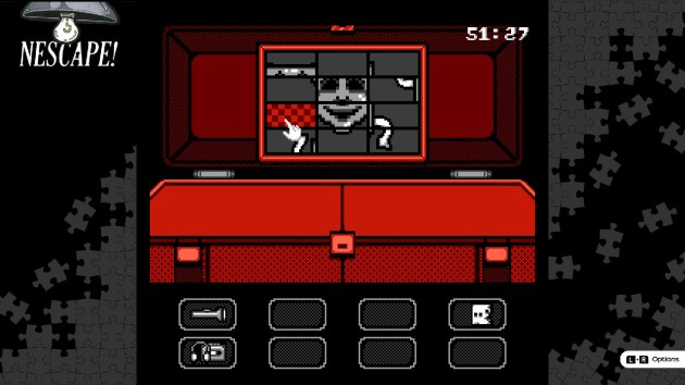
It’s never a good thing when a game causes my normally docile family to erupt into a screaming match. The magic of sliding puzzles.

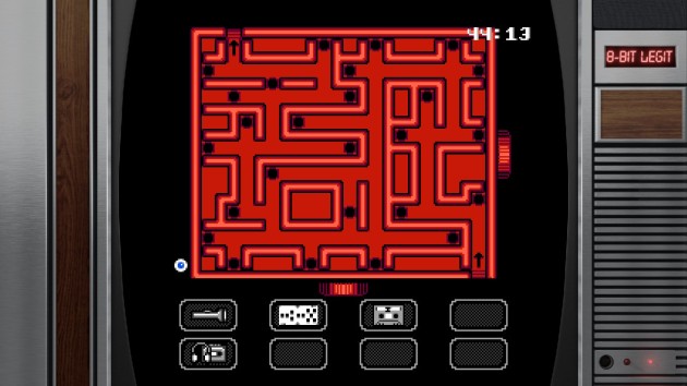
Like, early on, you have to do a sliding puzzle. For me, the attraction of escape rooms is doing them with my family. We all have a notepad, and we cooperate to solve the puzzles. You can’t do that with a sliding puzzle. You also can’t do that with a ball-in-a-maze tilt puzzle (one that even the guide advises you go slowly on). There’s even a “spot the difference” puzzle in this, and it’s one of the dumbest things I’ve seen in any game. For god’s sake: it’s 8-bit graphics and collision boxes in tiny windows we’re dealing with here. It wasn’t exactly QuickSpot. Like the other non-escape room stuff, it just stinks of busy work made to shave time off the clock and force replays. We still might have beat the clock, but during the fourth chapter, we ended up spending too much time trying to solve frame-swapping puzzle. At more than one point, we knew we must have solved it, but nothing happened. The design of it was.. well.. 8-bit enough that we weren’t 100% sure, so we kept tweaking it over and over.

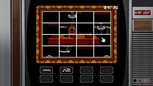
This is the swap puzzle in question, which should not have been clickable until it was the next puzzle in the sequence.

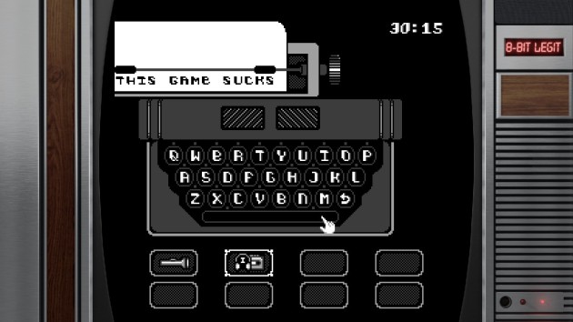
Well, it turns out, that wasn’t supposed to be the next thing we did. What happened was the lights went out, and when they came back on, there was this nonsensical gibberish on the typewriter. We knew there was a clue in it, so Mom and Angela took a pic on her phones to study it while I exited the screen to explore. Upon exiting the typewriter, the telegraph tile-swap puzzle was right there and opened in the same room we were already in, so we worked on that. Unknown to us, a hammer had spawned in another room during the last interval, and the puzzle associated with THAT was the next puzzle we were supposed to do, with the telegraph not working until that part was completed. It’s the type of design logic that’s there to deliberately mislead you and shave time, which is what bad escape rooms do. Granted, this was made in 2019, where what’s called “red herring design” was more common. It’s a design trope the industry has largely phased out, because they learned people are more likely to become repeat customers from winning and not timing-out and coming back to do the same room again. But, for us, it was the final straw. You can do this type of “not this puzzle YET” design in real escape rooms because your party can split up. Divide and conquer. In video escape rooms, everyone is tied to one screen. Should we have explored first before wasting time on the puzzle? Maybe. But, that’s the risk the developer took on when they designed it that way: that they’d piss off the players for deliberately wasting time with the obvious attempt of forcing a restart.

Well, it does.

Do you know what I’ve noticed? My friends who actually liked NEScape were not escape room fans. Indie Gamer Team’s Aki liked it. My friend Daria liked it so much she considers it one of her favorite NES Indies. If you’re a fan of games like Shadowgate or Uninvited or Deja Vu, where dying and starting over is expected, you might like this a lot more than we did. Meanwhile, my family hated this so much that we went to an actual escape room this morning just to get the nasty taste of NEScape out of our mouth. This is a terrible video escape room. There was no point in the strict time limit. Hey chaps: the game wasn’t very fun to begin with. Forcing a from-the-start replay was going to be especially annoying with all the busy-work you created between the puzzles. WE considered restarting. In fact, Angela worked out the game’s typewriter puzzle while we sat around bitching about the red-herring, time-eating sequence issue. She was going to get us back to the spot we were on, but when she got to the sliding puzzle, she said “oh right.. I forgot about this stuff. Yea, I don’t want to do this stuff again.” C’est la vie!

This isn’t a puzzle. It’s a time sink. One that you have to heeltoe your way through to avoid having to restart it. These mini-games are what ultimately sealed NEScape’s fate for us. I can deal with clunky interfaces, and I can even deal with having to redo puzzles (stupid and self-destructive as that idea is). One thing I can’t deal with is being bored, and the greatest sin of NEScape is the padding it chose is BORING!

So, that was that. If the thought of replaying the same puzzles over and over again until you finally open the ultimate door sounds like a good time to you, hey, you might enjoy this, ya weirdo. We didn’t. If it had just stuck to the puzzles, this would have been fine, I guess. Certainly not great. The interface was too clunky to rise to that level. Unfortunately, NEScape set itself up for failure with the strict time limit, which forces you to replay mini-games I didn’t even want to do one time, let alone multiple times. And FYI, a strict time limit would have likely sunk Escape Simulator or the Cape’s Escape Games as well. This is especially true of Escape Simulator, which has a short timer. But, that game doesn’t end when you time out, nor are you penalized for it. It’s more of a high score or time trial type of thing. The mini-games weren’t the deal breakers by themselves, but they did make me dread that replay. When Escape Simulator, Cape’s Escape Games, or Japanese Escape games do mini-games, I find them annoying too.. BUT I’M NOT FORCED TO REPLAY THEM! Escape Rooms require a different mentality from other games. They’re one-and-done. Replay value is not expected, and I’m not sure the developers understood that staple of the genre. BUT, if you want replay value, the way to do it is by adding hidden objects. It’s not by forcing you to redo the same puzzles with the same solutions over and over. That’s not fun, and NEScape isn’t fun. Lock this one in a room and throw away the key.

NEScape is not Chick-Approved

NEScape! was developed by KHAN Games
Point of Sale: Nintendo Switch, Xbox, NES Cartridge (Coming Soon?)

$4.99 timed out in the making of this review.

A review copy for Nintendo Switch was provided for this review. Upon the game’s release, an Xbox copy was purchased by Indie Gamer Chick.


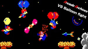
Arcade Archives: Vs. Balloon Fight (1984 Arcade Review)

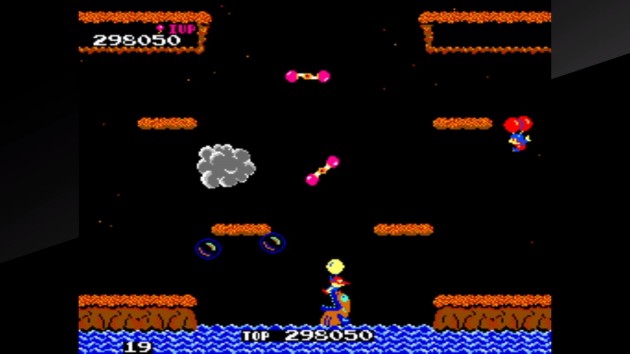
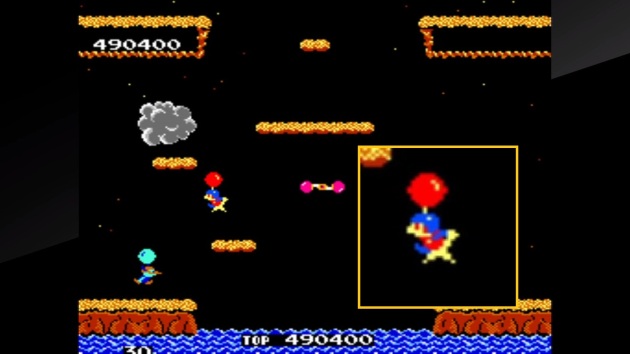
Owwww. Ow ow ow ow ow. Owwie. My hands. My beautiful, bony hands. What the hell were they thinking with this one? Look, I’ve never been the biggest Balloon Fight fan in the world. Admittedly, I’m not a fan of Joust, either. So here’s a warning to fans: maybe take this review with a grain of salt. Balloon Fight has never been for me. But, it could be with enough twists to the formula, which is why Vs. Balloon Fight got my attention. Of all the Nintendo Vs. System coin-ops, Balloon Fight has the most profound change to the NES counterpart. Well, besides Vs. Duck Hunt, where you can shoot the dog in bonus rounds (though you’re not supposed to). It’s the same concept: flap your arms to fly, and then come crashing down on top of enemies to pop their balloons. After that, you then can hit them a second time as they parachute down, or kick them off the ledge once they land, Mario Bros.-style. So, yea, in a nutshell, Balloon Fight is really just Joust with an extra hit-point and parachutes instead of eggs. The big difference over its NES counterpart, besides having a lot more levels, is that Vs. Balloon Fight is not a single-screen game. In the coin-op, the size of the playfield is doubled vertically and you have to scroll the screen upwards. It makes for a more exciting, intense experience. Enemies might come flying out of nowhere (especially when bumpers are added after six stages) creating a chaotic atmosphere that somehow never feels cheap because you ought to know better than to leave yourself wide open from the unseen menaces above. It should be great!

Sigh.

Here comes the “but..” Like the Starks say: nothing counts before the “but.”

Vs. Balloon Fight has absolutely brutal gravity. The amount of flapping it requires is completely unreasonable by any standard. The NES version allows you to maneuver with a steady pulse of tapping the button. But, for a game that you’re expected to pay two bits per session, that won’t do at all. You have to absolutely button-mash to maintain your flight, Track ‘n Field-style. I’m not having a pity-party for myself here, but I literally physically cannot button mash to this degree anymore. Thankfully, my family, including my 12-year-old sister, also couldn’t believe how furiously you had to tap the buttons to maintain your flight. Again, I’m not a fan of the NES version, but I think I’d remember if this was one of the reasons why. Just to make sure, I threw on the home version on Switch Online, and it took me only a few seconds to verify the gravity for the arcade version isn’t like the NES version at all. The worst part of this whole issue with Vs. Balloon Fight is, if you start to come down, the gravity seems to further intensify, requiring even faster flapping to regain your momentum. Maybe that’s more “realistic” but it’s a frick’n video game about a guy in a balloon dueling to the death with birds using balloons themselves. To hell with realism! And why the heck didn’t anyone care this much about realistic gravity when it was Pinball? The gravity especially affected me in the wide-open bonus stages, which require you to chase down balloons that rise out four chimneys. I would inevitably lose my strength, and any attempt at recovery was hopeless and I’d crash pathetically to the ground with balloons still rising.

In addition to the crushing gravity, the walls and ceilings seem to have a lot more bounce to them. This can be problematic near the water. The enemies tend to do what I call “ride the current” and drift across a straight line, going through one side of the screen and coming out the other, and this will likely include one that hovers just above the water line, where the big fish will jump up to snatch you. Since there’s often platforms right above you, I tended to bounce off them and make myself hover too close to the water. I lost more lives to falling in the drink than I did to the enemies, easily. Well, partial credit for the bumpers. Those things ought to have warning signs. And yes, the fish will eat the enemies too, and it’s ALWAYS hilarious when it happens!

On the NES, you can hold the B-Button to autoflap. Thankfully, Arcade Archives games almost always have an option on the button mapping menu to turn-on autofire. Even better is that you can set the speed, and this is one of those games where that matters greatly. In fact, I took advantage of it and set a different flap speed to each face button (kinky, right?). It works great! Hey, the game’s now completely playable, and you get to appreciate what is actually a massive improvement on the Joust formula. Fun characters. Lots of charm. The combat has weight and my beloved OOMPH and it feels impactful to crash a balloon, complete with satisfying POP sound! It always brought a smile to my face seeing the sad look of an enemy as it slowly drifted to its potential doom. Of course, they can turn the tables on you if you wait too long, pumping a new balloon and upgrading to a more aggressive level of AI. There were also moments I got sadistic glee out of. Like having a stage with lots of bumpers, and I’m at the top of the level and suddenly I hear the fish jumping up and down, and then a few seconds later a bonus bubble starts to rise onto the screen, meaning an enemy just got eaten off-screen. Side note: I’d like to think that the bubbles are the enemy souls going to Heaven and bursting them sends them straight to Hell. Or maybe it stops them from being resurrected. Either way is bliss!

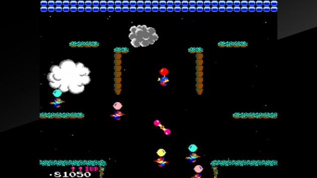
I did NOT die from this. When you take too much time to finish a stage, the clouds tap three mountains and cast Ball Lightning at you. It bounces around the stage and is an instakill even if you have two balloons. But, right here, more than half of it hit my body and I survived. That might be the most generous collision box I’ve seen in an arcade game.

Now, here’s why the gravity should be a deal breaker: because in the two modes designed specifically to compete for online high scores, you can’t turn on autofire. Yes, there’s online leaderboards in the main mode too, but you can cheat like you’ve been made an honorary Houston Astro in those. In addition to all scores counting no matter what adjustments you make to the game’s default settings (including giving yourself extra lives), you can use the interrupt save state feature. Until you game over, you can keep returning to the main menu and restarting from where you last saved. I used this to put myself 4th on the all-time leaderboard, because screw it, why not? Meanwhile, if you so much as pause the game in Hi-Score or the five minute Caravan mode, the game is over. You can’t just continue and must restart the game. While future releases of Arcade Archives would allow autofire in Hi-Score/Caravan, since it makes no sense to ban them when everyone has the option to turn them on and thus it’s a level playfield, they’re disabled here. So, 66% of the game requires you to mash buttons more than any game not based around the Olympics should, and those are that have protection from cheating. I figured this was an easy NO! Well, no, because it’s not 66% of the package where autofire is disabled. It’s 50% of it.

Let’s talk about co-op.

My promise to my readers in 2023: I will make a good faith effort to take the multiplayer for a test drive in games more often.

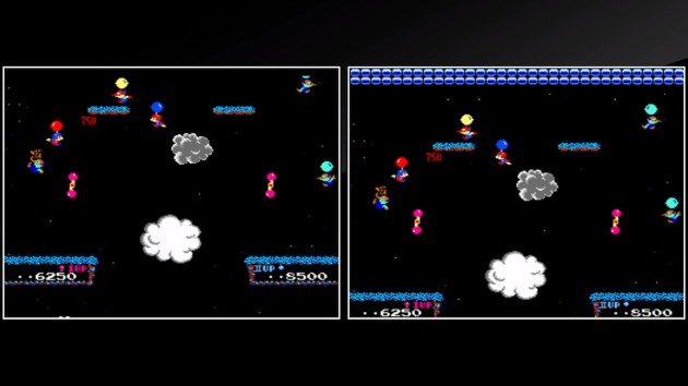
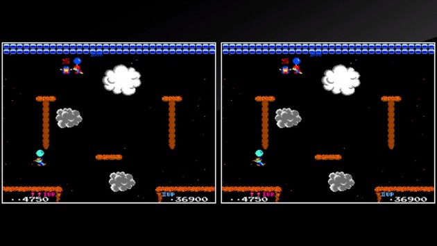
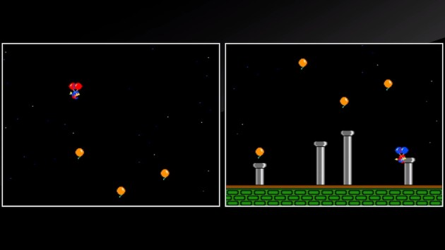
Being a Nintendo Vs. System release, a real Vs. Balloon Fight has two screens, which allows for two separate games to be played at once OR for a two-screened co-op experience. On a single Nintendo Switch, this is represented by two side-by-side mini-screens. Or, if you each own a separate copy of Arcade Archives: Vs. Balloon Fight, each player can have their own screen with one of the players hosting a game. I wasn’t willing to spend $16 on this, so Angela and me played on one screen “cooperatively” in quotation marks that feel ashamed to be associated with such an obvious lie. The only cooperation we showed was our mutual understanding that the two of us would be spending the next hour trying to assassinate each-other. Oh sure, we were bound to kill a few enemies would die along the way too. You know, in the crossfire. But really, once the game started with me immediately making a beeline for her and popping one of her balloons, sh*t was on. And guess what? It was a lot of fun, but it also further exposed some obvious weaknesses in Vs. Balloon Fight.

YOU MURDERER!

If a player runs out of lives, they can’t just re-up without issue. When either player has a game over, the action pauses and goes to the continue screen. If a player continues, the level restarts from the beginning. Since the other player was likely to be on their last life, we took to just feeding ourselves to the fish as soon as the game restarted so that we’d both have full lives to continue the fratricide. I get that it was 1984 and jump-in continues weren’t the commonplace practice yet, but it really hurts the flow of the multiplayer mode, especially when you’re having a blast killing each-other. It also sort of renders competing for points completely pointless. If you’re losing, pull a Tonya Harding and whack the other player. Your score resets to zero if you die. If you got a high score, too bad. That’s fine though. We had a jolly good time playing aggressively against each-other while also dealing with the enemies. We came to appreciate a comically well-timed betrayal when one of us was actually dealing with the baddies.

We’d actually work together best during bonus stages. I credit the cheerful music. Also, just so we’re clear: there’s no Balloon Trip mode in this. With the gravity it has, it’d basically be impossible anyway.

Even my parents got in on the action, and watching my Mom avenge me by taking out Angela about three seconds after Angela respawned from the previous murder will go down as an early highlight of 2023 for me. So, was this multiplayer mode enough to save Vs. Balloon Fight? Surprisingly.. yea! Barely, but barely counts. While I’m still pretty peeved that the modes I cared most about going into this are basically unplayable by me, fun is fun, and with autofire and a second player, Vs. Balloon Fight is a lot of fun. It could be more fun with some adjustments, like letting players reload without the level restarting. Especially since you’ll be draining each-other’s lives. Or, if you want to legitimately cooperate, that’s also fun. Of course it is! Trying to make homicide look like an accident is always fun.

Angela: “I KNEW IT!” Oh, like you weren’t doing it too!

Arcade Archives: Vs. Balloon Fight is Chick-Approved

Arcade Archives: Vs. Balloon Fight was developed by Hamster
Point of Sale: Nintendo Switch

$7.99 burst your bubble in the making of this review.

Dragon’s Lair Trilogy: The Definitive Review (Complete 3 Game Review + Rankings)

2023 marks the 40th Anniversary of Dragon’s Lair, a pioneer of “more fun to watch than play” gaming. I was born in 1989, and while Dragon’s Lair II: Time Warp technically counts as “my lifetime” really, two-year-old me wasn’t playing anything besides peek-a-boo by that point. Fast forward to the 2000s, when we ended up owning Dragon’s Lair on DVD. “Have I got a game for you!” Dad said to teenage me. He threw it in and handed me the remote control (which was NOT a very good controller) and it was just about the worst thing I’d ever experienced in my life. Even Dad admitted that playing it with a DVD remote control was not the smartest idea. We tried it on a game console but it kept clicking-through to the DVD control menu. Fast forward to Christmas morning, 2010, and waiting for me under the Christmas tree, again from Dad, is Dragon’s Lair Trilogy for the Wii. The look on his face was so precious, a look that continued later in the day when I threw the disc in and proceeded to get totally demolished by the games.
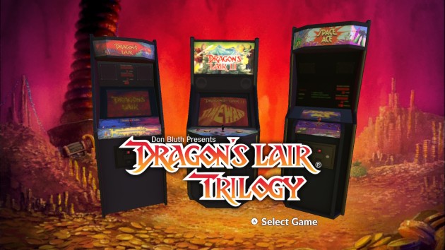
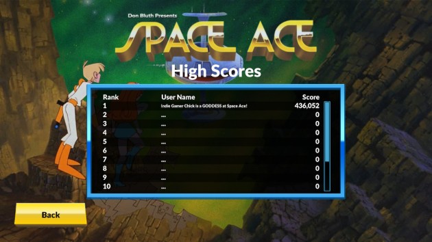
Dragon’s Lair, Space Ace, and Dragon’s Lair II: Time Warp are games that never stood a chance against the test of time. They’re famous for three things: being beautiful to look at, being difficult, and barely qualifying as video games. They served as little more than novelties, or “attractions” for arcades. Well, Dragon’s Lair did. In my eleven years on social media, I have never once heard a single person trade a tale of Space Ace in arcades. Not once. On the other hand, I had one reader describe Dragon’s Lair’s reign as king of arcades like a bright, beautiful shooting star. Look away for a moment and you risk missing it completely, but if you saw it, you’ll never forget it. No game that has aged as badly is remembered so fondly by the generation that experienced it in-person in arcades. Sadly, it’s a phenomena I’ll never be able to fully understand no matter how hard I try. When Dragon’s Lair 3D: Return to the Lair released in 2002, to 13-year-old me, it was just another game, and not even a good one. The excitement of actually playing Dragon’s Lair was lost on me and my generation. A “you had to be there” we can’t understand.

Or, maybe not? The only way I can know for sure is to put these games through the wringer.
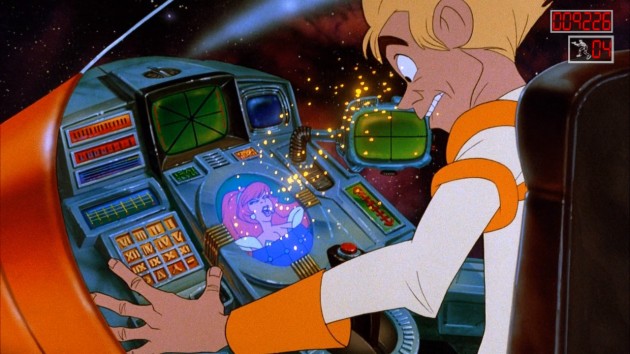
This is pretty much how my reviewing appears to developers.

Dragon’s Lair Trilogy retails for $19.99 on PlayStation, Nintendo Switch, and Xbox, with each individual game being sold separately on platforms like Steam for $9.99. Since that’s the sold-separately price, we’ll round it up and say a quality game in this set is worth $10 in value. I’ll round up the $19.99 price and say Dragon’s Lair Trilogy must get $20 in value to win my Seal of Approval. But, before I figure up the value of the games, I need to look at the slate of extra features in the set. Oh, before that, I have to mention the menus of Space Ace. Take a look at this screenshot from when you pause the game.
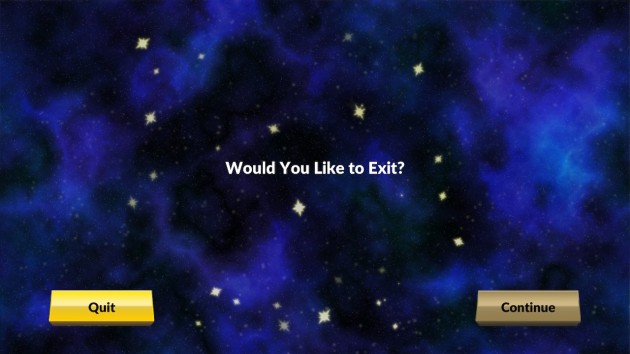
What option do you think is highlighted here? Believe it or not, “Continue” is the highlighted option, while nothing is highlighting the bright “quit” option that stands out a lot more in this screen. This is such a obviously bad choice that I’m convinced it’s an accident. That they MEANT for the brightened option to be the highlighted one, but whoever designed the menu accidentally crossed their 1s with their 0s and got it backwards. By the way, in every menu option where there is only two choices, this problem is there. Why not have an arrow? You know, that time-honored symbol you use to point at something and say THIS ONE! The other menus aren’t that much better. For Dragon’s Lair, is purple THIS ONE, or is it red? You would know from the front menu of the game since there’s more than two options to choose from and only one is a different color. But, if you weren’t paying that close of attention when you started the game, you wouldn’t know. Combined with the distinct lack of options for one of the extra features that I’ll get to and you can tell they just didn’t really care all much about presentation. I would have looked past it and just called this lazy, but then I keep going back to the gold/faded gold highlighting decision. I’ve been playing games my entire life and that’s the absolute worst menu select choice I’ve ever seen. I’m fining Dragon’s Lair Trilogy $5 in value for this. From here out, this will be the standard Definitive Review fine for bad menu design in classic game collections.

EMULATION EXTRAS

This slideshow requires JavaScript.

Dragon’s Lair Trilogy provides a few options for playing the games, though the one I wanted most is notably absent. You can choose three or five lives for each game. It really sucks that there’s no option for unlimited lives and a modern-style death counter for these games. There is every possibility that such an option might have made the difference between winning and losing. The lives system only makes sense if this is trying to suck money from players in $0.50 intervals. These days, the fun is in seeing how many times you croak before reaching the ending. It’s been years since this released, but if Digital Leisure wanted to attempt to appeal to modern gamers (and why wouldn’t they? We spend money too!), you don’t have to lower the difficulty. You just have to, you know, make it fun to die.

This slideshow requires JavaScript.

There’s also adjustable difficulty for the first Dragon’s Lair and Space Ace and a cabinet mode for all three games that I didn’t like one bit. Having played a lot of retro collections, there’s something about how this set handled scan lines on a TV screen that I found unconvincing. Dragon’s Lair allows you to play either the “Arcade” or “Home” versions. In the arcade version, you move to another screen if you die, whereas in the home version you have to repeat the stage until you complete it. Also included is a “Director’s Cut” option to play Dragon’s Lair II that changes the second-to-last level, making it shorter and nowhere near as memorable. I’ll talk about that more in the review of that game.

This slideshow requires JavaScript.

The most important addition is the “move guide” that you can optionally add to the bottom of every game. This is not the same as the flashing-light indicators the games originally utilized to guide your actions. It’s a directional overlay that tells you the exact button press, and you simply have to be quick on the draw. The cabinet mode also has lights that tell you which direction to press located around the joystick. Unless you have the games memorized, you basically have to play with either the move guide or the cabinet mode turned-on. Especially the first Dragon’s Lair and Space Ace. Take, for example, the very first scene in the entire game. Dirk falls through the rotten wood on the drawbridge and a monster pops out of the moat. You’re supposed to swing your sword at it, but the sword doesn’t flash yellow. You’re just supposed to know to use your sword, I guess. In fact, both Dragon’s Lair and Space Ace don’t always use the yellow indicators for both the action and the movement, and sometimes you just plain have to make an educated guess. By time Time Warp came around, they had included it with every move, but even with it, I found I couldn’t make progress at all without the move guide.

This slideshow requires JavaScript.

Of course, the downside is, they cover up the animation, which is the whole point of playing these. Instead of watching the whole screen, you’ll inevitably stare at the bottom of the screen waiting for the next prompt. I suppose you can think of this as a trainer to memorize which moves you do on what screen, but that’s assuming you actually want to get THAT good at forty-year-old games. Either way, the move guide is a welcome inclusion, but I’m not at all satisfied with the lack of options. Given how you can watch each scene bit by bit in the media extras, why not let people play and practice them? Why not have the option for a death-counter instead of lives? I would hope a modern re-release of a Dragon’s Lair collection (which would hopefully solve licensing issues and include more games) would do more in the future. As for this specific set, for all the emulation extras, I’m crediting no extra value to Dragon’s Lair Trilogy. If they gave you the option to replace the lives system with a death counter, I would award $5 in credit towards the set, and $2.50 for being able to practice individual scenes.

MEDIA EXTRAS

“The fish was about this big..” “That’s not how a big fish story is supposed to go, Rick!”

Dragon’s Lair Trilogy comes with a couple media extras, the highlight of which is an interview with Don Bluth, Gary Goldman, and Rick Dyer. It runs a little over twenty minutes and, if you’re a fan of this stuff like I am, it’ll leave you wanting a lot more. Not because this lacks the good stuff, but because the interview is so well done. Dyer especially comes across as a cool guy. The type of guy you want to see succeed. A mad scientist who, more or less, invented the FMV format as we think of it today. For better and for worse, I suppose. The problem with this interview is that there’s no option to rewind or fast forward. There’s volume issues, and if you mishear something, you have to restart the whole video and watch it again. That really sucks and I have to cut what I would reward this feature by half as a result. I wish it had been broken into separate segments. It makes no sense why they didn’t, especially since the actual feature does have title cards for each different part of the interview.

This slideshow requires JavaScript.

Dragon’s Lair Trilogy’s only other notable extra is a deleted scene for Dragon Lair II: Time Warp. It runs under a minute and is a partially voiced storyboard for a level set on a pirate ship, complete with what parts would flash yellow to indicate an action. The scene looks like it would have been dull. What’s frustrating is that the original Dragon’s Lair had many deleted scenes, including a full new “room” where one-eyed gargoyles hurl spears at Dirk. The scene is shown in the interview above, but you can’t watch it separately. Even more disheartening is the scene was apparently completed and colored by Digital Leisure, presumably with the intent of making it playable, but it’s nowhere to be found outside the interview. A quick glance at YouTube also makes it appear that there were multiple unused death animations that never made the game. It sure would have been swell to have all those. Space Ace gets no deleted scenes.
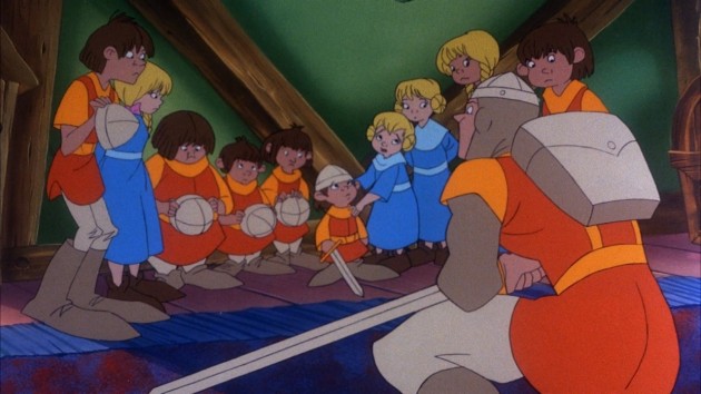
Dirk the Daring: the one hero in gaming who has irrefutable proof that he actually scootilypooped with the damsel he rescued. Of course, this leads into one of the great mysteries of video games: how the hell did Princess Daphne squirt out ten kids in what looks like a span of ten years and still maintain her figure? Clearly she messes around with the dark arts, which would explain why the forces of evil are always trying to kidnap her. They want to know her secret!

In fact, Space Ace feels pretty unloved by this set overall. Right before I finished this feature, I found out that a conversion kit for Dragon’s Lair II: Time Warp was created in 1991 that could turn it into a more difficult version of Space Ace that used diagonal moves. This is not included in this set. Space Ace’s only two “special features” are also included for the other two games: the attract screen and the ability to watch the full game without having to play it. That last one is the best feature, and it really says it all about this set, doesn’t it? That the best part about Dragon’s Lair Trilogy is the ability to just watch it without playing it.
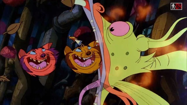
They never mentioned which drugs produced the concept for Dragon’s Lair II.

Also, they got the three main guys behind the trilogy together to do a really good interview. Why stop there? DO AN AUDIO COMMENTARY!! Like, duh, right! Angela, future Spielberg of her generation, has helped me to rediscover the greatness of a well done feature film audio commentary. Dragon’s Lair and Space Ace especially could have benefited from hearing how game designer Dyer and animation expert Bluth came together to make one of the most famous games of all time. At one point in the interview, they touch upon how Bluth would interpret Dyer’s storyboards and create animation that didn’t work from a video game perspective (suddenly I have a hunch what went wrong with Dragon’s Lair II). Which scenes? In which ways? We don’t find out, and an audio commentary could have corrected this. Maybe we’ll get one eventually. Anyway, for all the media extras, I’m crediting $2.50 in value to Dragon’s Lair Trilogy. Had they offered more flexibility with how to watch the interview, I’d of called it $5.

THE ULTIMATE VERDICT ON THE COLLECTION

For those not familiar with my way of thinking of how retro games should be reviewed, I take NO historical context into account. I don’t care how important a game was to the industry, because that doesn’t make a game worth playing today. The test of time is the cruelest test of all, but every video game must face it. I might not be here if not for Space Invaders’ success, but I wouldn’t want to play it today. Not when there’s better options. Therefore, when I review retro games, every game gets either a YES! or a NO!

YES! means the game is still fun and has actual gameplay value when played today and is worth seeking out.

NO! means the game didn’t age gracefully enough to merit playing today and is not worth seeking out, and certainly not worth spending money on.

For Dragon’s Lair Trilogy, the final score was as follows:

YES!: 1 ($10 in Value)
NO!: 2
$2.50 in Extra Value
$5.00 in Fines
TARGET VALUE: $20

TOTAL VALUE: $7.50

Dragon’s Lair Trilogy does not earn my Seal of Approval. With only one game worth playing today, and a game that you can buy separately on a few platforms, it’s not worth buying the whole set. Frankly, I’m still stunned that I could give any game in Dragon’s Lair Trilogy a YES! at all. I had previously planned to have “I HATE FMV GAMES” etched on my tombstone. But really, there’s no reason to own all three games, one of which isn’t THAT bad but not good enough and one of which is one of the worst coin-ops ever made. I suppose you can still feel free to grab this set REALLY cheap. Like, under $10 cheap. Even then, I’m sure you can get Dragon’s Lair by itself even cheaper.

GAME REVIEWS

Dragon’s Lair
Released June 19, 1983
Designed by Rick Dyer
Directed by Don Bluth

One of the problems with adapting Dragon’s Lair today, in the 2020s, is people would have a cow about a character like Princess Daphne. As if friendly but vapid airheads don’t exist anymore. Or perhaps they wouldn’t if not for portrayals in media, like this? I think that’s the argument. Frankly, I don’t care. Besides, Dirk himself is completely brain dead too. They are gaming’s most fit couple.

Man, did I ever get it wrong about Dragon’s Lair. I got fixated on the whole “it’s really just playing Simon Says with animated cues” aspect. Which, by the way, is still there. As far as elephants in the room go, this is an especially large one that’ll always be around, like a photo-bombing woolly mammoth. But, when you really stop and look at the set pieces and the timing and themes of Dragon’s Lair, you realize that, more than any FMV game ever made, Dragon’s Lair succeeds at creating the illusion of video game-like interactivity. Not only that, but it does so in a way that is practically clairvoyant. That read the tea leaves flawlessly on where video games would go eventually. It’s ironic that the sequel is called Time Warp, when really, it was the original game that saw the future. The type of boss fights and challenges in games that didn’t exist in 1983 but do now. Come to think of it, many were probably inspired by this!
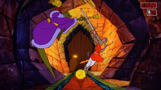
I think one of the aspects that makes Dragon’s Lair stand out is literally every single character is memorable. It’s such a shame that nobody has managed to make a truly great game based on this franchise in the forty years since the original. All the pieces are certainly in place.

You can’t talk about any of these games without talking about the Don Bluth animation. Before we start, I want to qualify myself: I am NOT an expert at animation. I just watch a lot of it. People talk about Dragon’s Lair like it’s right up there with The Secret of NIMH or An American Tail or The Land Before Time. But, it’s actually not that high of quality. It’s somewhere between a really expensive Saturday morning cartoon and a feature film. Whenever a corner could be cut, chances are it probably was. There’s a lot of reused animation throughout the game. People, including myself, overlook that, but when you’re paying attention, they stand out. Space Ace is worse about it, but it’s there throughout Dragon’s Lair. On the other hand, I love the use of color and I think the backgrounds are just beautiful. I think they went a long ways towards making Dragon’s Lair work. It feels like an adventure because it looks like one.
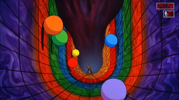
The later Dragon’s Lair 3D tried to recreate set pieces like this to various success. Had Dragon’s Lair 3D featured the smooth controls and lightning-fast responsiveness of a game like Prince of Persia: Sands of Time, for all we know, it might have gone down as one of the all-time greats. But, Dragon’s Lair 3D had sluggish controls, a problematic camera, and this RIDICULOUS recoil whenever you ran into a wall or object. AND YET, it still managed to be just a little bit alright, but nothing special. For a game with that many problems to still step across the “alright” threshold makes me wonder what if? about it. What if it had good play control and didn’t have that absolutely stupid recoil? Would it have been an unprecedented hit and reignited the franchise? We’ll never know, I suppose. I’m sure eventually they’ll re-release it, but I hope they don’t in its present state. Dragon’s Lair 3D turned twenty-years-old in November, and gaming has come a long ways. Scrap it and go again with modern technology and maybe, at long last, Dragon’s Lair will be the franchise it deserves to be.

Having said all that, I think the understated part of what makes Dragon’s Lair work, besides the beautiful use of color and the striking backgrounds, is that every room creates the illusion of an interactive video game. The last third of Space Ace and pretty-much all of Dragon’s Lair II come across like watching a movie that someone shoehorned button prompts into. That happens in Dragon’s Lair too, but it’s most rare in this game. The rooms are designed like video game challenges. Swinging left to right (or right to left if the room is mirrored) across flaming ropes. Dodging giant, rolling balls that are set to a pattern. You’re always acutely aware you’re not really controlling Dirk the Daring, but Dyer and Bluth did everything in their power to suspend your disbelief anyway. They even manage to succeed in some rooms, where the framing and directional options are unambiguous: the challenge is right, so move left. The beast is coming at you, so use your sword. It takes proper staging to pull off, but sometimes they did, and suddenly, Dragon’s Lair ain’t too bad a game at all.
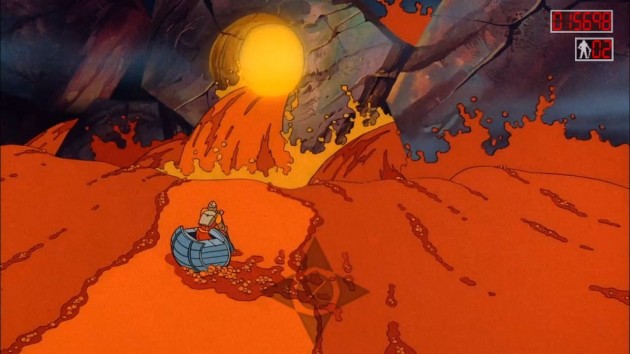
The rafting sequence is one such area. The timing of when to press the prompts and the various hazards that take place during this sequence just plain work as a magic trick that makes you feel like you’re in control of an already animated cartoon. I love using the magic trick analogy with Dragon’s Lair, because you never forget what you’re doing isn’t real. It’s not immersive at all. Instead, it becomes okay to allow yourself to play along anyway. That’s what makes stage magic fun, and Dragon’s Lair is basically stage magic as a video game. We know the score, but we’ll pretend we don’t, because we want to have fun.

Dragon’s Lair has more moments like that than any FMV game I’ve ever played. But, that doesn’t always mean the results work. Some of the rooms don’t do enough visual cues to make it predictable what the move will be. Moments where, logically you would think you’re going to press one direction, but really, you’re supposed to press another. Take this moment:
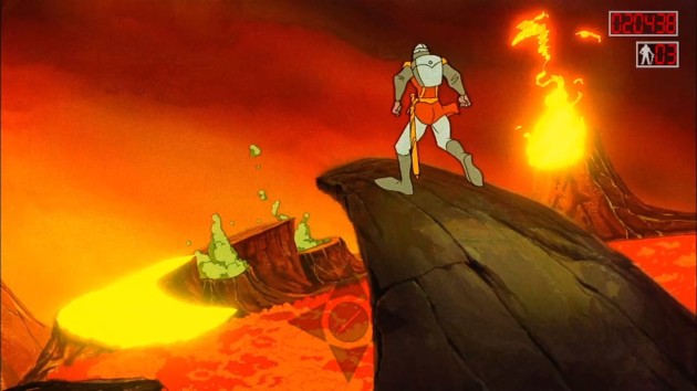
Assuming you weren’t using the move guide, which tells exactly when to press a button and what to press, what way would you press in the above screen shot? The flashing thing is to the left of you, but also in front of you. Hell, in theory, it’s also lower than you, would could imply you have to jump downward towards it, right? Well, the correct answer is you’re supposed to press UP. Even though the flashing target is in the lower left hand of the screen. I can’t imagine how many quarters a person would have needed in 1983 to commit this to memory. One reoccurring story I keep hearing from people is gathering around to watch someone in an arcade who could run through the entire game effortlessly. I’d not had the patience to get that far at all. I did make a good faith effort to play without the guide, but I couldn’t figure out what moves to do, and frankly I didn’t have any fun trying to figure it out.
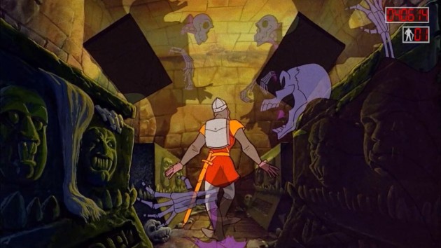
In some areas, there’s no way to anticipate what move could possibly be the next move. You have to wait for a cue, or just watch the guide. Well, at least with Dragon’s Lair, I found I could do both.

Oddly, Dragon’s Lair is the only game in the trilogy where you can play with the guide on and still watch the cartoon too. It’s not a visually complex story. There’s not a lot of screen clutter. You don’t have dozens of moving objects, or even if you do, they’re staged correctly to not distract from the point of PLAYING the game. It’s a “clean” presentation that remembered what it’s asking of players: enjoy the show, but also do things based on what the show does. That’s why Dragon’s Lair succeeds even forty years later while Space Ace and especially Dragon’s Lair II: Time Warp crash and burn. It IS an interactive movie, like few attempts at such a thing have been able to pull off. Even with the guide, you won’t miss anything with Dragon’s Lair. It’s something I didn’t appreciate until I played the other two games. How I tested this is I replayed each game a third time in three days and had my father and sister quiz me on details of the games. NOTHING unfair, and they understood what I was aiming for and went for details anyone playing the game should notice. For Dragon’s Lair, I answered six out of seven questions correct. For Dragon’s Lair II, it was two out of seven. For Space Ace, it was only one out of seven, with the one that I got right being from early in the game.
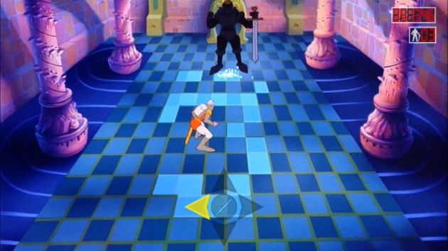
This memorable scene is an example of “this would be so cool if you could actually play it!” that certainly was NOT cool to play when you really could in Dragon’s Lair 3D. And actually, the scene is a little overrated in the arcade game. The patterns the knight taps out on the floor don’t always seem to make logical sense in terms of which button you’re expected to press.

Let me be clear: Dragon’s Lair isn’t a great game by any stretch. Besides the occasional “why would you press that direction at that moment?” issues, the game also makes you eventually repeat each room, only with the animation mirrored so every left/right move is reversed. Of course, if they didn’t do this, a game of Dragon’s Lair would only take about six minutes to complete. The biggest knock I have is against the historically terrible finale sequence. The rooms are all relatively short, which serve as logical checkpoints if you lose a life. In fact, I consider the smallness of the rooms to be a highlight of the game. It makes it feel like a real castle you’re exploring.
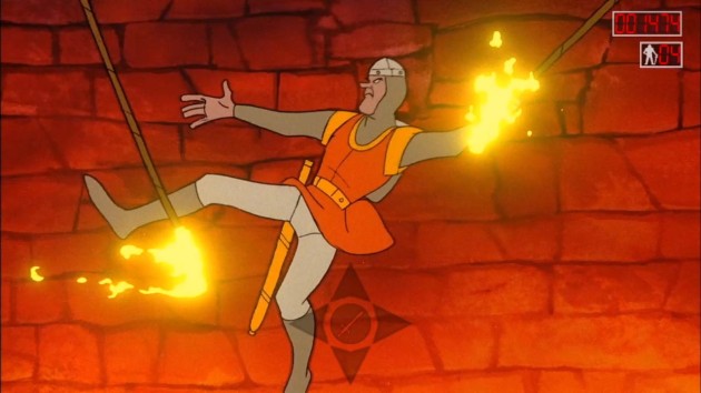
That’s probably the most underrated aspect of what makes Dragon’s Lair work: some rooms can be as short as one action. None of that minute-and-thirty-second short film that you have to replay over and over crap from the sequel.

Except for the final room with Singe the Dragon, which has no checkpoints, and the game grinds to halt and becomes agony. First, Singe nearly wakes from his sleep, which takes a while of just waiting around and doing nothing. AND THEN, FOR NO REASON, Princess Daphne very slowly explains that you need to retrieve a magic sword that’s in the room and use it to get the key around Singe’s neck. And she’s doing stripper poses the entire spiel. Mind you, this explanation was totally unnecessary. If it was a new and unique gameplay method, FINE, but it wasn’t, so what the hell were they thinking? You’re not doing anything different than you were doing leading up to this. You’re still just pressing buttons based on prompts. If you die.. and you probably will since the timing of this room can be brutal.. you have to watch this whole sequence again, from Singe’s nearly waking up to Daphne’s striptease-instructional video. No means to skip it. It’s torturous to sit through even once since a game about constant acton-reaction now suddenly has you just standing around waiting for the game part to start again. AND YOU HAVE TO REWATCH IT EVERY TIME YOU DIE! I get they probably wanted this room to feel climatic, but when you’re playing a game called DRAGON’S Lair and you slay a dragon and rescue the girl, that ought to be climatic enough. It’s one of the worst finales to a game I’ve ever seen. It ain’t a deal breaker, but it almost was. I had to think about it.
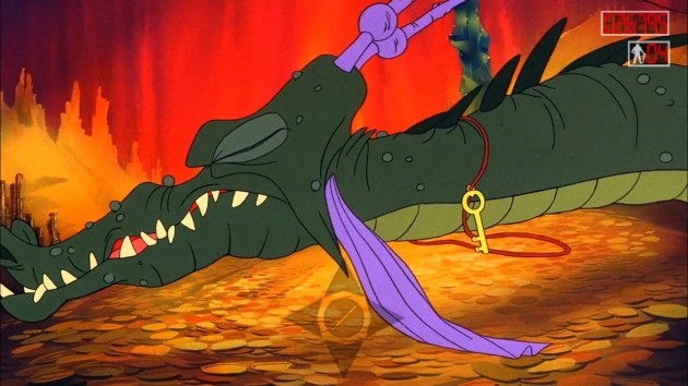
I actually didn’t kill Singe here. He died of old age after hearing the unskippable dialog for the three-dozenth time.

Okay, so Dragon’s Lair didn’t exactly stick the landing in its final act. But, everything up to that point is a lot better than I’ve ever given it credit for. It’s not fantastic or anything, but I enjoyed my time with it. Just think, all it took was basically creating the perfect FMV game to get me to finally say YES! to one of these things. And yet, I still wasn’t sure why the generation before me holds this up so fondly. Why they still get starry-eyed as they share tales of epic failure and sessions that lasted under a minute, or gathering around to watch that one weirdo who blew his life savings memorizing every sequence. Despite its relatively short window of fame, brutal difficulty, and all the truly-awful games in the franchise that followed, Dragon’s Lair is still is a game you want to enjoy. Why is that? I have to believe it’s for more than just the Don Bluth animation, or the hilarious yelps and squeals of Dirk the Daring, or what is just alright gameplay that is ultimately probably the best the format is capable of. So, I again asked myself: what could have possibly made those memories of Dragon’s Lair echo so loudly across the decades?

These two would go on to have ten kids.

I think I have the answer. Because the set pieces and art and characters all came together to make what players in 1983 wanted games to be like, but they weren’t. Not yet. Although it wasn’t their intention, Dragon’s Lair feels like a promise to gamers: this is where the medium is going. One day, games will look and sound this good and have action this exciting, only it will be you in control. Well, we all know what happened over the next forty years. Dragon’s Lair survives through history because it represents the promise of gaming kept.
Verdict: YES! **FLIP**

Dragon’s Lair II: Time Warp
Released June 16, 1991
Designed by Rick Dyer
Directed by Don Bluth

Pictured: Cathy’s brain melting from peeling back all the layers of awfulness from Dragon’s Lair II: Time Warp.

If I was too hard on Dragon’s Lair before, I wasn’t hard enough on Dragon’s Lair II: Time Warp. Talk about losing the plot! This sequel forgot literally everything that made the original game (and some of Space Ace) work. Dragon’s Lair, for all of its FMV-based flaws, still does everything in its power to look like a video game adventure. Time Warp doesn’t at all. It’s a series of disconnected animated vignettes that completely fails in every imaginable way. In the annals of bad games, it’s astonishing that nobody ever brings this one up. Perhaps because it’s an FMV game and that’s too low of a low-hanging fruit. Perhaps because the Don Bluth animation is so beautiful and vibrant. Perhaps because the nine segments of the game are so memorably bonkers that you wonder if the game was co-written by cocaine. But, actually playing Dragon’s Lair II, it’s shocking how many different ways a simple FMV sequel to the FMV game of the Golden Age could be so bad. How it could get it so wrong?
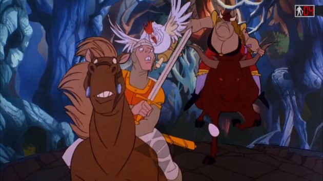
Time Warp starts off with Dirk’s mother-in-law trying to murder the man who rescued her daughter in the first place and is likely the only person capable of rescuing her again. In terms of intelligence, the apple fell about two inches from the tree on that one.

The most obvious problem with Dragon’s Lair II: Time Warp is that this really doesn’t make any effort at all to feel like a video game. In Dragon’s Lair, the game randomized all but the first and last levels of the game. It worked there because they were all short and they all flowed seamlessly into each-other. Time Warp’s nine levels are longer, linear, and with the exception of the first level, have no checkpoints at all. They’re also all, more or less, self-contained animated shorts that don’t fit-in with each-other. The moments where it feels like they were trying to animate some form of a video game trope in order to invoke the expectations of what a game should be like are few and far between. In Dragon’s Lair or Space Ace, whether you were swinging across ropes, timing when to move between spikes, leaping across platforms, or fighting monsters, the designers created the illusion that you were controlling Dirk and Dexter (well, until they forgot to do that in Space Ace too). Time Warp feels like a totally disconnected animated short that someone surgically grafted button prompts onto.

This is Eve. As in Adam & Eve. As in the Garden of Eden, which is the fourth stage of the game. Whereas Dragon’s Lair felt like an actual video game where a knight searches a castle looking for a damsel in distress, Time Warp feels like a series of two-minute-long Silly Symphony clips that someone attached a video game to long after the fact. Which isn’t far off from the truth. The Alice in Wonderland sequence for Dragon’s Lair II debuted on television in 1984 and the game was apparently fully completed between 1984 and 1986. It never came out until 1991 thanks to the bankruptcy of Cinematronics.

They must have realized how poorly flowing this would work as a video game, so in Time Warp, every single move does the yellow flashing prompt. You’d think that would make this the most playable game, but often the actions are too brief and the visuals so loud that you might need a couple lives to see them. Of course, every time you die on a stage, even if it’s the very last move on that level before you finish it, you have to start all the way over at the beginning. These aren’t teeny tiny rooms, like in Dragon’s Lair. These levels last over a minute of basically non-stop quick-time events where one mistake means you have to start over from the beginning. What’s especially annoying is they seem to have animated each level with moments that were clearly meant to be checkpoints. In the first level, you go from being chased by your mother-in-law into entering the castle from the original game, and if you die after the dungeon, you restart from there. Makes sense! Well, even though there’s a moment like that in each of the animated segments that follows, like a turning point in the action, it’s not utilized and you have to start over if you die.
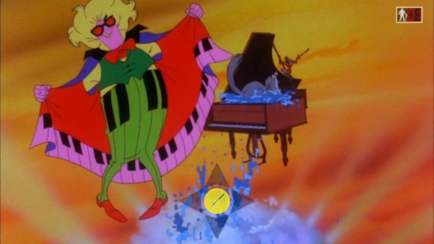
Dragon’s Lair has lots of beautiful art, but it also remembers that players are focused on the game itself. All the stuff happening on the screen is done in service to the gameplay. Dragon’s Lair II is filled with sight-gags and small details that you will die if you watch, because you’re not focusing on the next button prompt. I’m sure this was done in service to the days where people would gather around and watch someone play the game, but it’s a game that constantly forgets it’s game.

It stinks of game has no interest in giving players value. Instead, Dragon’s Lair II is completely focused on trying to squeeze as many quarters as possible. But, if you thought the lack of checkpoints was greedy, you ain’t seen nothing yet. Dragon’s Lair II: Time Warp gates players out of the final two levels unless they find all eleven magical items that are hidden throughout the first seven stages. It’s a sleazy move that made me feel unclean as I played it. Imagine playing through this in an arcade in 1991 and being interested in it enough that you spend enough money to GIT GUD and make it past the Ancient Egyptian level (ironically the only level in the entire game that feels remotely like the first game), and then suddenly the game just restarts from the beginning because you didn’t gather all items. In a game where you have a single second to make a decision, and ten times it will flash in two directions at once because one of the choices has the item, and you have to choose correctly, going ten for eleven, or else you.. keep going but actually will now have to replay the whole game from scratch eventually too. What a load of crap. Also, yes, ten times. For the playing card in stage three, they didn’t bother to animate the indicator that it’s one of the items you must get. Even worse: because of the Alice in Wonderland theme of that level, you wouldn’t even think that it’s THE item. It’s just right there and blended seamlessly with the rest of the design. Actually, some of the items that do flash do so in very visually-loud sections. The butterfly in the Beethoven stage is practically invisible!

This slideshow requires JavaScript.

I should also note that the arcade game had a scoring system that was removed completely from the home version. I didn’t even know that until I started researching whether the arcade game actually told players anywhere that they HAD to get the treasures to finish the game. It does.. at the bottom of a three-second long instruction screen that is briefly seen during the extended attract mode that runs on an over one-minute long cycle. It’s shamefully greedy on the same level that Ghosts ‘n Goblins forced full-replay was. Even worse: logically the way to not screw players is to make them only replay the levels where they missed an item, right? Well, Dragon Lair II has contempt for its players, so you have to replay the whole game from the start. Wow. Leland Corporation’s bankruptcy was well-deserved after pulling crap like that, and good riddance.
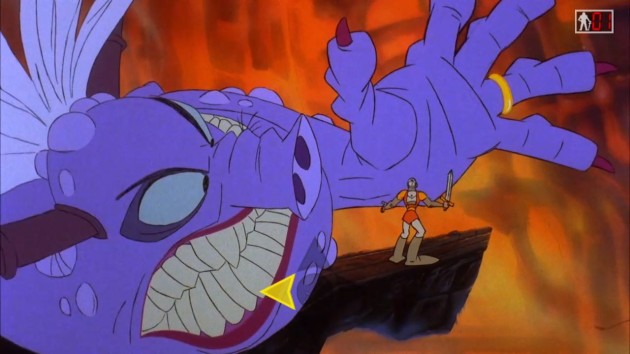
The best scene in the entire game is the eighth level, where Mordroc actually gets the Death Ring on Princess Daphne, who turns into Ganon if Ganon were a drag queen. BUT, if you play the Director’s Cut, this never happens. It starts exactly the same, with Mordroc clearly putting the Death Ring on Daphne and Dirk throwing his sword through his arm. Then, the scene changes from the original, and suddenly Daphne is out of the shot and the Death Ring isn’t on her. In a shorter, more plodding and less fun scene, you dodge Mordroc’s attacks before knocking the ring onto his finger. The one good call this game made was going with the Monster Daphne sequence. Too bad everything leading up to it was an unprecedented disaster.

So, that’s Dragon’s Lair II: Time Warp. I have nothing positive to say about it as a game. Dragon’s Lair wanted you to feel like you were in control of Dirk. Dragon’s Lair II feels like it wants you to appreciate the amazing art of Don Bluth while it shakes you down for quarters. We can do that without this button prompt stuff or the schoolyard bully robbing you of your lunch money routine this game pulls. The on-screen action feels completely disconnected from the controller. The item collecting system and lack of checkpoints practically makes Dragon’s Lair II a mugging. It’s astonishing to me that the same people who crapped all over the Sega CD’s Mighty Morphin Power Rangers game for having absolutely nothing to do with the on-screen prompts rewarded Dragon’s Lair II with raving reviews when it did the exact same thing. If you want to know whether a game critic is shallow or not, see if they did a review of Dragon’s Lair II, and if they did, see how much they focused on the incredible art work and not on how it factors into video game logic. Because this is BAD. As in I literally can’t believe nobody brought this stuff up in 1991. Dragon’s Lair II: Time Warp should be listed among the worst arcade games ever made. Sure is pretty, though.
Verdict: NO!

Space Ace
Released December 21, 1983
Designed by Rick Dyer
Directed by Don Bluth

This slideshow requires JavaScript.

I spent the last three days going back and forth on whether Space Ace would get a YES! or a NO! On one hand, I think it’s the most beautiful game in the trilogy, with a fun theme, an awesome concept, and a white-knuckle pace. On the other hand, like Dragon’s Lair II, it forgets it’s a video game and not an animated short about two-thirds of the way through it. It’s also the most frustrating from a technical point of view, as with-or-without the move guide, the timing of Space Ace in certain aspects feels like it genuinely isn’t lined-up properly with the on-screen action. This game was rushed through production, and it shows.
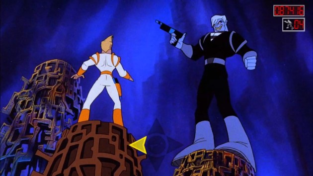
Fun Fact: Don Bluth himself provides the voice of both the villainous Borf and Dark Dexter, while animator Will Finn (who later worked for Disney during the 90s on basically every one of their good movies from that time period) provides the voice of Ace. I’ve been playing video games my entire life and, trust me, I know how bad things can be when developers grab whoever is handy, be it Sally in Accounting or John from Human Resources to do voice work. For someone who is NOT a professional voice actor by trade, Finn does a dang good job voicing Dexter. I’d genuinely never guessed this wasn’t his actual profession.

As always, the animation is jaw-dropping gorgeous, and the characters are memorable. The story and gameplay also have a tiny bit more going for them. The heroic dude-bro Dexter, aka Space Ace, is emasculated by the villainous Borf and turned into a pathetic weakling. Borf then kidnaps Kimberly and you must go on a daring adventure to rescue her. The twist is that sometimes you can “energize” and turn back into the big, buff, cocky Ace. There are times where, if you don’t do this, you die. But, most of the time, energizing branches the game into different types of sequences. There’s also a lot more “choose a random direction” moments, but since you’ll have to play out every scene anyway, there’s no point in having these. It only creates the illusion of unseen areas. It’s fine, but the problem is that Space Ace doesn’t put it all together properly and sort of ruins the whole experience in the process.
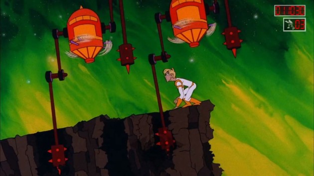
When Space Ace tries to invoke video game tropes like patterns and timing, it might actually be better than Dragon’s Lair. Take this scene in the first “level.” I mean.. look at that! That looks exactly like something you would see in a video game, right? A 2D timing challenge. If you’re going to do a fully-animated FMV video game that aspires to create the illusion that you’re actually controlling the character, yep, that’s the way to do it. But, at some point, it forgot to do these parts.

Like Dragon’s Lair, you have to repeat every major set piece and room once. But, unlike Dragon’s Lair, instead of mixing up the order, in Space Ace (at least on the highest difficulty setting), every sequence that repeats is done back-to-back. You play a room once, and then the screen goes black for a split-second and then it just repeats, only mirrored. It’s so lazy and jarring and it takes the wind right out of Space Ace’s sails. I cringed every single time it happened. Honestly, in Dragon’s Lair, I came to appreciate the mirrored levels. “Alright, I’ve done this room! What was the order?” I’d ask myself. That excitement wasn’t there for Space Ace because I literally just did this section. And, unlike Dragon’s Lair, which is set in a castle that would have many rooms, in Space Ace the narrative doesn’t lend itself at all to the repeating rooms. Not one bit. It’s Dexter running down an identical corridor, begin caught in an identical plastic bag, energizing at the exact same moment with the exact same pose.. it’s just so badly done. Not even comically bad, but just sadly bad.
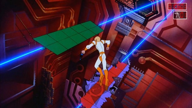
The flashing that was used in Dragon’s Lair and especially Dragon’s Lair II occasionally happens in Space Ace, but sometimes it doesn’t. Like right here, it doesn’t at all. I can’t imagine playing without the move guide, where the timing is totally guess work. In fact, I’ve heard Space Ace machines had the joysticks wear out a lot from people slamming them in the direction repeatedly. If you were wondering, here you would press LEFT.

And then you get to the areas where the on-screen action stops feeling like a video game and starts feeling like an animated short that someone just super-glued button prompts onto. This is the game I could make the least progress on without the guide. The game just plain quits helping sometimes, and guessing which direction was the correct direction, or WHEN to press the buttons for that matter, was purely luck-based. But, even when the indicator lights do flash, at some point a clear disconnect between controller actions and story narrative happens. The motorcycle sequence and the battle with Borf feel like just an ordinary cartoon that you have to press a button every couple seconds to make play. It’s no longer directed like a video game. It’s just a cartoon by that point. Which.. I guess that’s what all three of these games are, but what I mean is that it no longer feels like you’re playing Space Ace. You’re just advancing it.
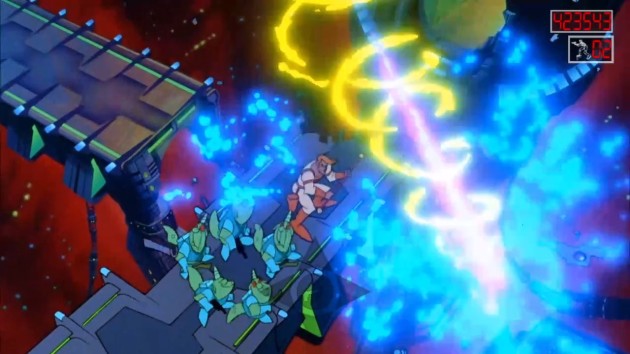
The end sequence sealed the NO! for this one. As an animated short, it’s satisfying, but as a video game, it’s a bit of a nonsensical disaster.

To Space Ace’s credit, it provided one final gaming highlight for me in 2022. I’d partially written these reviews for an abandoned article in 2021, and I needed to replay the games just to make sure I could. With my reaction time fading, it was basically now-or-never for this feature. While playing Space Ace, I game overed fairly quickly. Well, it turned out to be my only game over. To my absolute shock, I ran the table from there, losing a couple lives but still beating the game without needing another continue. What the fudge? ME? Are you kidding me? That felt really amazing. No joke. The lives I lost were of the “something about the button timing and the animation doesn’t seem to match-up at all” variety, but I didn’t mess-up after that. It felt great!
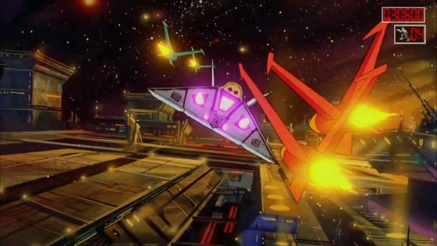
By the way, there’s both a Dragon’s Lair and Space Ace animated series by Ruby-Spears. In the Space Ace cartoon, which unlike Dragon’s Lair was done as part of the Saturday Supercade lineup, Kimberly is voiced by Nancy “Bart Simpson” Cartwright. I tried to watch these cartoons but I found them to be poison for the brain.

On the other hand, I pulled this monster final score off by not even watching the cartoon at all and instead focusing completely on the move guide. That’s what ulimately made the difference with these two games. With Dragon’s Lair, you can both enjoy the spectacle and play the game at the same time. It’s not a visually busy game. Space Ace always has a LOT going on, and if you take even a microsecond to appreciate that, you might find yourself losing a life. And now, it makes sense why nobody trades tales of Space Ace despite looking every bit as visually impressive as Dragon’s Lair. The fact that the first game proves you can get away with a visually nice animated game guided by a series of quick time events means I can’t excuse it for Space Ace. It needed to take a less-is-more approach, and it didn’t. Most telling of all: while I thought Dragon’s Lair II was more distracting, I actually scored lower on Space Ace in my quiz test. This was the game where Dyer and Booth lost their way.
Verdict: NO!

FINAL RANKINGS

How I determined the rankings is simple: I took the full list of games, then I said “I’m forced to play one game. Pick the one I could play the most and not get bored with.” That goes on top of the list. Then I repeat the question again with the remaining games over and over until the list is complete. Based on that simple criteria, here are the final rankings. Games above the Terminator Line received a YES! Games below it received a NO!

  1. Dragon’s Lair
    **TERMINATOR LINE**
  2. Space Ace
  3. Dragon’s Lair II: Time Warp

I seriously can’t believe I did that score though.

Chompy Chomp Chomp Party (Review)

Another day, another former Xbox Live Indie Game designed for parties that slipped through the cracks of time. In the case of Chompy Chomp Chomp by Utopian World of Sandwiches, since this is technically a new version that I haven’t played before, I can’t award it a YOU HEARTLESS BASTARDS award. Yet. The point of this review is to do my part to circumvent that. And actually, unlike many great XBLIGs that have since gone to oblivion, Chompy actually DID come back once before, in 2016, under the name Chompy Chomp Chomp Party for Wii U. I admit, I didn’t play it there. I never really liked the Wii U, which is what largely cemented my reputation as being “anti-Nintendo.” Which hardly seems fair or accurate. I don’t hate Nintendo. I just hated the Wii U. It hurt my hands to use it and it caused me to sink into whatever I was sitting on by several inches. Like, seriously, I weigh nothing, yet now my La-Z-Boy has a permanent groove of my ass embedded in it. Which actually is the only good thing to come out of the Wii U. Now, that chair only fits me and my bony ass.

Where was I?

La-Z-Boys. Good chairs.

No wait, Chompy Chomp Chomp. Good party game Chompy Chomp Chomp is.

Make sure to have everybody pick distinctive colors. When we let people pick ANY color, some were a little to close to each-other and it caused “confusion” which was code for “I’ll take any semi-valid excuse why *I’m* not winning right now.” While on the subject: yes, there’s a wide variety of colors to choose from, so if you have a player who is partially colorblind, there should be enough options to accommodate them without compromising gameplay. This includes an arrow too, if someone needs it.

Unlike yesterday’s review for Hidden in Plain Sight, where I had to make a case for the game being adaptable to all ages, there’s no question about Chompy being for everybody. Yes, this is one of the most frantic, unhinged party experiences in gaming, but it’s also one of the most simple to understand. It’s a cat and mouse chase where you are both the cat for one player and the mouse for someone else. In the main mode, you’ll have a ring under your feet that designates the color of the player you must eat. You score points for eating them, but while you do this, someone has YOUR color ring and is trying to eat you. After a few seconds, the rings will rotate around, often to the very person you’re chasing. The end result is chaos. Plain and simple. You can tell yourself you’re going to keep your wits about you, but you can’t. Games of Chompy Chomp Chomp turn on a dime. Leads vanish. The player in last can turn things around quickly. There’s absolutely no finesse. It’s madness. Out and out madness.

And it’s awesome.

Online play has been removed in favor of eight-player mode. I’m fine with that, even if we found eight players on screen at once to be too busy. You can also include bots, though I found the bots to be predictable and dumb even on harder difficulties.

It’s such a simple idea too. Keeping it real: I had planned to delay this review to much later this month, or even early 2023. In fact, I’d already warned the developers of this. But then, I played the first game I’ve played in ten years that I knew, beyond a shadow of a doubt, would have killed in an 80s arcade. It made me think of the only other game I’ve ever reviewed that I know in my heart would have been a major success if it had released in an arcade in 1982 – 1986. A game that, realistically, could have been done in that era, or any era, really. Coincidentally, after a long road getting there, that game had just re-released on Nintendo Switch last month. Then, fatefully, we had family visit us this last weekend. Family with game-loving little kids. When fate calls, you don’t even need to check the caller ID! My Dad says that, and it sounds wise so I’ll steal it here even though it makes less and less sense the more I think about it. Everybody agreed to help me out so I could do a couple party games for content. Like Hidden in Plain Sight, we had a rotation of eight players between the ages of 75 to 6. You literally couldn’t get a better variety of players to fully review party games with, since every possible age range and gaming background was represented here.

You would think the Pac-Man-themed maps would be perfect for a game based around eating. Where you don’t have to press any buttons and the act of eating is just touch-only, which essentially makes Chompy a glorified game of Tag (as in “you’re it!”). But, actually, we hated these maps. It’s nothing like playing Pac-Man. You’re not simply moving in four straight directions. You have too much range and movement. Cornering and sharp turns are too hard on these levels, and causes games to degenerate into contests decided by who gets hung-up on walls the least. Stick to levels with lots of room to run and large barriers that make it obvious where to turn at.

We were originally going to do eight player games. But, we actually found that the eight players all at the same time was a little TOO crazy and TOO frantic, and in some modes, almost impossible, really. Locating your Chompy in modes where players tended to cluster and keeping track of all the happenings was too much to handle. Also, some players couldn’t tell one color apart from another in the heat of battle (purple and pink especially caused issues, though it wasn’t alone in that), so we moved to four-player-only matches. Besides, most of us didn’t want to hold a single Joy-Con sideways. Does ANYBODY like using a single Joy-Con turned on its side? Maybe the worst controller Nintendo ever did, and that’s before you even factor in how quickly drift starts to overcome them. Anyway, once we focused on four-player play (and moved everybody onto distinctive colors), everybody had a blast. And, guess what? Over the course of a couple hours of playtime, everybody won at least once.

I was the sole person who liked ball mode the best. Everybody else voted for Zone Dash, but being a weirdo, I voted for this. Hold the ball to score points. For extra spicy chaos, pick an especially small map. Some of the maps are TOO big and too twisty-turny (such as the Pac-Man tribute maps that I talked about above). Really, we had the most fun with the small to medium-small maps.

I don’t mean to imply that skill won’t get you anywhere. It’s no coincidence that most games were won by me, Dad, or 9-year-old TJ, my God-Nephew who plays way too much Fortnite. Skill certainly does seem to matter. But, 6-year-old Sasha and 75-year-old non-gamer AJ also won matches too. When it comes to gaming, we don’t go easy on children or grouchy old fogeys in our house. It’s a long-standing policy of ours, because then when they actually do legitimately start to win games, it means something. It’s a rite of passage. So that one and only time I forced my Dad to lay down his king in a game of Chess was, frankly, a moment, and when the kids beat us at Chompy, it was their moment. Sasha’s several dead-last finishes where she became a kindred spirit of Inky, Pinky, Blinky, Clyde, and Sue probably didn’t feel great. Do you know what I’m sure felt great? When she beat us, straight-up, at the cupcake eating mode, which is like the main mode only there’s also cupcakes of your designated attack-color to score points with as well. It didn’t even take that long for Sasha to get good, either, and after that, she was always in the mix right at the end of games and sometimes it was her taking the match. The label “fun for all ages” has always been overused.. and often misused.. in gaming, but Chompy Chomp Chomp Party is fun for all ages and a cinch to get the hang of. Someone new to gaming can hang with seasoned pros in under an hour. Not a lot of multiplayer-only games can say that.

Spooky Party, the $2.50 DLC, gives you Ghost Mode, four new maps, and a new theme for the randomly-generated levels. Is it worth it? Not really. Death Match, where you don’t come back to life when eaten and the last person standing wins, was our universal choice for worst mode. Ghost Mode was the universal runner-up to that. Here, you’re sort of invisible, and can only get a kill when you phase-in. It’s not very fun and it’s not worth an extra 25% of the cost of the main game by itself, nor are the graveyard skin and maps. Really, the only reason to buy this is to support the developers by kicking them an additional couple bucks. Which is a good enough reason, I suppose. But, officially, Chompy Chomp Chomp Party: Spooky Party DLC is NOT Chick-Approved and doesn’t factor into the rankings of Chompy Chomp Chomp Party on the Indie Gamer Chick Leaderboard.

Plus, it really feels like they’ve wrung every possible variation of the formula out of it. There’s six modes if you buy the main package, plus the seventh reviewed in the above caption. Surprisingly, a couple of the modes that move-away-from the color-coded dynamic are very strong in their own right. Our favorite by far was Zone Dash. At the start of the match, players dash to be the first to touch a marker on the screen. Once a person touches it, Chompy becomes a game of Reverse Tag where being “it” means you have to run for your life. There’s two zones, and you have to dodge everybody else as you scurry between the two. You score points every time you reach one, but if you get eaten, that player becomes “it.” When you become “it” you receive a burst of speed to separate you from the pack of other players you’re no doubt a part of, plus just a hint of invincibility that wears off quickly. If the “it” player makes it to a zone, they get another burst of speed and are invincible as long as they stay in the zone, BUT, they can’t camp there. It’ll quickly disappear. This formula was just flat-out insanity, where making two full round trips between the zones was a very impressive accomplishment. More than likely, you’ll last only long enough to draw a single breath. I didn’t think anything Utopian World of Sandwiches could include would be better than the main game, but low and behold, Zone Dash was easily the best way to play. By itself, it’s one of the fifty most fun experiences I’ve ever had with an indie game. Everybody kept wanting to go back to it.

Make sure to experiment with different maps too. Use the built-in random generator, and actually write down the seeds that work. The only thing missing is the ability to design your own. Most of the maps included are pretty good. Some work better for some game types and not others. pictured above was our favorite map for Zone Dash.

So, what’s the catch? Well, I don’t think there is one. I worried that, eventually, someone would separate themselves and become too good for the game to be fun for anybody else. Now, I don’t think any one player could practice enough to become unbeatable at this. I think most games will ultimately become a mindless free-for-all. But, as long as you pick the right maps, it never stops being fun. I guess the one thing that’s missing is a map creator, or maybe the ability to customize your Chompys. Really though, Chompy Chomp Chomp Party is optimized for pick-up-and-play gaming. I reckon this will be busted-out at parties in the Vice household from now on. Especially if there’s a lot of kids or non-gamers. We were all hollering and cheering and yelling the whole time. The only things that I didn’t like about the gameplay can actually be adjusted. You can remove specific items from the game (including whammies that slow you down, or the over-powered speed boosts) or turn off items all together, or increase how frequently items are dropped. Actual effort and experience will be needed to figure out which maps make for the best gameplay, but once you have a feel for that, you can have someone jump in who doesn’t play video games at all. We actually had a ninth player, the too-mature-for-games Sarah, join us for a couple rounds after her kids pestered her into it. She reluctantly said “okay, yes, that was fun” when she handed the controller off a couple games later. She finished dead last every game, but still had a good time. It’s a game that refuses to be anything else.

You can save three maps, or you can write the seeds down. This was a lot of fun and we did use it, BUT, we also never did find a map where we were like “oh, we HAVE to keep that one.” I really think they should have included a map creator. Especially since Chompy lends itself to house-rules type of situations. The formula is versatile enough that you could probably invent an E-Sport within the game, ala Griffball in Halo, but without the ability to create a custom map for it, that’s not really an option yet.

Chompy Chomp Chomp Party is a game that could have happened in any era. It would have looked different in 1985, but the hectic gameplay would have fit right-in. In fact, the thing that’s always weirded me out about Chompy is that nobody else thought of this first. It’s so obviously fated to be an electrifying formula, much more than other arcade-like versus games, that it’s weird it didn’t exist until 2012. Seriously, what’s the definitive 80s arcade party game? Warlords? This is in an entirely different league. It’s the best indie party game I’ve played, and I’ve played a lot more than my review index suggests I have. The problem is, I’ve always had trouble getting players for them. That won’t be a problem with Chompy ever again. I’ll have my entire family saying “you HAVE to play this!” next time. That speaks volumes to me. I expected us to mess around with this for an hour, just enough for me to get one final review of it in. Instead, we played it twice over the course of two days, about four hours all-in, and would have kept playing if Sarah and her kids didn’t have a six hour drive in front of them. Do you know what the kids did on the way home? They played Chompy Chomp Chomp Party in the car, and when they get home, they knew they had a fourth player to join them if they pestered hard enough. Sarah called us Monday and said “what have you done to me?” We laughed. She said “oh, eat me!” I said “we can’t. There’s no online play!”

Chompy Chomp Chomp Party is Chick-Approved

Leaderboard Ranking: #33 of 306 Indie Gamer Chick-Approved Indie Games*
Top 94.8 Percentile of All 640 IGC-Reviewed Indie Games
Top 86.4 Percentile of All 306 IGC-Approved Indie Games
**Rankings based on time of publication. Check the Leaderboard for updated standings.
The original Chompy Chomp Chomp’s IGC Leaderboard position has been removed. Chompy Chomp Chomp Party is an updated version of the same game, not a sequel or a reboot, and is not considered a separate game. Please note, the original Chompy Chomp Chomp is for sale on Steam (link to sales page), but this review is not valid for it. For the original Chompy Chomp Chomp, read the original review here and the Second Chance with the Chick review here. Utopian World of Sandwiches declined to appeal this decision.

Chompy Chomp Chomp was developed by Utopian World of Sandwiches
Point of Sale: Nintendo Switch, Steam
$9.99 + $2.50 got chomped in the making of this review.

YOU HEARTLESS BASTARDS: Hidden in Plain Sight (Review)

YOU HEARTLESS BASTARDS!

How come Hidden in Plain Sight isn’t universally recognized today as one of THE great video game party experiences? That’s a party foul, right there!

Granted, this is now the third game that I’ve had to give YOU HEARTLESS BASTARDS recognition to that got its start on Xbox Live Indie Games. It’s where I got my start doing game reviews, and I know the uphill battle developers had to deal with. Like Escape Goat before it, Hidden in Plain Sight found modest success on Xbox 360 and on Steam. On Nintendo Switch? Nobody talks about about it. I don’t think people quite realize what a truly marvelous party game has been out on their console this whole time. One that, despite what developer Adam Spragg told me, is actually fun for all ages. Well, not all ages. Presumably 2-year-olds wouldn’t be great at this. They’d probably go kill crazy. That’s why they call it the terrible twos: because they make terrible +1s for multiplayer.

Go ninja! Go ninja! Go!

I should note that designer Adam Spragg is someone who I’d consider to be a good friend. No, actually, we go back far enough and have talked enough that I’d go so far as to call him a great friend. We have been ever since after my first review of Hidden in Plain Sight back in 2012. Hell, I consider myself a mediocre-at-best interviewer, but my 2012 interview with Adam is one of my strongest. But, that friendship stuff gets placed in suspended animation when I start playing a friend’s game. My friends would have it no other way. That’s sort of what makes them friends, you know? So, this is the part where I rip my friend’s heart out and say that, in the case of Hidden in Plain Sight, I’m more than a little disappointed that nothing has been done to jazz-up the presentation.

This play session incorporated a rotation of eight players between the ages of 75 to 6. EVERYBODY legitimately won at least one game, including Sasha, my 6-year-old niece (“hey, I’m almost 7!” she said when I shook my head and said “we just pwned by a 6-year-old!”). She touched all five statues in the classic Ninja Mode, being smart enough to not go for kills and thus avoiding detection. Later, she was on the winning team of a Knights Versus Ninjas game AND successfully scored the game-winning kill. Was she one of the better players? No. But, nobody let her win, either. We don’t go for that in our household. You play? You play to win. Little Sasha played to win. This ain’t no Candy Land. I was dang impressed. It also shows that Adam vastly underrated who can play these games. NOT EVERY MODE. Death Race and To Catch a Thief was a little out of her league, but she legit held up her end of the bargain as a teammate in others and was always a threat to steal the free-for-all matches.

Hidden in Plain Sight barely looked fine for a 2012 Xbox Live Indie Game. Now, it’s nearly 2023 and it looks exactly the same as it ever did. Kinda blurry. Kinda low-res. It doesn’t make for an interesting-looking game. If I hired a marching band and had fucking Beyoncé write a jingle about the awesomeness of Hidden in Plain Sight, it’s still going to be a tough sell at the point of sale, which is where most indies are made or broken. Even that goddamned ugly font. The font is something that will turn people off. It makes Hidden in Plain Sight look like an old freeware game. I could see someone who, via word-of-mouth, looks up the game, is totally interested, and then passes when they see the look, and that font. It doesn’t look retro-old. It looks like expired-milk old.

Catch a Thief mode became our least favorite mode. You pass over coins while a number of other players are snipers with limited bullets that must snipe them. There’s a wisdom to the design. The coins don’t just immediately disappear when you touch them. It’d be too obvious then. As for the NPCs, in this mode, you can mark which ones you’re sure aren’t people. My family being made up of slobbering fucking idiots, we all kept marking the real players. We sucked at this. All of us. BUT, I like that you can basically make up your own rules. We all took turns being the lone sniper, and we took turns where one of us was a player. It was fun.

Of course, gameplay is king, and I’m pleased to report that Hidden in Plain Sight absolutely holds up to the test of time. While, yes, games like Assassin’s Creed has multiplayer modes, there’s still never been a local multiplayer game quite like this. The main mode alone gave us over an hour of quality party gameplay over two days. In it, you’re presented with a room filled with dozens of identical ninjas (yes, you can adjust how many, including filling the whole screen if you wish), all of which are non-player characters (NPCs) except you and your fellow players. You don’t know which ninja you are, or which ones are your opponents. Your first task is to figure out where you are in the sea of ninja humanity, and you have to do so without giving away your position. Because, once you know where you are, you must sneakily begin to touch the five statues in the room. Every time you touch one, you score a point, but a chime goes off that alerts the room someone just scored. You can attack and take out characters from the game, but in doing so, you give away your position. There’s a variation of this mode where touching all five statues wins the game for you, but we preferred to stick to the main mode. Once we all got a feel for our own strategies, not to mention mimicry of NPC walking behavior, we kept going back to this mode again and again and it never got boring! It’s seriously such a genius use of video games as a medium for delivering the perfect social experience. It’s museum-worthy.

In Death Race, you’re again a randomly-assigned character in a room full of NPCs where the first challenge if figuring out who you are without giving away your identity. You have two buttons: walk and run. Hold them down to advance towards the finish line on the other side of the room. The NPCs will NEVER run, so you have to walk. The catch is everybody also has a single shot with a sniper rifle to take out anyone who they think is a real player. At one point, I tried to fake out like I was ready to pull the trigger on someone else, when in reality I had the crosshairs over my own character. It nearly worked, until my sister said “SHE’S GIVING HERSELF AN ESCORT!” and I was JFKed soon after. This was everybody’s second-favorite mode. This is the Squid Games a decade before that came out, and it’s AWESOME!

Unlike my previous experience reviewing Hidden in Plain Sight, this time, I was playing with family who actually wanted to play. At least after a few minutes. Hidden in Plain Sight’s worst aspect is that it’s a relatively difficult sell to get a game going. It sounds so much more complicated than it is. In the coming days, I’ll be posting a review of another for XBLIG that released more recently on Switch, Chompy Chomp Chomp (the review linked there is about to become outdated). That one is easy to explain: eat players and don’t get eaten. We played it first, and nobody wanted to move off of it and onto HIPS. Tellingly, when everybody wanted to play a party game again the next day, they wanted to do more rounds of Hidden in Plain Sight. Even those who preferred Chompy voted to play HIPS. I was delighted. I figured I’d have, at best, ninety minutes to check and make sure HIPS could still be fun in the 2020s. We doubled that, and even found that modes I’d previously scoffed at were actually among the highlights.

In my original 2012 game, I played with a bunch of interns at our office and games quickly devolved into letting two of the three royal NPCs die and just puppy-guarding the third. This go around, teams were planning complex “divide and conquer” strategies and rounds could go to the very last seconds before players began to make their moves.

Knights & Ninjas, where you divide into teams that must either assassinate three “royal” NPCs or protect them, became the mode we put the most time into on the second day, to the point that we had a little mini tournament with it. While yes, it does have issues with puppy-guarding, especially if a knight gives away their position killing an NPC by accident (they don’t try to attack the royals) it also proved the old adage “patience is a virtue.” The final match of the tournament was won by my parents when Mom and Dad (the ninjas) defeated Angela and myself (the knights) with two seconds left on the timer. Dad spent a lot of time lingering around the royal family without making his move, to the point my sister and me, and everybody watching, had him pegged as an NPC. I wasn’t bitter at all when I said “wow, congratulations Dad, you sure pulled off being a mindless drone convincingly!”

This is a last-assassin-standing type of mode where the playfield progressively shrinks into a circle. This was the only mode not every observer was interested in trying their luck at. That’s REALLY telling to me. It proves beyond a shadow of a doubt that it’s the deception and sneakiness that’s the attraction in Hidden in Plain Sight, whereas the killing is not that fun. In fact, the biggest fight in our house over HIPS was nobody wanted to be the snipers, to the point that we had to make a rule that everybody had to take a turn with the guns. Wow, I didn’t expect that. Even the little kids enjoyed learning to walk like NPCs and eventually were winning games with consistency. It’s a game that you WANT to get better at. Where winning feels rewarding.

So, even though it took a decade to get there, Hidden in Plain Sight now seems fated to be like an old, yellowing board game with split-corners on its box that’s tucked in our closet. Something to bust out not just when we have guests over, but also when we have free time and nothing better to do. I certainly underrated it before. It’s why I’m bumped-it-up nearly one-hundred positions higher on the IGC Leaderboard. Like many great board games, you need three other people. There’s no online play, because the charm is totally lost without everybody in the same room. You also need players who have the right mindset. If someone has overactive adrenal glands and goes stab-happy, it’ll ruin the fun for everybody else, as people going stab-happy tends to do. But, with the right group? Even observers can have fun trying to suss-out who is real and who is an NPC. Despite the archaic graphics, Hidden in Plain Sight sure feels like it’s going to be kind of timeless. Ten years later and, if anything, I think it somehow managed to get better with age. Of course, being someone who cheers for every game to find success, I still wish Adam would redo this with modern graphics. Maybe then you heartless bastards would give it a chance.

Hidden in Plain Sight is Chick-Approved
Leaderboard Ranking: #87 of 306 Indie Gamer Chick-Approved Indie Games*
Top 86.4 Percentile of All 640 IGC-Reviewed Indie Games
Top 71.5 Percentile of All 306 IGC-Approved Indie Games
*Rankings based on time of publication. Check the Leaderboard for updated standings.

Hidden in Plain Sight was developed by Adam Spragg

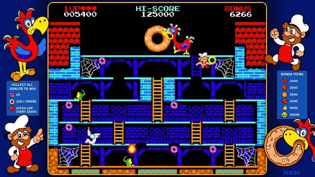
Point of Sale: Nintendo Switch, Steam
$5.99 gave up its position in the making of this review.


Donut Dodo (Review)

When I started Indie Gamer Chick, I thought I was going to be playing a lot of weird and experimental games. Well, now that I’ve played a LOT of retro games, I know it didn’t get any more weird and experimental than an 80s arcade. I love to hear stories about the Golden Age of Arcades from my readers. I’m jealous, really. I think I would have really loved it. Especially during the early-to-mid 80s, when so many novel and unique concepts seemed to hit one after another, with no rhyme or reason to them. A gorilla throws barrels at a carpenter (no, not Jesus, though try telling that to his fans) who must also avoid sentient fire as he tries to rescue his girlfriend. Sounds like a hoot! A yellow circle runs through a maze eating dots while being pursued by ghosts. Sure, why not? A spelunker must exterminate torsoless goggle people and dragons by impaling them with a hose and then pumping them with air until they burst. Actually, that sounds pretty deranged and sadistic and I really think you should seek help, buddy. Nothing had to make sense and all that mattered was that you had fun, whether it was from blowing up rocks with a spaceship or shooting at giant space bugs or helping a mama kangaroo rescue its Joey. It seems like it would have been right up my alley.

Really the answer to “is it like..” is “yes” before you even say what game it is. “Madden?” Oh ha, ha, you smart ass. (ponders) Well actually.. come to think about it, a little bit, yea.

Well, thanks to Donut Dodo, I think I have a good idea what kind of thrill that must have been for those who came before me. Because, holy crap, this is one of the best indie games ever made! You play the role of a pastry chef who had his donuts stolen by a strabismus-eyed dodo. You know, that’s exactly what drove people to hunt them to extinction. True story, donuts and everything. As the chef, you have to zig-zag around five single-screen levels to get them back. Donut Dodo is purely an avoider-type platformer, as there’s no methods of attack and your only option is to not touch the baddies. So, what’s it like? Well, it’s kind of like Donkey Kong, as you have a giant animal trying to kill you indirectly, and various minions that get in the way. And it’s kind of like any collecting game like, say, Pac-Man, where the level is filled with donuts and the object is to collect them all. And it’s kind of like Bomb Jack, as you get a bonus for grabbing the donuts in a specific order. And it’s kind of like Donkey Kong Jr. where sometimes you’re climbing ropes/vines using the same method used in that game. And it’s kind of like the 1982 Popeye, as there’s a toilet seat that stalks you similar to how Bluto does in that game. And it’s kind of like.. you know what? Screw it. Name any game of this genre from the Golden Age and there’s probably some nod to it in Donut Dodo. If that makes it sound like something that couldn’t possibly stand on its own, think again. It’s this weird game that both somehow feels like every other single-screen platform game and also like nothing you’ve ever played before.

I searched Donut Dodo high and low for SOME imperfection, and the best I could come up with is that there’s nothing that indicates you can actually touch the two oil barrels at the top of the second level. They’re big burning things with visible fire (aka a universal “do not touch” of gaming) that spit out the level’s fireball enemies. BUT, as long as the fireballs aren’t coming out at that moment, you can harmlessly walk right past them. In fact, you need to. I knew my jump wasn’t high enough to clear them and spent far too much time trying to figure out how to circumvent them before Angela said “are you SURE they’ll kill you?” I replied “of course they will! Look, it’s fire! The ouchie-form of oxygen!” Five seconds later she was rubbing it in that she figured it out before I did. I didn’t appreciate that, Pixel Games!

It’s like someone took all the best Golden Age games that followed in Donkey Kong’s wake, put them in a blender and hit the puree button while cackling like a mad scientist. I used to do that with food when I was a kid, and I never got in trouble for the mess I made doing so. My parents always took pity on me because the resulting unholy concoction usually left me traumatized the moment it hit my tongue. That could have so easily happened with Donut Dodo, but instead, the end result ended up being the best of its breed ever made. Go figure. Part of why that works is that everything the game took inspiration from is just done better here. It starts with the absolute precision controls. I always found the ladders in Donkey Kong annoying, but here, they’re just automatic. You can’t camp on them. When you hit up or down, you just zoom up and down the ladder. That works shockingly awesome and also helps with the many close-calls you’ll inevitably have with enemies. While I personally experienced a slight learning curve to the jumping physics, keep in mind that I really sucked at this game. Like seriously, the dodo might be extinct but the species got revenge on humanity by kicking my ass the last few days at this. No, this is a fair game with razor-sharp controls and I couldn’t stay alive because I never learned to mind my surroundings. Had I been Ra’s Al-Ghul’s student, I would have died like five minutes into training. Plus I was so comically bad at timing things that at one point I worried I might have cracked a rib laughing at myself. Maybe my most hilarious fail ever.

What a snooty looking bird. God, I’m glad they all died.The dodo tends to move itself and it’s usually not far away from the giant donut, which you have to grab to clear the level. Another masterful design decision.

Not that it’s impossibly hard. In fact, everything about Donut Dodo is fine-tuned to perfection. This features some of the most genuinely amazing level design I’ve ever seen. Layouts are maximized for heart-pounding close-calls with the relentless, but ultimately predictable, enemies. If it’s not the enemies that get you, it’s the level itself. Oh, and the dodo spits fire. Did they do that? AND THEY STILL WENT EXTINCT? Was a Song of Ice & Fire’s dragons based on dodos? Well, regardless of the real bird’s fate, the fictional bird’s game never lets up on the intensity, even on the easiest difficulty. BUT, it’s never unfair. It’s always on you when you die. That’s a lot more rare than you think. Like the best arcade games of the era it aspires to slot-in alongside of, Donut Dodo is a game about figuring out patterns and creating your own strategies for collecting the items. After beating the five stages, they recycle once with more enemies added. A possibly problematic choice somehow remained fairly designed. Plus, Donut Dodo throws twists into the formula. Like, sure, you can just collect all the donuts in any order, willy-nilly if you want. That’s how I started out playing Donut Dodo and I had a good enough time with it. I’ve never cared really about points anyway. There’s no online leaderboards, which might actually be the only turd in this game’s punch bowl. Without them, what incentive do you have to go for points? Glory? Pssh, glory is for people with courage, and I piss myself a little every time one of my own hairs touches my skin just slightly enough to trigger my “OH MY GOD THERE’S A SPIDER ON ME!” alarm.

UPDATE: The Steam version does, in fact, have online leaderboards. This didn’t effect my opinion of the game at all.

It also didn’t make it clear that, in the bonus stage, you control the pumpkin, not the chef. It has two arrows point at the pumpkin, but like, I thought it was saying “land on this.” Arrows with “HEY DUMMY, YOU ARE THIS” would have worked better, at least for me.

Then, I realized I suck at this and could use extra lives. You get a free life every 15,000 points. Well, fudge, I said. So, I played along and started going for the flashing donuts, and suddenly this was one of the best games I’ve ever played and roughly as addictive as all the drugs in the world and gambling in the world and even all the gambling on drugs in the world COMBINED. You can collect any donut to start, but then one donut will begin to flash at random. Collect that one without collecting any other donuts and you score 150 points instead of the normal 25. Another donut begins to flash, and now there’s a multiplier in effect. As long as you keep the chain going, you can score massive points. Going for combos forces you to zig-zag back and forth, thus crossing paths with the various monsters and traps much more frequently. What had been a relatively fast-paced game was now a relatively methodical one. BUT, it still never manages to feel like a slog. It’s also, simply put, one of the most elegant scoring systems I’ve ever seen. One that nets you sometimes more than one life per level. It’s an absolutely genius design that further adds to your ability to create your own strategies. Not only that, but it forces you to improvise, since you can’t simply memorize specific point-A to point-B routes like in, say, a Pac-Man game. You never know what will be the next target donut. And this, mind you, is the optional way to play it. I often talk about how games benefit from being flexible enough to allow players to come up with their own play styles. This will be my go-to game for that from now on. It’s that good. I’m not kidding: this should be shown and taught in game design schools. And has any indie EVER been a better fit for an Arcade1Up cabinet?

Some people might say that only having five levels (plus a bonus stage) is a knock on the game, but not me. If the stages were just alright, I might have wanted more. But, Pixel Games made five levels that were basically perfect. Like, seriously, they all feel totally different from each other, require different strategies, and are among the most clever video game stages for a game of this type ever made. Props to them for that AND for walking away a winner. It just takes one stinker to sour the whole experience, and why risk it when five levels was enough to make this an instant indie masterpiece? I’m not kidding about the Arcade1Up thing. Seriously Pixel Games: you should be pitching this to them.

So here I sit, saying to myself “I can’t fucking believe the developers of Sigi: A Fart for Melusina made one of the ten best indie games I’ve ever played.” Not that it wasn’t obvious they were very gifted. In fact, Sigi came so close to winning my Seal of Approval and coming up short that, if I included EVERY indie I reviewed and separated the games I liked versus the games I didn’t, the game at the top of the bad list would probably be Sigi. It was like 49.9 YES to 50.1 NO on it, and it just barely missed for me. But, I knew Pixel Games was a studio to keep an eye on. And now, they’ve turned-in what is, frankly, the biggest surprise game of my eleven years of writing game reviews. Hell, Donut Dodo might be the best game of its genre ever. And I don’t just mean “for indies” mind you. I’m trying to figure out any single-screen platformer, from any era or platform, that I liked more, and I can’t. I mean, I’ve been on a pretty big arcade/retro kick lately, so that’s really saying something. I liked this game so much and the potential it shows for what I call New Arcade Games as a genre that I’m going to play an indie game like this once a week from now on.

Pixel Games’ Sigi had really bad screenshake, to the point of distraction. That’s in Dodo, BUT, it’s optional! You can turn it off. Awesome! You can also turn off flashing, though they might want to check the bonus stage for that one last time.

Ultimately, I play video games to have fun. I couldn’t put Donut Dodo down. Even as it kicked the crap out of me, I kept playing and having a good time. Which is why Donut Dodo kept climbing my leaderboard. Without exaggeration, my experience playing Donut Dodo started with me getting my first game over in about thirty seconds and grumbling “yep, it’s a lot like an arcade game from 1983 alright.” But, Donut Dodo was just getting started. Over the next few days, I went from “this is pretty good. Kind of hard, but good!” to “I could see this being my go-to game with ten minutes to kill!” to “this is one of the best indie games I’ve ever played” and finally “I need to delete this fucking thing from my Switch or I’m not going to be able to get anything else done for a while, including the review of it!” That should count for something, and in my case, it counts for a lot. It’s why I started Indie Gamer Chick.

Dodo Donut is Chick-Approved
Leaderboard Ranking: #6 of 306 Indie Gamer Chick-Approved Indie Games*
Top 99.1 Percentile of All 640 IGC-Reviewed Indie Games
Top 98.0 Percentile of All 306 IGC-Approved Indie Games
*Rankings based on time of publication. Check the Leaderboard for updated standings.

Donut Dodo was developed by Pixel Games (Published by Flynn’s Arcade)
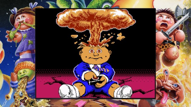

Point of Sale: Nintendo Switch, Steam
$3.99 (normally $4.99) had fingers that refused to type “Dodo” and instead kept typing “Dojo” in the making of this review. Hey, there’s a sequel idea, Pixel Games!

A review copy for Switch was provided. A copy was purchased by me on Steam afterwards, and someone in my house is also going to buy it on Switch. A old man who made too much fun of me for not paying attention while I played the game. LET’S SEE YOU DO BETTER oh shit wait he actually did do better.

Garbage Pail Kids: Mad Mike and the Quest for Stale Gum (Review)

I didn’t grow-up with Garbage Pail Kids. I was born in 1989, and the final set of stickers during the original 80s fad was set to release that year, but it got cancelled. After looking at the archives at the excellent resource site GeePeeKay, yea, good call that was. I mean, Christ! That’s some sick shit in those cards. It feels like, by the end, Garbage Pail Kids became more about being mean-spirited, like they were trying to deliberately bait controversy because that grew the franchise in the first place. Having said that, I wasn’t unfamiliar with the brand. When my Godfather’s son gave me his comic book collection when I was six, the boxes they came in were covered in GPK stickers. Plus Topps occasionally revived them for brief comebacks starting in the 2000s. Hell, for a while, my LaserDisc collecting father had the god awful Garbage Pail Kids movie listed on his “treasure hunt” list of discs he hadn’t added to his collection (in turns out it never even released on LD, maybe. There’s still debate on if it came out in Japan, I think). It’s one of those brands that an outsider looking-in can’t believe was as big as it was at its height. It was easily bigger in the 80s than the 90s fads of MY childhood like Tamagotchi or Furbies. I’m telling you, I would have made a much better child of the 80s than I was as a 90s kid. I mean, have you seen how shitty our Transformers looked? And don’t even get me started on our Voltron!

MIND BLOWN!!

Of course, the one thing missing from Garbage Pail Kids was a video game. 1984 was too late to end up on the Atari 2600, and it never would have been on Colecovision for.. uh.. obvious reasons. Nintendo would never have allowed the brand on the NES because they used to think bodily fluids were the devil’s brew, and Sega didn’t get cool until 1991. Garbage Pail Kids just had shitty timing all around to transition to gaming, really. And that’s why the real story behind Retrotrainment’s Garbage Pail Kids: Mad Mike and the Quest for Stale Gum literally, no joke, brought tears to my eyes. Because kids of the 80s used to spread rumors that they heard a Garbage Pail Kids game was FOR SURE coming to the NES, even claiming they’d seen it listed in game magazines. It never actually happened, because no such game was ever in development. Since kids knew it had to be coming because their friend said their uncle worked at Nintendo and told them it was happening, they assumed Nintendo had put the screws to it. Well, it took 35 years, but someone did something about it! Retrotainment teamed with The Goldbergs writer Adam F. Goldberg and Topps Trading Cards to make that mid-80s elementary school recess fantasy come true. They even created an elaborate meta story behind the game that it WAS developed in the mid-80s, then cancelled and buried until the ROM was unearthed in 2022. The trailer for this was so convincing that my friend Ryan was open to the possibility it was actually true. It’s absolutely criminal this video only has 11K views as of this writing. This just did not find its audience, and that’s heartbreaking.

That’s why I hadn’t even heard of this new Garbage Pail Kids game leading up to this week. Somehow, it just didn’t spread through social media. So, for those who don’t know, this is a 2022 NES game that you can actually pre-order now on cartridge. OR you can buy it right now for all modern platforms, where it plays on the same excellent NES emulator by Digital Eclipse used in collections like Teenage Mutant Ninja Turtles: Cowabunga Collection or SNK 40th Anniversary. If you buy this on Nintendo Switch, Xbox, PlayStation, or Steam, it comes with a boatload of extras. On the emulation side of things, you get a fully-loaded “Infinity Gauntlet of Emulation” which is my term for the six key “Gems” of emulation: save states, rewind, flicker removal, screen filters, button mapping, and a full tool-assisted play-through video that lets you take control of the action any time you want. Media extras include the soundtrack, two short films (including the above trailer), concept art, and more. My favorite feature was the side-by-side comparisons of the real GPK cards and their in-game 8-bit counterparts (48 total characters from the cards are used somewhere in the game). I got a kick out of seeing how close some of the game sprites came to the real cards, while others weren’t even in the ballpark.

And now I want a sequel more than I want to live to be 60.

Of course, if the game itself was no good, all these extras would be downright obnoxious. Which would be fitting for Garbage Pail Kids, and then I could crack jokes like “it belongs in the trash.” But alas, it’s one of the best original NES games of the homebrew era. Seriously, no joke, this is a phenomenal platformer. The meta concept of “lost 1986 – 88 licensed NES game” had me worried. Let’s face it: most licensed games on the NES from that era sucked, with rare exceptions like Goonies II or Capcom’s work on Disney properties. A developer aspiring to pay a mostly-accurate homage to both Garbage Pail Kids and 80s licensed games could have turned in a barely playable LJN-like effort and said “GET IT?” But, instead, Retrotainment gave us a game that feels genuinely true to the GPK license while also serving as a proper tribute to the best licensed 8-bit efforts from companies like Konami and Capcom. Nice graphics. Really good play control. Feels like they weren’t just stuck with the brand as part of a cash grab and they’d rather be doing anything else. No, this is a labor of love, and you feel it every single second of gameplay.

The humongous bosses feature some really impressive graphics. YES, you can sometimes “see the seams” of how they’re really not that big (this one here is a good example, the arms never move) but it feels so gosh-darn true to the time period that you can’t help but be charmed. Most importantly, all six bosses are fun.

You have four player characters, six decently-sized levels, six very fun boss fights, and extras to collect. I’ll start with the one and only major complaint: Garbage Pail Kids is let down by very mediocre sound design. I’ve never been a sound or music person, as I have legitimate physical issues that muck up music for me. But just the sound effects alone really take the punch out of GPK. It’s a really light, overly-conservative set of sound effects that just didn’t work for me, and in fact, it took away greatly from the OOMPH of the combat. In eleven years of doing game reviews, I can count on one hand the amount of times sound effects were so poorly done that they stood out to me, and I’m not happy they happened here, because most everything else is really nice.

Enemies comically fly off-screen when you kill them. That part works, but I just hate how little pizzazz there is to the sound effects. This is one of those games that I hope other developers study, where the whole game is incredibly fun and polished to the point that it makes you wonder how they got the sound so wrong?

There’s also some inconsistencies with collision boxes, especially when using the main Mad Mike character. It’s never a deal breaker, and the collision issues almost universally favor the player, but it also combines with the poor catalog of sound effects (and I don’t think the music is very good either, but again, that I can’t claim expertise in) to take away from the action feeling like it has real-world weight, velocity, and inertia to it. Imagine if you played Super Mario 1 and you went to stop a Goomba, and the stomp happened with visible distance between you and it, AND that famous Mario “WOO BOOP” sound when you do the stomp was instead a subdued “pff.” I’ve always said gameplay is king, but GPK is a prime example of how skimping on sound becomes distracting. In a game as good as this, that one area being really bad sticks out like a sore thumb. Which is probably a GPK card, come to think of it.

Garbage Pail Kids were “Trading Card Stickers” and the “trading” part is worked into the game with a fairly good system. Each stage has a guide character that you’ll encounter throughout the level who offers you tips and then offers to trade cards with you. There’s 39 cards total to collect. 4 of them actually can be used for special abilities in the game, the most valuable of which brings a character you’ve run out of health with back to life. 35 of the cards are for decoration only and can either be acquired via trading or by finding them randomly in garbage cans placed around the stage. When you trade, each card is assigned a 1 – 10 value, and you must trade cards equal to the value (or within one point) to get a trade to happen. Do you know what part of GPK lore they didn’t use? STICKERS! Gotta save something for the sequel, I suppose. (Shakes Fist) AND THERE BETTER BE A SEQUEL!! So help me God, I can’t be responsible for actions if there isn’t one!

Now, let’s get to the great stuff: if Garbage Pail Kids: Mad Mike and the Quest for Stale Gum had really come out in 1988, it would be remembered as a legend of the NES era. The six levels are all incredibly fun to explore, especially so with how they designed the player characters. You swap between the four on the fly with the SELECT button. Each of the four characters has unique abilities, and three of the four are so different that they fundamentally change the sub-genre of the game. Use Mad Mike and GPK feels like a 2D sword game, something like Rastan or Wizards & Warriors where you have to attack enemies directly (the bonus to this is he does the most damage). Use Leaky Lindsay to essentially turn GPK into a gun-based platformer like Mega Man or Contra as she fires snot projectiles at enemies. I used her the most. Use Patty Putty and the gameplay feels really different, as GPK becomes a Mario-like hop ‘n bop style game. The only of the four who feels like he’s not world-altering is Luke Puke, who can vomit out puddles which are effective on enemies below you. I used him the least, BUT, I did find plenty of uses for him. The level design feels like it’s well-suited for all four characters and has sections designed with specific characters in mind. It’s like a very gross, lower-budget Bloodstained: Curse of the Moon, only with just as much vampires.

Hiroshi Yamauchi is doing backflips in his grave.

Each of the six levels (sorry, no finale level or ultimate boss), which can be taken in any order, feel completely unique from each-other and there’s not a stinker in the bunch. None really stand-out, either, but I mean that in a good way. Garbage Pail Kids is that rare game where the level design is consistently fun from start to finish. There’s no weak-links and plenty of surprises. A stage themed around dinosaurs suddenly has a summer camp area. A stage themed around hell suddenly has a cafeteria. The team behind this really stretched their imaginations on this one and created a dazzling variety of settings that you want to see more of. My only real complaint is the rare blind jump, and even then, you actually can sort of circumvent them (or peek at the jump by holding down). There’s a nice assortment of enemies, only one of which I was annoyed by (a girl being struck by lightning, which caused a screen flashing. I don’t have seizures as badly as I used to but that stuff can still make me pretty sick). If I had to complain, I wish they did more with locating buttons to open doors, as I liked the exploration elements most of all. Plus, the difficulty felt just right for me. There’s four adjustable difficulty levels, and you can make your own challenge.

Some “fans” are actually demanding that Retrotainment and Digital Eclipse remove the multiple difficulty settings and emulation options and make GPK “Nintendo Hard.” I’m really not kidding. Can you imagine how full of yourself you have to be to demand a developer not try to make a game for as many people as possible? First off, how fucking insecure must you be in your own ability to just not use those options if you don’t want them? It’d be like an alcoholic going into a bar and demanding they stop selling drinks. So, Mr. MAKE IT NINTENDO HARD, is it that you have no self-control, or is that your way of trying to brag to the world you’re some kind of master player on the down low, because either way is laughable. Also, if you ever used a guide or a cheat code back in the day, or a Game Genie, bitch, you ain’t no more Nintendo Hard than anyone who uses rewind on an emulator. I wonder how many of these people who cry about rewind or save states can recite the Konami Code by heart. Seems like people who demand Nintendo Hard shouldn’t be able to do that, right?

Garbage Pail Kids also never strays from platforming, but given that it can often be disastrous when platformers veer too far off course, that might have been the right call. Instead, there are two mini-games, one of each hidden in every stage. Outhouses take you to a button mashing mini-game that I hated. I can’t mash buttons these days. I even had to have my Dad beat one for me, which is pretty sad. I’m 33, he’s 73, and he got it on his first try. The better mini-game is Buggy Betty’s. She’s hidden in every stage and offers a usable card if you can complete an electric maze without hitting the walls in three tries or less. There’s no bonus for collecting all 39 cards, but I wanted to anyway. It wasn’t that hard to get them all. I figured out that if you enter and exit a stage over and over, you’ll get a chance to trade for different cards every time. I finished the game with 35 cards and only needed maybe two post-credits minutes to get the remaining four.

The controls for the fly girl mazes were perfect, as was the collision detection. There were some tight squeezes too, like the one seen here. Yet, it was never unfair. Side Note: Buggy Betty is also one of the four super-power cards in the game. Pause the game and activate her card and you turn into her for ten seconds. There was only one section in the entire game I needed to use her, and another where I used Adam Bomb’s clear-all-the-enemies power.

Garbage Pail Kids for the NES (and by virtue of emulation, all modern consoles) is maybe the biggest surprise I’ve come across in years at Indie Gamer Chick. I’m stunned by how much I loved my time with it (which was only about two hours of total playtime, maybe). I was NOT this game’s target audience. I’m NOT nostalgic for Garbage Pail Kids. I think Garbage Pail Kids are stupid and gross and I don’t get the appeal in them at all. Transformers I get. G.I. Joe I get. Garbage Pail Kids? What the hell, 80s kids? Garbage Pail Kids are fucking disgusting! Yuck! So, being immune to GPK memberberries, this had to stand entirely on its gameplay merits. Boy, does it. It’s one of 2022’s best games, indie or otherwise. It’s a genuinely great game. Ignoring the sound design issues, everything about this works. As I neared the end of the final level, I didn’t want my time with GPK to be over! The entire time, my enthusiasm to see what came next never dipped even a little bit. The bosses, especially, were both fun to battle and felt like amazing rewards, like proper boss fights should feel. With no a smidge of love for the source material, I walked away from Garbage Pail Kids thinking “you heartless bastards better support this because I WANT MORE! I need a sequel and I need it like five minutes ago!”

This slideshow requires JavaScript.

Garbage Pail Kids as an IP means nothing to me. BUT, it meant something to the people who came together to make Garbage Pail Kids: Mad Mike and the Quest for Stale Gum. I’m always mindful when I review games at IGC that whether I love them or hate them, they could very well be something that the developers had in mind from the time they were little kids. My job here is to play and review those dreams. But, it’s rare that the dream in question actually gets to use the actual dream license from the designer’s childhood. Usually, they have to “file the serial number off” it and do their own creation. This is one of those very rare instances where the dream came completely true: working with the license, and making the game they always dreamed of. Imagine how hard it would be to say THAT game sucked. Thankfully, I’m off the hook. Garbage Pail Kids is a wonderful game by an elite indie developer, one of 2022’s best video games, and one of the best indies I’ve ever played. It feels true to the license, true to the time frame it was supposed to have been “lost” from, and most importantly, true to the dream. And it’s a dream come true. How can you not admire that? And now, by virtue of making this game, some kids that talked about how they heard a Garbage Pail Kids game was coming to the NES on a playground at school in the 80s have now become part of that very franchise’s lore.. forever. If that doesn’t bring a tear to your eye, you have no heart. Hell, I bet they even made a GPK card of that, too.

Garbage Pail Kids: Mad Mike and the Quest for Stale Gum is Chick-Approved
Leaderboard Ranking: #16 of 305 Indie Gamer Chick-Approved Indie Games*
Top 97.5 Percentile of All 639 IGC-Reviewed Indie Games
Top 94.8 Percentile of All 305 IGC-Approved Indie Games
*Rankings based on time of publication. Check the Leaderboard for updated standings.

Garbage Pail Kids: Mad Mike and the Quest for Stale Gum was developed by Retrotainment

Point of Sale: Nintendo Switch, Xbox, PlayStation, Steam, NES Cart (Limited Edition)

$9.99 said “there’s only one Cathy with a C card in the history of GPK? OH COME ON TOPPS YOU BUTTHOLES” in the making of this review. I will not stand for this discrimination of Cathys with Cs. Everyone knows the Kathy with a Ks are objectively awful people!

Maddening Euphoria (Review)

Man, I miss the good old days when I’d spend $1 on a small-scale indie and two hours later I’d have a review posted for it. Back when I was the Queen of Xbox Live Indie Games, most of the games I’d select to feature on this blog, for better and for worse, didn’t require a massive time investment to deliver a verdict on. This week, I was feeling particularly nostalgic for that, so I threw on Maddening Euphoria by Allison James and her Chequered Ink studio. I didn’t even realize I’d already done a game by her, 2019’s Gyro Boss DX. It was, you know, fine. Nothing special, but also nothing specifically wrong with it. It’s a Top 100 game on the IGC Leaderboard (#79 as of this writing) that also holds the rare distinction of being one of those games I’ve kept playing after the review was over. To this day, if I have my Switch and I only have five to ten minutes to kill, I’ll either boot-up Gyro Boss DX or Not Not. I’ll have a lot more fun messing around with them than I will having my iPhone scream at me to buy micro-transactions even on games that in theory shouldn’t have any. The medium NEEDS those quick burst, nothing gained, nothing lost type of games that make otherwise boring wait times pass faster. I can’t imagine someone in a line or a waiting room saying “I only have ten minutes. Let’s see if I can get a little further in Breath of the Wild!”

Maddening Euphoria has simple, stark graphics that remind me of Lumines. Along with the soundtrack, it gives the whole game a music video-like vibe. Oh, and since there’s really no place in the actual review for me to bitch about this, this is one of those games that blocks you from recording clips with your Switch. Screenshots only. Very maddening, but not euphorically so.

Maddening Euphoria is cut from the same cloth as Gyro Boss DX in that it’s optimized for short play sessions and based around challenging your own high scores. And, when I say short, I mean most of my rounds lasted a matter of seconds. It’s sort of like a randomly-generated version of the Impossible Game. A punisher where you must outrun a pace bar while leaping over pits and spikes. I’ve got a lot of grievances to air with it, so please keep in mind that I ultimately enjoyed this game. I thought I’d put an hour or two into it and be done. Two days later and I’m finally typing this review WHILE still playing it, and that counts for something. Of course, I’m still playing it while typing because I’m trying to figure out how to explain what exactly is happening. Besides the random layouts, the hook is that you’re running on an ever-rotating cylinder. You’re always somewhere near the top, and the further you distance yourself from the pace bar, the sooner the layout in front of you seems to spawn. I think.

Is that a llama or an alpaca? I can never tell the difference. One or the other spit in my Mom’s face once. She had it coming. She called it ugly. It was kind of ugly. The best part was it smiled right before it did it. One of the most unforgettable moments in my family’s history.

There’s no tutorial, explanations, or instructions besides telling you to move and jump. This led to some weird issues. Like, I thought the high score listed in the corner was broken. Nope. You see, there’s 36 different “themes” which is basically color schemes, and the displayed high score is only for the specific theme you’re playing. The game defaults to shuffling randomly through themes, and I didn’t realize that. This made me think “oh, wait, it’s NOT randomly generated and the themes are like levels and do specific objects in specific orders.” Nope, they’re definitely randomly generated. If certain themes are more likely to spawn certain types of levels, I didn’t catch onto it. There’s only so many types of ways Maddening Euphoria’s formula can generate a stage, and if the themes influence it, it’s subtly so. Of course, 36 themes means that, instead of having one high score to challenge yourself over and over again, you have 36 to go through. That gets annoying. Why not have both the theme high AND the overall high on display?

In addition to play modes where you’re always jumping or where you run automatically and can’t move backwards, there’s 155 special challenges that you can play separately. Do you know what the problem with these are? YOU GUESSED IT: the levels are still randomly generated. It begs the question: why even have challenges separate from the main modes? Why not just have them check off like achievements through normal gameplay? Once I realized that the maps for the challenges were randomly generated, I quit playing them, because I’d rather go for a high score. In the unlikely event I have a game that lasts an hour (the 155th and final challenge here) I’d legitimately kick myself for wasting it on the challenge and not the main game.

The cylindrical platforming is a nice novelty, but it also creates visibility issues. One of my biggest gaming pet peeves is blind jumping where you could possibly either fall to your death or stick the landing, with no way of being able to logic out how to fall. Unless I’m just terrible at this (don’t rule that out), there’s a lot of blind jumps in Maddening Euphoria, especially when you have to bounce off a trampoline and/or clear a large gap before seeing what comes after the gap. The nature of the game demands split-second judgment, but I’ve been killed by moments where, at the time the jump happens, there was no way of knowing where to land until I was too committed to change direction. Actually, there were many instances where I honestly question whether the layout was even survivable. I’m sure it was, but it probably required absolute perfection in terms of what pixel to jump off of and how far you had to press on the stick mid-air. Maddening Euphoria is a game where your high scores will be heavily influenced by how lucky (or unlucky) you were with the game’s level lottery. I wish they had just done 36 levels hand designed stages. Mind you, I’m not anti-procedural. The #1 ranked game on the Indie Gamer Chick Leaderboard as of this writing, Dead Cells, is also randomly generated. But, as I’ve noted in reviews for games like Chasm (which I loved) or Cloudberry Kingdom (which I didn’t), while I’m sure creating an algorithm that works every time is difficult, randomly generated levels will always be inelegant and make luck factor in as much as skill.

When the pace bar is close to you, a meter charges up. Fill up the meter and you gain a “second wind” which gives you a massive speed boost. You can use this strategically by deliberately teasing the bar, but there’s many risks involved. If you’re mid-jump and the layout is spitting out narrow platforms when the meter fills all the way, the second wind will probably kill you, since aiming your jumps with the enhanced speed is very difficult. Oh, and Second Winds spawn flashing triangles that give you a letter in E-U-P-H-O-R-I-A. When you fill that up all the way, you get a longer speed burst and all the spikes disappear. I don’t know if it lasts forever. I always died shortly after getting it. The controls are solid, until the speed boosts kicks-in, at which point you lose precision. In a game that demands precision, this is a problem.

Personally, I don’t really get the appeal in randomly generated stages. I never will. They’ll never have the elegance that hand-crafted stages have, and that’s all there is to it. Procedural generation’s promise of “never being the same game twice” is completely bullshit. It’s always the same game, every single time, and to say otherwise is like saying any game with random elements such as dice rolls or cards is never the same game twice. To Chequered Ink’s credit, Maddening Euphoria doesn’t use the bullshit “never the same game twice” spiel in its advertising. Plus, it only costs $1, which is a steal. For all the bitching I just did, seriously, this is worth more than $1. I turned this on and expected to play it for an hour and write this review. That was Wednesday. Now it’s Friday and I’ve put seven hours into it. And I really, really hate blind jumping and leap-of-faith platforming, so that speaks volumes for good this is. For all the unfairness and problematic design, every time I turned on Maddening Euphoria, I couldn’t put it down for over an hour. It has a potently addictive “just one more round” quality that the best modern arcade-style games have. Yea, I wish that they’d gone another direction with it, or at least hand-crafted the challenge levels, but I keep going back to how I’d find myself looking at the clock as I played this and say “shit, where did the last hour go?” Only time will tell if this will find its way permanently into my “I only have five minutes to kill” lineup. I’ll say this: if that time is spent with Maddening Euphoria, it should pass quite quickly.

Maddening Euphoria is Chick-Approved
Leaderboard Ranking: #134 of 304 Ranked Games*
Top 79 Percentile of All IGC Indie Reviews
Top 56 Percentile of All IGC Approved Indie Games
*Rankings based on time of publication. Check the Leaderboard for updated standings.

Maddening Euphoria was developed by Chequered Ink
Point of Sale: Nintendo Switch, Steam

$1 was spat on by an alpaca in the making of this review.