Multitasking

Hello, old friend. It’s been a while. You look.. um.. great? You really wear dying a miserable death, barely mourned and unloved well.

Playing an XBLIG in early 2016 is like visiting a dying relative in hospice care. You know any visit could be the last you’ll have, but you go anyway in secret hopes that they’ll leave you something nice to remember them. For those confused by the situation, yes, Xbox Live Indie Games are still alive. The last rites have been administered and happy families have been notified that a donor for Daddy’s faulty platforming engine has been located, but it’s technically still alive in the same way Ben Carson’s campaign is still technically ongoing. For now. No new games will be uploaded after September, 2016 and the marketplace will shut down entirely after September, 2017. Will you be able to access the games you already bought after that? The fuck if I know.

I do know that here it is, nearly two years after my last XBLIG review and I’m still basically known as “that girl who reviews XBLIGs.” And you know what? I’m proud of that. Plus, a few last second hidden gems that savvy indie fans have come to associate with the XBLIG market are still showing up. Take today’s game, Multitasking. It caught my attention because it twists the formula of WarioWare (my favorite game ever) by making you play multiple microgames at the same time. My family had a terrific chuckle at the thought of me playing such a game. Some people have coordination that makes them capable of rubbing their bellies while patting their heads at the same time. Meanwhile, I have such good coordination that I once broke my ankle falling three-inches off a Dance Dance Revolution platform at a bowling alley. I wish I could say I was joking, but I’m not. Given that and the fact that I can’t chew gum and talk at the same time without either biting my cheek or gagging on the gum, they said maybe I should rethink my choice in games to play. But fuck them and their lack of faith in my ability to step up my abilities. I was determined to prove them wrong.

Four games at once? Ha, yea right. I couldn't even do three games at the same time.

Four games at once? Ha, yea right. I couldn’t even do three games at the same time.

I failed. Not even with honor either. I was just awful at Multitasking. Except on Easy Mode, but this is one of those games where success there carries an undeniable shame with it. Again, the idea is “WarioWare, only playing multiple games simultaneously.” Your TV is divided into four screens. The top screen is controlled by the bumpers, the left screen with the left analog stick, the center screen with the face buttons, and the right screen by the right analog stick. The games are very basic, many of them lifted directly from WarioWare. The difference here is, instead of the speed increasing, the amount of games thrown at you increases. The games play fine and control solid, with one exception involving moving the analog sticks at bullseyes, which feels a bit too loose. It’s kind of annoying because I can’t blame being awful on the controls. It’s all on me.

For what it’s worth, Multitasking is fun. But, unlike games where my comical badness didn’t affect my overall enjoyment (Spelunky for example), I have to admit that my ceiling of fun was lowered here. I was damn near ecstatic about it at first, but the further I played it, the more I realized I just could not get better at it. God knows I tried, but no strategy seemed to work. The games are spit out at random, and my best runs by far were the ones where one of the games being displayed required simple button mashing with no finesse. If both games required my attention, I was screwed. On the rare instances where I made it far enough to have three games on-screen, I never survived the first wave of it. I’m just not wired for games like this. Multitasking is fine, albeit basic and kind of boring in how it’s presented, but fine. The online scoreboards suck to use (presumably to be corrected in the upcoming PC port), but fine. I probably would have ranked it higher if I could get better, but it’s hard for me to get worked up over a game that’s as impossible for me to play well. Yea, I love WarioWare, but I wouldn’t want to play two of them at once. I already feel like a douche for that time I played WarioWare Twisted using my GameBoy Player. This isn’t helping.

xboxboxartMultitasking was developed by yyrGames
Point of Sale: Xbox Live Indie Games

igc_approved1$1 jumped the gun so many times in the Wild Gunman minigame that she lost count in the making of this review. Though I do have to ask, when people had those duels in the old days, what happened if someone shot too soon and hit? Did the person shot get to come back from the dead so they could pace off again? If not, damn, I would have been the best gunfighter in the west! How come nobody else thought of the “just shoot first and say MY BAD” strategy before me? Someone get me a time machine, I need to try this shit out.

Multitasking is Chick-Approved and ranked on the Indie Gamer Chick Leaderboard.

Indie Gamer Chick Statement on the end of Xbox Live Indie Games

Today, developers of Xbox Live Indie Games (XBLIGs) were informed that Microsoft is in the process of winding down the service. The ability to publish new XBLIGs will end a year from today, September 9, 2016. Roughly a year after that, in September 2017, the XBLIG marketplace will shut-down. We all knew this was coming, but it doesn’t make it any easier.

I started Indie Gamer Chick in July, 2011 as an XBLIG review site. It wasn’t long after that the XBLIG developer community discovered me and embraced my reviews. It’s because of them that Indie Gamer Chick is around today, and for that I owe them a gratitude that words never seem strong enough to convey. Although I’m sure some developers weren’t happy to have their game run through my wringer, I hope they all know that negative reviews never came with malice or the intent of hurt feelings. Judging by the response you as a community had to IGC, I think most of you understand that. Some of you went on to become my friends, but know this: I do love you all. Thank you so much for making this whole experience rewarding for me. I’ll never forget what you’ve done for me.

For those of you who have an Xbox 360 but have never dipped your toes into the XBLIG scene, you have two years to enjoy what XBLIG has to offer. It has many wonderful games that cost as little as a dollar. Check my review index. It’s mostly made up of XBLIGs. And for those devs who has developed exclusively for XBLIG, please begin porting your work to other platforms. Even if you’re not proud of your work or satisfied with it. Those games represent our collective legacy as a community. Many of you are moving onto to great things. Future generations should get to see where you came from. That’s the lasting legacy of XBLIG: amateur developers who aspired to do great things. Although not everyone who made games for XBLIG got to taste success, I firmly believe that a community as close as ours shares in each-others success. Because of what began on XBLIG, indie gaming today shines a little brighter. And, because of what began on XBLIG, our future as gamers has never been brighter.

XBLIG developers and fans: please share your memories or gratitude for XBLIG in the comments.

Three Dead Zed (Second Chance with the Chick)

It’s been over two years since I reviewed Three Dead Zed, by former Indie Gamer Chick Leaderboard sponsors Gentlemen Squid. Last time, I interviewed them alongside the review. And I didn’t like the game. The only way that whole situation could have been more awkward is if I had just run over their dog beforehand. I considered bringing them back for this Second Chance with the Chick, but I’m not doing that for the same reason I decided not to pursue a career as an obstetrician: because I didn’t want to ever have to tell an anxious parent that their child was stillborn.

To their credit, Gentlemen Squid fixed the worst issues from my first play through. I never once reached for a switch that didn’t activate on my first attempt. Just having that work by itself makes Three Dead Zed playable. But I still really didn’t like it. It’s not for a lack of personality, either. The hilarious story of a shape-shifting zombie getting loose and trying to find cats with tinfoil hats is raving lunacy. And I mean that in the best possible way. I sort of wish the best bits unfolded when you started and completed levels, instead of having to find hidden rooms. In the event I missed one, I shook my hand at the sky, as if God himself was responsible for me somehow missing it. I never once wanted to replay a stage to find those secrets. I just wanted the fucking game to be over with, which is never a good sign. Having said that, the writing is extraordinarily sharp. If you can put up with everything else I’m about to say, Three Dead Zed might be worth it for you.

You know a game is in trouble when its best comedy bits are often hidden in the background. Like the warning about the company BBQ. Why would a company need to caution against a barbeque you ask? Maybe my father is there serving his infamous chili. Though if that were the case, the only place they would draw the fire is around the buttocks.

You know a game is in trouble when its best comedy bits are often hidden in the background. Like the warning about the company BBQ. Why would a company need to caution against a barbeque you ask? Maybe my father is there serving his infamous chili. Though if that were the case, the only place they would need to draw the fire is around the buttocks.

It wasn’t for me. Movement is just all over the place. Which, um.. you know, come to think of it, movement by definition should be all over the place. What I’m trying to say is the controls are crap. Honestly, with the game’s engine and the way the characters were built, there wasn’t much they could do to fix this part of Three Dead Zed from the first time out. So I was sort of bracing myself for the worst when I restarted it. And I was right. There’s just a lack of parameters for certain actions. Like it’s easy to have a tiny sliver of your body standing on the edge of a moving platform and getting crushed from passing by a ceiling. Or you’ll struggle to make jumps with the moves-too fast while jumping-too-loose frog-athlete-zombie thing. You have to use this zombie all the time too, because it’s the only one that can make long jumps, or do wall jumping. But judging how close you can get to something before you die never quite clicked for me.

It’s really hard to put a finger on the difference between a good platformer and a bad one when it comes to just the act of movement. It almost defies explanation, but I’ll try. In a good platformer, you form an equilibrium with the layout of stages. You can instinctively judge distances in jumps, or how close you can get to that buzz saw trap before you’re going to die. I never got that from Three Dead Zed. A long time ago, I might have thought that would be on me, but considering that I’m able to easily find that balance in almost any other platformer, I think I sort of have to blame the game. I also don’t think it has to do with switching between three characters. I had to do that in Trine as well, but never had that issue. Three Dead Zed lacks a certain elegance of movement and jumping. I don’t think with the engine they used, it could have ever been precise.

I did appreciate the effort. The stages are pretty well constructed, even lending themselves well to non-linear exploration. I would have probably taken more advantage of this, if not for the bad controls, or if Gentlemen Squid haven’t been so obsessed with dick-move enemy placement. They really had a fetish for putting soldiers on the exact spots where they best stood to unfairly tag you with bullets in a way that you never had a reasonable chance to know they existed, and even less chance of avoiding their attacks. I hate it when games do this. When I mention it to developers, sometimes they giggle and say “I know right?” as if they expect a high-five. Sorry to leave you guys hanging, but I need to level with you: any idiot can make an unfair game. It takes no talent. It takes no creativity. It takes no artistry. When Mario Maker hits the Wii U, you’ll probably see hundreds, if not thousands, of user levels that center around “last pixel jumping” or dick move enemy placement. I assure you, nobody will complement the twelve-year-olds making those stages on their mastery of level design. When you have absolutely no hope of dodging attacks, or even knowing the enemies exist, that takes no skill to create. This also shouldn’t be mistaken for adding “difficulty” to your game. Difficulty should be something where a player has a reasonable chance to overcome it, thus displaying their skills. When they have no hope, that’s difficult in the same way you would use the word to describe someone who chains themselves to a McDonalds and claims they’re going on hunger strike until they stop serving beef. “How’s it going with that nut who chained himself to McDonalds?” “Well, sir, he’s being.. difficult.”

Three Dead Zed 2

Hooray for busywork!

Did Three Dead Zed ever have a chance, even with patchwork? Probably not. The devs were frank with me in admitting that they could only do so much with the engine they used. That’s fine. You know what? They showed me that they have a lot of talent to work with in the future. The writing was very sharp, even inspired, and the level layouts (sans bastard enemy placement) were well done. With a better platforming engine with more precision movement, Three Dead Zed probably could have been something special. Chalk this one up to life on the learning curve. I’m certain Gentlemen Squid will blow me away next time. They seem determined to. If they weren’t, they wouldn’t have bothered fixing the stuff that made Three Dead Zed unplayable the first time around. I’m excited for their future. I think they are too, since they just squirted ink all over me. Well, at least I hope that’s ink.

Three Dead Zed logoThree Dead Zed was developed by Gentlemen Squid
Point of Sale: Steam, Xbox Live Indie Games

$4.99’s father’s chili is banned by the Ginevra Convention in the making of this review.


Shutshimi

With my last two reviews landing in the top ten on the Indie Gamer Chick Leaderboard, I’m now worried that my readers will think I’m going soft. Or possibly that I’ve been replaced by my nicer, goatee wearing Mirror Universe counterpart. Neither is true. As far as you know. But really, I have a reputation to maintain here. So what I need is a game from a genre that is my least favorite. Something that looks like it’s been done a zillion times before. Something I can rake over coals and murder with my malicious words. I need a shmup.

So I picked Shutshimi, and it’s one of the ten best indie games I’ve ever played. Well, fuck me.

I should have known better. As many of you are aware, the original Wario Ware on Game Boy Advance is my personal choice for the best game ever made. Probably a sign that I have ADHD or something. But other games based around time crunches have also owned me, such as Pac-Man Championship Edition, Bejeweled Blitz, NES Remix, or XBLIGs Orbitron and Minigame Marathon. I’m wired for shit like this. And Shutshimi is essentially the Wario Ware of shoot-em-ups. Stages last ten seconds. Sometimes less, but never more. Between stages, you enter a store where you have a choice of three different items. The items have overly-long, elaborate descriptions (that are often not very helpful) and you have exactly ten seconds to make your selection. You fight a boss every few rounds, but only ten seconds at a time. And that’s pretty much the entirety of the game. And I call it a game only because it might be slanderous to call it what it really is: a drug.

Hell, it even looks like how you picture being on drugs.

Actually, going off this picture, maybe I’m on to something with the whole drug thing.

And an addictive drug at that. I have no love for this genre. I find the majority of shmups to be boring, samey, typically unambitious, and designed strictly to target those that are nostalgic for shooters. I’m certainly not nostalgic for them, and thus I’m not these games target audience. More over, shmups are the most high-risk genre for my epilepsy triggers, something I honestly haven’t minded up to this point. I don’t want to sound like I’m milking my condition.. even though that’s exactly what I’m doing.. but it’s a genre I do go out of my way to avoid. I skipped this one for weeks. I only gave it consideration to begin with because it came via Anthony Swinnich, a long-time Indie Gamer Chick fan, and because he put “The Switch” in it. In other words, they included an option that made this game more epilepsy friendly.

Ten hours. That’s how long I played Shutshimi the first time I booted it up. Shock doesn’t even begin to describe how I feel about this. It’s one of the best games I’ve ever played. And it did it the same way Wario Ware did: simplifying the play mechanics, and then weaponizing them by throwing them at you in fast-paced, bite-sized chunks. Because the game is randomized, you really can’t count on anything. An item that does one thing will do a different thing the next time you see it. No two play-throughs are the same. The lightning-fast approach is only detrimental because the writing is so damn funny, you’ll want to read it all and simply can’t.

Oh, that’s not the only fault here. Shutshumi is one of those games that is so good, the mistakes it makes frustrates me to a greater degree, because they’re so fundamental they shouldn’t exist. The top of the list for me is the lack of variety of enemies. The opening enemies, the sharks and squids, are too easy to dispose of. It takes too long for newer, more challenging baddies to appear. It’s also too easy to get a feel for enemy patterns. I wish the ordering of enemies had been every bit as random as the items. If Shutshumi had gone for full-on random wackiness like Super Amazing Wagon Adventure, I think it would have made the game stronger. Despite the awesome randomness of the items (which often determine the effects of the next stage instead of giving you a power-up), because the levels unfold more or less in a linear way, Shutshimi almost becomes too easy.

Not that I know how good I am. There’s no online leaderboards as of yet. When the game gets Greenlit on Steam, they’ll come, but that’s no help as of yet. My top score is in the 9,000 point range. I’m not especially skilled at this, but I don’t have to be good at stuff to enjoy it. If that were the case, I wouldn’t still be golfing. But without those leaderboards, the ceiling of addictiveness for Shutshimi is significantly smaller. I’m also annoyed that only the PC version contains the epilepsy switch, meaning I couldn’t play the XBLIG version. Me, Indie Gamer Chick! If you look up XBLIG in the dictionary, there’s a picture of me urinating on Sententia. I mean, I appreciate the switch’s presence, but why did only one platform get it? Epileptics play consoles too, you know.

The lack of variety in enemies (along with the lack of online leaderboards) is the only thing that finally got me to put the controller down. As Brian pointed out, maybe that's a good thing.

The lack of variety in enemies (along with the lack of online leaderboards) is the only thing that finally got me to put the controller down. As Brian pointed out, maybe that’s a good thing.

My other concerns are nit-picky. There’s no variety in the backdrops, except stuff caused by random item pick-ups that result in party effects or for the game to be shrouded in darkness (I’m guessing with epilepsy mode turned off, there’s lightning flashes for that section). And some of the items are just stupid. One of them eliminates enemies altogether for a single stage. Technically that helps you advance an extra wave for free, but it also means you score no points. Just a really bad idea. I also think the shotgun weapon is now my choice for least favorite item in a good game. Fucking thing is worthless.

I’m sure shmup fans will be appalled that this game, which is admittedly overly simplistic, is the only game of its breed to capture my imagination. But it did. For all of its flaws (most of which, oddly enough, seem to be due to lack of ambition), it’s the first game in a long while that I had trouble putting down. It took me an extra couple days to get this review up because I would go back to check something about it and end up putting in an extra hour or two of playtime. Shutshumi is such a breath of fresh air. A great idea, something that will hopefully kickstart a new era of creativity for a genre that often lacks it. It also proves that the best ideas are often the simplest. Shutshumi has not a single mechanic that hasn’t been done before. Every part of it is tired. But it’s how it used its mechanics that makes it special. They should show it off in game design classes. I commend the developers at Neon Deity Games. And I only call them developers because I think it might be slanderous to call them what they really are: a drug cartel.

Yep, I ran that joke into the ground.

xboxboxartShutshimi was developed by Neon Deity Games
Point of Sale: Xbox Live Indie GamesIndie Game StandHumble Store

IGC_Approved$1 noted that “the wacky smoking animal” stuff is getting tired. First the pipe smoking cat from Aqua Kitty and now a cigar-smoking goldfish? Give it a fucking rest, guys in the making of this review.

Shutshimi is Chick-Approved and Ranked on the Indie Gamer Chick Leaderboard.


Magicians & Looters (Second Chance with the Chick)

Imagine any game you played and didn’t enjoy. It doesn’t matter which game. Just try it.

Now, imagine if you could change one thing about that game. It could be the jumping mechanics. It could be the difficulty level. Are you picturing it? Good.

Is that game now, with that one change, one of the best games you’ve played?

That’s a legitimate question I pose to you. Because I just had such an experience. I played Magicians & Looters back in September, 2013. It’s a game I probably should have liked. It’s a Metroidvania, which is probably my favorite genre. It was highly ambitious, featuring three unique characters that you would alternate between, each with their own skills. It featured a large map with well-executed level design and unique platforming challenges. The humor-based writing was really sharp, with an emphasis on actual comedy as opposed to just quoting old video games and movies. I mean, doesn’t this game sound pretty fucking sweet?

I said sweet, not swine.

I said sweet, not swine.

But then there was the combat. That God damned combat. The guys at Morgopolis Studios wanted a more sophisticated, realistic combat system. Thus, they created an elaborate dodge/counter/block/attack setup that hypothetically should have made their title stand out. Instead, it crippled the game’s pace and made combat such a lethargic chore that it ruined the whole title. At least for me.

Thank God someone was listening. Now, the combat is more in line with traditional 2D games. And that one change alone completely alters how enjoyable Magicians & Looters is. When you’re not worrying about the game grinding to a screeching halt every time you encounter an enemy, you can really enjoy what the developers accomplished here. This is their first game mind you. I’ve long been a proponent of Theurer’s Law, which states that nobody should get their first game published. Well, actually I’m for a variation on it: keep your first project simple. I guess it’s a good thing Morgopolis Studios didn’t subscribe to that theory. What they came up with here is something very special.

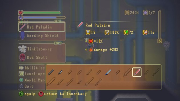
Yes, you collect something called a "Red Skull" in this game. Which is actually significantly less half-assed than Hugo Weaving's performance in Captain America.

Yes, you collect something called a “Red Skull” in this game. Which is actually significantly less half-assed than Hugo Weaving’s performance in Captain America.

The map really stands out. You know, when you’re not taken back by how awful the combat is. A lot of indie Metroidvanias either overly simplify the map design, or they bite off more than they can chew and end up with a dull, sprawling mess. Magicians & Looters has a damn near perfect map. The design is so logical, and that’s a rarity in indie gaming. I’m still not sold on the leveling up system, but because the combat mechanics are fixed, it doesn’t feel like I’m underpowered anymore. It helps that the controls are more responsive thanks to the patchwork. In fact, I can’t help but wonder if this is the single-greatest use of a patch in gaming history. Thank God this wasn’t XBLA, or that patch would have been unaffordable and turned the development team into jaded douchebags.

M&L isn’t perfect by any means. Some of the dialog is too smart-assed for its own good. The longer you play, the longer you realize that these characters are damn-near unlikable. If you knew people who talked like this, you would hate them. You would go out of your way to avoid attending parties with them. Or, if stuck at a party with them, you would master the art of choking on appetizers just to avoid conversing with them. By the way, the secret to that is not faking it. Otherwise, you’ll fail to properly turn blue and thus they’ll want to keep talking with you. Nope, just suck it up, literally, and lodge that fucker in your throat. Though I suggest you make sure someone with a ten foot distance knows the Heimlich maneuver before trying this. Actually, don’t try this at all. Or at least don’t tell people you got the idea from me.

Where was I?

Mom?? Oh wait, I made that joke last time. Um, gimmie a second. Um, something about vaginal VDs or something.

Mom?? Oh wait, I made that joke last time. Um, gimmie a second. Um, something about vaginal VDs or something.

Oh, and the boss battles are still a bit tedious. A lot of people complained about the final boss. I actually can’t comment on it. Despite the accolades I’m bestowing upon the game, I had to walk away during the final battle because of epilepsy concerns. But, I tracked down the ending on YouTube and it’s worth a look. Is it disappointing I couldn’t finish it? Sure. But I can’t deny that every single part of the game before it had me shaking my head in disbelief. THIS from a game that originally didn’t even win my seal of approval? Are you kidding me?

I started Indie Gamer Chick three years ago today, and my focus was on Xbox Live Indie Games. It didn’t take me long to realize I had found a treasure trove of underrated, overlooked gems. So I guess it shouldn’t surprise me that, three years later, I’m still finding games that can blow my mind. There are precious few games out there that have scared me with the potential their developers display. This is one of them. What really amazes me is, even after reviewing over four-hundred games on the platform, I’m still able to say this about a new game: Magicians & Looters is the best Xbox Live Indie Game ever made. I have no doubt about it. Curly was right: just one thing. Figure that out, and everything else will work itself out.

xboxboxartMagicians & Looters was developed by Morgopolis Studios
Also on Steam

IGC_Approved$2.99 has been holding off on this review for over a month now, because Cathy thought announcing a new best XBLIG ever on her site’s birthday would be more festive. Though we’ve heard the guys at Morgopolis have aged horribly waiting for the announcement in the making of this review.

Magicians & Looters is Chick-Approved and Ranked on the Indie Gamer Chick Leaderboard. Please note, she said “best Xbox Live Indie Game of all time.” Not best Indie of all time.


Bad Bunny

Approximately nine hours ago, I started watching the new Hobbit movie with Brian. Weirdly enough, the counter on the television indicates that we only began watching it one and a half hours ago. I tried to alert scientists of the world of the bizarre vortex in space and time emanating from our living room, but they showed little interest. Probably because checking it out would require them to watch the Hobbit as well.

Thankfully, I was also playing an Easter-themed XBLIG called Bad Bunny. It was a bit disappointing in one regard: the cover art made it look like it would have a lot more personality than it did. Take a look.

xboxboxart

Not bad-looking. I figured it would be like an XBLIG version of Naughty Bear. Which, granted, was one of the worst games of the last generation, but at least it had an interesting concept. So I ponied up a dollar and fired it up. Needless to say, it was not Naughty Bear.

screen1

Yeah. So instead it’s another fixed-position wave shooter, only this time the enemies are rabbits firing Easter eggs at you. Honestly though, Bad Bunny not bad at all. It’s not good or memorable either, but it didn’t feel like a complete waste of a dollar. There’s not a whole lot for me to comment on. The projectiles fired at your stationary turret could stand out a little more, so that you could better defend yourself. And they could have really used more power-ups to keep things interesting. And online leaderboards as opposed to just a local one. And it could have used more than one ordinary play mode. Bad Bunny isn’t remotely ambitious and you’ve played a million games like this before.

BUT, it is fun for an hour, and fun is all that has ever mattered in my books. Bad Bunny is a totally harmless, borderline charming arcadey throwback and yes, I do like it a little bit. Let people moan that I enjoyed this half-assed shooter and didn’t like something ambitious and thoughtful, like Deadlight. Am I saying Bad Bunny is better than Deadlight? I guess technically I am, though that seems somehow wrong. How about “I personally enjoyed the overall experience of one hour with Bad Bunny more than I did several hours with Deadlight.” Besides, it’s just one person’s opinion. It’s not like it’s notarized by the Pope or anything. I actually did try to get it notarized but he stopped taking my calls when I wouldn’t stop calling him “Super Mario.”

xboxboxartBad Bunny was developed by Game Play You

IGC_Approved$1 Has no clue how we got from Jesus being beaten, executed by crucifixion, then returning from the dead to bunnies and colored eggs in the making of this review.

Bad Bunny is Chick-Approved and ranked on the Indie Gamer Chick Leaderboard.

Like my new logo? The gentleman who designed it, Kenneth Seward Jr., is for hire! Visit his site and check him out on Twitter. Reasonable rates, awesome work!

Footage via the unsung hero of the XBLIG scene, Splazer Productions

 Still here? Cool. I have a new blog that will contain my non-gaming related ravings. Header


E.Y.E.R.I.S.

Twin-stick shooters. I’m willing to bet that I’ve played more of them than anyone my age on the planet. I’ve reviewed over a dozen here alone, and that’s not counting the ones I sampled for a few minutes before realizing that there would be no unique hook. I get why they exist in the numbers they do. It’s a relatively simple genre to pull off successfully. It’s perfect for a new developer who wants to get his or her feet wet in the whole game creation process. But I’m to a point where I’m so over twin-stick shooters. They need something that makes them stand out, or I’ll bore quickly.

E.Y.E.R.I.S., God bless it, really does try to be different. Unfortunately, it takes the art-house route to get there. There have been artsy TwickS in the past. Hell, I would say the grand-daddy of all XBLIG hits I Made a Game with Zombies is an artsy example of the genre. Here, the art vibe is less subtle and borderline pretentious, as you get motivational snippets of guidance that seemingly have no relevancy or anchor of any sort to the goings-on. Maybe it means more to the guys who made this, but for me, I just couldn’t get a feel for what concept or feeling they were trying to invoke here. It just came across as snooty.

Wait, without vision your path is revealed? How in the fuck do see the path? Without vision, I'll end up walking into walls!

Wait, without vision your path is revealed? How in the fuck do see the path? Without vision, I’ll end up walking into walls!

There is an actual game here though, and it’s a decent one. Of course it is. It’s pretty fucking hard to botch a twin-stick shooter. In E.Y.E.R.I.S. (I have no clue what it stands for, and the game doesn’t tell you) you start off on a stage where you have no ability to shoot and have to avoid the baddies for about a minute. Once you finish that, you’ll be given a choice of what the next stage will be. All the stages are the same, as far as I can tell, with the only difference being what gun you’re given. Repeat this three more times, adding additional weapons and shields with each new stage, and afterwards the game ends and simply cycles back to the opening screen, with no explanation of what this whole thing was about. I made up my own and assumed I was fighting off some kind of aggressive eye-infection.

Bad picture for the marketplace. It makes it seem like the soft-focus will be a major element in the game. It isn't.

Bad picture for the marketplace. It makes it seem like the soft-focus will be a major element in the game. It isn’t.

Again, it’s pretty hard to screw up a genre this simple. I spent a lot of time on the fence, trying to figure out how I felt about E.Y.E.R.I.S., and I came to the conclusion that it’s a decent game, and for those not burned out on the genre, or for those that get all touchy-feelly about games like this, you’ll probably enjoy it more than me. I don’t feel strongly about it one way or another, which means it gets to hang out at the bottom of the Leaderboard, but a decent game is a decent game, even if it sniffs its own farts.

xboxboxartE.Y.E.R.I.S. was developed by AbstrAKT Games

IGC_Approved$1 has no idea why I complain about people sniffing farts when I’m a world-renowned fan of picking one’s own nose. Mmm Hmmm, few things in life as satisfying as picking one’s own nose in the making of this review.

Hey, I wash my hands afterward. And I don’t eat any thing that comes out of it. Hello? Gross.

E.Y.E.R.I.S. is Chick-Approved and ranked very, very low on the Indie Gamer Chick Leaderboard.

Shipwreck

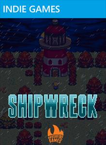
If you’ve been browsing the Xbox Live Indie Game marketplace, there’s a chance you might have noticed a fairly convincing Zelda clone pop-up over the last month. That is, if you can see past the dozen or so Flappy Bird clones littering the new releases. Then again, you might have missed it. After all, it has box art that looks like this:

Insert Tom Hanks and/or Gilligan's Island joke here.

Insert Tom Hanks and/or Gilligan’s Island joke here.

And it has a name that isn’t likely to inspire thoughts of the game whose legacy it tries so very hard to invoke. Shipwreck? Seriously? Still, it caught my attention, even though I’m not all teary-eyed nostalgic over Zelda. Chances are, it meant more to your childhood than it did mine. Don’t get me wrong. I love the series. Link Between Worlds was my favorite game of 2013, which I’m just as shocked by as anyone else. And I admit, the thought of a really good Zelda clone had me a bit excited. But it was all for not. My rule is, if I like a game 50.1% more than I dislike it, it gets my seal of approval. Shipwreck hovers around 40%. Maybe 45%. Close, but no cigar.

But I’m getting ahead of myself. The idea is, you’re a chick whose ship crashes and you have to gather four magical elements and defeat a ghost inside a lighthouse so that you can get a new ship and return home. The graphical style, sword-swinging animation, and castaway theme of the game is clearly aimed after Link’s Awakening, which I’ve always felt was one of the more overrated Zeldas. Still a solid game, mind you, but just not all that. Shipwreck still does a good job of emulating the feel of it. But then some glaring flaws pop up.

Credit where it's due: it looks the part.

Credit where it’s due: it looks the part.

For starters, the overworld has no enemies in it. For real. You just wander from place to place, looking for the next dungeon. There’s also no hidden caves, secret passageways, or surprises of any sorts. It’s an empty, sprawling, lifeless world. That worked in a game like Shadow of the Colossus (which mind you, still had SOME collectables, like the fruit or lizard tails), but in a 2D Zelda style game? It’s just so boring. Given the fact that Zeldas have been based around secret doors from the very start of the franchise, neglecting to include them in a Zelda tribute seems to miss the point of the series entirely.

There’s also not many items to collect. I got a shield (which you have to equip and activate, just like in Link’s Awakening), a crossbow, a lantern, and a pick-axe. That’s it. The game’s dungeons (one starter, four “gather the holy trinkets”, and one finale) don’t contain special items that you need to solve puzzles or advance further. Really, the more you play Shipwreck, the less tributey this Zelda tribute feels. It’s missing so many key elements of the formula, with only the boring stuff that anyone can do left in. It would be like if at Shaquille O’Neal’s hall of fame induction, they left out his four championships and focused on Kazaam and his free-throw shooting. Why would you even do that? And why would you leave the best parts of Zelda out of a Zelda tribute?

It does a lot of other fundamental stuff wrong. There’s no overworld map. The enemies “blink” when they take damage and don’t recoil enough. They also all seem to take two shots to kill. Except the boring bosses, which are spongy as hell. Oh, and you know how in some Zelda games, in order to get to where you’re supposed to go in a dungeon, you have to fall through the floor? Yea, Shipwreck does that too. Only in Shipwreck, you take damage for it. What a horrible idea! And why the FUCK does it only use two equip buttons when there are four face buttons on an Xbox controller? No, it doesn’t matter if you’re paying tribute to a two-button game. Not using all the resources at your disposal is just obnoxious.

The first boss is a giant crab monster. Of course it is.

The first boss is a giant crab monster. Of course it is.

Yes, Shipwreck does a lot of things right. I like how, instead of enemies dropping hearts (even when you have full health), they drop apples that you can save and use later. Now that’s a good idea. I liked the desert dungeon. And…….. well actually that’s the only stuff that really stood out to me. Everything else never got brutally awful or anything, but Shipwreck was bland and boring from the start and never really picks up steam. It will find an audience because it looks Zeldaish enough to warrant a purchase. I’m also not this game’s target audience, and I’m sure children of the 80s will probably enjoy this a lot more than I did. But, taken on its own merit, Shipwreck is just a dull video game experience. And taken as a Zelda clone? No secrets. No clever puzzles oriented around items found in dungeons. All that’s really left is the combat and some aspects of dungeon exploration, and even those are quite a bit off. Let Shipwreck be a lesson to everyone: when paying tribute to your favorite childhood classic, looking the part should take a back seat to feeling the part. Shipwreck is to Zelda what Lucky Charms would be without the marshmallows.

xboxboxartShipwreck was developed by Brushfire Games

$2.99 really did enjoy the desert dungeon quite a bit in the making of this review.

My amigo Tim Hurley really disagrees with me on this one. Read his review.

Iota

Protip: when naming your game, don’t give it a name that is just asking to be mocked.  Such is the case with Iota.  If I wanted to be an unoriginal wiseass, I could say “I didn’t like Iota one iota.”  But I’m above such laziness.

Well, then again, I’ve been updating only like once a week for a couple of months now.  So fuck it.  Laziness for the win.

I didn’t like Iota one iota.

Iota looks really good.. for an XBLIG. But typically, really good XBLIGs would look merely decent on Sega Dreamcast.

Iota looks really good.. for an XBLIG. But typically, really good XBLIGs would look merely decent on Sega Dreamcast, which you’ll note is fifteen years old.

Iota is one of those XBLIGs that falls into the category of “looks too good.”  It’s the curse of the platform.  With only a few exceptions, the better an XBLIG looks, the worse it plays.  Iota looks pretty dang good, which means the curse is especially potent here.  The idea is you play as a robot that must go around stages collecting shiny balls of light.  Collecting all of them opens up a shinier ball of light, clearing the stage.  Oh, and the platforming is sort of like a stripped-down Outland, which itself could best be described as “Ikaruga with jumping.”

In the interest of fairness, I’ll disclose that I’m not wired to really like Iota all that much to begin with.  I don’t like bullet hells, and I don’t like platformers that drink the bullet-hell Kool-Aid.  But, in the case of Iota, the stuff I dislike the most has nothing to do with the bulletly hellness of it, and honestly the bullet-hell stuff isn’t even that bad, at least up to the point where I determined that I would never have fun with this and quit.  Quick: what’s the most important thing a precision-based platformer OR a bullet hell would need?  Tight controls, right?

Guess what Iota doesn’t have?

If Sega hit the Sake too much and made a platformer that controlled exactly like Sonic the Hedgehog, only heavier and starring Juggernaut from X-Men, that’s what Iota would feel like.  Starting movement is too slow, stopping isn’t instantaneous, jumping feels too heavy or sometimes just doesn’t respond in time at all.  In just the first three levels, I lost count of how many times I went to jump, hit the button long before I got to the cliff, and then watched as my character didn’t jump and plunged to his death.  If it was less than ten times, I’ll eat my hat.

I didn't like it, but it did help to pretend this was a modern ReBoot game :P

The 2.5D perspective also made calculating distances and heights annoying at times, but that’s hardly Iota’s biggest problem.

Another issue is the inconsistency of the color-swapping bullet hell gimmick.  You switch the robot from red to blue, which allows you to pass harmlessly through bullets.  Using the triggers as a sort of dash-attack, you can also knock out the enemies.  Except the game is a bit fickle about the timing of it.  Switching mostly allows you to instantaneously pass through the bullets with relative ease, but upon landing on the platform and dashing into the robot (which has to match your color in order to kill it), sometimes it would register me as still changing colors, resulting in a death.  I experimented with this a lot (probably more than any play-tester did, judging by how bad it is), and it was bizarre how the bullets could be passed through instantaneously, but there was a lag in using it to kill enemies.  I found out that the jumping and landing had nothing to do with the lag.  I could situation myself on a platform, wait for the robot to come at me, switch colors, to the point that my robot looked fully like he had switched, dash, and die because it thought I was still the wrong color.

Level design was nearly my biggest issue, which is really impressive considering that I only played four stages.  I don’t think the idea of collecting all the trinkets in a level to open up an exit works in a game like this.  Maybe it was worth experimenting to find out, but really, a game based around one-hit kills and a broken checkpoint system should have simply been about getting from point A to point B.  With all the backtracking, it bogs the game down, makes it less exciting.  And then there was the third level, which is almost entirely done in the dark.  It’s not a particularly hard stage, but because you have very limited visibility, you have to heel-toe it, nudging the stick one tiny bit at a time, like you’re masturbating the microscopic penis of a Ferrari owner.  It’s shameful that the developers didn’t recognize this as BORING design.  Because, above all else, your games should not bore.  Every other aspect of Iota has potential to be a pretty decent platformer.  But a stage like this, which can’t be played at a speed above molecular-degradation of an atom, never had potential to be anything but the most boring level in platform history.  It’s only purpose is now to point and it and say “for fuck’s sake, don’t ever make a stage like this” to other developers.

Although I found nothing to like about Iota, I don’t deny this could have been something good.  Certainly a foundation has been laid for something that could be entertaining.  But Iota put a premium on graphics, and didn’t focus on the stuff that really matters in a platformer of this sort, and the result is a game with limited value.  Tighter controls would have made a world of difference here.  And stuff like the all-dark level should have never entered into the thoughts of the developer.  Ten seconds of research would have shown that the number-one gripe of the vast majority of Spelunky player  are the dark stages, and in Iota, the visibility a player has is much worse.  Thus, Iota serves as a reminder that, with the freedom indie developers have, the flip side is you end up with level design such as this that nobody in their right fucking mind would attempt.  I absolutely can’t believe the developers didn’t second-guess some of the design choices here.  Ultimately, Iota’s only hope is to lure people in with its impressive graphics.  Except, Iota really only looks good for an XBLIG.  And that’s like saying melanoma looks good as far as cancer goes.

xboxboxartIota was developed by Cashie Brothers

$1 will be keeping an eye on the Cashie Brothers, as I suspect they’ll get things right in their next game in the making of this review.

Gameplay footage courtesy of Splazer Productions

Grand Class Melee

If a game is fun, then is that game good? Has the objective of the game design been fulfilled, or are there more criteria we demand before we can deem a game quality? What relegates a game to the realm of “guilty pleasure,” instead of simply being a good game? Artistic intent, perhaps?If that is indeed the case, and artistry is the deciding factor, then Grand Class Melee is a guilty pleasure game of mine. It’s unbalanced, random, and more chaotic than an All Rainbow Road Cup in Mario Kart. Certainly, one wouldn’t leverage the title in an “Are Games Art?” debate. But perhaps they could successfully leverage it in an argument against the need for games to be emotionally exhausting affairs. Maybe it could make a stand against games that put complicated mechanics at the heart of their systems. Grand Class Melee sticks to the most fundamental property of game design, in so much that it is simply a blast.
screen3
Fun or not, the objective of a review is to be objective about subjectivity, so let’s try to break down the experience, which is so much greater than the sum of its parts, into its most primitive elements.
Firstly, the art is far from what one would call inspired. As with a lot of games on the Xbox Live Indie Games market, Grand Class Melee utilizes pixel art in its design. While sometimes pixel art can feel like the right choice, artistically, it more often than not feels like the easy way out; placeholder graphics to be overlooked, as they’re only there to facilitate gameplay itself.
The maps are equally uninspired, randomized, I believe. There is a breeze present that marginally affects movement speed and tall grass that some classes will be able to take advantage of for stat bonuses. Unfortunately, a lack of truly clever level mechanics does hinder the game, leaving the player wondering what could have been.
Where the game comes together, sensibly, is within the mechanics themselves. Up to four players can gain agency over the sprites in an all out brawl. If four players aren’t available, computer characters can fill in for them, at one of 3 different difficulty settings. But, like with Smash Bros., the ability to communicate with other players in order to gang up on an alpha player is an essential part of the experience. Especially given the occasional balancing issues, but more on that in a moment.
screen2
The game controls very simply. If you’ve ever played a classic Legend of Zelda, with the overhead camera, then you will be right at home. Characters can move in any of the four compass directions, and have a stationary and a lunge attack mapped to A and B. The triggers will sport two abilities; one inherent to your current class, one a leftover from a lower rung of your class tree. Between matches, choosing these abilities allows for a tiny degree of customization that actually ends up being essential to the upcoming match’s dynamics.
The 60 classes —which can be seen here— are supposedly balanced by fan interaction, and, while certain class combinations feel broken, the sequel will likely opt for more fairness in classes. Honestly, I prefer the outlandish combinations, as teleporting characters fire Dragon Ball Z inspired kai beams across the stage, threatening bulky characters who can’t close the distance. It’s comical, and lends itself to a sort of party-game atmosphere.
Like Dynasty Warriors, I urge people to play this game, and to play it with friends. The game isn’t revolutionary, won’t address social issues, will not engage you with riveting narrative, and I promise, the art direction won’t sweep you away. But, it should be fun. If it isn’t, then it’s definitely because your friends suck.
How’s that for objective?
xboxboxartGland Class Melee was developed by Gigatross GamesIGTlogo-01$1 says, “it’s a way to prove to your friends that you are better at Zelda, which is about as likely to get you laid as being one dollar richer. So, you know, why not? in the making of this review.Benjamin has awarded Grand Class Melee the Indie Gamer Team Seal of Approval.